I once read a discussion about microphone placement in an Usenet Forum (it was a long time ago). Someone asked “where is the best place to position the microphones to record a french horn?” Lots of people had opinions, but the answer that I liked most was “that’s like asking ‘where is the best place to stand to take a photo of a mountain?” Of course, that answer might have been too facetious for the person asking the question, but, in my opinion, it was a good analogy. The correct answer, as always, is “it depends” – in this case, on perspective.
Example #1
Take a look at the image below.
Fig 1. A photo of a fishing boat, near the coast of Newfoundland, on a foggy day. The photo is 640 pixels wide and 480 pixels high. The vertical scale here is the black-to-white value, ranging from 0 (black) to 256 (white).
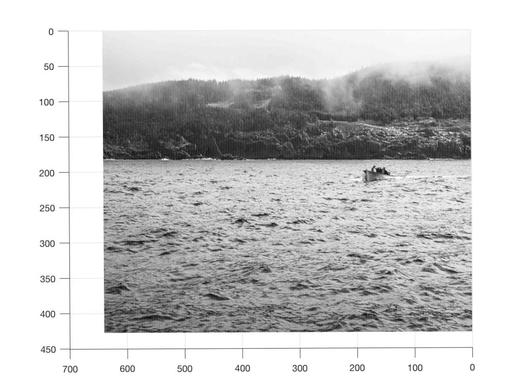
As you can read in the caption, this is a 640 x 480 black and white photo of a fishing boat off the coast of Newfoundland, near where I grew up, on a foggy day. Of course, if I didn’t tell you that, then it would be impossible to know it – but that’s because you’re looking at the “data” (the information in the pixels in the photo) from the wrong place… I’ll rotate the image a little and we’ll try again.
Fig 2: The same information as in Figure 1, but viewed from a different location.
Figure 2 is just a rotation of Figure 1 – we’re still looking at the same photo, but from another direction. It still doesn’t look like a boat… Let’s rotate some more…
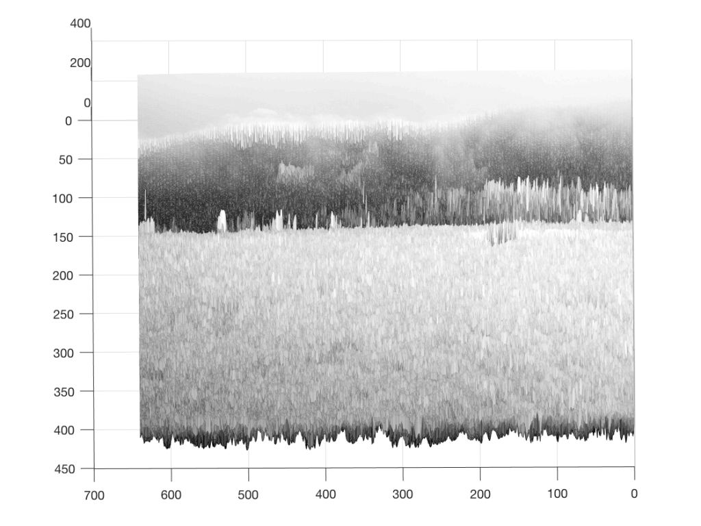
Fig 3: The same information as in Figures 1 and 2, but viewed from a third direction.
Figure 3 is looking more like something – but there’s still no boat in sight… If you come back to Figure 3 after you look at Figure 4, you’ll recognise the trees on the land, the sky, and the water – you’ll also be able to see where the boat is. But this view of the photo is just off-position enough to scramble the data into being almost unrecognisable. So, let’s rotate the view of the data one last time…
Fig 4: Finally! A photo of a fishing boat, near the coast of Newfoundland, on a foggy day
So, what was the point of this, somewhat obscure analogy? It was to try to show that, by looking at the data from only one viewpoint, or one dimension (say, Figure 1, for example), you might arrive at an incorrect interpretation of the data.
Example #2
Watch this video.
In this video, Penn and Teller do the same trick twice. Both times, the trick is impressive, but for two different reasons. This is because your perspective changes. The first time, it’s just a good magic trick – or at least an old one. The second time, you’re impressed because of their skill in executing it. Two different perceptions resulting from two different perspectives.
Example #3
Once-upon-a-time, I taught a course in electroacoustic measurements at McGill University. I remember one class, early in the year, where I started one day by saying “What is a ‘frequency response’?” and one of the students, with a smile on his face replied “The only thing that matters…”
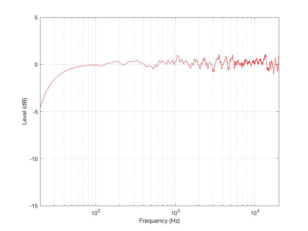
I went through some old data and found a measurement of a loudspeaker. Figure 5, below, shows the magnitude response of a three-way loudspeaker, measured in free-field (therefore, no reflections or influence of the room) at a distance of three meters from the loudspeaker, on-axis to the tweeter.
Fig 5. The magnitude response of a 3-way loudspeaker, measured at a distance of 3 m, on-axis to the tweeter, in a free-field.
This is just the kind of measurement that you’d see in a magazine… It’s also the kind of measurement that you’d use to make a “frequency response” for a data sheet. This one would read something like “<40 Hz – >20 kHz ±1 dB”, give or take.
However, let’s think about what this really is and whether it actually tells you anything at all… It’s a measurement of the relationship between input voltage to output pressure, in one place in space, at one listening level, with one type of signal (maybe a swept sine wave or an MLS signal, or something else…), at one temperature of the drivers’ voice coils, at one relative humidity level of the air (okay, okay… now I’m getting into excruciating minutæ…)
However, does this tell us anything about how the loudspeaker will sound? Well, yes. If you use it outdoors in a large field and you stand 3 m in front of it and listen to the same signal that was used to do the measurement. If, however, you stand closer, or not directly in front of it, or if you listen to music over time, or if you bring it indoors, this is just one piece of information – perhaps useful, but certainly inadequate…
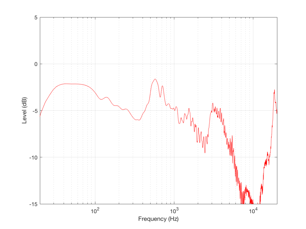
Let’s look at another measurement of the same loudspeaker
Fig. 6. The magnitude response of the same loudspeaker, measured 90 degrees to the side under the same conditions.
As you can see, this loudspeaker’s magnitude response looks “pretty bad” – or at least “not very flat” off-axis (which implies that I just equated “flat” with “good” – which might not necessarily be correct…).
This is the magnitude response of the signal that this loudspeaker will send out the side while you’re listening to that “nice” flat direct sound. Something like this will hit the side wall and reflect back, different frequencies reflecting with different intensities according to the absorptive properties of the wall, the total distance travelled by the reflection, and the relative humidity (okay, okay …I’ll stop with the humidity references…)
As is obvious in Figure 6, this “sound” is almost completely unlike the “sound” in Figure 5 (assuming that a free-field magnitude response can be translated to “sound” – which is a stretch…)
So, just like in Example 1 and Example 2, by “looking” at the data from another direction, we get some more information that should be used to influence our opinion. The more data from the more perspectives, the better…
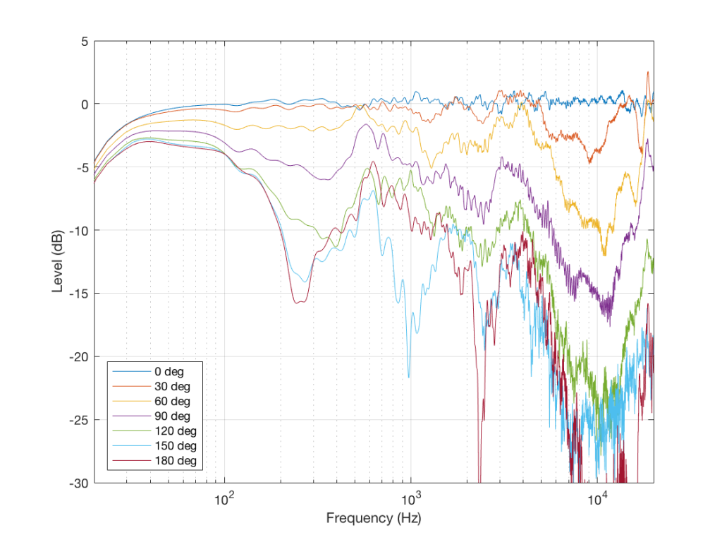
Fig 7. The same loudspeaker, measured for magnitude response at every 30 degrees in the horizontal plane, on one side, in a free field, at one level, with one type of signal, at one set of voice coil temperatures, etc. etc….
So, we have one measurement that shows that this loudspeaker is “flat” and therefore “good”, in some persons’ opinions. However, we have a bunch of other measurements that prove that this is not enough information. And, if we measure the same loudspeaker at a different listening level, or at a different temperature, or with a different stimulus, we’d probably get a different answer. How different the measurement is is dependent on how different the measurement conditions are.
The “punch line” is that you cannot make any assumptions about how that loudspeaker will sound based on that one measurement in Figure 5 or the “frequency response” information in its datasheet. In fact, it could just be that having that graph in your hand will be worse than having no graphs in your hand, because your eyes might tell you that this speaker should sound good, and they get into a debate with your ears, who might disagree…
So, without more information, that one plot in Figure 5 is just a plot of one parameter – or one dimension – of many. And you can’t make any conclusions based on that.
Or put another way:
An astronomer, a physicist and a mathematician are on a train in Scotland. The astronomer looks out of the window, sees a black sheep standing in a field, and remarks, “How odd. All the sheep in Scotland are black!” “No, no, no!” says the physicist. “Only some Scottish sheep are black.” The mathematician rolls his eyes at his companions’ muddled thinking and says, “In Scotland, there is at least one sheep, at least one side of which appears to be black from here some of the time.” Link
Often, people want simple answers to what are usually complicated questions. “What is the best restaurant in the world?” “Is this new movie worth seeing?” “Is it better for ‘the environment’ to buy cloth or disposable diapers?” “Is this Metallica album any good?”
My rule of thumb to any question like this is that, if the answer is “it depends….” then I immediately trust the person doing the answering. Once upon a time, the answer to the first question was “Noma in Copenhagen” if you believed one rating, but if you don’t like eating yogurt with ants, perhaps you might disagree… Some people screamed with delight when they saw the latest Star Wars trailer – others aren’t into science fiction so much, so they might not be the first in line to buy tickets. It turns out that the cloth vs. disposable is, in part, dependent on geography and natural resources.
However, it’s easy to go to many websites and learn that Death Magnetic is an affront to humanity due to a heavy-handed use of dynamic range compression, and the engineers involved should be on a “most wanted” poster with bounties on their heads…
Personally, I disagree. True, Death Magnetic isn’t the best album to use to show what a wide-dynamic-range recording sounds like – but that’s just one aspect of everything about that recording. Similarly, it would be misguided to say that “Casablanca” is a bad movie because of it’s obvious lack of colours – there are other aspects of that movie that might make it worth watching…
Now, before we go any further, don’t send me emails and comments about this. If you stick with me, you’ll see that my point is not to argue the merits of Death Magnetic. If you don’t like it, I respect your opinion, and I won’t make you listen to it. (And, just for the record, while I type this, I’m listening to an old recording of Schoenberg String Quartets on my headphones – hopefully proof that I’m open to listening to other albums as well…)
My problem with the people I’m trying to make fun of is that they use a single measure – a one-dimensional analysis – to judge the quality of something that has more dimensions. For example, no one ever complains about the overall frequency range of Death Magnetic. Maybe that’s really good (whatever that means).
We can even go further in our mission to pick nits: How, exactly, does one measure or rate the “dynamic range” of a recording? Spoiler alert: this question will not be answered by the end of this blog posting. I just hope to show that answering this question is difficult – and that you shouldn’t trust someone else’s rating…
To start, let’s get back-to-basics. The dynamic range of something is a measure or rating of its loudest level to its quietest. So, we can talk about the dynamic range of an audio device – comparing the level at which it can go no louder to the level of its noise floor (both of which are dependent on the frequency to which you want to pay attention). Or, we could talk about the dynamic range of a conversation over dinner – from the loudest moment in the evening when the drunk, belligerent person was shouting down the table at someone he disagreed with, to that quiet moment early in the evening at 8:20 p.m. when no one at the table could think of something to say.
Let’s take a different recording as an example, since it will make the show-and-tell a little easier.
If I take Jennifer Warnes’s 1986 recording of “Bird on a Wire” from the album “Famous Blue Raincoat” and plot the sample values of the left channel on a linear scale ranging from -1 to 1, it will look like Figure 1.
Fig 1: The individual values of all of the samples in “Bird on a Wire”, plotted on a linear scale.
This shows us some stuff. For example, we can see that there are no samples louder than 0.5 of maximum. We can also see that it’s a bit “spiky” – probably drum beats, if we don’t know the tune. There’s also a part of the tune centred around the 150 second mark that’s probably a bit louder, and a section afterwards that is a bit quieter. However, what is the “dynamic range” of this song?
Attempt #1
One way to answer the question is to compare the loudest peak in the song to the average level (also known as the “crest factor” of the signal). Let’s try that…
Using Matlab, I found out that this is a single sample with a value of 0.4973 that occurs 259.4884 seconds into the tune (sample #11,443,439, if you’re wondering). Then I calculated the overall RMS value of the entire track (the square Root of the Mean of the sample values individually Squared) and found out that it’s 0.0530.
Therefore, our “dynamic range” of this recording is 20*log10(0.4973 / 0.0530) = 19.45 dB
That’s an answer that was easy to calculate. However, to borrow a quote from Pauli: “That is not only not right; it is not even wrong.”
This is because the value of a single sample in a song cannot be considered to be the perceived peak in the music – even if it is the biggest one. In addition, the total average the power of all of the samples in the song means nothing, since you can’t listen to the entire song at once. It’s like saying “what is the elevation of the Alps?” You can do the average, and come up with a number, but it won’t matter much for planning your hike over Mont Blanc…
Attempt #2
One of the problems with Figure 1 is that it shows the sample values on a linear scale, which has little to do with the way we hear. For example, we hear a drop from a linear value of 1 down to a linear value of 0.5 the same as going from 0.5 down to 0.25 – and 0.25 down to 0.125… (I was halving the signal in each of those steps). So, let’s re-plot the values on a logarithmic scale, which is a better visual representation of how we hear the signal. This is shown in Figure 2.
Fig 2: The same data that was shown in Figure 1, plotted on a decibel scale. It says “dB FS” – but it’s not really. It’s actually just 20*log10(abs(sample value)).
Things look a little less different now – although, to be fair, I have a range of 100 dB on the Y-axis – which is big. Note that the samples with a value of 0 are not plotted on this graph, since they will have a value of -∞ dB, which would require a bigger computer screen. So, if you could zoom in on this plot, you’d see holes where those sample values occur.
Let’s zoom in a little on the vertical axis so that things are a little more friendly.
Fig 3: The same information as is shown in Figure 2 with a reduced range in the Y-axis.
Okay, so we still see that there’s a quiet section around the 200-second mark, but the loud section just before it doesn’t seem as louder as it did in the linear plot.
There is a quick lesson to be learned here: linear plotting of audio tends to exaggerate the louder stuff. This is because, in a linear world, the area of 0.5 up to 1.0 is half of the plot (if we only talk about the positive world), but in the log world (which our ears live in) it’s only the top 6 dB. (Similarly, if you’re plotting in linear frequency, the top octave on a piano is more important than all of the others combined… which is not true.)
Another way to see this exaggeration is to look at the dip in level at about the 220 second mark. This is much more evident as a “trough” in Figure 3 than in Figure 1, because the low-level samples get equal attention in the log-scale plot.
Why have I mentioned this? It’s because if you go to Youtube and watch videos of people ranting about the “loudness wars” they often do demonstrations where they use compression to reduce the dynamic range of old recordings and play “before and after” results. As they do this, the video shows what looks like a real-time plot of a linear representation of the results. Apart from the fact that it’s likely that you’re actually looking at a scaling of a plot in a graphics editor, and not in an audio editor, the linear representation is not a fair one to show what a compressor does to an audio signal. Note that I’m not making any comment about the content of those videos – I’m just warning you about jumping to conclusions based on the visual representation of the data.
Okay, back to our story… How can we find the dynamic range of this recording?
Well, our second possibility is to look for a loud section in Figure 3 and compare it to a quiet section in Figure 3. The problem is, how do we find those sections? We’ve already established that looking at the loudest single sample in the entire song is a silly idea. So is finding the RMS of the entire track. Let’s try something else. Let’s do a running RMS of the song. This is shown in Figure 4.
Fig 4: The same data shown in Figure 3 (in blue) and a running RMS value (in red) with a 10-second time constant.
Now, one of the problems with an RMS calculation is that part of the calculation is to take the mean (or average) of a bunch of values. However, you have to decide how many values to average – in other words, “how long a slice of time are we taking?” In the plot above, the RMS value (shown in red) is calculated using a 10-second window (which is why it starts at the 5-second mark). For each point on that red line, I took all of the audio sample 5 seconds before to 5 seconds afterwards, squared them, found the mean value, and then took the square root of that. This can give me some indication of the level of the music in those 10 seconds – but we don’t hear all 10 seconds at once… so now, it’s like asking the average height of Mont Blanc (instead of the average height of the Alps). So, this information is still not really useful.
One thing is interesting, though… Look at where the red line says the quietest moment in the song is. It’s not centred around the deep trough at 220 seconds. It’s a little later than that. This is because a narrow, deep notch in the blue signal gets averaged out of existence in the RMS calculation – making it less significant.
Another interesting thing is to note how low the RMS value is relative to the instantaneous values. (In other words, the red line is a lot lower than the top of the blue curve.) This is because the peaks in the signal are short – but that’s not visible because I’m plotting the whole tune. If I zoom in to only one second of music (in Figure 5) this becomes more intuitive…
Fig 5: A zoomed-in portion of Figure 4, showing only 1 second of music. Remember that the red line still shows the RMS value of the surrounding 10 seconds of music, 9 seconds of which are not shown here.
So, let’s reduce our RMS time constant to see what happens…
Fig 6: The same data shown in Figure 3 (in blue) and a running RMS value (in red) with a 1-second time constant.
Now we’re starting to see a little more variation in the RMS signal, which might be a little closer to the way we hear things. But it’s still not a good representation because the RMS time window is 1 second – and we don’t hear 1 second of music simultaneously either…
So, how much time is “now” when we’re listening to music? Some people say 30 milliseconds is a good number, since anything outside that window can be heard as an echo… This is a mis-interpretation of a mis-interpretation, but at least it gives us a number to put into the math, so let’s try that.
Fig 7: The same information as shown in Figure 3 (in blue) and a running RMS (in red) with a 30 ms time constant.
Now, if you squint just right, the red curve basically looks like a lower copy of the blue curve, so it’s probably not useful at this magnification. Let’s zoom in to see if it’s makes more sense
Fig 7: The same information as shown in Figure 5, but with a 30 ms time constant for the RMS calculation.
Enough… Hopefully you can see where I’m headed with this: no where… The simple problem is that, in order to find the dynamic range of a piece of music, we need to compare the loudest moment to the quietest moment. Unfortunately, none of what I’ve shown you so far is a measurement of either of these two values.
We can do other things. We can band-limit the signal (since neither 20 kHz nor 20 Hz have much contribution to how loud something sounds). We can play with time constants (maybe using a short one to invent a number for the peaks, and a longer one for the quiet moments). We can do other, more complicated stuff, including applying filters (simple ones like the ones used in the ITU-1770 standard, or complicated ones like the ones suggested by companies who make gear).
We also have to consider whether our perception of how loud something is is related to the average level or the peak level (JJ points out in his lecture at about 20:38 that different persons will disagree on this…).
Ultimately, we get to a point where we have to say that a single number to represent the dynamic range of a song is a nice number to have, but probably not related to how you perceive it. And if it is, it might not be related to how I perceive it…
And, in the end, the REAL message is that it doesn’t matter. Deciding that a recording is “good” because it has been rated to have a wide dynamic range by someone’s calculation is like saying that “Casablanca” isn’t a good movie because it doesn’t have any colours in it – or choosing a restaurant based on a single rating from one critic. No matter what the rating is, if you don’t want to eat live ants crawling on yogurt, you should probably go somewhere else…
Addendum: Before you comment on this posting, please go and watch the two lectures by JJ here and here. If the content of your comment indicates that you have not watched these two lectures, I will probably delete it from my website. You’ve been warned… I will also delete your comment if you mention Death Magnetic – if you want to talk about that, make your own website. You, too, have been warned.
Interesting that they include people who “buy” digital downloads in the “own” category, since normal consumers typically don’t know that they’re only buying access to the music from most sites, and not actually purchasing the content, like we did in the old days…
In my previous posting, I mentioned that I was using a tone at or around 997 Hz to test my signal. In truth, only one of the plots I showed there actually used 997 Hz – but that doesn’t really matter.
The question that I’ll talk about in this posting is “why did I prefer to use 997 Hz instead of 1 kHz as my target frequency?” (I didn’t just randomly choose 997 Hz – it’s a common number that’s often used by people in the audio industry.)
The answer to that question has to do with some considerations on how digital audio equipment and software is tested.
Let’s start by talking a little about how a signal gets a PCM (Pulse-Code Modulation) representation in the digital domain. Note that this is the VERY basic explanation – I’m leaving out a lot of steps here…
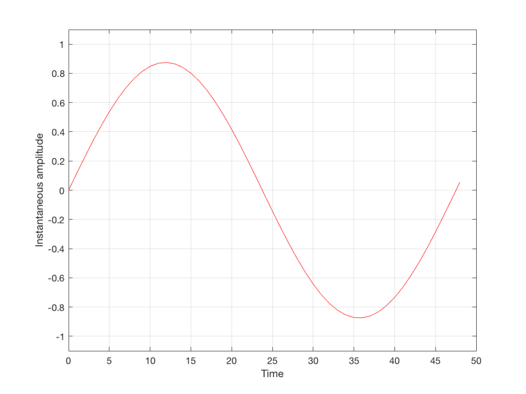
We’ll start with a signal like the portion of a sine wave shown in Figure 1.
Fig 1: An audio signal that has infinite resolution in the time and amplitude domains.
This signal is continuous – meaning that we can zoom in infinitely and still get a smooth curve – both in terms of time, and amplitude.
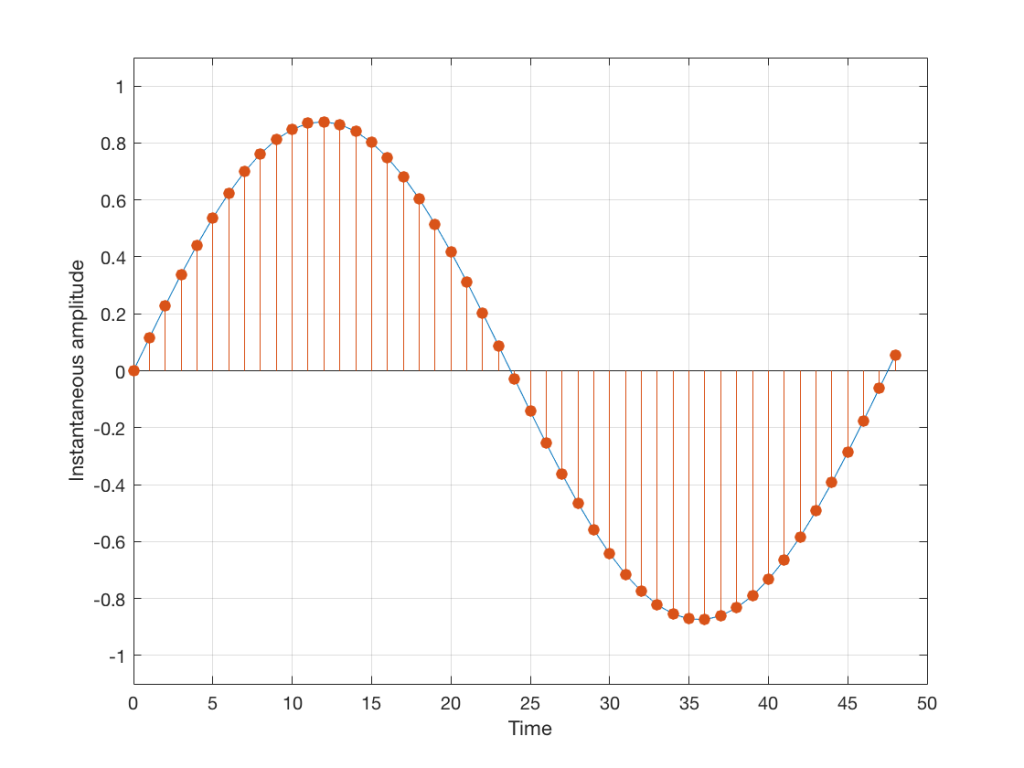
We then take that signal and measure its amplitude every time a clock ticks – and regular intervals. This is represented by the red dots in Figure 2. (I just left out a whole lot of information about anti-aliasing filters, but it doesn’t matter for the purposes of this discussion…)
Fig 2: An audio signal (blue) that has been sampled at discrete time intervals, but still has infinite resolution in its amplitude measurement (shown in red).
So, in Figure 2 we have a representation of a sinusoidal wave that has been “sampled” – a word that means “measured at regular time intervals. We are grabbing a “sample” or a “measurement” of the amplitude of the signal.
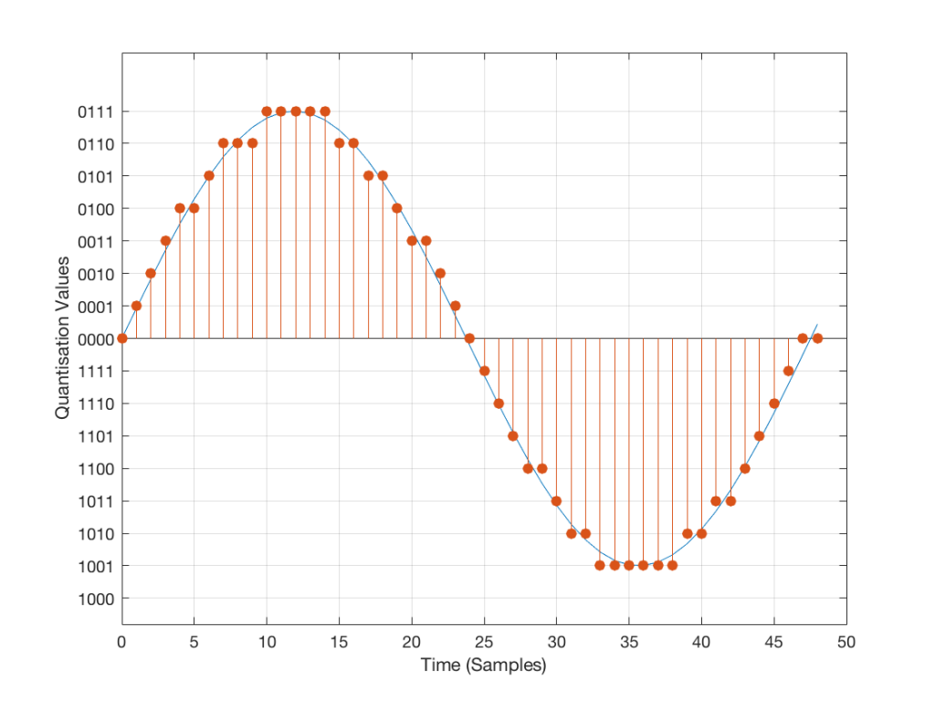
The problem is that the “ruler” we use to measure those values doesn’t have infinite resolution – just like the ruler that you would use to measure the length of something. If your ruler has lines only as fine as millimetres or 1/16th of an inch, then you cannot measure something accurately to the micrometer or to 1/64th of an inch. So, you “round off” your measurement to the nearest value on the ruler.
We do the same with audio – we have a finite number of values that we can store or transmit to represent the instantaneous amplitude of the signal, so we have to round off or “quantise” the values to the nearest value that we have. The result looks something like Figure 3:
Fig 3: An audio signal (blue) that has been sampled at discrete time intervals and “quantised” or “rounded off” to the nearest available amplitude value (red).
I’ve shown the quantisation values on the left (the Y-axis) as binary values. As you can see there, we have a 4-bit signal which gives us a total of 2^4 = 16 possible quantisation values for storing the signal’s amplitude at each sample.
If you’re really paying attention, you’ll notice that there are one fewer positive values than negative values, since one of the positive values is taken to represent the “0” line. This is why, when I made my original signal, I didn’t scale it all the way up to ±1 – just to keep things smooth in the explanations. If you aren’t paying that much attention, and you didn’t notice this – then please have a look, since it will come up again later…
Normally, of course, we store audio signals with a LOT more bits than this – a CD uses 16-bit resolution, which gives us a total of 65536 possible quantisation levels (2^16). Other systems use a different number of bits – either fewer or more, depending.
At this point, it should be pretty clear that you have a finite number of samples (or measurements) per second (typically 44100 samples per second (or 44.1 kHz), if it’s a CD, although 48000 samples per second (48 kHz) is also a pretty common number – other systems use other values for this.)
So, if we look at a CD, we have 44100 samples per second, and 65536 possible quantisation values to choose from for each sample (because it’s a 44.1 kHz, 16-bit system). Notice that we have more quantisation values than samples per second…
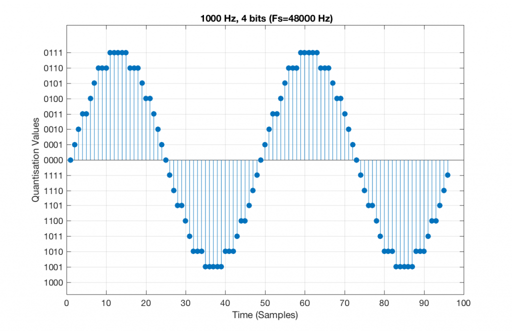
Now, let’s say that we want to test a piece of digital audio gear, and one of the tests that we wanted to perform was to ensure that all possible quantisation values are working properly (whatever that means). Let’s also say that the gear has only 4 bits of resolution and is running at a sampling rate o 48 kHz, to start. One way to test any audio gear is to feed in a sine tone and to see what comes out. So, we’ll do that, using a 1 kHz sine tone. The result looks like Figure 4, below.
Fig 5. A 1 kHz sine tone, represented in a PCM system with 4 bits of resolution and a sampling rate of 48 kHz.
There are two things to notice about that signal in Figure 5:
The first is that all possible quantisation values are used at least once – except for the very bottom one – but that last one is my fault, caused by the scaling of the sine wave, and the fact that it is symmetrical.
The second is that the wave is perfectly periodic – meaning that it repeats itself over and over and over… There are two cycles of the waveform shown in the plot, and if you count the dots, you’ll see that the two are identical. This second point is the one that will be important to understand as we go further. The reason this exact repetition happens is because the frequency of the sine tone (1000 Hz) is an integer divisor of the sampling rate (48000 Hz). In other words, 48000 / 1000 = 48 – not a weird number like 48.3.
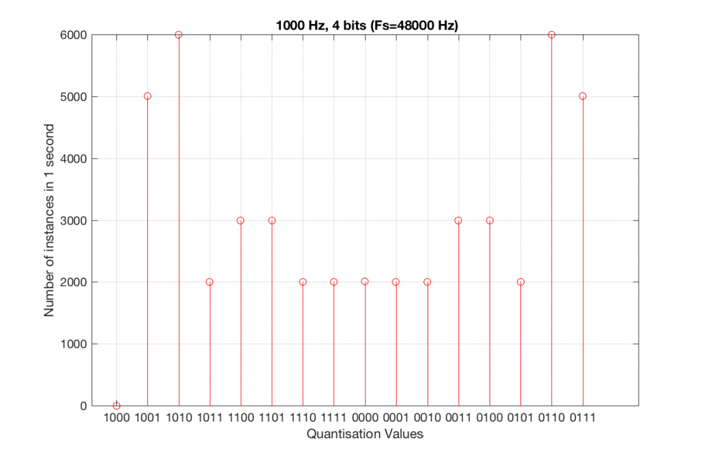
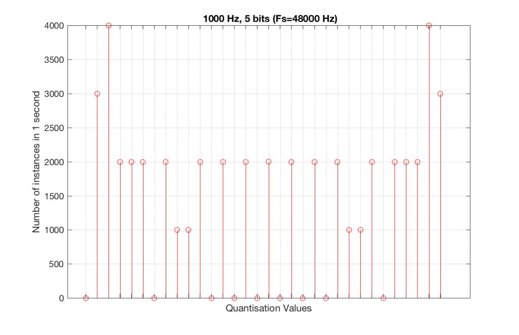
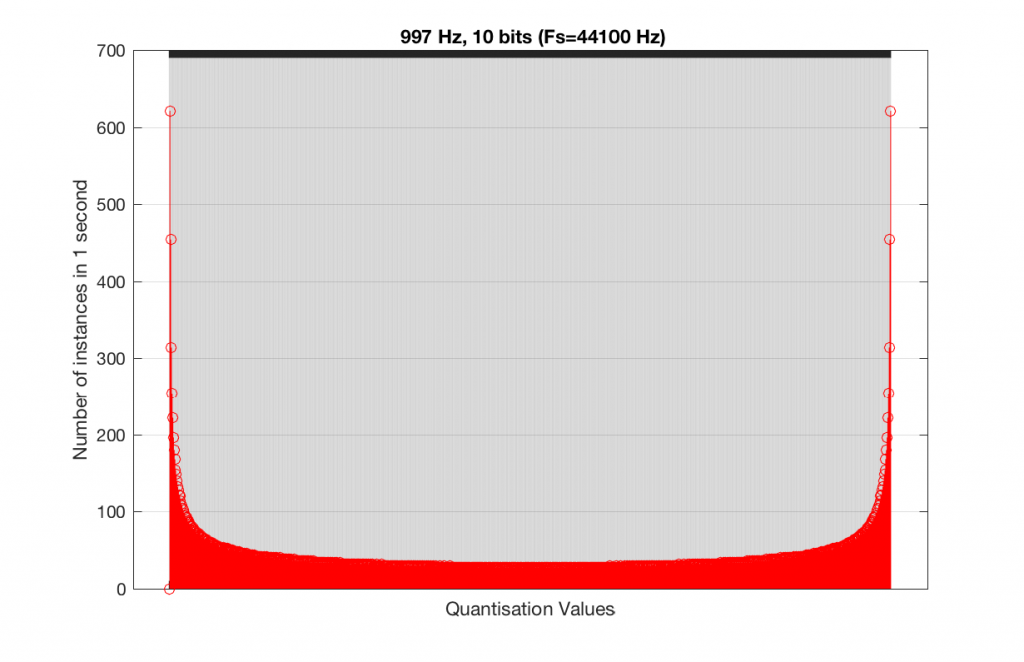
Let’s take that same signal (1 kHz in a 4-bit, 48 kHz PCM system) and we’ll count the number of times each sample value occurs after 1 second (or in a time of 48000 samples). We can then plot these values as is shown in Figure 6, which is a kind of plot called a “histogram”.
Fig 6. A histogram of the number of times each quantisation value is used in 1 second of a 1 kHz sine tone in a 4-bit, 48 kHz PCM system.
As can be seen in Figure 6, the bottom quantisation value (1000) is never used – but apart from that one, all others are.
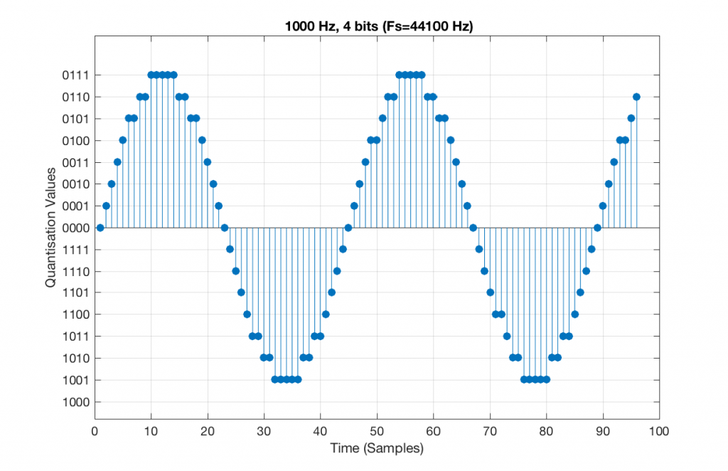
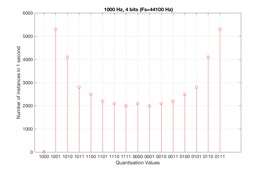
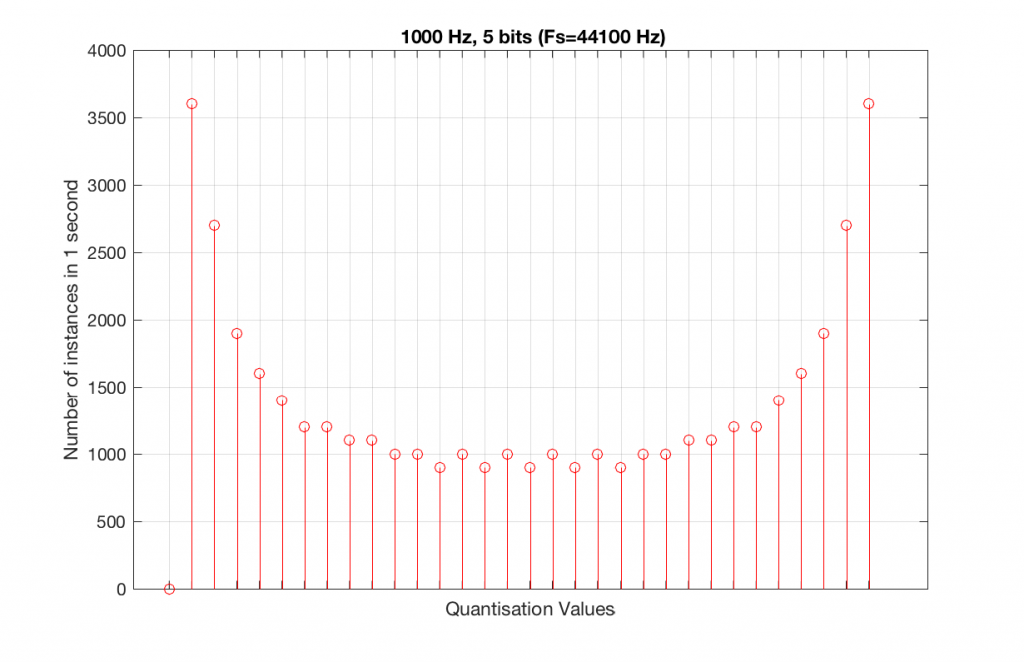
Let’s do the same thing, but with a 4-bit, 44.1 kHz system instead. The results of this are shown below in Figure 7 and 8.
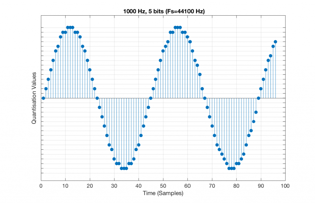
Fig 7. A 1 kHz sine tone, represented in a 4-bit, 44.1 kHz system. Notice that the second instance of the waveform is not identical to the first. This is because 44100 / 1000 = 44.1 – not an integer value.
Fig 8. A histogram of the quantisation values of 1 second of a 1 kHz sine tone in a 4-bit, 44.1 kHz PCM system.
Compare Figures 6 and 8. Notice that Figure 8 appears to be a “smoother” shape. This is due to the fact that the instances of the waveform are not identical copies of each other. As can be seen in Figure 7, the waveform is slightly different. Of course, after a full second, then the whole cycle repeats itself, since there are 1000 cycles per second in the signal, and 44100 samples per second. If the signal were 1000.1 Hz, then it would take 10 seconds for the repetition to start.
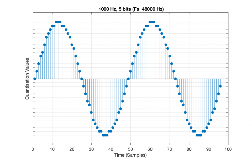
Let’s increase the number of bits and see what happens. We’ll take it up to 6 bits.
Fig 9. A 1 kHz sine tone, represented in a PCM system with 5 bits of resolution and a sampling rate of 48 kHz.
Figure 9 shows a 1 kHz sine tone in a 5-bit, 48 kHz system. Again, since 48000/1000 = 48, the two cycles are identical to each other. However, something new has happened here. If you look carefully at the positive side of the sine wave, you may notice that there are 5 quantisation values that are never used. On the negative side, there are 3 unused values, as well as the very bottom one.
So, because we are in a 5-bit system, we have 2^5 = 32 possible quantisation values, but, because we are using a 1 kHz sine tone, 9 of those possible values are never used. As a result, our histogram looks like Figure 10, below.
Fig 10. A histogram of the quantisation values of 1 second of a 1 kHz sine tone in a 5-bit, 48 kHz PCM system. Notice that 8 of the possible 32 values are not used (plus one more at the bottom).
Let’s now compare that to a 5-bit, 44.1 kHz system.
Fig 11. A 1 kHz sine tone, represented in a PCM system with 5 bits of resolution and a sampling rate of 44.1 kHz.Fig 12. A histogram of the quantisation values of 1 second of a 1 kHz sine tone in a 5-bit, 48 kHz PCM system. Notice that all of the possible 32 values are used (except for the bottom one…).
We can see that there is a basic problem here. The behaviour of the system may be different due only to the relationship between the sampling rate and the frequency of the signal.
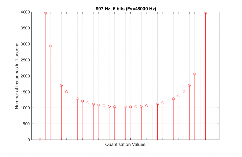
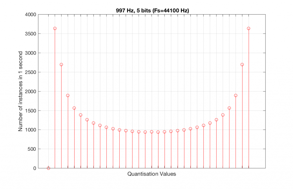
The question is “what do we do about this?” We can see from Figures 10 and 12 that, when the signal’s frequency is not a nice round divisor of the sampling rate, we stand a better chance of testing the system more completely. So, instead of using a “nice” frequency like 1000 Hz, let’s use something close, but different enough to make things “misbehave” a little. One possible solution is to use 997 Hz, as we can see below:
Fig 13. A histogram of the quantisation values of 1 second of a 997 Hz sine tone in a 5-bit, 48 kHz PCM system. Notice that all of the possible 32 values are used (except for the bottom one…).Fig 14. A histogram of the quantisation values of 1 second of a 997 Hz sine tone in a 5-bit, 48 kHz PCM system. Notice that all of the possible 32 values are used (except for the bottom one…).
As can be seen in the histograms in Figure 13 and 14, changing the signal to 997 Hz from 1000 Hz results in us using all of the quantisation values in both sampling rates. So, we do a more thorough test, and stand a better chance of not missing anything…
At this point, you might say, “yes, but normally we used far more than 5 or 6 bits – this won’t happen in a system with more bits…” Nice try, but actually, things get worse, as you can see in Figures 15 and 16, below.
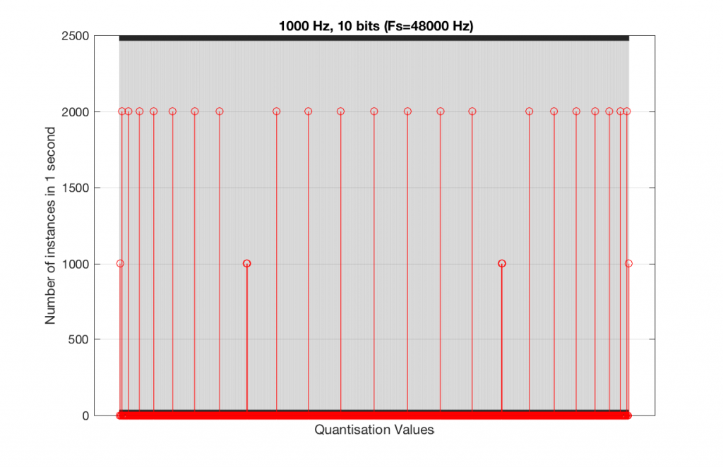
Fig 15. A histogram of the quantisation values of 1 second of a 1 kHz sine tone in a 10-bit, 48 kHz PCM system.
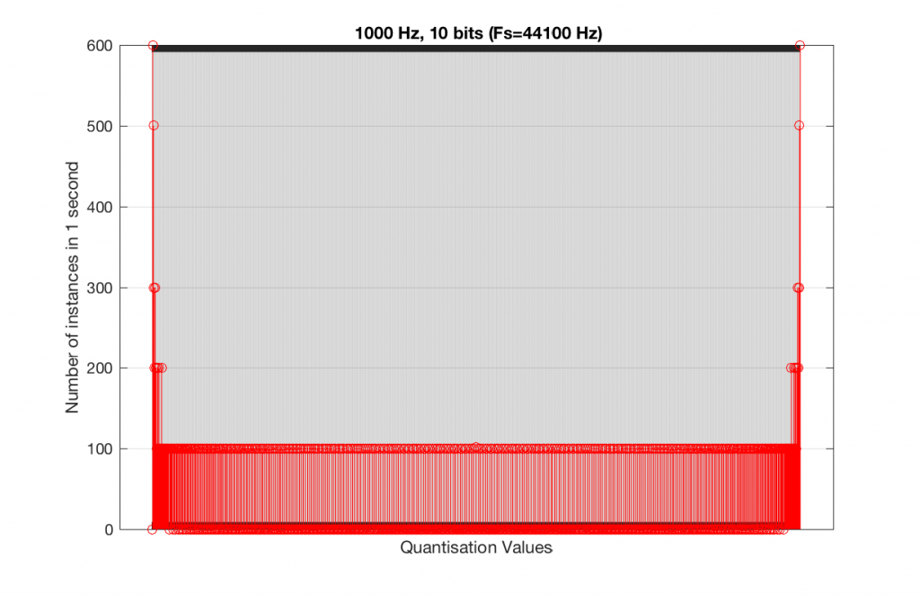
Fig 16. A histogram of the quantisation values of 1 second of a 1 kHz sine tone in a 10-bit, 44.1 kHz PCM system.
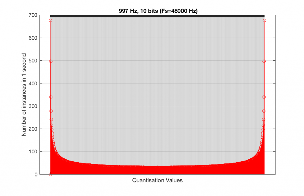
As you can see in Figures 15 and 16, lots of quantisation values are unused in both sampling rates with a 1 kHz signal. By comparison, if we used a 997 Hz tone, the results would be very different, as is shown in Figures 17 and 18.
Fig 15. A histogram of the quantisation values of 1 second of a 997 Hz sine tone in a 10-bit, 48 kHz PCM system.Fig 16. A histogram of the quantisation values of 1 second of a 997 Hz sine tone in a 10-bit, 44.1 kHz PCM system.
In fact, as we get more and more bits of resolution, the worse the problem gets, since we have an increasing number of available of quantisation values (increasing by a factor of 2 every time we add another bit), but the number of values that we use does not increase.
This is because, at some time, we start repeating the cycle. If the sampling rate divided by the signal frequency is an integer value (like a 1 kHz tone in a 48 kHz system), then we don’t use any new quantisation values after the first cycle of the tone (or 1 ms, in this case). If the sampling rate divided by the signal frequency is not an integer value (like a 997 Hz tone in a 48 kHz system) then we don’t start repeating ourselves until 1 second has passed.
However, think back to a comment that I made up at the top – if signal does start repeating itself after 1 second (in other words, if the frequency is an integer value), and if the number of samples per second is smaller than the number of quantisation values, then we will start repeating ourselves after 1 second, and we will only test the number of quantisation values that is equal to the sampling rate.
For example, if you have a 16-bit system, then you have 65536 possible quantisation values. If the sampling rate is 48000 Hz then we could only test a maximum of 48000 possible quantisation values out of the 65536 possible ones in one second, regardless of the frequency that we choose. Typically, however, we test fewer than this, because of the repetition of some values (e.g. the maximum value, if you have a periodic signal with a frequency greater than 1 Hz).
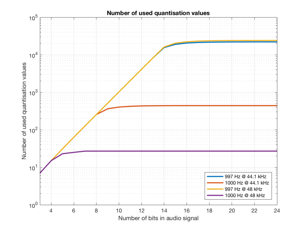
If we do this for the two frequencies we’ve been looking at – 1 kHz and 997 Hz, for two sampling rates, 44.1 kHz and 48 kHz, at different bit depths, the results look like the following figures.
Fig 17. The number of quantisation values used for 997 and 1 kHz tones in PCM systems with sampling rates of 44.1 or 48 kHz, for varying bit depths.
Notice in Figure 17 that the total number of quantisation values that are used when you have a 1 kHz tone in a 48 kHz system does not increase once you hit a word length of 7 bits. That does not mean that the signal’s representation does not improve – it does, since the quantisation values that you are using have a better resolution – so you’re rounding off less, so the error is smaller.
Notice as well that the 997 Hz tone not only results in us using far more quantisation values (topping out at the sampling rates) than the 1000 Hz tone, but that they are more similar in the two sampling rates.
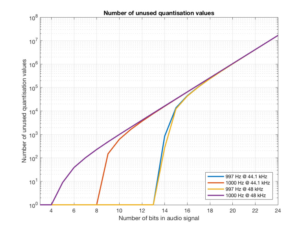
If we plot the number of unused samples instead, it looks like Figure 18.
Fig 18. The number of quantisation values that are not used for 997 and 1 kHz tones in PCM systems with sampling rates of 44.1 or 48 kHz, for varying bit depths.
Figure 18 is a little misleading, since as the bit depth increases, the total possible number of quantisation values also increases, however, since the two frequencies that we are analysing are integer values, the maximum number cannot go past the sampling rate. So, in an extreme case (if you choose your frequency or signal carefully), only 48000 values out of a possible 16777216 values are used in a 24-bit system per second in a system with a sampling rate of 48 kHz.
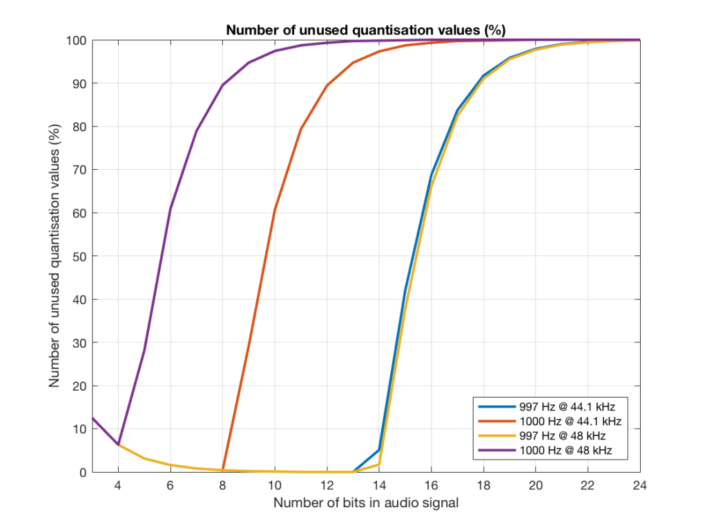
Figure 19 shows the same information as Figure 18, except that I’ve displayed the values in percent.
Fig 19. The percentage of quantisation values that are not used for 997 and 1 kHz tones in PCM systems with sampling rates of 44.1 or 48 kHz, for varying bit depths.
So, as you can see there, in a 16-bit system, even if you use a 997 Hz tone, about 70% of the total possible quantisation values are used.
Caveat
Of course, the signals that I used here were generated digitally, and did not include dither. If I had included proper dithering, then more of the quantisation values would have been used. However, the point of this posting was not to talk about correct ways of creating PCM signals – it was an attempt to explain why we use 997 Hz instead of 1 kHz when we test digital audio systems.
Sometimes, someone will use a plot to show the relative levels of different frequency bands in a signal. Even I have done this from time to time…. However, it’s important to have the skills to be able to read these plots with a little-more-knowledge-than-normal in order to not be distracted into thinking something that isn’t true.
One way to calculate the relative levels of frequency bands of a signal (whether it’s a measurement of a loudspeaker, a black box, or your favourite track on your favourite CD) is to so something called a “Fourier Transform”. This is a set of calculations that can be used to show how much energy there is in a signal, by frequency.
Typically, we do a Discrete Fourier Transform or “DFT” – although most people call it a Fast Fourier Transform or “FFT”. We will not discuss the difference between these things in this posting. I’ll just use the term “FFT” here, in order to be like everyone else…
(If you’d like to know how to do your own FFT’s by hand, this is one place to start learning…)
In order to give me something to analyse, I made a signal comprised of a sine tone with a frequency around 997 Hz. (I’ll explain at the end why it’s not exactly 997 Hz. I’ll also explain in another posting why I chose 997 Hz instead of a good-old-fashioned 1 kHz.)
I set that sine tone to have a level of -1 dB FS.
Then, I made some white noise and set its level to be exactly 80 dB below the level of the sine tone. In order to calculate this, I found the total RMS value of the noise signal, and used this to create a gain that makes it a level of -81 dB FS. (Just for the sake of being as pedantic as possible, the white noise that I created was the result of a “rand” function in Matlab, which, as you can see in this posting, has a rectangular probability density function.)
Therefore, I have an input that has a signal-to-noise ratio of 80 dB. (Note that this measurement does not use any band-limiting on the white noise… Typically a SNR measurement would apply some low pass filter to the noise.)
To keep things looking pretty on my graphs, I set the sampling rate to 65536 Hz (2^16).
Then, I pretended that this signal was coming in from some unknown device, and I do an FFT on it to find out the relative balance between the signal (the sine tone) and the noise (which I already “secretly” know is 80 dB lower)
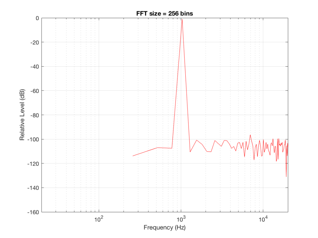
If I do an FFT of 256 points on the signal (and therefore, I’m only looking at the first 256 samples of the signal – this is an important point that we’ll come back to later…), the result looks like Figure 1.
Fig 1: The magnitude response of the signal, calculated using a 256-bin FFT.
Note that the sine tone is a little higher than 997 Hz – but this is not really important. (the explanation is at the end!).
There are some things to notice here:
The first is that the plot does not extend lower than a frequency of 256 Hz. This is because the resolution of a 256-point FFT is 256 Hz – so, there is a “point” on the plot every 256 Hz – typically called a “bin” – since it contains information about the level of a collection of frequencies around its centre frequency. (If you’re new to FFT’s, don’t jump to the conclusion that the frequency resolution is equal to the length of the FFT. This is incorrect. The frequency resolution is equal to the sampling rate divided by the FFT length – 65536 Hz / 256 bins = 256 Hz.) Limiting the length of the FFT limits its resolution, which has an obvious impact when we plot the results on a logarithmic frequency scale.
The second is that, although the SNR of the signal is 80 dB, on the magnitude response, it appears that the noise is generally lower than -100 dB. This is not that difficult to believe, since the noise is spread over a wide frequency range – so, although any one frequency may, indeed, be more than 100 dB below the signal – the sum of the energy in all of those frequency bands totals more than any of the individual contributions. (In the same way that 1000 people can shout louder than 1 person – even if all 1000 people are, individually, shouting at the same level.)
One thing that is not obvious from the plot, but that we have to keep in mind is that this shows us the level of the different frequency ranges over the entire length of the signal (all 256 samples of it). However, the noise that I created that is part of that signal is exactly that – noise. Since it is noise, there is no guarantee that all frequencies are represented at the same level at any one time – in fact, they’re not. “White noise” has the characteristic of having equal probability of having the same level at all frequencies. But if 1000 people have equal probability of winning a lottery, that doesn’t mean than 1000 of them will win. In order to ensure that you actually get the same level at all frequencies, you would have to listen to white noise forever – and I’m not willing to wait that long…
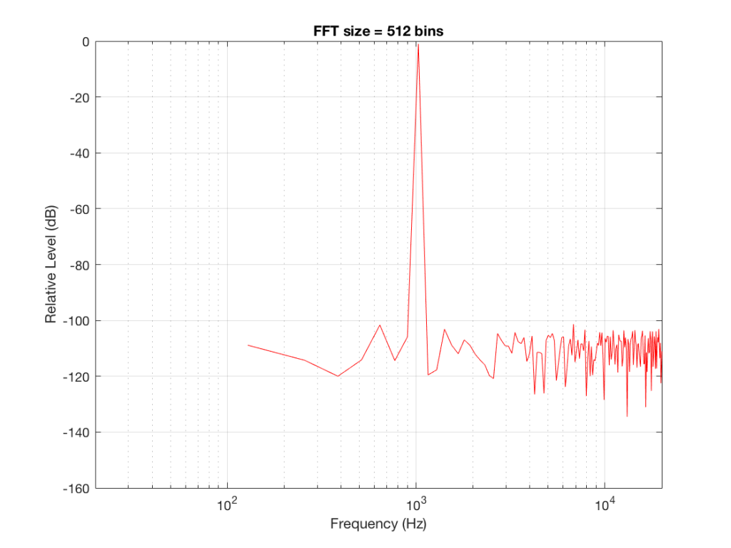
Fig 2: The magnitude response of the signal, calculated using a 512-bin FFT.
Figure 2 shows the same analysis done on the same signal, but with a 512-bin FFT instead. There, you can see that the the resolution of the plot is better – we have a bin or point every 128 Hz (remember 65536 Hz / 512 bins = 128 Hz). Also, the sine tone has the same level (-1 dB FS) but the noise, which we know is 80 dB lower, appears to be even lower than it does in Figure 1… Strange…
Let’s do some more FFT’s with more and more bins to see what happens…
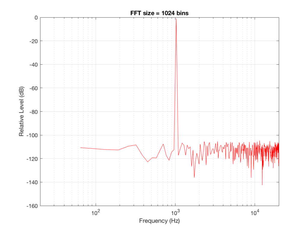
Fig 3: The magnitude response of the signal, calculated using a1024-bin FFT
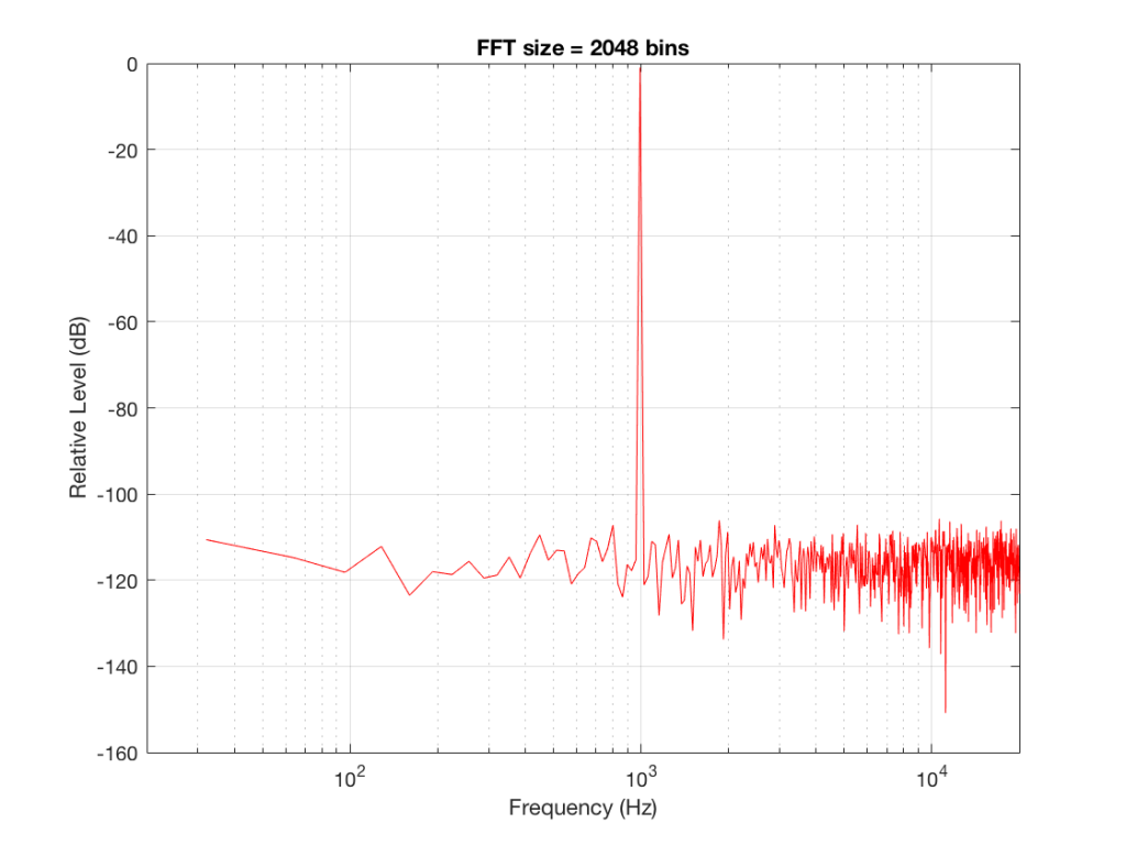
Fig 4: The magnitude response of the signal, calculated using a 2046-bin FFT.
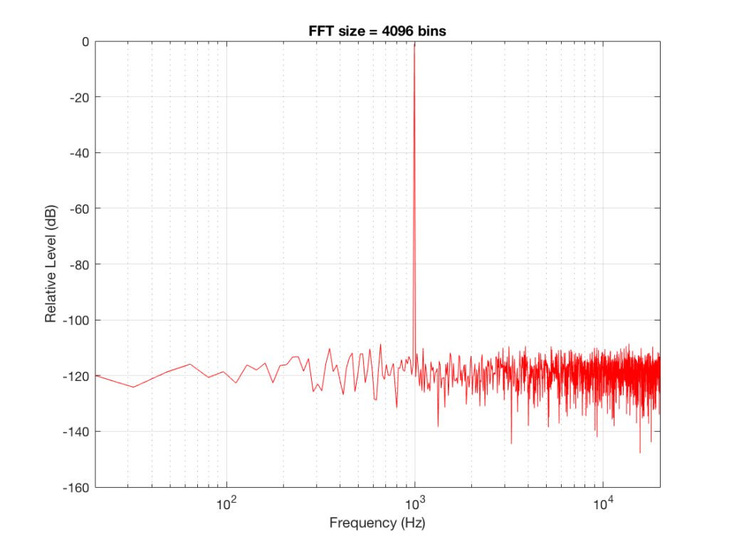
Fig 5: The magnitude response of the signal, calculated using a 4096-bin FFT.
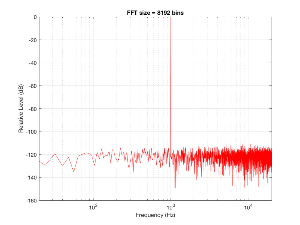
Fig 6: The magnitude response of the signal, calculated using a 8192-bin FFT
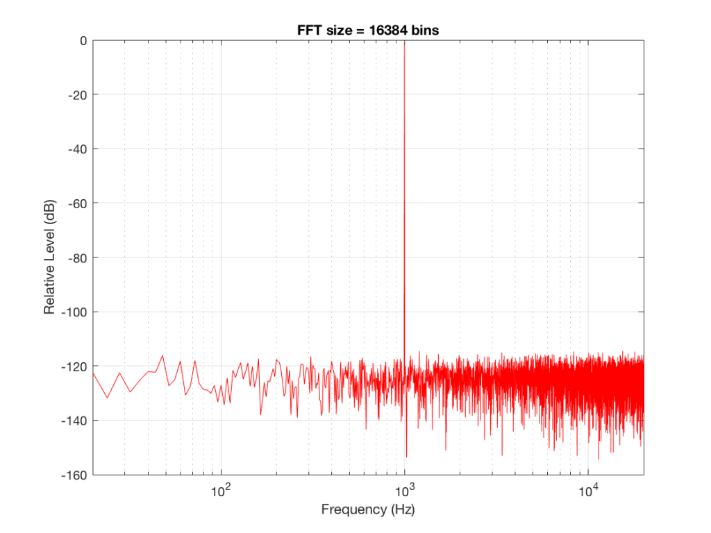
Fig 7: The magnitude response of the signal, calculated using a 16384-bin FFT
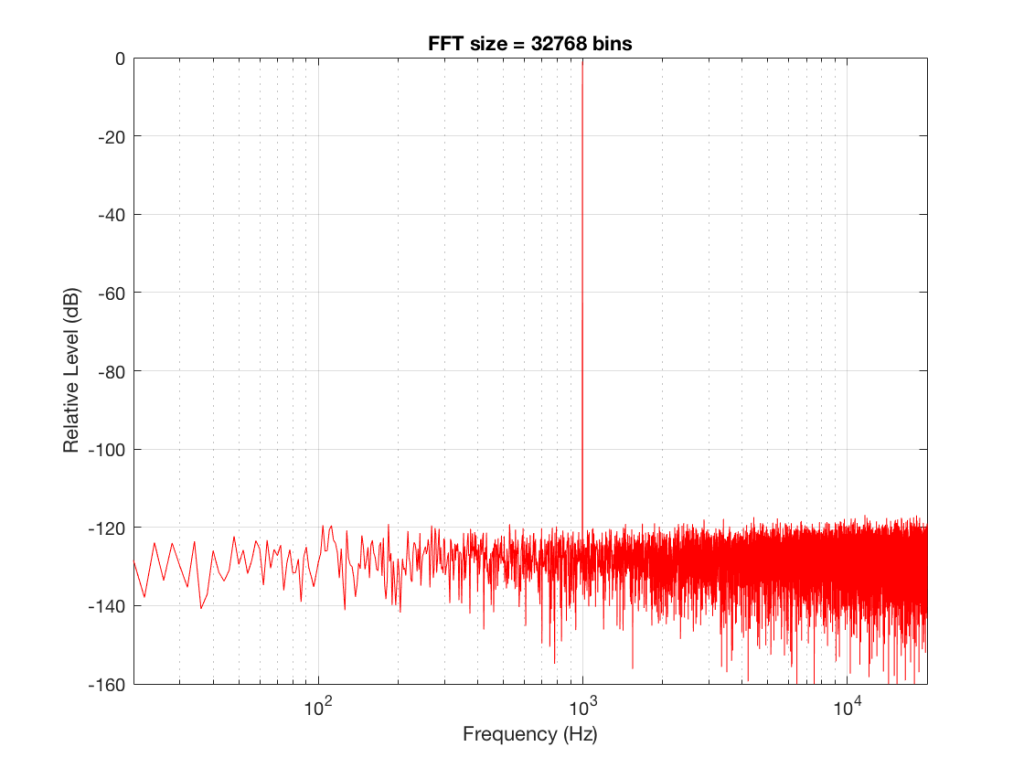
Fig 8: The magnitude response of the signal, calculated using a 32768-bin FFT
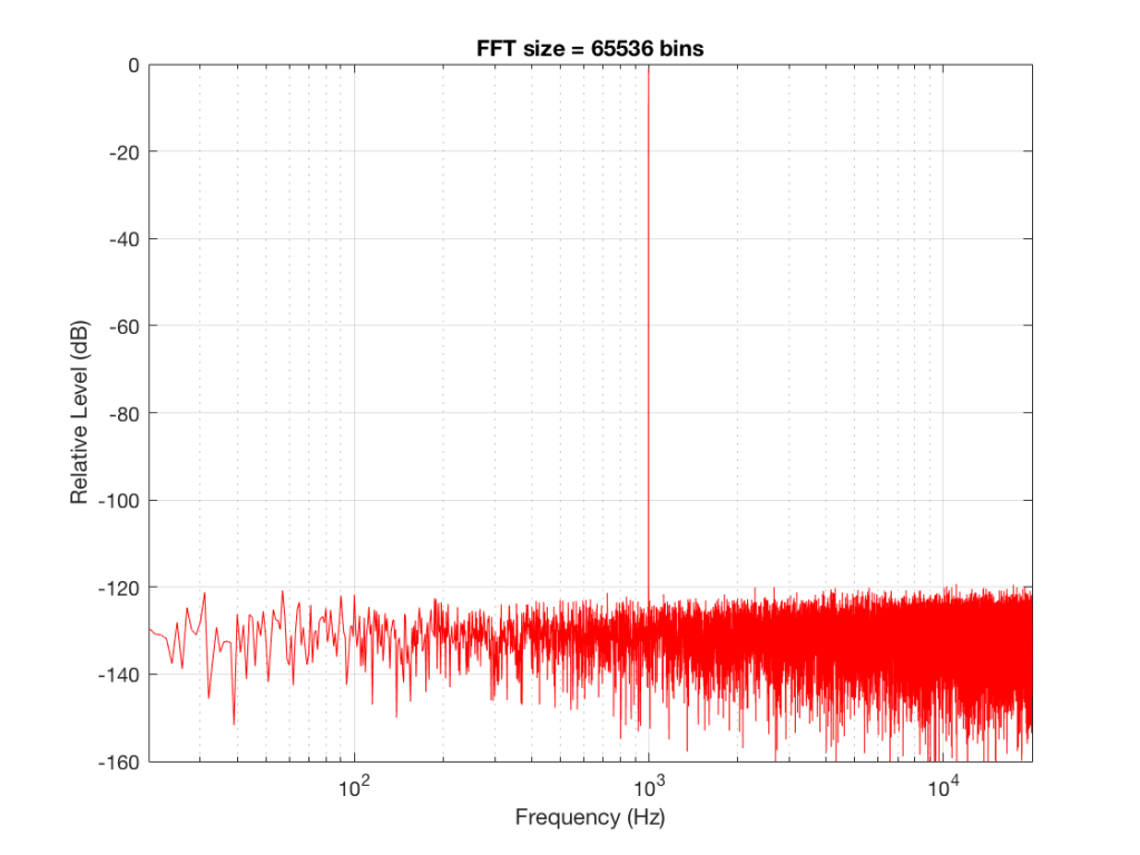
Fig 9: The magnitude response of the signal, calculated using a 65536-bin FFT.
So, by going from a 256-bin FFT to a 65536-bin FFT, we appear to have dropped the noise floor by more than 20 dB.
Weird? No. Why?
Remember that every time we double the length of the FFT, we double the number of frequency bins in its output. So, that plot in Figure 9 has more individual frequencies contributing to add together to the same noise signal, 80 dB lower than the sine tone. (If you asked 1000 people to shout as loudly as 10 people, each individual in the larger group would have to be quieter to produce the same total output.)
The “punch line” here is that we cannot make a direct conclusion about the overall Signal-to-Noise ratio of the signal by looking at any of the plots above. Of course we can say that the “signal” (the sine tone) is obviously louder than the noise – by a lot. But we can’t be much more detailed than that.
So, if someone jumps between a SNR number and a spectral plot like the ones above, in an effort to convince you of something, be very careful about being led down a garden path.
Some extra information:
We also have to remember that, although the signal that I used to make these graphs was initially the same, the actual signal that was used by each of the FFT’s was different. This is because, by default, the length of the signal used by an FFT calculation is the same as the number off bins in the FFT. So, for example, a 256-bin (or 256-point) FFT only uses 256 samples as its input. A 32768-point FFT uses 32768 samples (the first 256 of which were the ones used by the 256-point FFT). So, for example, if you load a recording of Britney Spears singing “Toxic” into Matlab, and you type the command FFT(toxic, 256) – you’ll get a 256-bin FFT of the first 5 .8 milliseconds (256 samples) of the recording – not a representation of the spectral content of the entire song.
Initially, I started out by saying that I would use a 997 Hz sine tone. This might look a little weird because it’s not a nice number like 1000 Hz. There’s a good reason for this, and I’ll write a posting about it some other day.
Then, I said that it’s not really 997 Hz – I moved it a little. This is because I wanted the frequency of my sine tone to land exactly on one of the bins of my FFT. So for example, in the case of the 256-bin FFT, I had a frequency resolution of 256 Hz – so my bins are at the following:
256 Hz
512 Hz
768 Hz
1024 Hz
1024 Hz is the closest value to 997 Hz that occurs in the sequence so I used that instead. If I had kept the sine tone fixed at 997 Hz, the plots would not have looked as pretty, because the information about its level would have “leaked” or “been spread out” into the adjacent bins. So, instead of a nice clean spike, we would have seen a big, round bump.