The original Loudness War

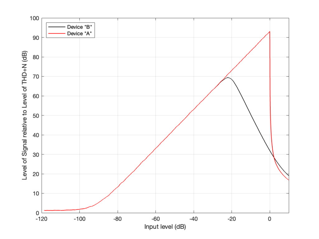
The June, 1968 issue of Wireless World magazine includes an article by R.T. Lovelock called “Loudness Control for a Stereo System”. This article partly addresses the issue of resistance behaviour one or more channels of a variable resistor. However, it also includes the following statement:

It is well known that the sensitivity of the ear does not vary in a linear manner over the whole of the frequency range. The difference in levels between the threshold of audibility and that of pain is much less at very low and very high frequencies than it is in the middle of the audio spectrum. If the frequency response is adjusted to sound correct when the reproduction level is high, it will sound thin and attenuated when the level is turned down to a soft effect. Since some people desire a high level, while others cannot endure it, if the response is maintained constant while the level is altered, the reproduction will be correct at only one of the many preferred levels. If quality is to be maintained at all levels it will be necessary to readjust the tone controls for each setting of the gain control

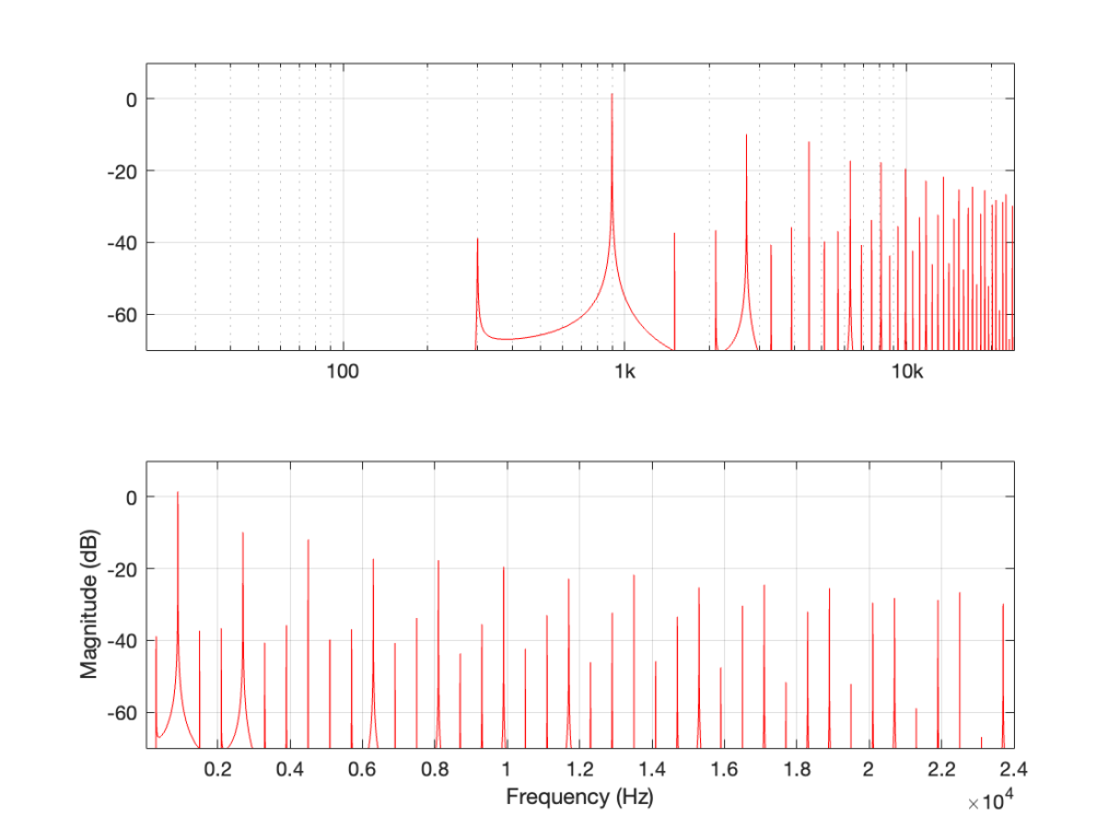
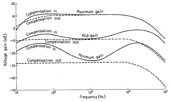
The article includes a circuit diagram that can be used to introduce a low- and high-frequency boost at lower settings of the volume control, with the following example responses:

These days, almost all audio devices include some version of this kind of variable magnitude response, dependent on volume. However, in 1968, this was a rather new idea that generated some debate.

In the following month’s issue The Letters to the Editor include a rather angry letter from John Crabbe (Editor of Hi-Fi News) where he says

Mr. Lovelock’s article in your June issue raises an old bogey which I naively thought had been buried by most British engineers many years ago. I refer, not to the author’s excellent and useful thesis on achieving an accurate gain control law, but to the notion that our hearing system’s non-linear loudness / frequency behaviour justifies an interference with response when reproducing music at various levels.

Of course, we all know about Fletcher-Munson and Robinson-Dadson, etc, and it is true that l.f. acuity declines with falling sound pressure level; though the h.f. end is different, and latest research does not support a general rise in output of the sort given by Mr. Lovelock’s circuit. However, the point is that applying the inverse of these curves to sound reproduction is completely fallacious, because the hearing mechanism works the way it does in real life, with music loud or quiet, and no one objects. If `live’ music is heard quietly from a distant seat in the concert hall the bass is subjectively less full than if heard loudly from the front row of the stalls. All a `loudness control’ does is to offer the possibility of a distant loudness coupled with a close tonal balance; no doubt an interesting experiment in psycho-acoustics, but nothing to do with realistic reproduction.

In my experience the reaction of most serious music listeners to the unnaturally thick-textured sound (for its loudness) offered at low levels by an amplifier fitted with one of these abominations is to switch it out of circuit. No doubt we must manufacture things to cater for the American market, but for goodness sake don’t let readers of Wireless World think that the Editor endorses the total fallacy on which they are based.

with Lovelock replying:

Mr. Crabbe raises a point of perennial controversy in the matter of variation of amplifier response with volume. It was because I was aware of the difference in opinion on this matter that a switch was fitted which allowed a variation of volume without adjustment of frequency characteristic. By a touch of his finger the user may select that condition which he finds most pleasing, and I still think that the question should be settled by subjective pleasure rather than by pure theory.

and

Mr. Crabbe himself admits that when no compensation is coupled to the control, it is in effect a ‘distance’ control. If the listener wishes to transpose himself from the expensive orchestra stalls to the much cheaper gallery, he is, of course, at liberty to do so. The difference in price should indicate which is the preferred choice however.

In the August edition, Crabbe replies, and an R.E. Pickvance joins the debate with a wise observation:

In his article on loudness controls in your June issue Mr. Lovelock mentions the problem of matching the loudness compensation to the actual sound levels generated. Unfortunately the situation is more complex than he suggests. Take, for example, a sound reproduction system with a record player as the signal source: if the compensation is correct for one record, another record with a different value of modulation for the same sound level in the studio will require a different setting of the loudness control in order to recreate that sound level in the listening room. For this reason the tonal balance will vary from one disc to another. Changing the loudspeakers in the system for others with different efficiencies will have the same effect.

In addition, B.S. Methven also joins in to debate the circuit design.

The debate finally peters out in the September issue.

Apart from the fun that I have reading this debate, there are two things that stick out for me that are worth highlighting:

  • Notice that there is a general agreement that a volume control is, in essence, a distance simulator. This is an old, and very common “philosophy” that we forget these days.
  • Pickvance’s point is possibly more relevant today than ever. Despite the amount of data that we have with respect to equal loudness contours (aka “Fletcher and Munson curves”) there is still no universal standard in the music industry for mastering levels. Now that more and more tracks are being released in a Dolby Atmos-encoded format, there are some rules to follow. However, these are very different from 2-channel materials, which have no rules at all. Consequently, although we know how to compensate for changes in response in our hearing as a function of level, we don’t know what the reference level should be for any given recording.

Phantom imaging

The July 1968 issue of Wireless World Magazine contains a description of an early, but interesting analysis of the relationship between phantom image placement in a 2-channel stereo system and interchannel level differences. This is an old favourite topic of mine, originally inspired by the work of Michael Williams and his “Stereophonic Zoom”, and extending to my first AES paper in 1999.

If you, like me, are interested in this (for example, if you’re making a panning algorithm or you’re testing the veracity of headphone-based “virtual” systems), some important figures from that article are shown below.

The typical way of showing the relationship between IAD and phantom image placement.
This one is interesting because it shows the different results in different rooms, (which would also be influenced by loudspeaker directivity.)

Note that, for the plots above and below, the x-axes show the position of the image in the stereo sound stage, where 0 is the centre point between the two loudspeakers and 0.5 is a position in one of the two loudspeakers. This is 0.5 because it’s one-half of the total angular distance between the two loudspeakers. So, you can consider the loudspeaker aperture as ±0.5.

The relationship between image WIDTH and position. This is something I’ve not seen expressed so clearly before.

For more information similar to this, see these links as a start:

Aliasing is Weird: Part 2

In Part 1, we looked at what happens when you try to record a signal whose frequency is higher than 1/2 the sampling rate (which, from now on, I’ll call the Nyquist Frequency, named after Harry Nyquist who was one of the people that first realised that this limit existed). You record a signal, but it winds up having a different frequency at the output than it had at the input. In addition, that frequency is related to the signal’s frequency and the sampling rate itself.

In order to prevent this from happening, digital recording systems use a low-pass filter that hypothetically prevents any signals above the Nyquist frequency from getting into the analogue-to-digital conversion process. This filter is called an anti-aliasing filter because it prevents any signals that would produce an alias frequency from getting into the system. (In practice, these filters aren’t perfect, and so it’s typical that some energy above the Nyquist frequency leaks into the converter.)

So, this means that if you put a signal that contains high frequency components into the analogue input of an analogue-to-digital converter (or ADC), it will be filtered. An example of this is shown in Figure 1, below. The top plot is a square wave before filtering. The bottom plot is the result of low-pass filtering the square wave, thus heavily attenuating its higher harmonics. This results in a reduction in the slope when the wave transitions between low and high states.

Figure 1: A square wave before and after low-pass filtering.

This means that, if I have an analogue square wave and I record it digitally, the signal that I actually record will be something like the bottom plot rather than the top one, depending on many things like the frequency of the square wave, the characteristics of the anti-aliasing filter, the sampling rate, and so on. Don’t go jumping to conclusions here. The plot above uses an aggressively exaggerated filter to make it obvious that we do something to prevent aliasing in the recorded signal. Do NOT use the plots as proof that “analogue is better than digital” because that’s a one-dimensional and therefore very silly thing to claim.

However…

… just because we keep signals with frequency content above the Nyquist frequency out of the input of the system doesn’t mean that they can’t exist inside the system. In other words, it’s possible to create a signal that produces aliasing after the ADC. You can either do this by

  • creating signals from scratch (for example, generating a sine tone with a frequency above Nyquist)
    or
  • by producing artefacts because of some processing applied to the signal (like clipping, for example).

Let’s take a sine wave and clip it after it’s been converted to a digital signal with a 48 kHz sampling rate, as is shown in Figure 2.

Figure 2: The red curve is a clipped version of the black curve.

When we clip a signal, we generate high-frequency harmonics. For example, the signal in Figure 2 is a 1 kHz sine wave that I clipped at ±0.5. If I analyse the magnitude response of that, it will look something like Figure 3:

Figure 3: The magnitude response of Figure 2, showing the upper harmonics that I created by clipping.

The red curve in Figure 2 is not a ‘perfect’ square wave, so the harmonics seen in Figure 3 won’t follow the pattern that you would expect for such a thing. But that’s not the only reason this plot will be weird…

Figure 3 is actually hiding something from you… I clipped a 1 kHz sine wave, which makes it square-ish. This means that I’ve generated harmonics at 3 kHz, 5 kHz, 7 kHz, and so on, up to ∞ Hz..

Notice there that I didn’t say “up to the Nyquist frequency”, which, in this example with a sampling rate of 48 kHz, would be 24 kHz.

Those harmonics above the Nyquist frequency were generated, but then stored as their aliases. So, although there’s a new harmonic at 25 kHz, the system records it as being at 48 kHz – 25 kHz = 23 kHz, which is right on top of the harmonic just below it.

In other words, when you look at all the spikes in the graph in Figure 3, you’re actually seeing at least two spikes sitting on top of each other. One of them is the “real” harmonic, and the other is an alias (there are actually more, but we’ll get to that…). However, since I clipped a 1 kHz sine wave in a 48 kHz world, this lines up all the aliases to be sitting on top of the lower harmonics.

So, what happens if I clip a sine wave with a frequency that isn’t nicely related to the sampling rate, like 900 Hz in a 48 kHz system, for example? Then the result will look more like Figure 4, which is a LOT messier.

Figure 4: The magnitude response of a 900 Hz square wave, plotted with a logarithmic frequency axis in the top axis and a linear axis in the bottom.

A 900 Hz square wave will have harmonics at odd multiples of the fundamental, therefore at 2.7 kHz, 4.5 kHz, and so on up to 22.5 kHz (900 Hz * 25).

The next harmonic is 24.3 kHz (900 Hz * 27), which will show up in the plots at 48 kHz – 24.3 kHz = 23.7 kHz. The next one will be 26.1 kHz (900 Hz * 29) which shows up in the plots at 21.9 kHz. This will continue back DOWN in frequency through the plot until you get to 900 Hz * 53 = 47.7 kHz which will show up as a 300 Hz tone, and now we’re on our way back up again… (Take a look at Figure 7, below for another way to think of this.)

The next harmonic will be 900 Hz * 55 = 49.5 kHz which will show up in the plot as a 1.5 kHz tone (49.5 kHz – 48 kHz).

Depending on the relationship between the square wave’s frequency and the sampling rate, you either get a “pretty” plot, like for the 6 kHz square wave in a 48 kHz system, as shown in Figure 5.

Figure 5: the magnitude response of a 6 kHz square wave in a 48 kHz system

Or, it’s messy, like the 7 kHz square wave in a 48 kHz system in Figure 6.

Figure 6: The magnitude response of a 7 kHz square wave in a 48 kHz system.

The moral of the story

There are three things to remember from this little pair of posts:

  • Some aliased artefacts are negative frequencies, meaning that they appear to be going backwards in time as compared to the original (just like the wheel appearing to rotate backwards in Part 1).
  • Just because you have an antialiasing filter at the input of your ADC does NOT protect you from aliasing, because it can be generated internally, after the signal has been converted to the digital domain.
  • Once this aliasing has happened (e.g. because you clipped the signal in the digital domain), then the aliases are in the signal below the Nyquist frequency and therefore will not be removed by the reconstruction low-pass filter in the DAC. Once they’re mixed in there with the signal, you can’t get them out again.
Figure 7: This is the same as Figure 4, but I’ve removed the first set of mirrored alias artefacts and plotted them on the left side as being mirrored in a “negative frequency” alternate universe.

One additional, but smaller problem with all of this is that, when you look at the output of an FFT analysis of a signal (like the top plot in Figure 7, for example), there’s no way for you to know which components are “normal” harmonics, and which are aliased artefacts that are actually above the Nyquist frequency. It’s another case proving that you need to understand what to expect from the output of the FFT in order to understand what you’re actually getting.

Aliasing is weird: Part 1

One of the best-known things about digital audio is the fact that you cannot record a signal that has a frequency that is higher than 1/2 the sampling rate.

Now, to be fair, that statement is not true. You CAN record a signal that has a frequency that is higher than 1/2 the sampling rate. You just won’t be able to play it back properly, because what comes out of the playback will not be the original frequency, but an alias of it.

If you record a one-spoked wheel with a series of photographs (in the old days, we called this ‘a movie’), the photos (the frames of the movie) might look something like this:

As you can see there, the wheel happens to be turning at a speed that results in it rotating 45º every frame.

The equivalent of this in a digital audio world would be if we were recording a sine wave that rotated (yes…. rotated…) 45º every sample, like this:

Notice that the red lines indicating the sample values are equivalent to the height of the spoke at the wheel rim in the first figure.

If we speed up the wheel’s rotation so that it rotated 90º per frame, it looks like this:

And the audio equivalent would look like this:

Speeding up even more to 135º per frame, we get this:

and this:

Then we get to a magical speed where the wheel rotated 180º per frame. At this speed, it appears when we look at the playback of the film that the wheel has stopped, and it now has two spokes.

In the audio equivalent, it looks like the result is that we have no output, as shown below.

However, this isn’t really true. It’s just an artefact of the fact that I chose to plot a sine wave. If I were to change the phase of this to be a cosine wave (at the same frequency) instead, for example, then it would definitely have an output.

At this point, the frequency of the audio signal is 1/2 the sampling rate.

What happens if the wheel goes even faster (and audio signal’s frequency goes above this)?

Notice that the wheel is now making more than a half-turn per frame. We can still record it. However, when we play it back, it doesn’t look like what happened. It looks like the wheel is going backwards like this:

Similarly, if we record a sine wave that has a frequency that is higher than 1/2 the sampling rate like this:

Then, when we play it back, we get a lower frequency that fits the samples, like this:

Just a little math

There is a simple way to calculate the frequency of the signal that you get out of the system if you know the sampling rate and the frequency of the signal that you tried to record.

Let’s use the following abbreviations to make it easy to state:

  • Fs = Sampling rate
  • F_in = frequency of the input signal
  • F_out = frequency of the output signal

IF
F_in < Fs/2
THEN
F_out = F_in

IF
Fs > F_in > Fs/2
THEN
F_out = Fs/2 – (F_in – Fs/2) = Fs – F_in

Some examples:

If your sampling rate is 48 kHz, and you try to record a 25 kHz sine wave, then the signal that you will play back will be:
48000 – 25000 = 23000 Hz

If your sampling rate is 48 kHz, and you try to record a 42 kHz sine wave, then the signal that you will play back will be:
48000 – 42000 = 6000 Hz

So, as you can see there, as the input signal’s frequency goes up, the alias frequency of the signal (the one you hear at the output) will go down.

There’s one more thing…

Go back and look at that last figure showing the playback signal of the sine wave. It looks like the sine wave has an inverted polarity compared to the signal that came into the system (notice that it starts on a downwards-slope whereas the input signal started on an upwards-slope). However, the polarity of the sine wave is NOT inverted. Nor has the phase shifted. The sine wave that you’re hearing at the output is going backwards in time compared to the signal at the input, just like the wheel appears to be rotating backwards when it’s actually going forwards.

In Part 2, we’ll talk about why you don’t need to worry about this in the real world, except when you REALLY need to worry about it.

One measurement is worse than no measurements

Let’s say that we have to do an audio measurement of a Device Under Test (DUT) that has one input and one output, as shown below.

We don’t know anything about the DUT.

One of the first things we do in the audio world is to measure what most people call the “frequency response” but is more correctly called the “magnitude response”. (It would only be the “frequency response” if you’re also looking at the phase information.)

The standard way to do this is to use an impulse response measurement. This is a method that relies on the fact that an infinitely short, infinitely loud click contains all frequencies at equal magnitude. (Of course, in the real world, it cannot be infinitely short, and if it were infinitely loud, you would have a Big Bang on your hands… literally…)

If we measure the DUT with a single-sample impulse with a value of 1, and use an FFT to convert the impulse response to a frequency-domain magnitude response and we see this:

… then we might conclude that the DUT is as perfect as it can be, within the parameters of a digital audio system. The click comes out just like it went in, therefore the output is identical to the input.

If we measure a different DUT (we’ll call it DUT #2) and we see this:

… then we might conclude that DUT #2 is also perfect. It’s just an attenuator that drops the level by half (or -6.02 dB).

However, we’d be wrong.

I made both of those DUTs myself, and I can tell you that one of those two conclusions is definitely incorrect – but it illustrates the point I’m heading towards.

If I take DUT #1 and send in a sine tone at about 1 kHz and look at the output, I’ll see this:

As you can see there, the output is a sine wave. It looks like one on the top plot, and the bottom plot tells me that there ONLY signal at 1 kHz, which proves it.

If I send the same sine tone through DUT #2 and look at the output, I’ll see this:

As you can see there, DUT #2 clips the input signal so that it cannot exceed ±0.5. This turns the sine wave into the beginnings of a square wave, and generates lots of harmonics that can be seen in the lower half of the plot.

What’s the point?

The point is something that is well-known by people who make audio measurements, but is too easily forgotten:

An Impulse Response measurement only shows you the linear behaviour of an audio device. If the system is non-linear, then your impulse response won’t help you. In a worst case, you’ll think that you measured the system, you’ll think that it’s behaving, and it’s not – because you need to do other measurements to find out more.

The question is “what is ‘non-linear’ behaviour in an audio device?”

This is anything that causes the device to make it impossible to know what the input was by looking at the output. Anything that distorts the signal because of clipping is a simple example (because you don’t know what happened in the input signal when the output is clipped). But other things are also non-linear. For example, dynamic processors like compressors, limiters, expanders and noise gates are all non-linear devices. Modulating delays (like in a chorus or phaser effect), or a transmission system with a drifting clock are other examples. So are psychoaoustic lossy codecs like MP3 and AAC because the signal that gets preserved by the codec changes in time with the signal’s content. Even a “loudness” function can be considered to have a kind of non-linear behaviour (since you get a different filter at different settings of the volume control).

It’s also important to keep in mind that any convolution-based processing is using the impulse response as the filter that is applied to the signal. So, if you have a convolution-based effects unit, it cannot simulate the distortion caused by vacuum tubes using ONLY convolution. This doesn’t mean that there isn’t something else in the processor that’s simulating the distortion. It just means that the distortion cannot be simulated by the convolver.*

P.S.

The reason for the title: “One measurement is worse than no measurements” is that, when you do a measurement (like the impulse response measurement on DUT #2) you gain some certainty about how the device is behaving. In many cases, that single measurement can tell the truth, but only a portion of it – and the remainder of the (hidden) truth might be REALLY bad… So, your one measurement makes you THINK that you’re safe, but you’re really not… It’s not the measurement that’s bad. The problem is the certainty that results in having done it.


* Actually, one of the questions on my comprehensive exams for my Ph.D. was about compressors, with a specific sub-question asking me to explain why you can’t build a digital compressor based on convolution (which was a new-and-sexy way to do processing back then…). The simple answer is that you can’t use a linear time-invariant processor to do non-linear, time-variant processing. It would be like trying to carry water in a net: it’s simply the wrong tool for the job.

Dynamic Styli Correlator Pt. 3

I thought that I was finished talking about (and even thinking about) the RCA Dynagroove Dynamic Styli Correlator as well as tracking and tracing distortion… and then I got an email about the last two postings pointing out that I didn’t mention two-channel stereo vinyl, and whether there was something to think about there.

My first reaction was: “There’s nothing interesting about that. It’s just two channels with the same problem, and since (at least in a hypothetical world) the two axes of movement of the needle are orthogonal, then it doesn’t matter. It’ll be the same problem in both channels. End of discussion.”

Then I took the dog out for a walk, and, as often happens when I’m walking the dog, I re-think thoughts and come home with the opposite opinion.

So, by the time I got home, I realised that there actually is something interesting about that after all.

Starting with Emil Berliner, record discs (original lacquer, then vinyl) have been cut so that the “mono” signal (when the two channels are identical) causes the needle to move laterally instead of vertically. This was originally (ostensibly) to isolate the needle’s movement from vibrations caused by footsteps (the reality is that it was probably a clever manoeuvring around Edison’s patent).

This meant that, when records started supporting two audio channels, a lateral movement was necessary to keep things backwards-compatible.

What does THIS mean? It means that, when the two channels have the same signal (say, on the lead vocal of a pop tune, for example) when the groove of the left wall goes up, the groove of the right wall goes down by the same amount. That causes the needle to move sideways, as shown below in Figure 1.

Figure 1. A two-channel groove with identical information in the two channels.

What are the implications of this on tracing distortion? Remember from the previous posting that the error in the movement of the needle is different on a positive slope (where the needle is moving upwards) than a negative slope (downwards). This can be seen in a one-channel representation in Figure 2.

Figure 2. The grey line is the groove wall. The blue line shows the actual movement of the needle and the red line shows the difference between the two – the error contained in the output signal.

Since the two groove walls have an opposite polarity when the audio signals are the same, then the resulting movement of the two channels with the same magnitude of error will look like Figure 3.

Figure 3. The physical movement of the two channels, and their independent errors.

Notice that, because the two groove walls are moving in opposite polarity (in other words, one is going up while the other is going down) this causes the two error signals to shift by 1/2 of a period.

However, Figure 3 doesn’t show the audio’s electrical signals. It shows the physical movement of the needle. In order to show the audio signals, we have to flip the polarity of one of the two channels (which, in a real pickup would be done electrically). That means that the audio signals will look like Figure 4.

Figure 4. The electrical outputs of the two audio channels and their error components.

Notice in Figure 4 that the original signals are identical (that’s why it looks like there’s only one sine wave) but their actual outputs are different because their error components are different.

But here’s the cool thing:

One way to think of the actual output signals is to consider each one as the sum of the original signal and the error signal. Since (for a mono signal like a lead vocal) their original signals are identical, then, if you sit in the right place with a properly configured pair of loudspeakers (or a decent pair of headphones) then you’ll hear that part of the signal as a phantom image in the middle. However, since the error signals are NOT correlated, they will not be localised in the middle with the voice. They’ll move to the sides. They’re not negatively correlated, so they won’t sound “phase-y” but they’re not correlated either, so they won’t be in the same place as the original signal.

So, although the distortion exists (albeit not NEARLY on the scale that I’ve drawn here…) it could be argued that the problem is attenuated by the fact that you’ll localise it in a different place than the signal.

Of course, if the signal is only in one channel (like Aretha Franklin’s backup singers in “Chain of Fools” for example) then this localisation difference will not help. Sorry.

SNR vs DNR

When you look at the datasheet of an audio device, you may see a specification that states its “signal to noise ratio” or “SNR”. Or, you may see the “dynamic range” or “DNR” (or “DR”) lists as well, or instead.

These days, even in the world of “professional audio” (whatever that means), these two things are similar enough to be confused or at least confusing, but that’s because modern audio devices don’t behave like their ancestors. So, if we look back 30 years ago and earlier, then these two terms were obviously different, and therefore independently usable. So, in order to sort this out, let’s take a look at the difference in old audio gear and the new stuff.

Let’s start with two of basic concepts:

  1. All audio devices (or storage media or transmission systems) make noise. If you hold a resistor up in the air and look at the electrical difference across its two terminals and you’ll see noise. There’s no way around this. So, an amplifier, a DAC, magnetic tape, a digital recording stored on a hard drive… everything has some noise floor at the bottom that’s there all the time.
  2. All audio devices have some maximum limit that cannot be exceeded. A woofer can move in and out until it goes so far that it “bottoms out” on the magnet or rips the surround. A power amplifier can deliver some amount of current, but no higher. The headphone output on your iPhone cannot exceed some voltage level.

So, the goal of any recording or device that plays a recording is to try and make sure that the audio signal is loud enough relative to that noise that you don’t notice it, but not so loud that the limit is hit.

Now we have to look a little more closely at the details of this…

If we take the example of a piece of modern audio equipment (which probably means that it’s made of transistors doing the work in the analogue domain, and there’s lots of stuff going on in the digital domain) then you have a device that has some level of constant noise (called the “noise floor”) and maximum limit that is at a very specific level. If the level of your audio signal is just a weeee bit (say, 0.1 dB) lower than this limit, then everything is as it should be. But once you hit that limit, you hit it hard – like a brick wall. If you throw your fist at a brick wall and stop your hand 1 mm before hitting it, then you don’t hit it at all. If you don’t stop your hand, the wall will stop it for you.

In older gear, this “brick wall” didn’t exist in lots of gear. Let’s take the sample of analogue magnetic tape. It also has a noise floor, but the maximum limit is “softer”. As the signal gets louder and louder, it starts to reach a point where the top and bottom of the audio waveform get increasingly “squished” or “compressed” instead of chopping off the top and bottom.

I made a 997 Hz sine wave that starts at a very, very low level and increases to a very high level over a period of 10 seconds. Then, I put it through two simulated devices.

Device “A” is a simulation of a modern device (say, an analogue-to-digital converter). It clips the top and bottom of the signal when some level is exceeded.

Device “B” is a simulation of something like the signal that would be recorded to analogue magnetic tape and then played back. Notice that it slowly “eases in” to a clipped signal; but also notice that this starts happening before Device “A” hits its maximum. So, the signal is being changed before it “has to”.

Let’s zoom in on those two plots at two different times in the ramp in level.

Device “A” is the two plots on the top at around 8.2 seconds and about 9.5 seconds from the previous figure. Device “B” is the bottom two plots, zooming in on the same two moments in time (and therefore input levels).

Notice that when the signal is low enough, both devices have (roughly) the same behaviour. They both output a sine wave. However, when the signal is higher, one device just chops off the top and bottom of the sine wave whereas the other device merely changes its shape.

Now let’s think of this in terms of the signals’ levels in relationship to the levels of the noise floors of the devices and the distortion artefacts that are generated by the change in the signals when they get too loud.

If we measure the output level of a device when the signal level is very, very low, all we’ll see is the level of the inherent noise floor of the device itself. Then, as the signal level increases, it comes up above the noise floor, and the output level is the same as the level of the signal. Then, as the signal’s level gets too high, it will start to distort and we’ll see an increase in the level of the distortion artefacts.

If we plot this as a ratio of the signal’s level (which is increasing over time) to the combined level of the distortion and noise artefacts for the two devices, it will look like this:

On the left side of this plot, the two lines (the black door Device “A” and the red for Device “B”) are horizontal. This is because we’re just seeing the noise floor of the devices. No matter how much lower in level the signals were, the output level would always be the same. (If this were a real, correct Signal-to-THD+N ratio, then it would actually show negative values, because the signal would be quieter than the noise. It would really only be 0 dB when the level of the noise was the same as the signal’s level.)

Then, moving to the right, the levels of the signals come above the noise floor, and we see the two lines increasing in level.

Then, just under a signal level of about -20 dB, we see that the level of the signal relative to the artefacts starts in Device “B” reaches a peak, and then starts heading downwards. This is because as the signal level gets higher and higher, the distortion artefacts increase in level even more.

However, Device “A” keeps increasing until it hits a level 0 dB, at which point a very small increase in level causes a very big jump in the amount of distortion, so the relative level of the signal drops dramatically (not because the signal gets quieter, but because the distortion artefacts get so loud so quickly).

Now let’s think about how best to use those two devices.

For Device “A” (in red) we want to keep the signal as loud as possible without distorting. So, we try to make sure that we stay as close to that 0 dB level on the X-axis as we can most of the time. (Remember that I’m talking about a technical quality of audio – not necessarily something that sounds good if you’re listening to music.) HOWEVER: we must make sure that we NEVER exceed that level.

However, for Device “B”, we want to keep the signal as close to that peak around -20 dB as much as possible – but if we go over that level, it’s no big deal. We can get away with levels above that – it’s just that the higher we go, the worse it might sound because the distortion is increasing.

Notice that the red line and the black line cross each other just above the 0 dB line on the X-axis. This is where the two devices will have the same level of distortion – but the distortion characteristics will be different, so they won’t necessarily sound the same. But let’s pretend that the the only measure of quality is that Y-axis – so they’re the same at about +2 dB on the X-axis.

Now the question is “What are the dynamic ranges of the two systems?” Another way to ask this question is “How much louder is the loudest signal relative to the quietest possible signal for the two devices?” The answer to this is “a little over 100 dB” for both of them, since the two lines have the same behaviour for low signals and they cross each other when the signal is about 100 dB above this (looking at the X-axis, this is the distance between where the two lines are horizontal on the left, and where they cross each other on the right). Of course, I’m over-simplifying, but for the purposes of this discussion, it’s good enough.

The second question is “What are the signal-to-noise ratios of the two systems?” Another way to ask THIS question is “How much louder is the average signal relative to the quietest possible signal for the two devices?” The answer to this question is two different numbers.

  • Device “A” has a signal-to-noise ratio of about 100 dB , because we’re going to use that device, trying to keep the signal as close to clipping as possible without hitting that brick wall. In other words, for Device “A”, the dynamic range and the signal-to-noise ratio are the same because of the way we use it.
  • Device “B” has a signal-to-noise ratio of about 80 dB because we’re going to try to keep the signal level around that peak on the black curve (around -20 dB on the X-axis). So, its signal-to-noise ratio is about 20 dB lower than its dynamic range, again, because of the way we use it.

The problem is, these days, a lot of engineers aren’t old enough to remember the days when things behaved like Device “B”, so they interchange Signal to Noise and Dynamic Range all willy-nilly. Given the way we use audio devices today, that’s okay, except when it isn’t.

For example, if you’re trying to connect a turntable (which plays vinyl records that are mastered to behave more like Device “B”) to a digital audio system, then the makers of those two systems and the recordings you play might not agree on how loud things should be. However, in theory, that’s the problem of the manufacturers, not the customers. In reality, it becomes the problem of the customers when they switch from playing a record to playing a digital audio stream, since these two worlds treat levels differently, and there’s no right answer to the problem. As a result, you might need to adjust your volume when you switch sources.

What is a “virtual” loudspeaker? Part 1

#91.1 in a series of articles about the technology behind Bang & Olufsen

Without connecting external loudspeakers, Bang & Olufsen’s Beosound Theatre has a total of 11 independent outputs, each of which can be assigned any Speaker Role (or input channel). Four of these are called “virtual” loudspeakers – but what does this mean? There’s a brief explanation of this concept in the Technical Sound Guide for the Theatre (you’ll find the link at the bottom of this page), which I’ve duplicated in a previous posting. However, let’s dig into this concept a little more deeply.

To begin, let’s put a “perfect” loudspeaker in a free field. This means that it’s in a space that has no surfaces to reflect the sound – so it’s an acoustic field where the sound wave is free to travel outwards forever without hitting anything (or at least appear as this is the case). We’ll also put a “perfect” microphone in the same space.

Figure 1: A loudspeaker and a microphone (the circle) in a free field: an infinite space completely free of reflective surfaces.

We then send an impulse; a very short, very loud “click” to the loudspeaker. (Actually a perfect impulse is infinitely short and infinitely loud, but this is not only inadvisable but impossible, and probably illegal.)

Figure 2: The “click” signal that’s sent to the input of the loudspeaker.

That sound radiates outwards through the free field and reaches the microphone which converts the acoustic signal back to an electrical one so we can look at it.

Figure 3: The “click” signal that is received at the microphone’s location and sent out as an electrical signal.

There are three things to notice when you compare Figure 3 to Figure 2:

  • The signal’s level is lower. This is because the microphone is some distance from the loudspeaker.
  • The signal is later. This is because the microphone is some distance from the loudspeaker and sound waves travel pretty slowly.
  • The general shape of the signals are identical. This is because I said that the loudspeaker and the microphone were both “perfect” and we’re in a space that is completely free of reflections.

What happens if we take away the microphone and put you in the same place instead?

Figure 4: The microphone has been replaced by something more familiar.

If we now send the same click to the loudspeaker and look at the “outputs” of your two eardrums (the signals that are sent to your brain), these will look something like this:

Figure 5: The outputs of your two eardrums with the same “click” signal from the loudspeaker.

These two signals are obviously very different from the one that the microphone “hears” which should not be a surprise: ears aren’t microphones. However, there are some specific things of which we should take note:

  • The output of the left eardrum is lower than that of the right eardrum. This is largely because of an effect called “head shadowing” which is exactly what it sounds like. The sound is quieter in your left ear because your head is in the way.
  • The signal at the right eardrum is earlier than at the left eardrum. This is because the left eardrum is not only farther away, but the sound has to go around your head to get there.
  • The signal at the right eardrum is earlier than the output of the microphone output (in Figure 3) because it’s closer to the loudspeaker. (I put the microphone at the location of the centre of the simulated head.) Similarly the left ear output is later because it’s farther away.
  • The signal at the right eardrum is full of spikes. This is mostly caused by reflections off the pinna (the flappy thing on the side of your head that you call your “ear”) that arrive at slightly different times, and all add together to make a mess.
  • The signal at the left eardrum is “smoother”. This is because the head itself acts as a filter reducing the levels of the high frequency content, which tends to make things less “spiky”.
  • Both signals last longer in time. This is the effect of the ear canal (the “hole” in the side of your head that you should NOT stick a pencil in) resonating like a little organ pipe.

The difference between the signals in Figures 2 and 4 is a measurement of the effect that your head (including your shoulders, ears/pinnae) has on the transfer of the sound from the loudspeaker to your eardrums. Consequently, we geeks call it a “head-related transfer function” or HRTF. I’ve plotted this HRTF as a measurement of an impulse in time – but I could have converted it to a frequency response instead (which would include the changes in magnitude and phase for different frequencies).

Here’s the cool thing: If I put a pair of headphones on you and played those two signals in Figure 5 to your two ears, you might be able to convince yourself that you hear the click coming from the same place as where that loudspeaker is located.

Although this sounds magical, don’t get too excited right away. Unfortunately, as with most things in life, reality tends to get in the way for a number of reasons:

  • Your head and ears aren’t the same shape as anyone else’s. Your brain has lived with your head and your ears for a long time, and it’s learned to correlate your HRTFs with the locations of sound sources. If I suddenly feed you a signal that uses my HRTFs, then this trick may or may not work, depending on how similar we are. This is just like borrowing someone else’s glasses. If you have roughly the same prescription, then you can see. However, if the prescriptions are very different, you’ll get a headache very quickly.
  • In reality, you’re always moving. So, even if the sound source is not moving, the specific details of the HRTFs are always changing (because the relative positions and angles to your ears are changing) but my system doesn’t know about this – so I’m simulating a system where the loudspeaker moves around you as you rotate your head. Since this never happens in real life, it tends to break the simulation.
  • The stuff I showed above doesn’t include reflections, which is how you determine distance to sources. If I wanted to include reflections, each reflection would have to have its own HRTF processing, depending on its angle relative to your head.

However, hypothetically, this can work, and lots of people have tried. The easiest way to do this is to not bother measuring anything. You just take a “dummy head” -a thing that is the same size as an average human head (maybe with an average torso) and average pinnae* – but with microphones where the eardrums are – and you plunk it down in a seat in a concert hall and record the outputs of the two “ears”. You then listen to this over earphones (we don’t use headphones because we want to remove your pinnae from the equation) and you get a “you are there” experience (assuming that the dummy head’s dimensions and shape are about the same as yours). This is what’s known as a binaural recording because it’s a recording that’s done with two ears (instead of two or more “simple” microphones).

If you want to experience this for yourself, plug a pair of headphones into your computer and do a search for the “Virtual Barber Shop” video. However, if you find that it doesn’t work for you, don’t be upset. It just means that you’re different: just like everyone else.* Typically, recordings like this have a strange effect of things sounding very close in the front, and farther away as sources go to the sides. (Personally, I typically don’t hear anything in the front. All of the sources sound like they’re sitting on the back of my neck and shoulders. This might be because I have a fat head (yes, yes… I know…) and small pinnae (yes, yes…. I know…) – or it might indicate some inherent paranoia of which I am not conscious.)

* Of course, depressingly typically, it goes without saying that the sizes and shapes of commercially-available dummy heads are based on averages of measurements of men only. Neither women nor children are interested in binaural recordings or have any relevance to such things, apparently…

on to Part 2