In Part 1, we looked at what happens when you try to record a signal whose frequency is higher than 1/2 the sampling rate (which, from now on, I’ll call the Nyquist Frequency, named after Harry Nyquist who was one of the people that first realised that this limit existed). You record a signal, but it winds up having a different frequency at the output than it had at the input. In addition, that frequency is related to the signal’s frequency and the sampling rate itself.
In order to prevent this from happening, digital recording systems use a low-pass filter that hypothetically prevents any signals above the Nyquist frequency from getting into the analogue-to-digital conversion process. This filter is called an anti-aliasing filter because it prevents any signals that would produce an alias frequency from getting into the system. (In practice, these filters aren’t perfect, and so it’s typical that some energy above the Nyquist frequency leaks into the converter.)
So, this means that if you put a signal that contains high frequency components into the analogue input of an analogue-to-digital converter (or ADC), it will be filtered. An example of this is shown in Figure 1, below. The top plot is a square wave before filtering. The bottom plot is the result of low-pass filtering the square wave, thus heavily attenuating its higher harmonics. This results in a reduction in the slope when the wave transitions between low and high states.
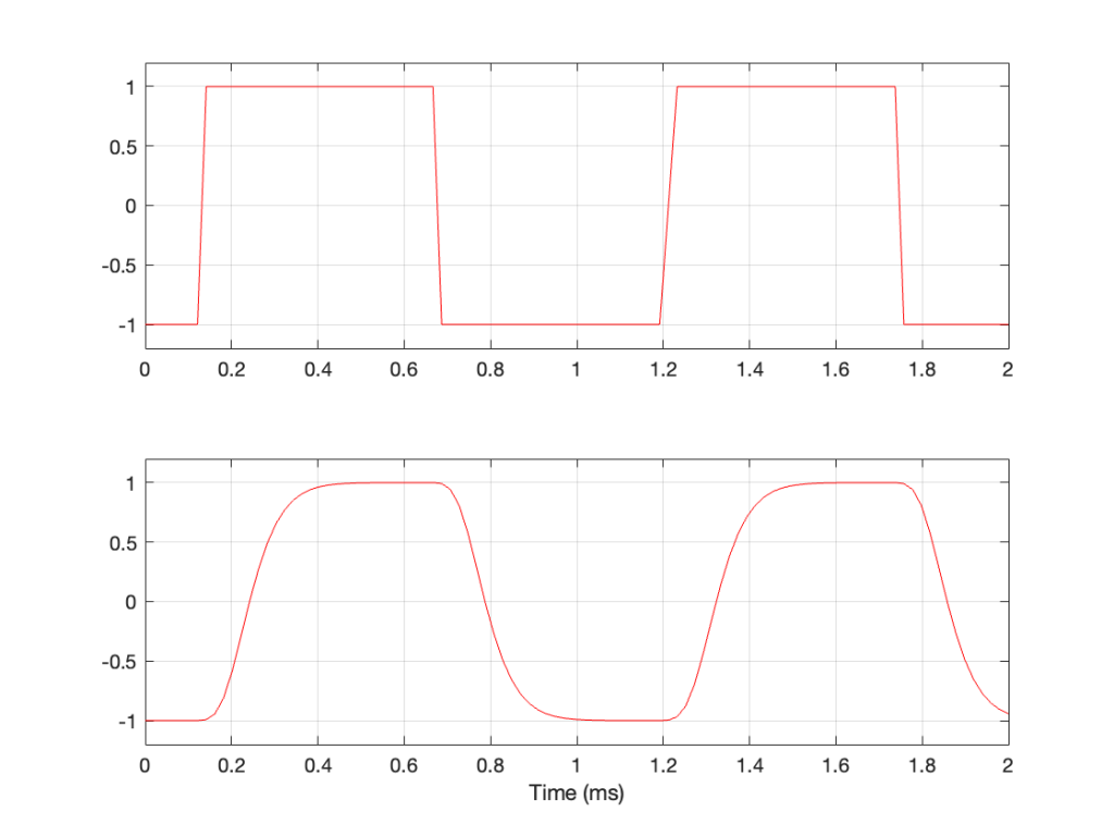
This means that, if I have an analogue square wave and I record it digitally, the signal that I actually record will be something like the bottom plot rather than the top one, depending on many things like the frequency of the square wave, the characteristics of the anti-aliasing filter, the sampling rate, and so on. Don’t go jumping to conclusions here. The plot above uses an aggressively exaggerated filter to make it obvious that we do something to prevent aliasing in the recorded signal. Do NOT use the plots as proof that “analogue is better than digital” because that’s a one-dimensional and therefore very silly thing to claim.
However…
… just because we keep signals with frequency content above the Nyquist frequency out of the input of the system doesn’t mean that they can’t exist inside the system. In other words, it’s possible to create a signal that produces aliasing after the ADC. You can either do this by
- creating signals from scratch (for example, generating a sine tone with a frequency above Nyquist)
or - by producing artefacts because of some processing applied to the signal (like clipping, for example).
Let’s take a sine wave and clip it after it’s been converted to a digital signal with a 48 kHz sampling rate, as is shown in Figure 2.
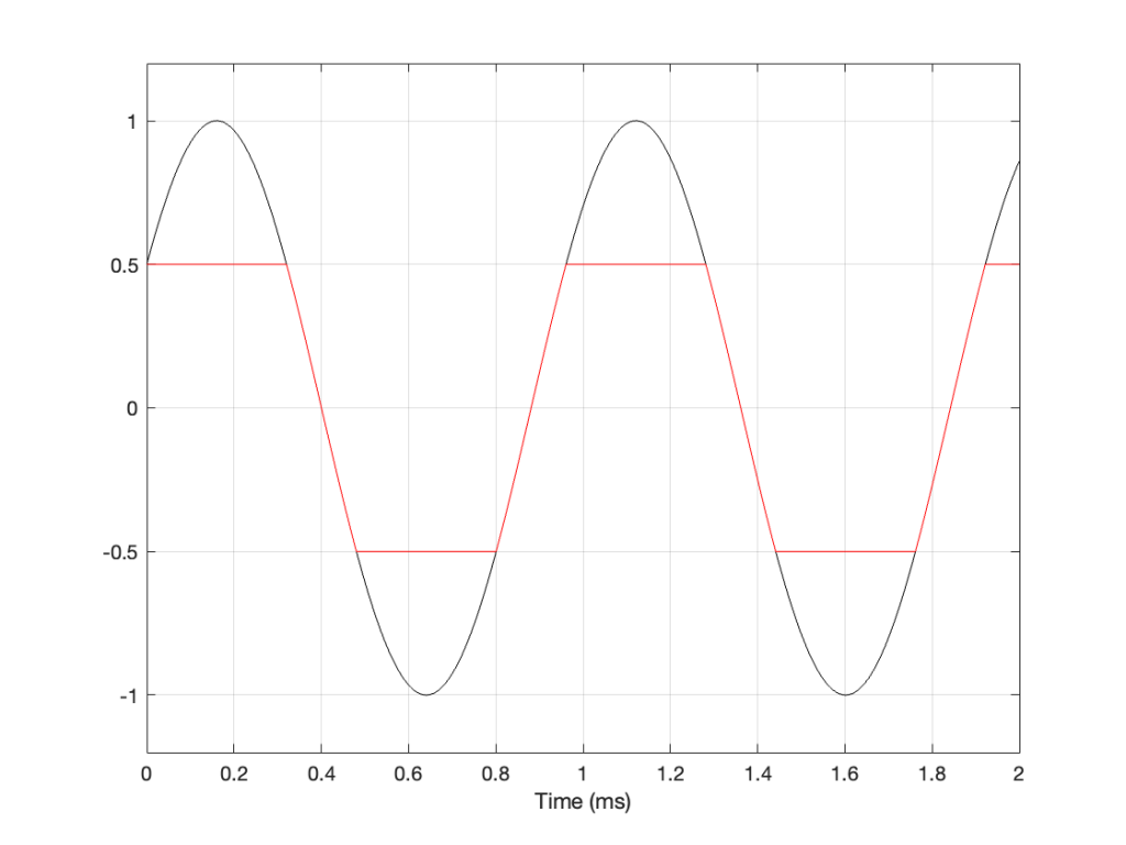
When we clip a signal, we generate high-frequency harmonics. For example, the signal in Figure 2 is a 1 kHz sine wave that I clipped at ±0.5. If I analyse the magnitude response of that, it will look something like Figure 3:
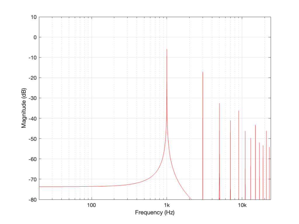
The red curve in Figure 2 is not a ‘perfect’ square wave, so the harmonics seen in Figure 3 won’t follow the pattern that you would expect for such a thing. But that’s not the only reason this plot will be weird…
Figure 3 is actually hiding something from you… I clipped a 1 kHz sine wave, which makes it square-ish. This means that I’ve generated harmonics at 3 kHz, 5 kHz, 7 kHz, and so on, up to ∞ Hz..
Notice there that I didn’t say “up to the Nyquist frequency”, which, in this example with a sampling rate of 48 kHz, would be 24 kHz.
Those harmonics above the Nyquist frequency were generated, but then stored as their aliases. So, although there’s a new harmonic at 25 kHz, the system records it as being at 48 kHz – 25 kHz = 23 kHz, which is right on top of the harmonic just below it.
In other words, when you look at all the spikes in the graph in Figure 3, you’re actually seeing at least two spikes sitting on top of each other. One of them is the “real” harmonic, and the other is an alias (there are actually more, but we’ll get to that…). However, since I clipped a 1 kHz sine wave in a 48 kHz world, this lines up all the aliases to be sitting on top of the lower harmonics.
So, what happens if I clip a sine wave with a frequency that isn’t nicely related to the sampling rate, like 900 Hz in a 48 kHz system, for example? Then the result will look more like Figure 4, which is a LOT messier.
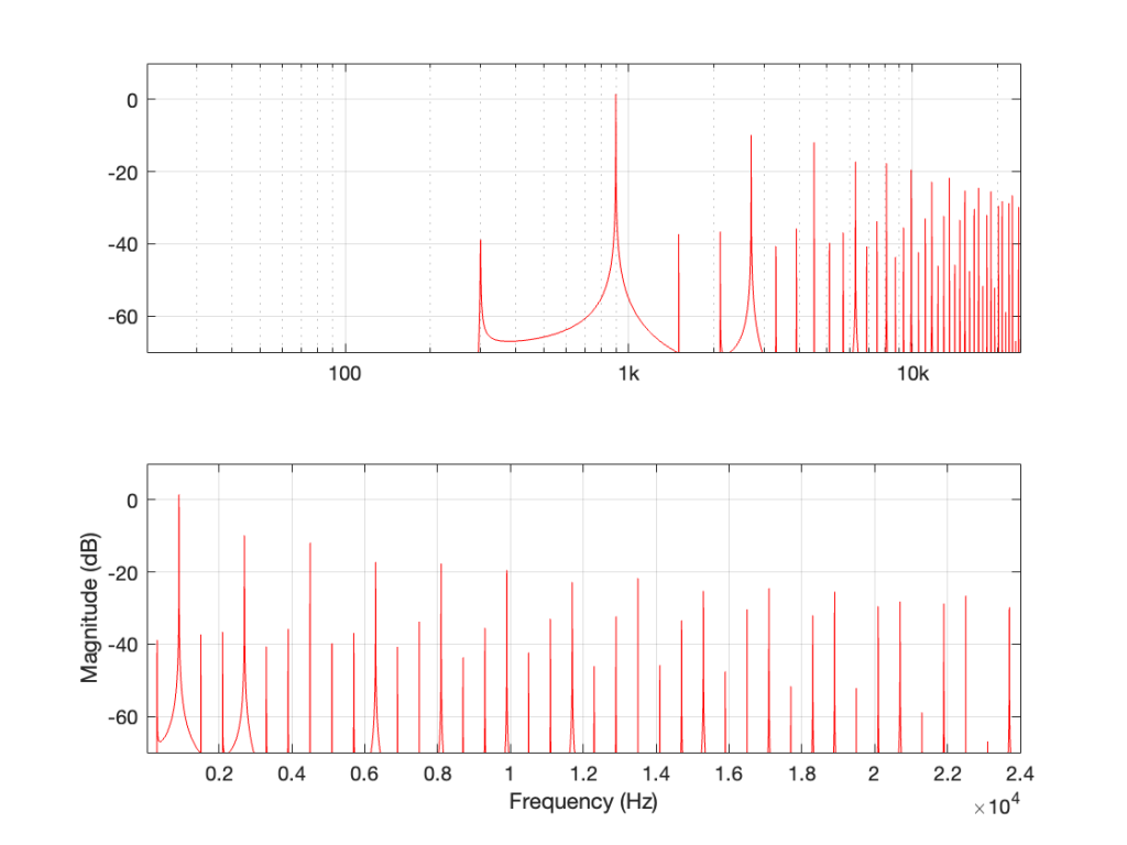
A 900 Hz square wave will have harmonics at odd multiples of the fundamental, therefore at 2.7 kHz, 4.5 kHz, and so on up to 22.5 kHz (900 Hz * 25).
The next harmonic is 24.3 kHz (900 Hz * 27), which will show up in the plots at 48 kHz – 24.3 kHz = 23.7 kHz. The next one will be 26.1 kHz (900 Hz * 29) which shows up in the plots at 21.9 kHz. This will continue back DOWN in frequency through the plot until you get to 900 Hz * 53 = 47.7 kHz which will show up as a 300 Hz tone, and now we’re on our way back up again… (Take a look at Figure 7, below for another way to think of this.)
The next harmonic will be 900 Hz * 55 = 49.5 kHz which will show up in the plot as a 1.5 kHz tone (49.5 kHz – 48 kHz).
Depending on the relationship between the square wave’s frequency and the sampling rate, you either get a “pretty” plot, like for the 6 kHz square wave in a 48 kHz system, as shown in Figure 5.
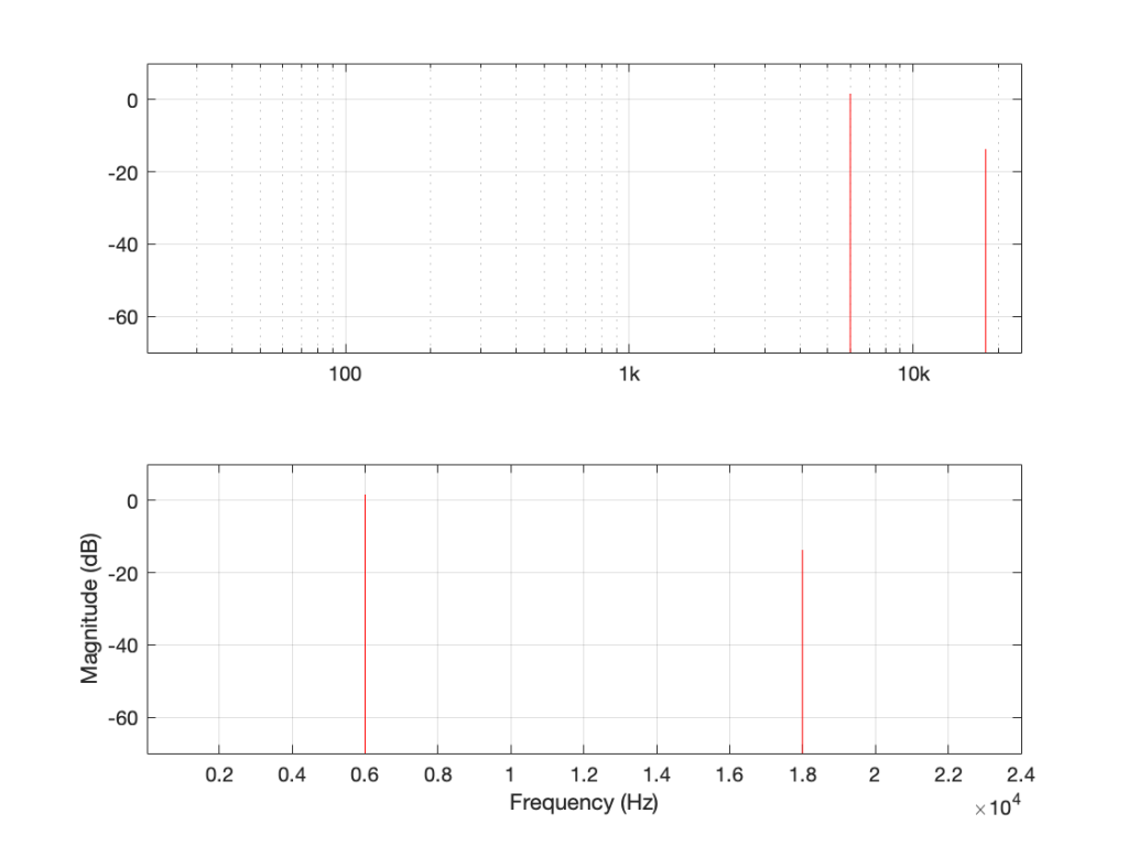
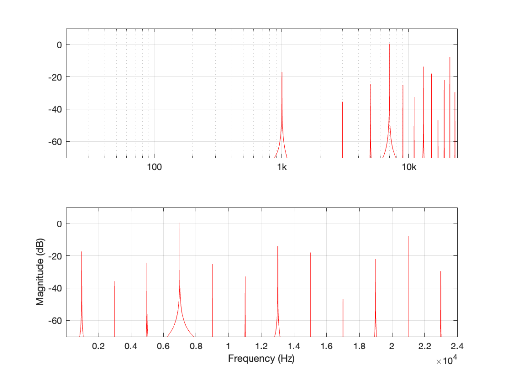
Or, it’s messy, like the 7 kHz square wave in a 48 kHz system in Figure 6.
The moral of the story
There are three things to remember from this little pair of posts:
- Some aliased artefacts are negative frequencies, meaning that they appear to be going backwards in time as compared to the original (just like the wheel appearing to rotate backwards in Part 1).
- Just because you have an antialiasing filter at the input of your ADC does NOT protect you from aliasing, because it can be generated internally, after the signal has been converted to the digital domain.
- Once this aliasing has happened (e.g. because you clipped the signal in the digital domain), then the aliases are in the signal below the Nyquist frequency and therefore will not be removed by the reconstruction low-pass filter in the DAC. Once they’re mixed in there with the signal, you can’t get them out again.
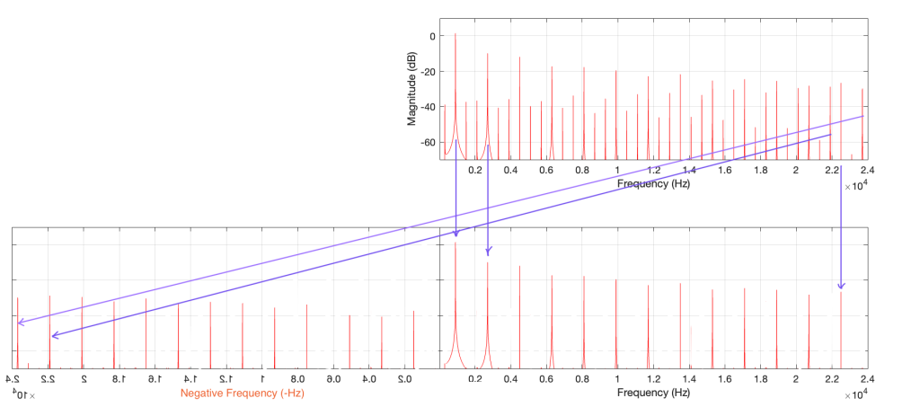
One additional, but smaller problem with all of this is that, when you look at the output of an FFT analysis of a signal (like the top plot in Figure 7, for example), there’s no way for you to know which components are “normal” harmonics, and which are aliased artefacts that are actually above the Nyquist frequency. It’s another case proving that you need to understand what to expect from the output of the FFT in order to understand what you’re actually getting.