Links to:
DFT’s Part 1: Some introductory basics
DFT’s Part 2: It’s a little complex…
DFT’s Part 3: The Math
DFT’s Part 4: The Artefacts
The previous posting in this series showed that, if we just take a slice of audio and run it through the DFT math, we get a distorted view of the truth. We’ll see the frequencies that are in the audio signal, but we’ll also see that there’s energy at frequencies that don’t really exist in the original signal. These are artefacts of slicing a “window” of time out of the original signal.
Let’s say that I were a musician, making samples (in this sentence, the word “sample” means what it means to musicians – a slice of a recording of a sound that I will play using a sampler) to put into my latest track in my new hip hop album. (Okay, I use the word “musician” loosely here… but never mind…) I would take a sample – say, of the bell that I recorded, which looks like this:
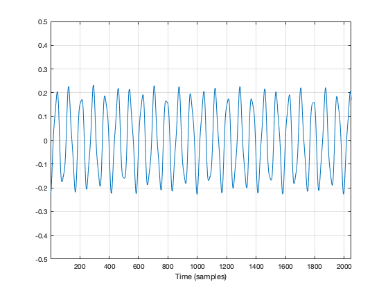
We’ve already seen that the first sample (now I’m back to using the technical definition of the word “sample” – an instantaneous measurement of the amplitude of the signal) and the last sample aren’t on the 0 line. So, if we just play this recording, it will start and end with a “click”.
We get rid of the click by applying a “fade” on the start and the end of the recording, resulting in something like the following:
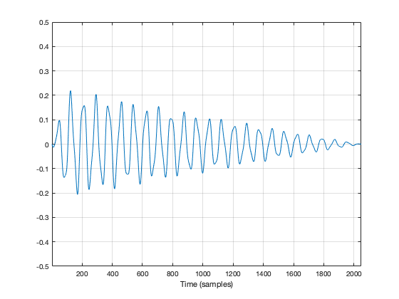
So, the moral of the story so far is that, in order to get rid of an audible “click”, we need to fade in and fade out so that we start and end on the 0 line.
We can do the same thing to our slice of audio (from now on, I’m going to call it a “window”) to help the computer that’s doing the DFT math so that it doesn’t get all the extra frequency content caused by the clicks.
In Figure 2, above, I was being artistic with my fade in and fade out. I made the fade in fast (100 samples long) and I made the fade in slow (2000 samples long) so that the end result would look and sound more like a bell. A computer doesn’t care if we’re artistic or not – we’re just trying to get rid of those clicks. So, let’s do it.
Option 1 is to do nothing – which is what we’ve done so far. We take all of the individual samples in our window, and we multiply them by 1. (All other samples (the ones that we’re not using because they’re outside the window) are multiplied by 0.) If you think about what this looks like if I graph it in time, you’ll imagine a rectangle with a height of 1 and a length equal to the length of the window in samples.
If I do that to my original bell recording, I get the result shown in Figure 3.
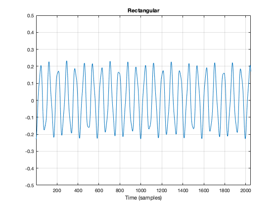
You may notice that Figure 3 is almost identical to Figure 1. The only difference is that I put the word “Rectangular” at the top. The reason for this will become clear later.
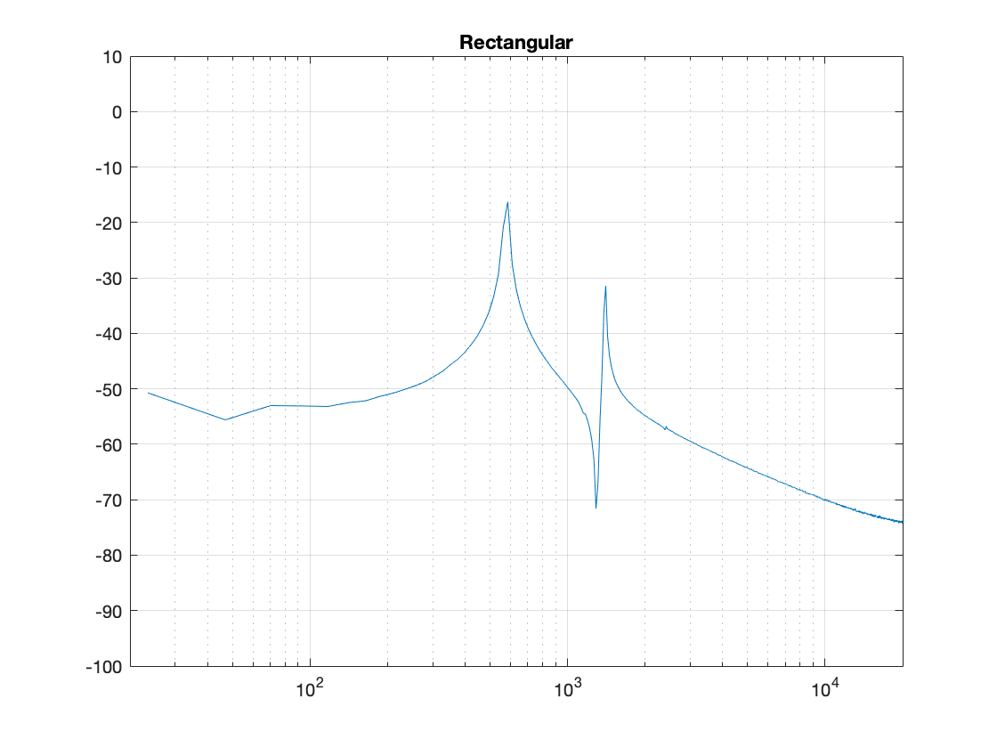
As we’ve already seen, this rectangular windowing of our recording is what gives us the problems in the first place. So, if I do a DFT of that window, I’ll get the following magnitude response.
What we know already is that we want to fade in and fade out to get rid of those clicks. So, let’s do that.
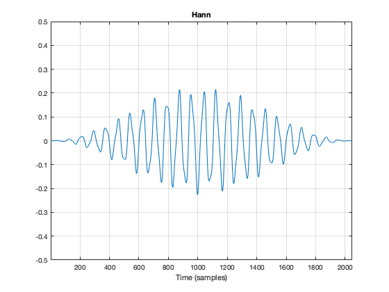
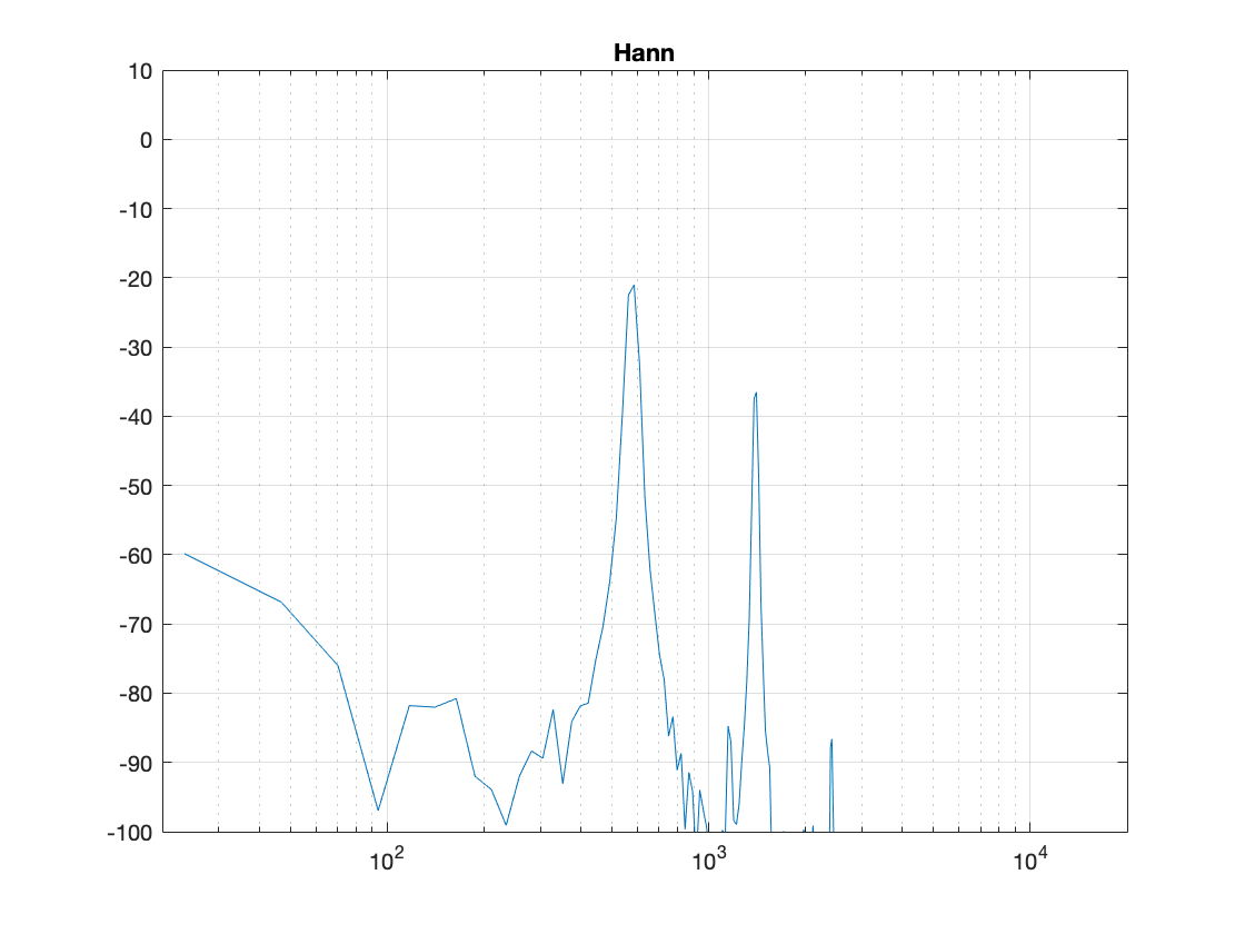
Figure 5, above, shows the result. the ramp in and the ramp out are not straight lines – in fact, they look very much like the shape of an upside-down cosine wave (which is exactly what they are…). If we do a DFT of that window, we get the result shown in Figure 6.
There are now some things to talk about.
The first is to say that the shape of this “envelope” or “windowing function” – the gain over time that we apply to the audio signal – is named after the Austrian meteorologist Julius von Hann. He didn’t invent this particular curve – but he did come up with the idea of smoothing data (but in his case, he was smoothing meteorological data over geographical regions – not audio signals over time). Because he came up with the general idea, they named this curve after him.
Important sidebar: Some people will call this a “Hanning” window. This is not strictly correct – it’s a Hann function. However, you can use the excuse that, if you apply a Hann window to the signal, then you are hanning it… which is the kind of obfuscated back-pedalling and revisionist history used to cover up a mistake that is typically only within the purview of government officials.
The second thing is to notice is that the overall response at frequencies that are not in the original signal has dropped significantly. Where, in Figure 4, we see energy around -60 dB FS at all frequencies (give or take….) the plot in Figure 6 drops down below -100 dB FS – off the plot. This is good. It’s the result of getting rid of those non-zero values at the start and stop of the window… No clicks means no energy spread all over the frequency spectrum.
The third thing to discuss is the levels of the peaks in the plots. Take a look at the highest peak in Figure 4. It’s about -17 dB FS or so. The peak at the same frequency in Figure 6 is about -21 dB or so… 4 dB lower… This is because, if you look at the entire time window, there is indeed less energy in there. We made portions of the signal quieter, so, on average, the whole thing is quieter. We’ll look at how much quieter later.
This is where things get a little interesting, because some people think that the way that we faded in and faded out of the window (specifically, using a Hann function) can be improved in some way or another… So, let’s try a different way.
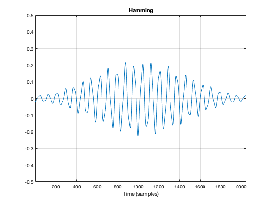
Figure 7, above, shows the same bell sound again, this time processed using a Hamming function instead. It looks very similar to the Hann function – but it’s not identical. For starters, you may notice that the start and stop values are not 0 – although they’re considerably quieter than they would have been if we had used a rectangular windowing function (or, in other words “done nothing”). The result of a DFT on this signal is shown in Figure 8.
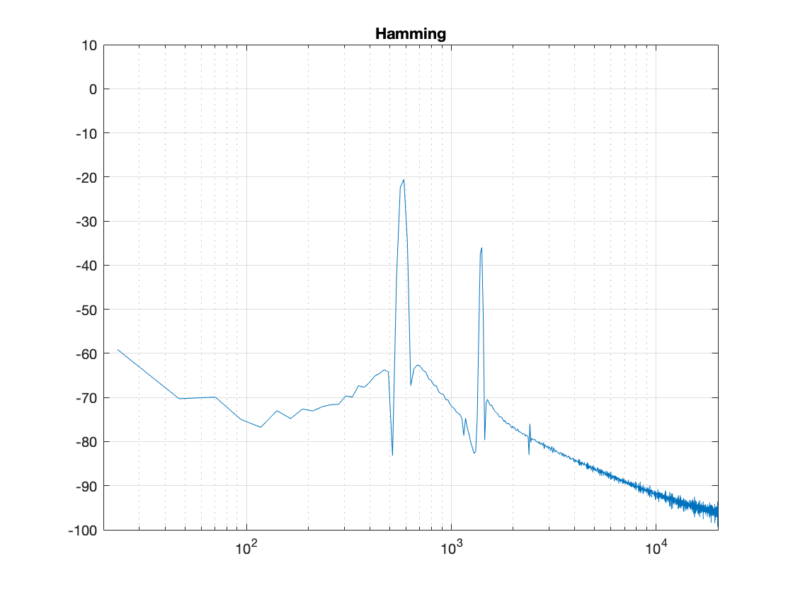
There are two things about Figure 8 that are different from Figure 6. The first is that the overall apparent level of the wide-band artefacts is higher (although not as high as that in Figure 4…). This is because we have a “click” caused by the fact that we don’t start and stop at 0. However, the advantage of this function is that the peaks are narrower – so we get a better idea of the actual signal – we just need to learn to ignore the bottom part of the plot.
Figure 9, shows yet another function, called a Blackman function.
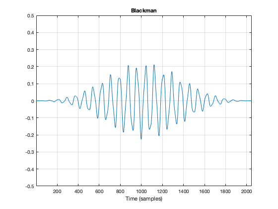
You can see there that it takes longer for the signal to ramp in from 0 (and to ramp out again at the end), so we can expect that the peaks will be even lower than those for the Hann window. This can be seen in Figure 10.
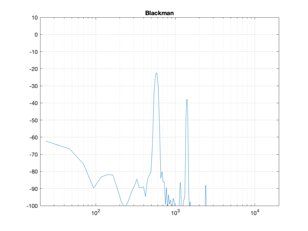
Indeed, the peaks are lower….
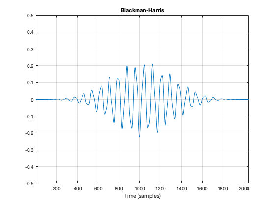
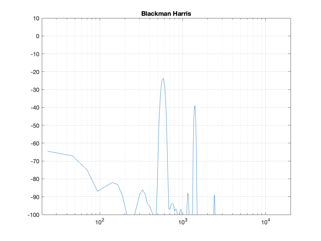
Another function is called the Blackman-Harris function, shown in Figures 11 and 12.
There are other windowing functions. And there are some where you can change some variables to play with width and things. Or you can make up your own. I won’t talk about them all here… This is just a brief introduction…
The purpose of this is to show some basic issues with windowing. You can play with the windowing function, but there will be subsequent effects in the DFT result like:
- the apparent magnitude of the actual signal (the peaks in the plots above)
- the apparent magnitude in frequency bands that aren’t in the signal
- the apparent width of the frequency band of the actual signal
Also, you have to remember that a DFT shows you the complete frequency content of the slice of time that you fed it. So, if the frequency content changes over time (the sound of a sitar string being plucked, or the “pew pew” sound of Han Solo’s laser, for example) then this change over time will not be shown…
Some more details…
Let’s dig a little into the differences in the peaks in the DFT plots above. As we saw in Part 4, if the frequency of the signal you’re analysing is not exactly the same as the frequency of the DFT bin, then the energy will “bleed” into adjacent bins. The example I showed in that posting compared the levels shown by the DFT when the frequency of the signal is either exactly the same as a frequency bin, or half-way between two of them – a reminder of this is shown below in Figure 13.
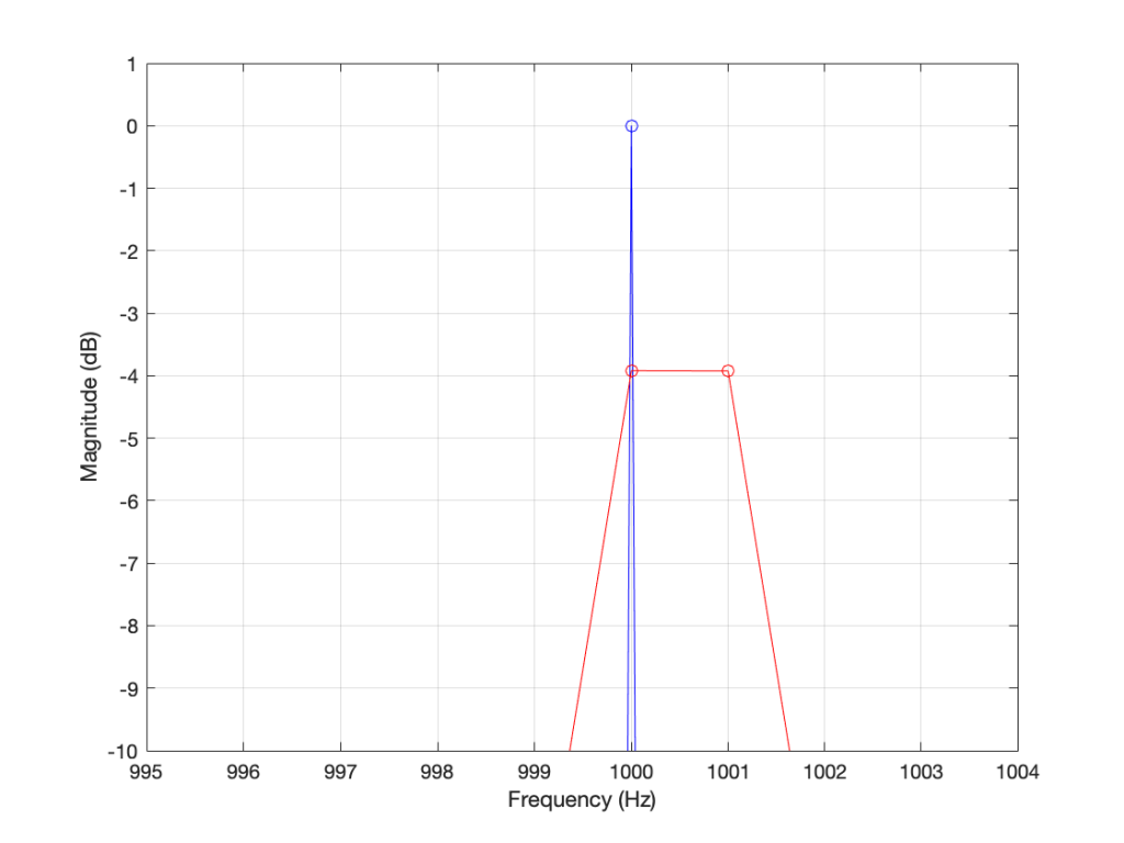
As you can see in that plot, the energy in the 1000.5 Hz bleeds into the two adjacent bins. In fact, it’s more accurate to say that there is energy in all of the DFT bins, due to the discontinuity of the signal when the beginning is wrapped around to meet its end.
So, let’s analyse this a little further. I’ll create a signal that is on a frequency bin (therefore it’s a sine wave with a carefully-chosen frequency), and do the DFT. Then, I’ll make the frequency a little lower, and do the DFT again. I’ll repeat this until I get to a signal frequency that is half-way between two bins. I’ll stop there, because once I pass the half-way point, I’ll just start seeing the same behaviour. The result of this is shown for a rectangular window in Figure 14.
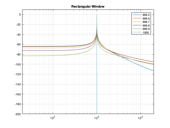
As you can see there, there is a LOT of energy bleeding into all frequency bins when the signal is not exactly on a bin. Remember that this does not mean that those frequencies are in the signal – but they are in the signal that the DFT is being asked to analyse.
Let’s do this again for the other windowing functions.
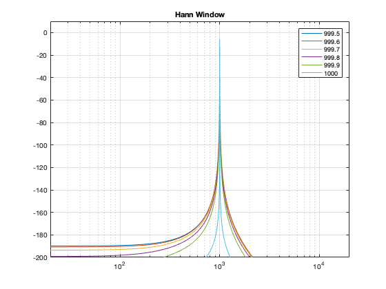
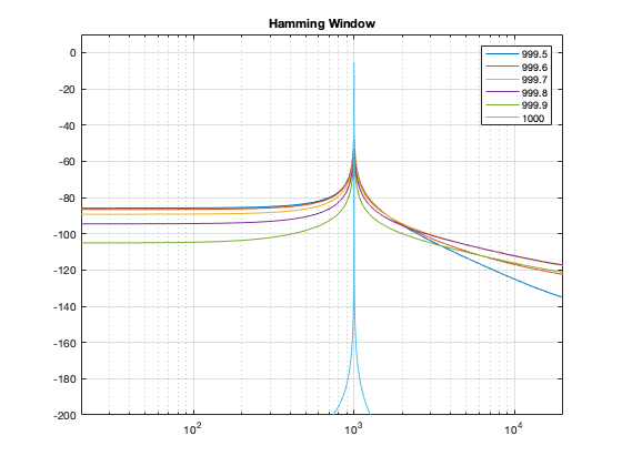
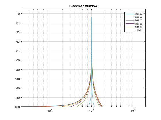
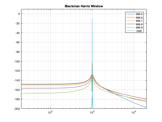
What you may notice when you look at Figures 14 to 18 is that there is a relationship between the narrowness of the plot when the signal is on a bin frequency and the amount of energy that’s spread everywhere else when it’s not. Generally, you have to make a trade between accuracy and precision at the frequency where there’s energy to truth at all other frequencies.
However, if you look carefully at those plots around the 1000 Hz area, you can see that it’s a little more complicated. Let’s zoom into that area and have a look…
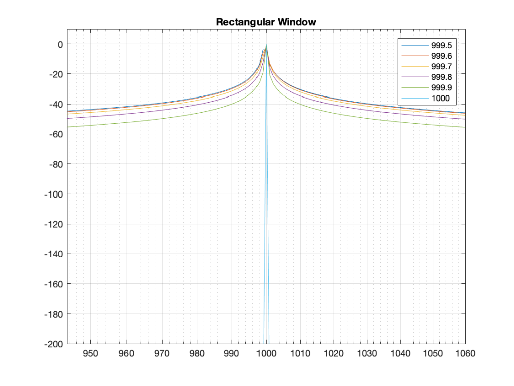
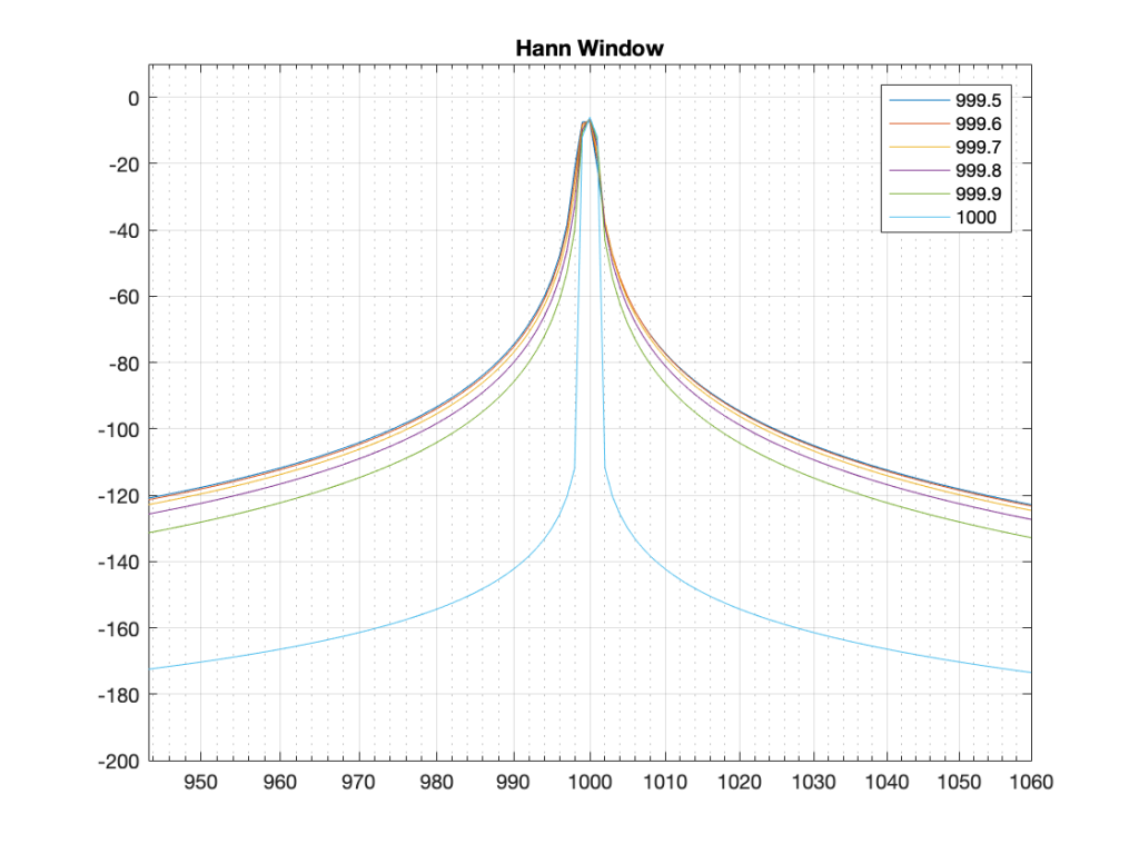
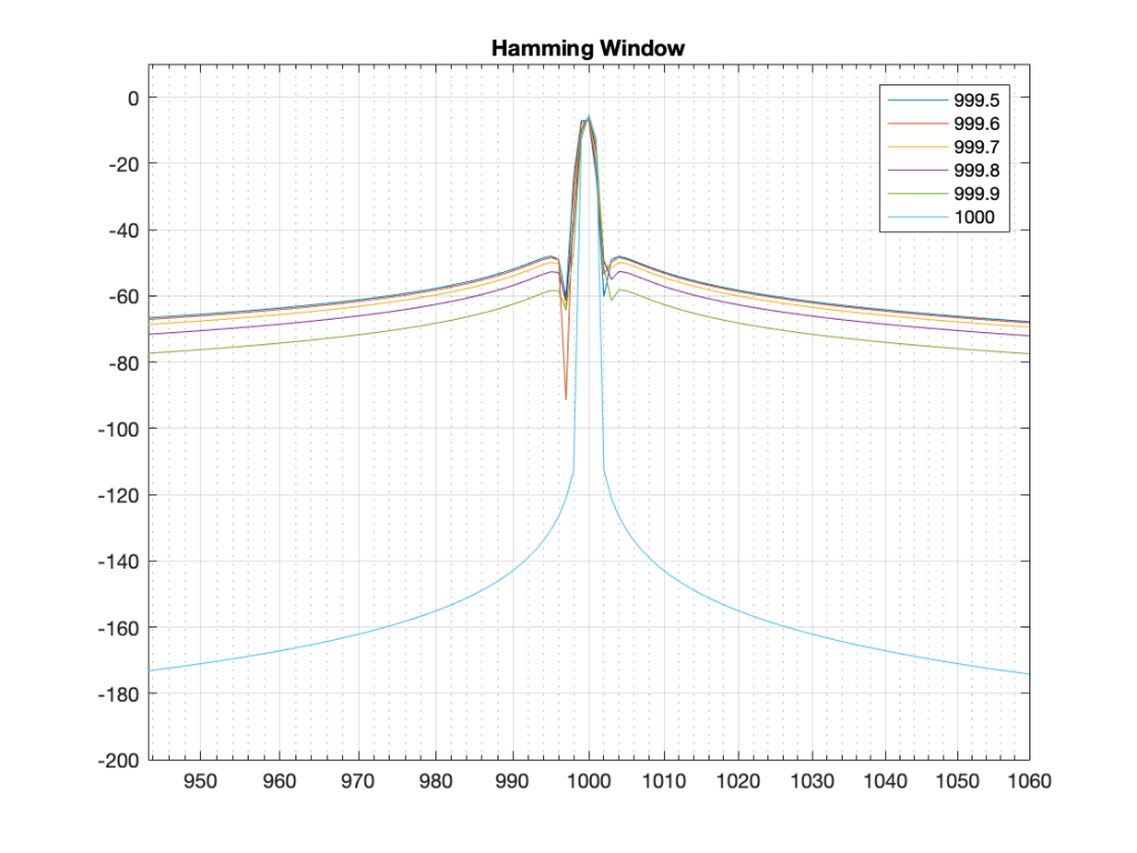
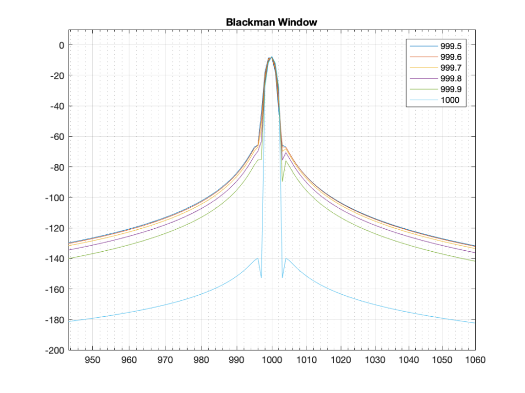
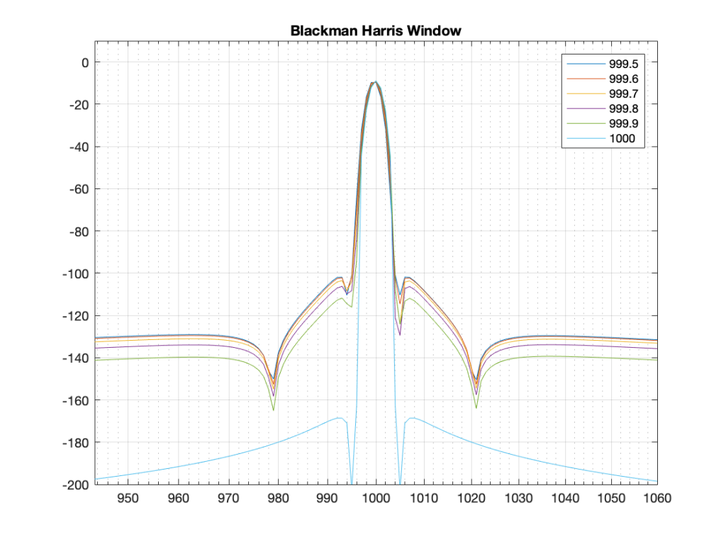
The thing to compare in plots 19 to 22 is the how similar the plots in each figure is, relative to each other. For example, in Figure 19, the six plots are very different from each other. In Figure 22, the six plots are almost identical from 995 Hz to 1005 Hz.
Depending on what kind of analysis you’re doing, you have to decide which of these behaviours is most useful to you. In other words, each type of windowing function screws up the result of the DFT. So you have to choose which one screws it up the least for the type of signal and the type of analysis you’re doing.
Alternatively, you can choose a favourite windowing function, and always use that one, and just get used to looking at the way your results are screwed up.
Some final details
So far, I have not actually defined the details of any of the windowing functions we’ve looked at here. I’ve just said that they fade in and fade out differently. I won’t give you the mathematical equations for creating the actual curves of the functions. You can get that somewhere else. Just look them up on the Internet. However, we can compare the shapes of the gain functions by looking at them on the same plot, which I’ve put in Figure 23.
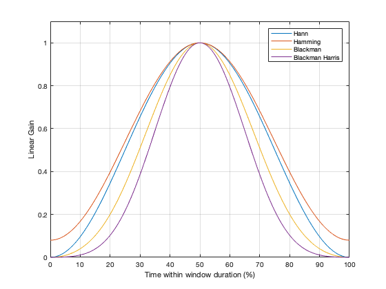
You may notice that I left out the rectangular window. If I had plotted it, it would just be a straight line of 1’s, which is not a very interesting shape.
What may surprise you is how similar these curves look, especially since they have such different results on the DFT behaviour.
Another way to look at these curves (which is almost never shown) is to see them in decibels instead, which I’ve done in Figure 24.
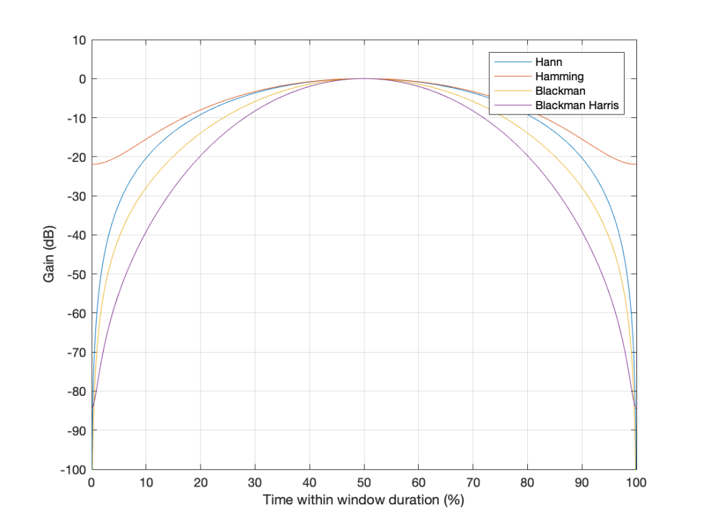
The reason I’ve plotted them in dB in Figure 24 is to show that, although they all look basically the same in Figure 23, you can see that they’re actually pretty different… For example, notice that, at about 10% of the way into the time of the window, there is a 40 dB difference between the Blackman Harris and the Hann functions… This is a lot.
One thing that I’ve only briefly mentioned is the fact that the windowing functions have an effect on the level that is shown in the DFT result, even when the signal frequency is exactly the same as the DFT bin frequency. As I said earlier, this is because there is, in fact, less energy in the time window overall, because we made the signal quieter at the beginning and end. The question is: “exactly how much quieter?” This is shown in Figure 25.
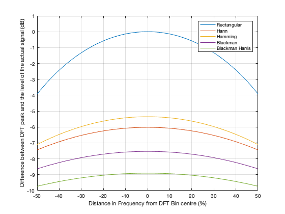
So, as you can see there, a DFT of a rectangular windowed signal can show the actual level of the signal if the frequency of the signal is exactly the same as the DFT bin centre. All of the other windowing functions will show you a lower level.
HOWEVER, all of the other windowing functions have less variation in that error when the signal frequency moves away from the DFT bin. In other words, (for example) if you use a Blackman Harris window for your DFT, the level that’s displayed will be more wrong than if you used a rectangular window, but it will be more consistent. (Notice that the rectangular window ranges from almost -4 dB to 0 dB, whereas the Blackman Harris window only ranges from about -10 to -9 dB.)
We’ll dig into some more details in the next and final posting in this series… with some exciting animated 3D plots to keep things edu-taining.