Links to:
DFT’s Part 1: Some introductory basics
DFT’s Part 2: It’s a little complex…
DFT’s Part 3: The Math
The previous post ended with the following:
And, you should be left with a question… Why does that plot in Figure 12 look like it’s got lots of energy at a bunch of frequencies – not just two clean spikes? We’ll get into that in the next posting.
Let’s begin by taking a nice, clean example…
If my sampling rate is 65,536 Hz (2^16) and I take one second of audio (therefore 65,536 samples) and I do a DFT, then I’ll get 65,536 values coming out, one for each frequency with an integer value (nothing after the decimal point. The frequencies range from 0 to 65,535 Hz, on integer values (so, 1 Hz, 2 Hz, 3 Hz, etc…) (And we’ll remember to throw away the top half of those values due to mirroring which we talked about in the last post.)
I then make a sine wave with an amplitude of 0 dB FS and a frequency of 1,000 Hz for 1 second, and I do an DFT of it, and then convert the output to show me just the magnitude (the level) of the signal (so I’m ignoring phase). The result would look like the plot below.
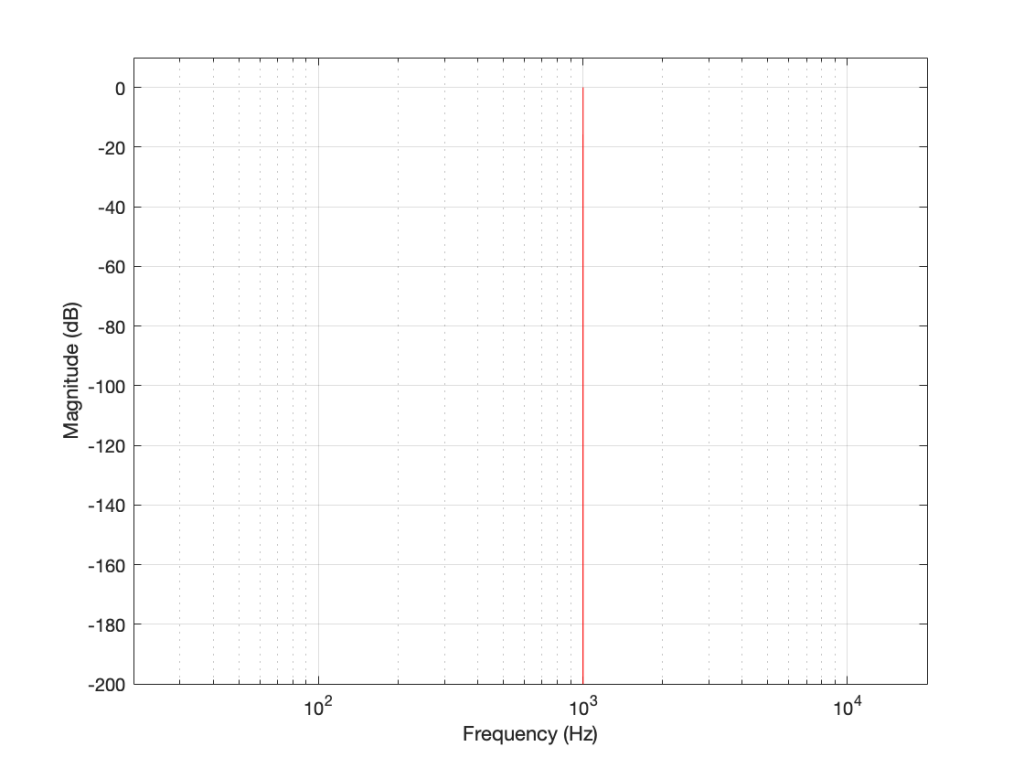
The plot above looks very nice. I put in a 1,000 Hz sine wave at 0 dB FS, and the plot tells me that I have a signal at 1,000 Hz and 0 dB FS and nothing at any other frequency (at least with a dynamic range of 200 dB). However, what happens if my signal is 1000.5 Hz instead? Let’s try that:
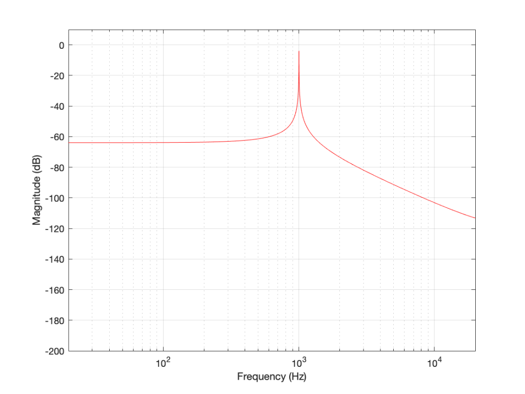
Now things don’t look so pretty. I can see that there’s signal around 1000 Hz, but it’s lower in level than the actual signal and there seems to be lots of stuff at other frequencies… Why is this?
In order to understand why the level in Figure 2 is lower than that in Figure 1, we have to zoom in at 1000 Hz and see the individual points on the plot.
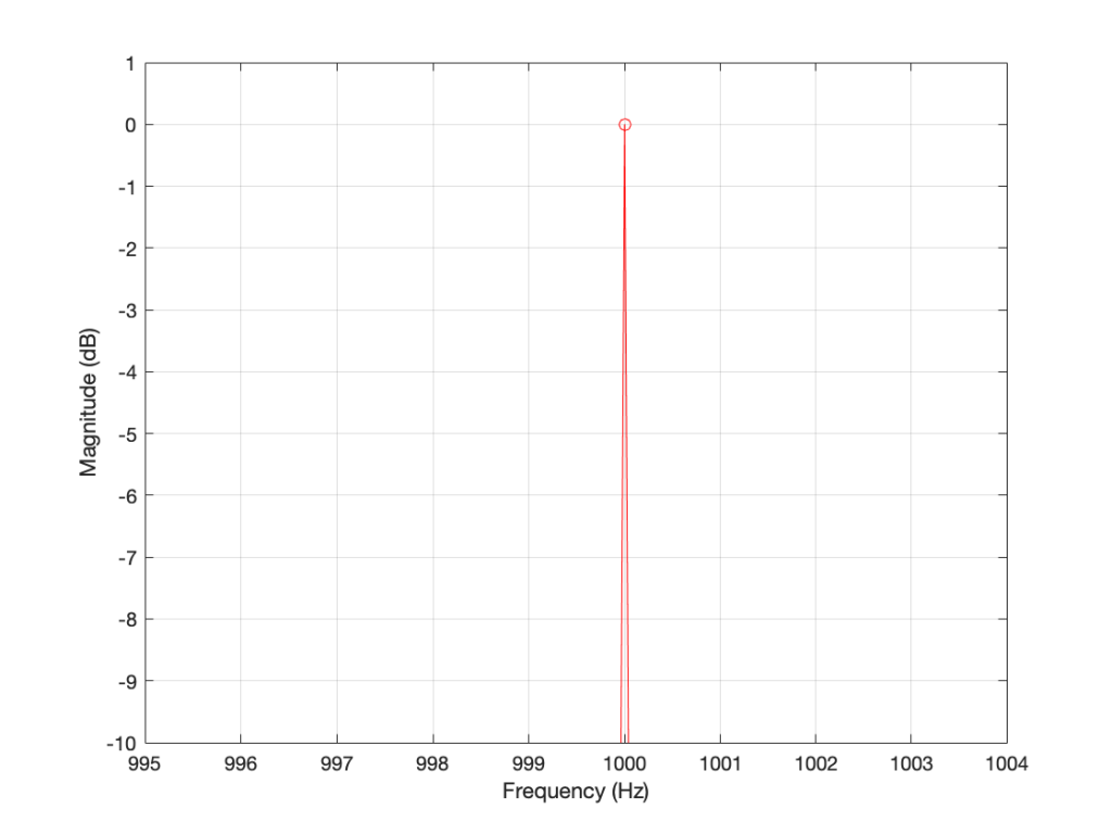
As you can see in Figure 1 (Zoom), above, there is one DFT frequency “bin” at 1000 Hz, exactly where the sine wave is centred.
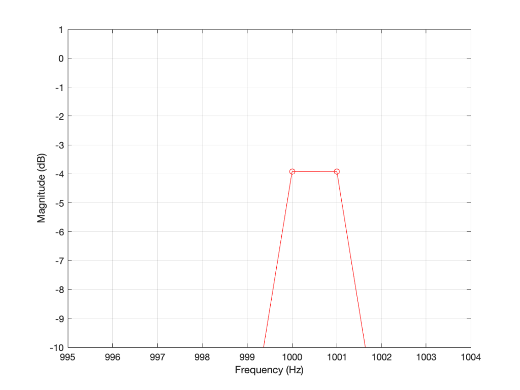
Figure 2 (Zoom) shows that, when the sine wave is at 1000.5 Hz, then the energy in that signal is distributed between two DFT frequency bins – at 1000 Hz and 1001 Hz. Since the energy is shared between two bins, then each of their level values is lower than the actual signal.
The reason for the “lots of stuff at other frequencies” problem is that the math in a DFT has a limited number of samples at its input, so it assumes that it is given a slice of time that repeats itself exactly.
For example…
Let’s look at a portion of a plot like the one below:
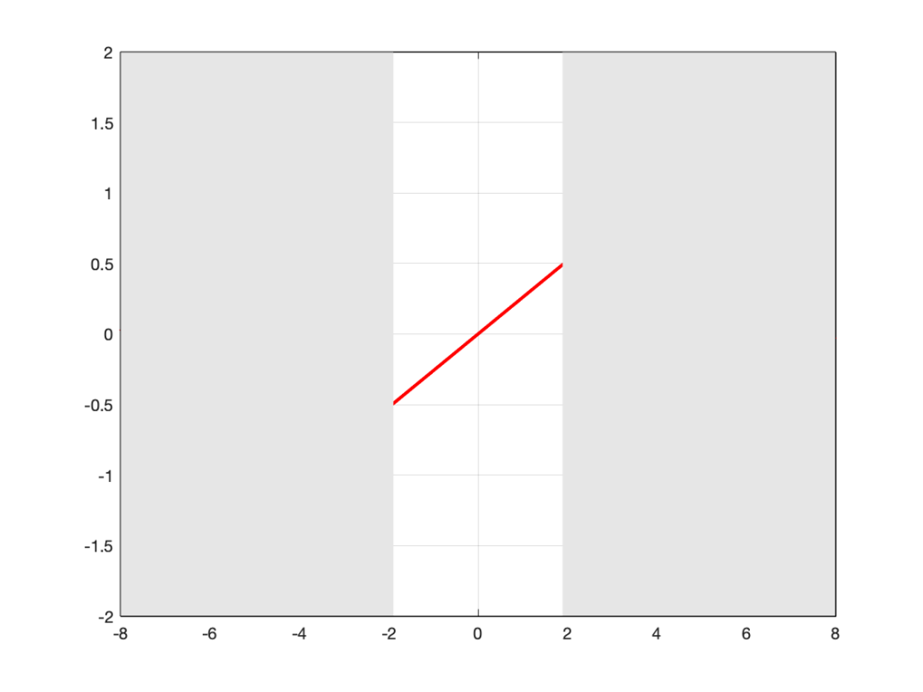
If I asked you to continue this plot to the left and right (in other words, guess what’s under the gray rectangles), would you draw a curve like the one below?
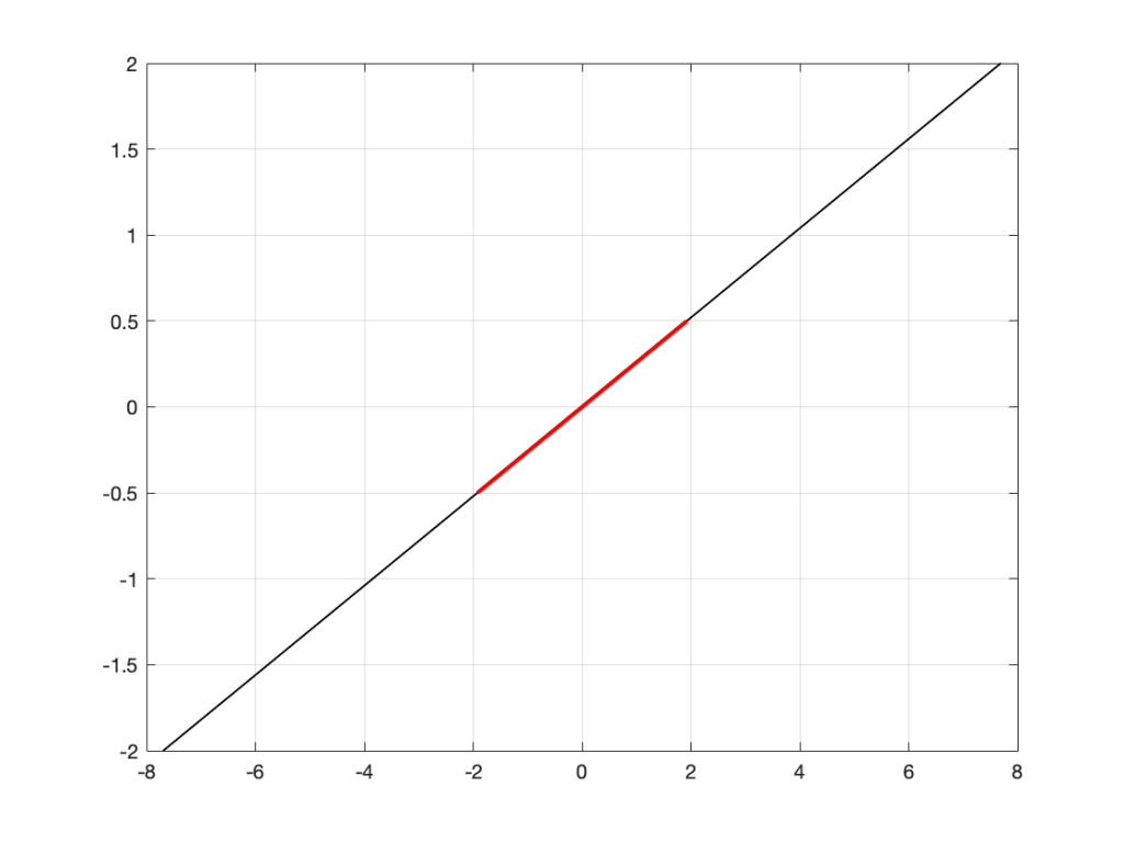
This would be a good guess. However, the figure below is also a good guess.
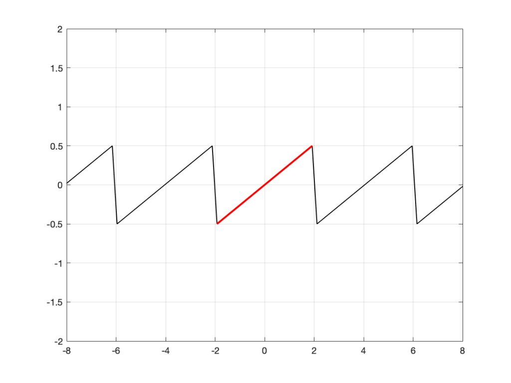
Of course, we could guess something else. Perhaps Figure 3 is mostly correct, but we should add a drawing of Calvin and Hobbes on a toboggan, sliding down the hill to certain death as well. You never know what was originally behind those grey rectangles…
This is exactly the problem the math behind a DFT has – you feed it a “slice” of a recording, some number of samples long, and the math (let’s call it “a computer”, since it’s probably doing the math) has to assume that this slice is a portion of time that is repeated forever – it started at the beginning of time, and it will continue repeating until the end of time. In essence, it has to make an “extrapolation” like the one shown in Figure 4 because it doesn’t have enough information to make assumptions that result in the plot in Figure 3.
For example: Part 2
Let’s go back to the bell recording that we’ve been looking at in the previous posts. We have a portion of a recording, 2048 samples long. If I plot that signal, it looks like the curve in Figure 5.
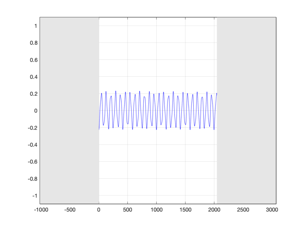
When the computer does the DFT math, the assumption is that this is a slice that is repeated forever. So, the computer’s assumption is that the original signal looks like the one below, in Figure 6.
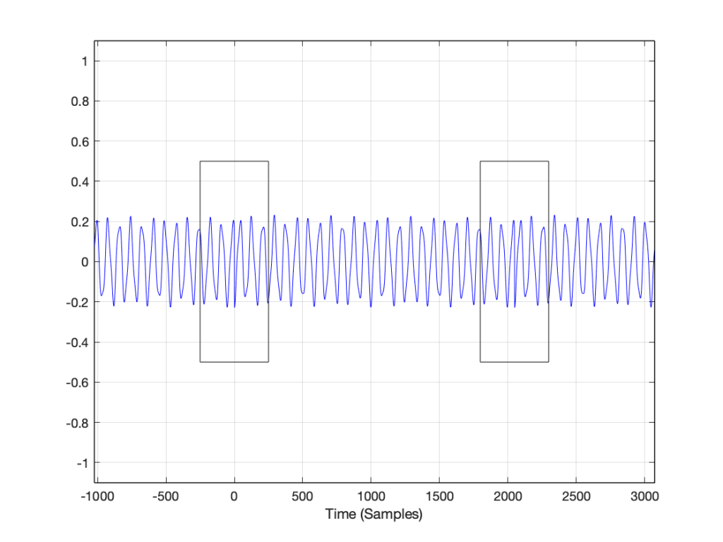
I’ve put rectangles around the beginning (at sample 1) and end (at sample 2048) of the slice to highlight what the signal looks like, according to the computer… The signal in the left half of the left rectangle (ending at sample 0) is the end of the slice of the recording, right before it repeats. The signal starting at 2049 is the beginning again – a repeat of sample 1.
If we zoom in on the signal in the left rectangle, it looks like Figure 7.
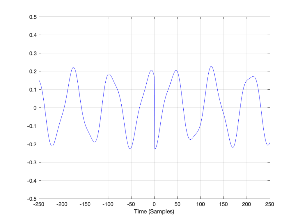
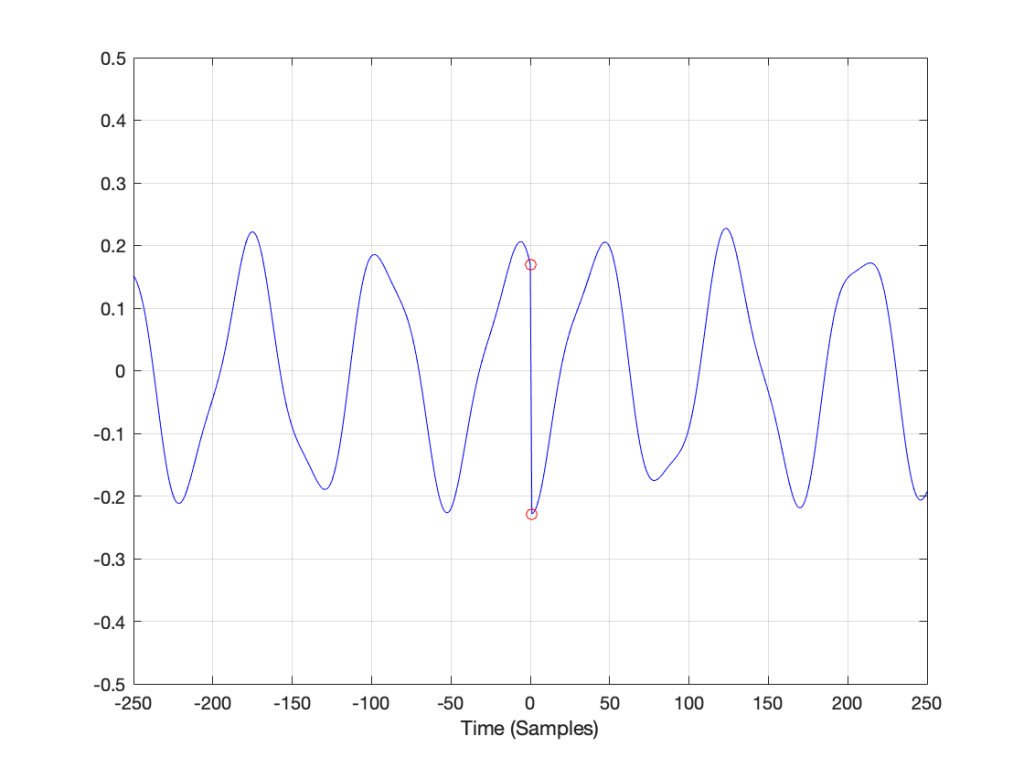
Notice that vertical line at sample 1 (actually going from sample 0 to sample 1, to be accurate). Of course, our original bell recording didn’t have that “instantaneous” drop in there – but the computer assumes it does because it doesn’t have enough information to assume anything else.
If we wanted to actually make that “instantaneous” vertical change in the signal (with a theoretical slope of infinity – although it’s not really that steep….), we would have to add other frequencies to our original signal. Generally, you can assume that, the higher the slope of an audio signal, either 1) the louder the signal or 2) the more high frequency content in the signal. Let’s look at the second one of those.
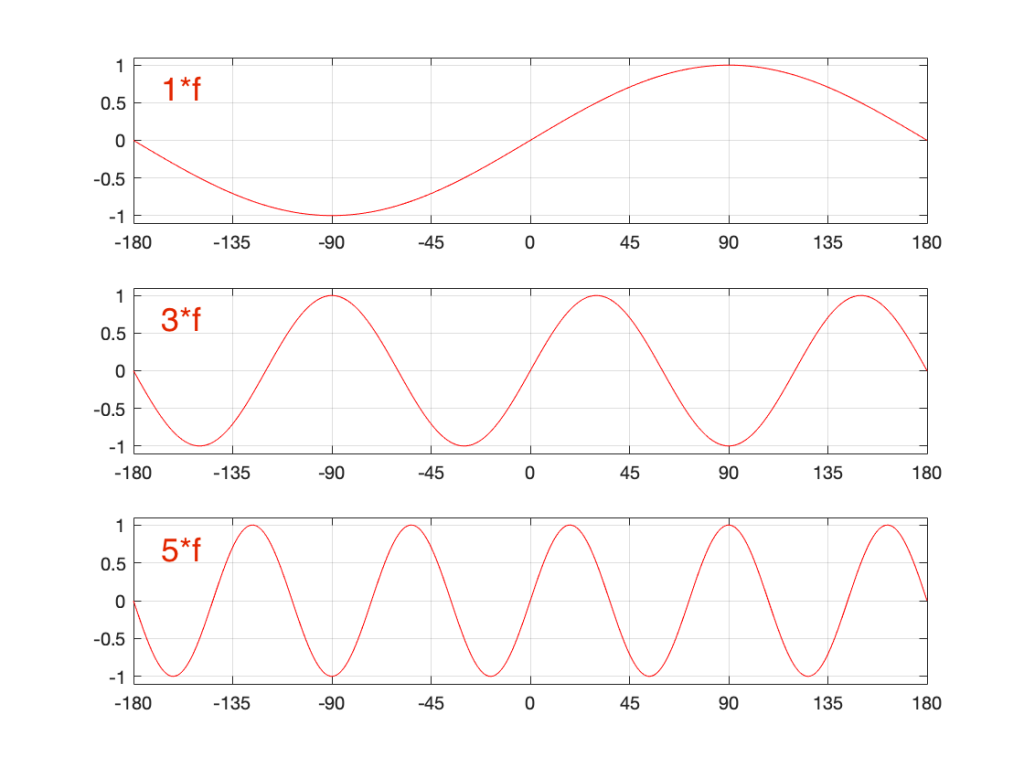
Let’s look at portions of sine waves at three different frequencies. These are shown below, in Figure 8. The top plot shows a sine wave with some frequency, showing how it looks as it passes phase = 0º (which we’ll call “time = 0” (on the X-axis)). At that moment, the sine wave has a value of 0 (on the Y-axis) and the slope is positive (it’s going upwards). The middle plot shows a sine wave with 3 times the frequency (notice that there are 6 negative-and-positive bumps in there instead of just 2). Everything I said about the top plot is still true. The level is 0 at time=0, and the slope is positive. The bottom plot is 5 times the frequency (10 bumps instead of 2). And, again, at time=0, everything is the same.
Let’s look a little more carefully at the slope of the signal as it crosses time=0. I’ve added blue lines in Figure 9 to highlight those.
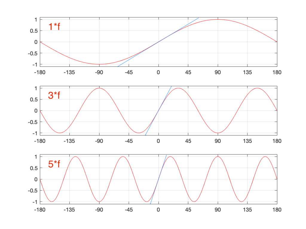
Notice that, as the frequency increases, the slope of the signal when it crosses the 0 line also increases (assuming that the maximum amplitude stays the same – all three sine waves go from -1 to 1 on the Y-axis.
One take-away from that is the idea that I’ve already mentioned: the only way to get a steep slope in an audio signal is to add high frequency content. Or, to say it another way: if your audio signal has a steep slope at some time, it must contain energy at high frequencies.
Although I won’t explain here, the truth is just a little more complicated. This is because what we’re really looking for is a sharp change in the slope of the signal – the “corners” in the plot around Sample 0 in Figure 7. I’ve put little red circles around those corners to highlight them, shown below in Figure 10. When audio geeks see a sharp corner like that in an audio signal, they say that the waveform is discontinuous – meaning that the level jumps suddenly to something unexpected – which means that its slope does as well.
Basically, if you see a discontinuity in an audio signal that is otherwise smooth, you’re probably going to hear a “click”. The audibility of the click depends on how big a jump there is in the signal relative to the remaining signal. (For example, if you put a discontinuity in a nice, smooth, sine wave, you’ll hear it. If you put a discontinuity in a white noise signal – which is made up of nothing but discontinuities (because it’s random) then you won’t hear it…)
Circling back…
Think back to the examples I started with at the beginning of this post. When I do a 65,536-point DFT of a 1000 Hz sine wave sampled at 65,536 Hz, the result is a nice clean-looking magnitude response (Figure 1). However, when I do a 65,536-point DFT of a 1000.5 Hz sine wave sampled at 65,536 Hz, the result is not nearly as nice. Why?
Think about how the end of the two sine waves join up with their beginnings. When you do a 65,536-point DFT on a signal that has a sampling rate of 65,536 Hz, then the slice of time that you’re analysing is exactly 1 second long. A 1000 Hz sine wave, repeats itself exactly after 1 second, so the 65,537th sample is identical to the first. If you join the last 30 samples of the slice to the first 30 samples, it will look like the red curve on the top plot in Figure 10, below.
However, if the sinusoid has a frequency of 1000.5 Hz, then it is only half-way through the waveform when you get to the end of the second. This will look like the lower black curve in Figure 10.
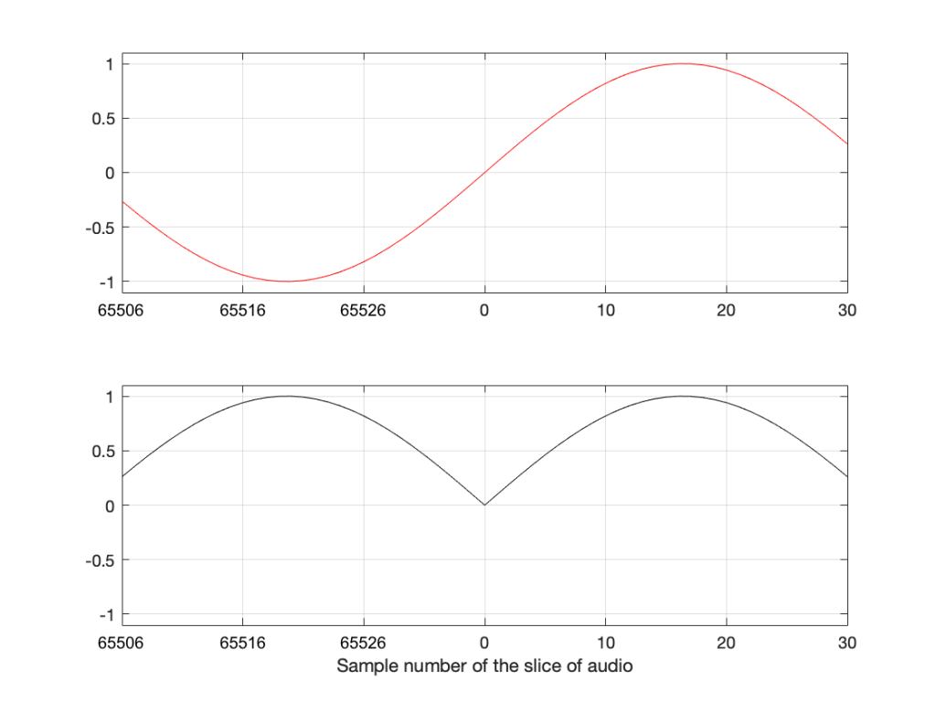
Notice that the lower plot has a discontinuity in the slope of the waveform. This means that there is energy in frequencies other than 1000.5 Hz in it. And, in fact, if you measured how much energy there is in that weird waveform that sounds like a sine wave most of the time, but has a little click every second, you’ll find out that the result is already plotted in Figure 2.
The conclusion
The important thing to remember from this posting is that a DFT tells you what the relative frequency content of the signal is – but only for the signal that you give it. And, in most cases, the signal that you give it (a slice of time that is looped for infinity) is not the same as the total signal that you took the slice from.
So, most of the time, a DFT (or FFT – you choose what you call it) is NOT showing you what is in your signal in real life. It’s just giving you a reasonably good idea of what’s in there – and you have to understand how to interpret the plot that you’re looking at.
In other words, Figure 2 does not show me how a 1000.5 Hz sine tone sounds – but Figure 1 shows me how a 1000 Hz sine tone sounds. However, Figures 1 and 2 show me exactly how the computer “hears” those signals – or at least the portion of audio that I gave it to listen to.
There is a general term applied to the problem that we’re talking about. It’s called “windowing effects” because the DFT is looking at a “window” of time (up to now, I’ve been calling it a “slice” of the audio signal. I’m going to change to using the word “time window” or just “window” from now on.
In the next posting, DFT’s Part 5: Windowing, we’ll look at some sneaky ways to minimise these windowing effects so that they’re less distracting when you’re looking at magnitude response plots.