Audio Mythinformation: 16 vs 24 bit recordings

Preface: Lincoln was right

There is a thing called “argument from authority” which is what happens when you trust someone to be right about something because (s)he knows a lot about the general topic. This is used frequently by pop-documentaries on TV when “experts” are interviewed about something. Example: “we asked an expert in underwater archeology how this piece of metal could wind up on the bottom of the ocean, covered in mud and he said ‘I don’t know’ so it must have been put there by aliens millions of years ago.” Okay, I’m exaggerating a little here, but my point is that, just because someone knows something about something, doesn’t mean that (s)he knows everything about it, and will always give the correct answers for every question on the topic.

In other words, as Abraham Lincoln once said: “Don’t believe everything you read on the Internet.”

Of course, that also means that also applies to everything that follows in the posting below (arrogantly assuming that I can be considered to be an authority on anything), so you might as well stop reading and go do something useful.

My Inspiration

There has been some discussion circulating around the Interweb lately about the question of whether the “new” trend to buy “high-resolution” audio files with word lengths of 24 bits actually provides an improvement in quality over an audio file with “only” 16 bits.

One side of this “religious” war comes from the people who are selling the high-res audio files and players. The assumed claim is that 24 bits makes a noticeable improvement in audio quality (over a “mere” 16 bits) that justifies asking you to buy the track again – and probably at a higher price.

The other side of the war are bloggers and youtube enthusiasts who write things like (a now-removed) article called “24/192 Music Downloads… and why they make no sense” (which, if you looked at the URL, is really an anti-Pono rant) and “Bit Depth & The 24 Bit Audio Myth

Personally, I’m not a fan of religious wars, so I’d like to have a go at wading into the waters in a probably-vain attempt to clear up some of the confusion and animosity that may be caused by following religious leaders.

Some background

If you don’t know anything about how an audio signal is converted from analogue to digital, you should probably stop reading here and go check out this page or another page that explains the same thing in a different way.

Now to recap what you already know:

  • An analogue to digital converter makes a measurement of the instantaneous voltage of the audio signal and outputs that measurement as a binary number on each “sample”
  • The resolution of that converter is dependent on the length of the binary number it outputs. The longer the number, the higher the resolution.
  • The length of a binary number is expressed in Binary digITs or BITS.
  • The higher the resolution, the lower the noise floor of the digital signal.
  • In order to convert the artefacts caused by quantisation error from distortion to program-dependent noise, dither is used. (Note that this is incorrectly called “quantisation noise” by some people)
  • In a system that uses TPDF (Triangular Probability Distribution Function) dither, the noise has a white spectrum, meaning that is has equal energy per Hz.

A good rule of thumb in a PCM system with TPDF dithering is that the dynamic range of the system is approximately 6 * the number of bits – 3 dB. For example, the dynamic range of a 16-bit system is 6*16-3 = 93 dB. Some people will say that this is the signal-to-noise ratio of the system, however, this is only correct if your signal is always as loud as it can be.

Let’s think about what, exactly, we’re saying here. When we measure the dynamic range of a system, we’re trying to find out what the difference is (in dB) between (1) the loudest sound you can put through the system without clipping and (2) the noise floor of the system.

The goal of an engineer when making a piece of audio gear (or of a recording engineer when making a recording) is to make the signal (the music) so loud that you can’t hear the noise – but not so loud that the signal clips and therefore distorts. There are three ways to improve this: you can either (1) make your gear capable of making the signal louder, (2) design your gear so that it has less noise, or (3) both of those things. In either case, what you are trying to maximise is the ratio of the signal to the noise. In other words, relative to the noise level, you want the signal as high as possible.

However, this is a rather simplistic view of the world that has two fatal flaws:

The first problem is that (unless you like most of the music my kids like) the signal itself has a dynamic range – it gets loud and it also gets quiet. This can happen over long stretches of time (say, if you’re listening to a choral piece written by Arvo Pärt) or over relatively short periods of time (say, the difference between the sharp peak of a rim shot on a snare and the decay of a piano noise in the middle of the piece of music I’ve plotted below.)

You should note that this isn’t a piece that I use to demonstrate wide dynamic range or anything – I just started looking through my classical music collection for a piece that can demonstrate that music has loud AND quiet sections – and this was the second piece I opened (it’s by the Ahn Trio – I was going alphabetically…) So don’t make a comment about how I searched for an exceptional example of the once recording in the history of all recordings that has dynamic range. That would be silly. If I wanted to do that, I would have dug out an Arvo Pärt piece – but Arvo comes after Ahn in the alphabet, so I didn’t get that far.
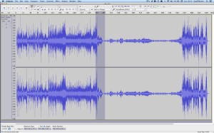
Screenshot of a a piece of music by the Ahn Trio.
Figure 1: Screenshot of the waveform representation of the Concerto for Piano Trio and Percussion, performed by the Ahn Trio. Note how big the difference is between the peaks and the quiet sections.

The portion of this piece that I’ve highlighted in Figure 1 (the gray section in the middle) has a peak at about 1 dB below full scale, and, at the end gets down to about -46 dB below that. (You might note that there is a higher peak earlier in the piece – but we don’t need to worry about that.) So, that little portion of the music has a dynamic range of about 45 dB or so – if we’re just dumbly looking at the plot.

So, this means that we want to have a recording system and a playback system for this piece of music that has can handle a signal as loud as that peak without distorting it – but has a constant noise floor that is quiet enough that I won’t hear it at the end of that piano note decaying at the end of that little section I’ve highlighted.

What we’re really talking about here is more accurately called the dynamic range of the system (and the recording). We’re only temporarily interested in the Signal to Noise ratio, since the actual signal (the music) has a constantly varying level. What’s more useful is to talk about the dynamic range – the difference  (in dB) between the constant noise of the system (or the recording) and the maximum peak it can produce. However, we’ll come back to that later.

The second problem is that the noise floor caused by TPDF dither is white noise, which means that you have equal energy per Hertz as we’ve seen before. We can also reasonably safely assume that the signal is music which usually consists of a subset of all frequencies at any moment in time (if it had all frequencies present, it would sound like noise of some colour instead of Beethoven or Bieber), that are probably weighted like pink noise – with less and less energy in the high frequencies.

In a worst-case situation, you have one note being played by one instrument and you’re hoping that that one note is going to mask (or “drown out”) the noise of the system that is spread across a very wide frequency range.

For example, let’s look again at the decay of that piano note in the example in Figure 1. That’s one note on a piano, dropping down to about -40-something dB FS, with a small collection of frequencies (the fundamental frequency of the pitch and its multiples), and you’re hoping that this “signal” is going to be able to mask white noise that stretches in frequency band from something below 20 Hz all the way up past 20 kHz. This is worrisome, at best.

In other words, it would be easy for a signal to mask a noise if the signal and the noise had the same bandwidth. However, if the signal has a very small bandwidth and the noise has a very wide bandwidth, then it is almost impossible for the signal to mask the noise.

In other words, the end of the decay of one note on a piano is not going to be able to cover up hiss at 5 kHz because there is no content at 5 kHz from the piano note to do the covering up.

So, what this means is that you want a system (either a recording or a piece of audio gear) where, if you set the volume such that the peak level is as loud as you want it to be, the noise floor of the recording and the playback system is inaudible at the listening position. (We’ll come back to this point at the end.) This is because the hope that the signal will mask the noise is just that – hope. Unless you listen to “music” that has no dynamic range and is constantly an extremely wide bandwidth, then I’m afraid that you may be disappointed.

One more thing…

There is another assumption that gets us into trouble here – and that is the one I implied earlier which says that all of my audio gear has a flat magnitude response. (I implied it by saying that we can assume that the noise that we get is white.)

Let’s look at the magnitude response of a pair of earbud headphones that millions and millions of people own. I borrowed this plot from this site – but I’m not telling you which earbuds they are – but I will say that they’re white. It’s the top plot in Figure 2.
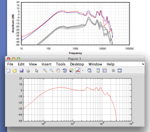
Top plot: The frequency response of a pair of earbud headphones. Bottom plot: The magnitude response of a filter I made to "copy" the response.
Fig 2: Top plot: The magnitude response of a pair of earbud headphones. Bottom plot: The magnitude response of a filter I made to mimic the response. It’s not perfect – but it’s close enough for the arguments I’m making here.

This magnitude response is a “weighting” that is applied to everything that gets into the listener’s ears (assuming that you trust the measurement itself). As you can see if you put in a signal that consists of a 20 Hz tone and a 200 Hz tone that are equal in level, then you’ll hear the 200 Hz tone about 40 dB louder than the 20 Hz tone. Remember that this is what happens not only to the signal you’re listening to, but also the noise of the system and the recording – and it has an effect.

For example, if we measure a 16-bit linear PCM digital system with TPDF dithering, we’ll see that it has a 93.3 dB dynamic range. This means that the RMS level of a sine wave (or another signal) that is just below clipping the system (so it’s as loud as you can get before you start distorting) is 93.3 dB louder than the white noise noise floor (yes, the repetition is intentional – read it again). However, that is the dynamic range if the system has a magnitude response that is +/- 0 dB from 0 Hz to half the sampling rate.

If, however, you measured the dynamic range through those headphones I’m talking about in Figure 2, then things change. This is because the magnitude response of the headphones has an effect on both the signal and the noise. For example, if the signal you used to measure the maximum capabilities of the system were a 3 kHz sine tone, then the dynamic range of the system would improve to about 99 dB. (I measured this using the filter I made to “fake” the magnitude response – it’s shown in the bottom of Figure 2.)

Remember that, with a flat magnitude response, the dynamic range of the 16-bit system is about 93 dB. By filtering everything with a weird filter, however, that dynamic range changes to 99 dB IF THE SIGNAL WE USE TO MEASURE THE SYSTEM IS a 3 kHz SINE TONE.

The problem now is that the dynamic range of the system is dependent on the spectrum of the signal we use to measure the peak level with – which will also be true when we consider the signal to noise ratio of the same system. Since the spectrum of the music AND the dither noise are both filtered by something that isn’t flat, the SNR of the system is dependent on the frequency content of the music and how that relates to the magnitude response of the system.

For example, if we measured the dynamic range of the system shown above using sine tones at different frequencies as our measurement signal, we would get the values shown in Figure 3
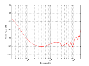
The dynamic range of a 16-bit TPDF system, if the measurement is done relative to a sine wave.
Fig 3: The dynamic range of a 16-bit TPDF system that includes the filter shown in the bottom of Figure 2, if the measurement is done relative to a sine wave with a frequency shown in the x-axis.

If you’re looking not-very-carefully-at-all at the curve in Figure 3, you’ll probably notice that it’s basically the curve on the bottom of Figure 2, upside down. This makes sense, since, generally, the filter will attenuate the total power of the noise floor, and the signal used to make the dynamic range measurement is a sine wave whose level is dependent on the magnitude response. What this means is that, if your system is “weak” at one frequency band, then the signal to noise ratio of the system when the signal consists of energy in the “weak” band will be worse than in other bands.

Another way to state this is: if you own a pair of those white earbuds, and you listen to music that only has bass in it (say, the opening of this tune) you might have to turn up the level so much to hear the bass that you’ll hear the noise floor in the high end.

Wrapping up

As I said at the beginning, some people say “more bits are better, so you should buy all your music again with 24-bit versions of your 16-bit collection”. Some other people say “24-bits is a silly waste of money for everyone”.

What’s the truth? Probably neither of these. Let’s take a couple of examples to show that everyone’s wrong.

Case 1: You listen to music with dynamic range and you have a good pair of loudspeakers that can deliver a reasonably high peak SPL level. You turn up the volume so that the peak reaches, say, 110 dB SPL (this is loud for a peak, but if it only happens now and again, it’s not that scary). If your recording is a 16-bit recording, then the noise floor is 93 dB below that,  so you have a wide-band noise floor of 17 dB SPL which is easily audible in a quiet room. This is true even when the acoustic noise floor of the room is something like 30 dB SPL or so, since the dither noise from the  loudspeaker has a white noise characteristic, whereas acoustic background noise in “real life” is usually pink in spectrum. So, you might indeed hear the high-frequency hiss. (Note that this is even more true if you have a playback system with active loudspeakers that protect themselves from high peaks – they’ll reduce the levels of the peaks, potentially causing you to push up the volume knob even more, which brings the noise floor up with it.)
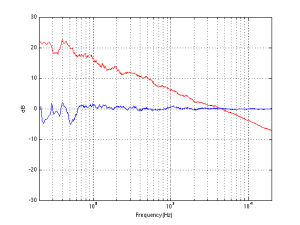
The FFT's of a white noise sample (the blue curve) and a pink noise sample (the red curve), both of which have the same total RMS level.
Fig 4: The FFT’s of a white noise sample (the blue curve) and a pink noise sample (the red curve), both of which have the same total RMS level.

Case 2: You have a system with a less-than-flat magnitude response (i.e. a bass roll-off) and you are listening to music that only has content in that frequency range (i.e. the bass), so you turn up the volume to hear it. You could easily hear the high-frequency noise content in the dither if that high frequency is emphasised by the playback system.

Case 3: You’re listening to your tunes that have no dynamic range (because you like that kind of music) over leaky headphones while you’re at the grocery store shopping for eggs. In this case, the noise floor of the system will very likely be completely inaudible due to the making by the “music” and the background noise of announcements of this week’s specials.

The Answer

So, hopefully I’ve shown that there is no answer to this question. At least, there is no one-size-fits-all answer. For some people, in some situations, 16 bits are not enough. There are other situations where 16 bits is plenty. The weird thing that I hope that I’ve demonstrated is that the people who MIGHT benefit from higher resolution are not necessarily those with the best gear. In fact, in some cases, it’s people with worse gear that benefit the most…

… but Abraham Lincoln was definitely right. Stick with that piece of advice and you’ll be fine.

Appendix 1: Noise shaping

One of the arguments against 24-bit recordings is that a noise-shaped 16-bit recording is just as good in the midrange. This is true, but there are times when noise shaping causes playback equipment some headaches, since it tends to push a lot of energy up into the high frequency band where we might be able to hear it (at least that’s the theory). The problem is that the audio gear is still trying to play that “signal”, so if you have a system that has issues, for example, with Intermodulation Distortion (IMD) with high-frequency content (like a cheap tweeter, as only one example) then that high-frequency noise may cause signals to “fold down” into audible bands within the playback gear. So noise shaping isn’t everything it’s cracked up to be in some cases.

B&O Tech: Where great sound starts

#25 in a series of articles about the technology behind Bang & Olufsen loudspeakers


You’ve bought your loudspeakers, you’ve connected your player, your listening chair is in exactly the right place. You sit down, put on a new recording, and you don’t like how it sounds. So, the first question is “who can I blame!?”

Of course, you can blame your loudspeakers (or at least, the people that made them). You could blame the acoustical behaviour of your listening room (that could be expensive). You could blame the format that you chose when you bought the recording (was it 128 kbps MP3 or a CD?). Or, if you’re one of those kinds of people, you could blame the quality of the AC mains cable that provides the last meter of electrical current supply to your amplifier from the hydroelectric dam 3000 km away Or you could blame the people who made the recording.

In fact, if the recording quality is poor (whatever that might mean) then you can stop worrying about your loudspeakers and your room and everything else – they are not the weakest link in the chain.

So, this week, we’ll talk about who those people are that made your recording, how they did it, and what each of them was supposed to look after before someone put a CD on a shelf (or, if you’re a little more current, put a file on a website).


Recording Engineer

The recording engineer is the person you picture of when you think about a recording session. You have the musicians in the studio or the concert hall, singing and playing music. That sound travels to microphones that were set up by a Recording Engineer who then sits behind a mixing console (if you’re American – a “mixing desk” if you’re British) and fiddles with knobs obsessively.

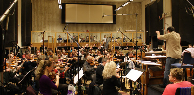
Fig 1. A recording engineer (the gentleman on the right) engineering a recording. This is actually probably a staged shot – but it could easily have been taken either during the tracking or mixing part of the process.

There’s a small detail here that we should not overlook. Generally speaking, a “recording engineer” has to do two things that happen at different times in the process of making a recording. The first is called “tracking” and the second is called “mixing”.


Tracking

Normally, bands don’t like playing together – sometimes because they don’t even like to be in the same room as each other.  Sometimes schedules just don’t work out. Sometimes the orchestra and the soloist can’t be in the same city at the same time.

In order to circumvent this problem, the musicians are recorded separately in a process called “tracking”. During tracking, each musician plays their part, with or without other members of the band or ensemble. For example, if you’re a rock band, the bass and the drummer usually arrive first, and they play their parts. In the old days, they would have been recorded to seaport tracks on a very wide (2″!) magnetic tape (hence the term “tracking”) where each instrument is recorded on a separate track. That way, the engineer has a separate recording of the kick drum and the snare drum and each tom-tom and each cymbal, and so on and so on. Nowadays, most people don’t record to magnetic tape because it’s too expensive. Instead, the tracks are recorded on a hard disc on a computer. However, the process is basically the same.

Once the bass player and the drummer are done, then the guitarist comes into the studio to record his or her parts while listening to the previously-recorded bass and drum parts over a pair of headphones. Then the singer comes in and listens to the bass, drums and guitar and sings along. Then the backup vocalists come in, and so on and so on, until everyone has recorded their part.

During the tracking, the recording engineer sets up and positions the microphones to get the optimal sound for each instrument. He or she will make sure that the gain that is applied to each of those microphones is correct – meaning that it’s recorded at a level that is high enough be mask the noise floor of the electronics and the recording medium, but not so high that it distorts. In the old days, this was difficult because the dynamic range of the recording system was quite small – so they had to stay quite close to the ceiling all the time – sometimes hitting it. Nowadays, it’s much easier, since the signal paths have much wider dynamic ranges so there’s more room for error.


In the case of a classical recording, it might be a little different for the musicians, but the technical side is essentially the same. For example, an orchestra will play (so you don’t bring in the trombone section first – everyone plays together) with a lot of microphones in the room. Each microphone will be recorded on its own individual track, just like with the rock band. The only difference is that everyone is playing at the same time.

Fig 2. A typical orchestra recording session. Note that all the musicians are there, and there are a lot of microphones in the room. Each of those microphones is probably being recorded on its own independent track on a hard disc somewhere so that they can be mixed together later.


Once all the tracking is done the musicians are finished. They’ve all been captured, each on their own track that can be played back later in isolation (for example, you can listen to just the snare drum, or just the microphone above the woodwind section). Sometimes, they will even have played or sung their part more than once – so we have different versions or “takes” to choose from later. This means that there may be hundreds of tracks that all need to be mixed together (or perhaps just left out…) in order to make something that normal people can play on their stereo.


Mixing

Now that all the individual tracks are recorded, they have to be combined into a pretty package that can be easily delivered to the customers. This means that all of those individual tracks that have been recorded have to be assembled or “mixed” together into a version that has, say, only two channels – one for the left loudspeaker and one for the right loudspeaker. This is done by feeding each individual track to its own input on a mixing console and listening to them individually to see how they best fit together. This is called the “mixing” process. During this stage, basic decisions are made like “how loud should the vocals be relative to the guitars (and everything else)”. However, it’s a little more detailed than that. Each track will need its own processing or correction (maybe changing the equalisation on the snare drum – or altering the attack and decay of the bass guitar using a dynamic range compressor – or the level of the vocal recording is changed throughout the tune to compensate for the fact that the singer couldn’t stay the same distance from the microphone whilst singing…) that helps it to better fit into the final mix.

Fig 3. A mixing console that has been labelled with the various tracks for the input strips. This is a very typical look for a console during a mixing session – although the surroundings are not.


If you walk into the control room of a recording studio during a mixing session, you’d see that it looks almost exactly like a recording session – except that there are no musicians playing in the studio. This is because what you usually see on videos like this one is a tracking session – but the recording engineer usually does a “rough mix” during tracking – just to get a preliminary idea of how the puzzle will fit together during mixing.

Once the mixing session for the tune is finished, then you have a nearly-finished product. You at least have something that the musicians can take home to have a listen to see if they’re satisfied with the overall product so far.


Editing

In classical music there is an extra step that happens here. As I said above, with classical recordings, it’s not unusual for all the musicians to play in the same room at the same time when the tracking is happening. However, it is unusual that they are able to play all the way through the piece without making any mistakes or having some small issues that they want to fix. So, usually, in a classical recording, the musicians will play through the piece (or the movement) all the way through 2 or 3 times. While that happens, a Recording Producer is sitting in the control room, listening and making notes on a copy of the score. Each time there is a mistake, the producer makes a note of it – usually with a red make indicating the Take Number in which the mistake was made. If, after 2 or 3 full takes of the piece, there are points in the piece that have not been played correctly, then they go back and fix small bits. The ensemble will be asked to play, say 5 bars leading up to the point that needs fixing – and to continue playing for another 5 bars or so.

Later, those different takes (either full recordings, or bits and pieces) will be cut and spliced together in a process called editing. In the old days, this was done using a razor blade to cut the magnetic tape and stick it back together. For example, if you listen to some of Glen Gould’s recordings, you can hear the piano playing along, but the tape hiss changes suddenly in the background noise. This is the result of a splice between two different recordings – probably made on different days or with different brands of tape. Nowadays, the “splicing” is done on a computer where you fade out of one take and fade into another gradually over 10 ms or so.

Fig 4. A “crossfade” on a modern digital audio workstation. The edit point (what used to be a “tape splice”) is where the recording on the top right is faded out and a different recording (bottom right) of the same music is faded in.


If the editing was perfect, then you’ll never hear that it happened. Sometimes, however, it’s possible to hear the splice. For example, listen to this recording and  listen to the overall level and general timbre of the piano. It changes to a quieter, duller sound from about 0′ 27″ to about 0´ 31″. This is a rather obvious tape splice to a different recording than the rest of the track.


Mastering Engineer

The final stage of creating a recording is performed by a Mastering Engineer in a mastering studio. This person gets the (theoretically…) “finished” product and makes it better. He or she will sit in a room that has very little gear in it, listening to the mixed song to hear if there are any small things that need fixing. For example, perhaps the overall timbre of the tune needs a little brightening or some control of the dynamic range.

Another basic role of the mastering engineer is to make sure that all of the tracks on a single album sound about the same level – since you don’t want people sitting at home fiddling with the volume knob from tune to tune.

When the mastering engineer is done, and the various other people have approved the final product, then the recording is finished. All that is left to do is to send the master to a plant to be pressed as a CD – or uploaded to the iTunes server – or whatever.


Fig 5. A mastering engineer sitting at a mastering console. Notice that, unlike a mixing console, a mastering console does not have a massive number of faders and knobs because it doesn’t have a lot of inputs. Also note that the mastering engineer looks better rested and more cleanly shaven than the recording engineer (above) because he doesn’t have to talk to musicians every day at work. Okay, okay, I’m joking… sort of…


In other words the Mastering Engineer is the last person to make decisions about how a recording should sound before you get it.

This is why, when I’m talking to visitors, I say that our goal at Bang & Olufsen is to build loudspeakers that perform so that you, in your listening room, hear what the mastering engineer heard – because the ultimate reference of how the recording should sound is what it sounded like in the mastering studio.


Appendicies

What’s a producer?

The title of Recording Producer means different things for different projects. Sometimes, it’s the person with the money who hires everyone for the recording.

Sometimes (usually in a pop recording) it’s the person sitting in the control room next to the recording engineer who helps the band with the arrangement – suggesting where to put a guitar solo or where to add backup vocals. Some pop producers will even do good ol’ fashioned music arrangements.

A producer for a classical recording usually acts as an extra set of ears for the musicians through the recording process. This person will also sit with the recording engineer in the control room, following the score to ensure that all sections of the piece have been captured to the satisfaction of the performers. He or she may also make suggestions about overall musical issues like tempi, phrasing, interpretation and so on.


But what about film?

The basic procedure for film mixing is the same – however, the “mixing engineer” in a film world is called a “re-recording engineer”. The work is similar, but the name is changed.


So that’s a “Tonmeister”?

A tonmeister is a person who can act simultaneously as a Recording Engineer and a Recording Producer. It’s a person who has been trained to be equally competent in issues about music (typically, tonmeisters are also musicians), acoustics, electronics, as well as recording and studio techniques.


B&O Tech: Visual Analogies to Problems in Audio

#23 in a series of articles about the technology behind Bang & Olufsen loudspeakers


Audio people throw words around like “frequency” and “distortion” and “resolution” and “” without wondering whether anyone else in the room (a) understands or (b) cares. One of the best ways to explain things to people who do not understand but do care is to use analogies and metaphors. So, this week, I’d like to give some visual analogies of common problems in audio.


Let’s start with a photograph. Assuming that your computer monitor is identical to mine, and the background light in your room is exactly the same as it is in mine, then you’re seeing what I’m seeing when you look at this photo.

original

Let’s say that you, sitting there, looking at this photo is analogous to you, sitting there, listening to a recording on a pair of loudspeakers or over headphones. So what happens when something in the signal path messes up the signal?


Perhaps, for example, you have a limited range in your system. That could mean that you can’t play the very low and/or high frequencies because you are listening through a smaller set of loudspeakers instead of a full-range model. Limiting the range of brightness levels in the photo is similar to this problem – so nothing is really deep black or bright white. (We could have an argument about whether this is an analogy to a limited dynamic range in an audio system, but I would argue that it isn’t – since audio dynamic range is limited by a noise floor and a clipping level, which we’ll do later…) So, the photo below “sounds” like an audio system with a limited range:

limited_range

Of course, almost everything is there – sort of – but it doesn’t have the same depth or sparkle as the original photo.


Or what if you have a noisy device in your signal chain For example, maybe you’re listening to a copy of the recording on a cassette tape – or the air conditioning is on in your listening room. Then the result will “sound” like this:

noise

As you can see, you still have the original recording – but there is an added layer of noise with it. This is not only distracting, but it can obscure some of the more subtle details that are on the same order of magnitude as the noise itself.


In audio, the quietest music is buried in the noise of the system (either the playback system or the recording system). On the other extreme is the loud music, which can only go so loud before it “clips” – meaning that the peaks get chopped off because the system just can’t go up enough. In other words, the poor little woofer wants to move out of the loudspeaker by 10 mm, but it can only move 4 mm because the rubber holding on to it just can’t stretch any further. In a photo, this is the same as turning up the brightness too much, resulting in too many things just turning white because they can’t get brighter (in the old days of film, this was called “blowing out” the photo), as is shown below.

clipping


This “clipping” of the signal is what many people mean when they say “distorted” – however, distortion is a much broader range of problems then just clipping. To be really pedantic, any time the output of a system is not identical to its input, then the signal is distorted.


A more common problem that many people face is a modification of the frequency response. In audio, the frequency is (very generally speaking) the musical pitch of the notes you’re hearing. Low notes are low frequencies, high notes are high frequencies. Large engines emit low frequencies, tiny bells emit high frequencies. With light, the frequency of the light wavicle hitting your eyeball determines the colour that you see. Red is a low frequency and violet is a high frequency (see the table on this page for details). So, if you have a pair of headphones that, say, emphasises bass (the low frequencies) more than the other areas, then it’s the same as making the photo more red, as shown below.

freq_response


Of course, not all impairments to the audio signal are accidental. Some are the fault of the user who makes a conscious decision to be more concerned with convenience (i.e. how many songs you can fit on your portable player) than audio quality. When you choose to convert your CD’s to a “lossy” format (like MP3, for example), then (as suggested by the description) you’re losing something. In theory, you are losing things that aren’t important (in other words, your computer thinks that you can’t hear what’s thrown away, so you won’t miss it). However, in practice, that debate is up to you and your computer (and your bitrate, and the codec you’ve chosen, and the quality of the rest of your system, and how you listen to music, and what kind of music you’re listening to, and whether or not there are other things to listen to at the same time, and a bunch of other things…) However, if we’re going to make an analogy, then we have to throw away the details in our photo, keeping enough information to be moderately recognisable.

limited_res

As you can see, all the colours are still there. And, if you stand far enough away (or if you take off your glasses) it might just look the same. But, if you look carefully enough, then you might notice that something is missing… Keep looking… you’ll see it…


So, as you can see, any impairment of the “signal” is a disruption of its quality – but we should be careful not to confuse this with reality. There are lots of people out there who have a kind of weird religious belief that, when you sit and listen to a recording of an orchestra, you should be magically transported to a concert hall as if you were there (or as if the orchestra were sitting in your listening room). This is silly. That’s like saying when you sit and watch a re-run of Friends on your television, you should feel like you’re actually in the apartment in New York with a bunch of beautiful people. Or, when you watch a movie, you feel like you’re actually in a car chase or a laser battle in space. Music recordings are no more of a “virtual reality” experience than a television show or a film. In all of these cases (the music recording, the TV episode and the film), what you’re hearing and seeing should not be life-like – they should be better than life. You never have to wait for the people in a film to look for a parking space or go out to pee. Similarly, you never hear a mistake in the trumpet solo in a recording of  Berlin Philharmonic and you always hear Justin Bieber singing in tune. Even the spatial aspects of an “audiophile” classical recording are better-than-reality. If you sit in a concert hall, you can either be close (and hear the musicians much louder than the reverberation) or far (and hear much more of the reverberation). In a recording, you are sitting both near and far – so you have the presence of the musicians and the spaciousness of the reverb at the same time. Better than real life!

So, what you’re listening to is a story. A recording engineer attended a music performance, and that person is now recounting the story of what happened in his or her own style. If it’s a good recording engineer, then the storytelling is better than being there – it’s more than just a “police report” of a series of events.

To illustrate my point, below is a photo of what that sinking WWII bunker actually looked like when I took the photo that I’ve been messing with.

reality


Of course, you can argue that this is a “better” photo than the one at the top – that’s a matter of your taste versus mine. Maybe you prefer the sound of an orchestra done recorded with only two microphones played through two loudspeakers. Maybe you prefer the sound of the same orchestra recorded with lots of microphones played through a surround system. Maybe you like listening to singers who can sing. Maybe you like listening to singers who need auto tuners to clean up the mess. This is just personal taste. But at least you should be choosing to hear (or see) what the artist intended – not a modified version of it.

This means that the goal of a sound system is to deliver, in your listening room, the same sound as the recording engineer heard in the studio when he or she did the recording. Just like the photos you are looking at on the top of this page should look exactly the same as what I see when I see the same photo.


High-res audio codes: What’s what?

Back in the “old days”, people used to take a look at a three-letter code on CD packaging that indicated the domain used for the Recording, Mastering, and Distribution media. Usually, you saw things like “DDD” (meaning “Digital, Digital, Digital”) or “ADD” (for an Analogue recording that was mastered and distributed in the Digital domain).

Nowadays, there’s plenty of discussion about “high-resolution” audio – but one of things that nobody has seemed to agree on is exactly what is “high” and what is “normal” resolution (although I, personally, would also include George Massenburg’s call for a “Vile-Resolution” classification as well).

Well, finally, important people have gotten together to agree on how high is enough to be called “high”  – and how to tell consumers about it. The details can be found here: Link.

Some details from that page are below

The descriptors for the Master Quality Recording categories are as follows:

MQ-P
From a PCM master source 48 kHz/20 bit or higher; (typically 96/24 or 192/24 content)

MQ-A
From an analog master source

MQ-C
From a CD master source (44.1 kHz/16 bit content)

MQ-D
From a DSD/DSF master source (typically 2.8 or 5.6 MHz content)

B&O Tech: What is “Loudness”?

#21 in a series of articles about the technology behind Bang & Olufsen loudspeakers

Part 1: Equal Loudness Contours

Let’s start with some depressing news: You can’t trust your ears. Sorry, but none of us can.

There are lots of reasons for this, and the statement is actually far more wide-reaching than any of us would like to admit. However, in this article, we’re going to look at one small aspect of the statement, and what we might be able to do to get around the problem.

We’ll begin with a thought experiment (although, for some of you, this may be an experiment that you have actually done). Imagine that you go into the quietest room that you’ve ever been in, and you are given a button to press and a pair of headphones to put on. Then you sit and wait for a while until you calm down and your ears settle in to the silence… While that’s happening you read the instructions of the task with which you are presented:

Whenever you hear a tone in the headphones in either one of your ears, please press the button.

Simple! Hear a beep, press the button. What could be more difficult to do than that?

Then, the test begins: you hear a beep in your left ear and you press the button. You hear another, quieter beep and you press the button again. You hear an even quieter beep and you press the button. You hear nothing, and you don’t press the button. You hear a beep and you press the button. Then you hear a beep at a lower frequency and so on and so on. This goes on and on at different levels, at different frequencies, in your two ears, until someone comes in the room and says “thank you, that will be all”.

While this test seems like it would be pretty easy to do, it’s a little unnerving. This is because the room that you’re sitting in is so quiet and the beeps are also so quiet that, sometimes you think you hear a beep – but you’re not sure, because things like the sound of your heartbeat, and your breathing, and the “swooshing” of blood in your body, and that faint ringing in your ears, and the noise you made by shifting in your chair are all, relatively speaking VERY loud compared to the beeps that you’re trying to detect.

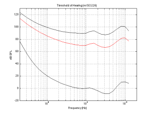
Anyways, when you’re done, you’ll might be presented with a graph that shows something called your “threshold of hearing”. This is a map of how loud a particular frequency has to be in order for you to hear it. The first thing that you’ll notice is that you are less sensitive to some frequencies than others. Specifically, a very low frequency or a very high frequency has to be much louder for you to hear it than if you’re listening to a mid-range frequency. (There are evolutionary reasons for this that we’ll discuss at the end.) Take a look at the bottom curve on Figure 1, below:

The threshold of hearing (bottom curve) and the Equal Loudness contours for 70 phons (red curve) and 90 phons (top curve) according to ISO226.
Fig 1: The threshold of hearing (bottom curve) and the Equal Loudness contours for 70 phons (red curve) and 90 phons (top curve) according to ISO226.

The bottom curve on this plot shows a typical result for a threshold of hearing test for a person with average hearing and no serious impairments or temporary issues (like wax build-up in the ear canal).  What you can see there is that, for a 1 kHz tone, your threshold of hearing is 0 dB SPL (in fact, this is how 0 dB SPL is defined…) As you go lower in frequency from there, you will have to turn up the actual signal level just in order for you to hear it. So, for example, you would need to have approximately 60 dB SPL at 30 Hz in order to be able to detect that something is coming out of your headphones or loudspeakers. Similarly, you would need something like 10 dB SPL at 10 kHz in order to hear it. However, at 3.5 kHz, you can hear tones that are quieter than 0 dB SPL! It stands to reason, then, that a 30 Hz tone at 60 dB SPL and a 1 kHz tone at 0 dB SPL and a 3.5 kHz tone at about -10 dB SPL and a 10 kHz tone at about 10 dB SPL would all appear to have the same loudness level (since they are all just audible).

Let’s now re-do the test, but we’ll change the instructions slightly. I’ll give you a volume knob instead of a button and I’ll play two tones at different frequencies. The volume knob only changes the level of one of the two tones, and your task is to make the two tones the same apparent level. If you do this over and over for different frequencies, and you plot the results, you might wind up with something like the red or the top curves in Fig 1. These are called “Equal Loudness Contours” (some people call them “Fletcher-Munson Curves because the first two researchers to talk about them were Fletcher and Munson) because they show how loud different frequencies have to be in order for you to think that they have the same loudness. So, (looking at the red curve) a 40 Hz tone at 100 dB SPL sounds like it’s the same loudness as a 1 kHz tone at 70 dB SPL or a 7.5 kHz tone at 80 dB SPL. The loudness level that you think you’re hearing is measured in “phons” – and the phon value of the curve is its value in dB SPL at 1 kHz. For example, the red curve crosses the 1 kHz line at 70 dB SPL, so it’s   the “70 phon” curve. Any tone that has an actual level in dB SPL that corresponds to a point on that red line will have an apparent loudness of 70 phons. The top curve is for the 90 phons.

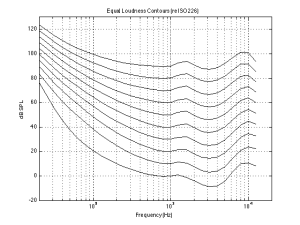
Figure 2 shows the Equal Loudness Contours from 0 phons (the Threshold of Hearing) to 90 phons in steps of 10 phons.

Fig 2: The Equal Loudness contours for 0 phons (bottom curve) to 90 phons (top curve) in 10 phone increments, according to ISO226.
Fig 2: The Equal Loudness contours for 0 phons (bottom curve) to 90 phons (top curve) in 10 phon increments, according to ISO226.

There are two important things to notice about these curves. The first is that they are not “flat”. In other words, your ears do not have a flat frequency response. In fact, if you were measured the same way we measure microphones or loudspeakers, you’d have a frequency response specification that looked something like “20 Hz – 15 kHz ±30 dB” or so… This isn’t something to worry about, because we all have the same problem. So, this means that the orchestra conductor asked the bass section to play louder because he’s bad at hearing low frequencies, and the recording engineer balancing the recording adjusted the bass-to-midrange-to-treble relative levels using his bad hearing, and, assuming that the recording system and your playback system are reasonably flat-ish, then hopefully, your hearing is identically bad to the conductor and recording engineer, so you hear what they want you to.

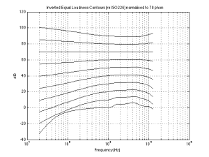
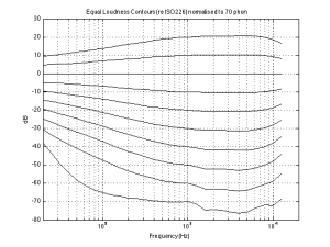
However, I said that there are two things to notice – that was just the first thing. The second thing is that the curves are different at different levels. For example, if you look at the 0 phon curve (the bottom one) you’ll see that it raises a lot more in the low frequency region than, say, the 90 phon curve (the top one) relative to their mid-range values. This means that, the quieter the signal, the worse your ability to hear bass (and treble). For example, let’s take the curves and assume that the 70 phon line is our reference – so we’ll make that one flat, and adjust all of the others accordingly and plot them so we can see their difference. That’s shown in Figure 3.

Fig 3: The Equal Loudness contours for 0 phons (bottom curve) to 90 phons (top curve) in 10 phone increments, according to ISO226. These have all been normalised to the 70 phone curve and subsequently inverted.
Fig 3: The Equal Loudness contours for 0 phons (bottom curve) to 90 phons (top curve) in 10 phon increments, according to ISO226. These have all been normalised to the 70 phon curve and subsequently inverted.

What does Figure 3 show us, exactly? Well, one way to think of it is to go back to our “recording engineer vs. you” example. Let’s say that the recording engineer that did the recording set the volume knob in the recording studio so that (s)he was hearing the orchestra with a loudness at the 70 phon line. On other words, if the orchestra was playing a 1 kHz sine tone, then the level of the signal was 70 dB SPL at the listening position – and all other frequencies were balanced by the conductor and the engineer to appear to sound the same level as that. Then you take the recording home and set the volume so that you’re hearing things at the 30 phon level (because you’re having a dinner party and you want to hear the conversation more than you want to hear Beethoven or Justin Bieber, depending on your taste or lack thereof). Look at the curve that intersects the -40 dB line at 1 kHz (the 4th one from the bottom) in Figure 3. This shows you your sensitivity difference relative to the recording engineer’s in this example. The curve slopes downwards – meaning that you can’t hear bass as well – so, your recording playing in the background will appear to have a lot less bass and a little less treble than what the recording engineer heard – just because you turned down the volume. (Of course, this may be a good thing, since you’re having dinner and you probably don’t want to be distracted from the conversation by thumpy bass and sparkly high frequencies.)

Part 2: Compensation

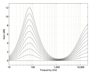
In order to counter-act this “misbehaviour” in your hearing, we have to change the balance of the frequency bands in the opposite direction to what your ears are doing. So if we just take the curves in Figure 3 and flip each of them upside down, you have a “perfect” correction curve showing that, when you turn down the volume by, say 40 dB (hint: look at the value at 1 kHz) then you’ll need to turn up the low end by lots to compensate and make the overall balance sound the same.

Fig 3: The Equal Loudness contours for 0 phons (bottom curve) to 90 phons (top curve) in 10 phon increments, according to ISO226. These have all been normalised to the 70 phon curve.
Fig 4: The Equal Loudness contours for 0 phons (bottom curve) to 90 phons (top curve) in 10 phon increments, according to ISO226. These have all been normalised to the 70 phon curve.

Of course, these curves shown in Figure 4 are normalised to one specific curve – in this case, the 70 phon curve. So, if your recording engineer was monitoring at another level (say, 80 phons) then your “perfect” correction curves will be wrong.

And, since there’s no telling (at least with music recordings) what level the recording and mastering engineers used to make the recording that you’re listening to right now (or the one you’ll hear after this one), then there’s no way of predicting what curve you should use to  do the correction for your volume setting.

All we can really say is that, generally, if you turn down the volume, you’ll have to turn up the bass and treble to compensate. The more you turn down the volume, the more you’ll have to compensate. However, the EXACT amount by which you should compensate is unknown, since you don’t know anything about the playback (or monitoring) levels when the recording was done. (This isn’t the same for movies, since re-recording engineers are supposed to work at a fixed monitoring level which should be the same as all the cinemas in the world… in theory…)

This compensation is called “loudness” – although in some cases it would be better termed “auto-loudness”. In the old days, a “loudness” switch was one that, when engaged, increased the bass and treble levels for quiet listening. (Of course, what most people did was hit the “loudness”switch and left it on forever.) Nowadays, however, this is usually automatically applied and has different amounts of boost for different volume settings (hence the “auto-” in “auto-loudness”). For example, if you look at Figure 5 you’ll see the various amounts of boost applied to the signal at different volume settings of the BeoPlay V1 / BeoVision 11 / BeoSystem 4 / BeoVision Avant when the default settings have not been changed. The lower the volume setting, the higher the boost.

Fig 5: The equalisation applied by the "Loudness" function at different volume settings in the BeoPlay V1, BeoVision 11, BeoSystem 3 and BeoVision Avant. Note that these are the default settings and are customisable by the user.
Fig 5: The equalisation applied by the “Loudness” function at different volume settings in the BeoPlay V1, BeoVision 11, BeoSystem 3 and BeoVision Avant. Note that these are the default settings and are customisable by the user.

Of course, in a perfect world, the system would know exactly what the monitoring levels was when they did the recording, and the auto-loudness equalisation would change dynamically from recording to recording. However, until there is meta-data included in the recording itself that can tell the system information like that, then there will be no way of knowing how much to add (or subtract).

Historical Note

I mentioned above that the extra sensitivity we have in the 3 kHz region is there due to evolution. In fact, it’s a natural boost applied to the signal hitting your eardrum as a result of the resonance of the ear canal. We have this boost (I guess, more accurately, we have this ear canal) because, if you snap a twig or step on some dry leaves, the noise that you hear is roughly in that frequency region. So, once-upon-a-time, when our ancestors were something else’s lunch, the ones with the ear canals and the resulting mid-frequency boost were more sensitive to the noise of a sabre-toothed tiger trying to sneak up behind them, stepping on a leaf, and had a little extra head start when they were running away. (It’s like the T-shirt that you can buy when you’re visiting Banff, Alberta says: “I don’t need to run faster than the bear. I just need to run faster than you.”)

As an interesting side note to this: the end result of this is that our language has evolved to use this sensitive area. The consonants in our speech – the “s” and”t” sounds, for example, sit right in that sensitive region to make ourselves easiest to understand.

Warning note

You might come across some youtube video or a downloadable file that let’s you “check your hearing” using a swept sine wave. Don’t bother wasting your time with this. Unless the headphones that you’re using (and everything else in the playback chain) are VERY carefully calibrated, then you can’t trust anything about such a demonstration. So don’t bother.

Warning note #2 – Post script…

I just saw on another website here that someone named John Duncan made the following comment about what I wrote in this article. “Having read it a couple of times now, tbh it feels like it is saying something important, I’m just not quite sure what. Is it that a reference volume is the most important thing in assessing hifi?” The answer to this is “Exactly!” If you compare two sound systems (say, two different loudspeakers, or two different DAC’s or two different amplifiers and so on… The moral of the stuff I talk about above is that, not only in such a comparison do you have to make sure that you only change one thing in the system (for example, don’t compare two DAC’s using a different pair of loudspeakers connected to each one) you absolutely must ensure that the two things you’re comparing are EXACTLY the same listening level. A different of 1 dB will have an effect on your “frequency response” and make the two things sound like they have different timbral balances – even when they don’t.

For example, when I’m tuning a new loudspeaker at work, I always work at the same fixed listening level. (for me, this is two channels of -20 dB FS full-band uncorrelated pink noise produces 70 dB SPL, C-weighted at the listening position). Before I start tuning, I set the level to match this so that I don’t get deceived by my own ears. If I tuned loudspeakers quieter than this, I would push up the bass to compensate. If I tuned louder, then I would reduce the bass. This gives me some consistency in my work. Of course, I check to see how the loudspeakers sound at other listening levels, but, when I’m tuning, it’s always at the same level.

High-Resolution Audio: More is not necessarily better…

I’ve been collecting some so-called “high-resolution” audio files over the past year or two (not including my good ol’ SACD’s and DVD-Audio’s that I bought back around the turn of the century… Or my old 1/4″, half-track, 30 ips tapes that I have left over from the past century. (Please do not add a comment at the bottom about vinyl… I’m not in the mood for a fight today.) Now, let’s get things straight at the outset. “High Resolution” means many things to many people. Some people say that it means “sampling rates above 44.1 kHz”. Other people say that it means “sampling rates at 88.2 kHz or higher”. Some people will say that it means 24 bits instead of 16, and sampling rate arguments are for weenies. Other people say that if it’s more than one bit, it ain’t worth playing. And so on and so on. For the purposes of this posting, let’s say that “high resolution” is a blanket marketing term that is used by people these days when they’re selling an audio file that you can download that is has a bit rate that is higher than 44.1 kHz / 16 bits or 1378.125 kbps. (You can calculate this yourself as follows: 44100 samples per second * 16 bits per sample * 2 channels / 1024 bits in a kilobit = 1378.125) I’ll also go on record (ha ha…) as saying that I would rather listen to a good recording of a good tune played by good musicians recorded at 44.1 kHz / 16 bit (or even worse!) than a bad recording (whatever that means) of a boring tune performed poorly by musicians that are encumbered neither by talent nor the interest to rehearse (or any recording that used an auto-tuner). All of that being said, I will also say that I am skeptical when someone says that something is something when they could get away with it being nothing. So, I like to check once-and-a-while to see if I’m getting what I was sold. So, I thought I might take some of my legally-acquired LPCM “high-resolution audio” files and do a quick analysis of their spectral content, just to see what’s there. In order to do this, I wrote a little MATLAB script that

  • loads one channel of my audio file
  • takes a block of 2^18 samples multiplied by a Blackman-Harris function and does an 2^18-point FFT on it
  • moves ahead 2^18 samples and repeats the previous step over and over until it gets to the end of the recording (no overlapping… but this isn’t really important for what I’m doing here…)
  • looks through all of the FFT results and take the maximum value of all FFT results for each FFT bin (think of it as a peak monitor with an infinite hold function on each frequency bin)
  • I plot the final result

So, the graphs below are the result of that process for some different tunes that I selected from my collection.

Track #1

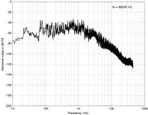
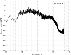
Track 1 (an 88.2/24 file) is plotted first. Not much to tell here. You can see that, starting at about 1 kHz or so, the amplitude of the signals starts falling off.  This is not surprising. If it did not do that, then we would use white noise instead of pink noise to give us a rough representation of the spectrum of music. You may notice that the levels seem quite low – the maximum level on the plot being about -40 dB FS but keep in mind that this is (partly) because, at no point in the tune, was there a sine wave that had a higher level than that. It does not mean that the peak level in the tune was -40 dB FS.

Track 1: Full spectrum

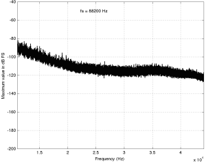
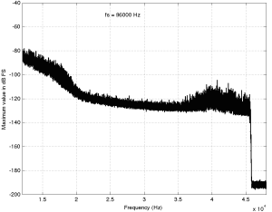
The second plot of the same tune just shows the details in the top 2 octaves of the recording. Since this is a 88.2 kHz file, then this means we’re looking at the spectrum from 11025 Hz to 44100 Hz. I’ve plotted this spectrum on a linear frequency scale so that it’s easier to see some of the details in the top end. This isn’t so important for this tune, but it will come in handy below…

Track 1: Top 2 octaves

Track #2

The full-bandwidth plot for Track #2 (another 94/24 file) is shown below.

Track 2: Full bandwidth

This one is interesting if you take a look up at the very high end of the plot – shown in detail in the figure below.

Track 2: Top 2 octaves

Here, you can see a couple of things. Firstly,  you can see that there is a rise in the noise from about 35 kHz up to about 45 kHz. This is possibly (maybe even probably) the result of some kind of noise shaping applied to the signal, which is not necessarily a bad thing, unless you have equipment that has intermodulation distortion issues in the high end that would cause energy around that region to fold back down. However, since that stuff is at least 80 dB below maximum, I certainly won’t lose any sleep over it. Secondly, you can see that there is a very steep low pass filter (probably an anti-aliasing filter) that causes the signal to drop off above about 45 kHz. Note that the boost in the energy just before the steep roll-off might be the result of a peak in the low pass filter’s response – but I doubt it. It’s more a “maybe” than a “probably”. You may also have some questions about why the noise floor above about 46 kHz seems to flatten out at about -190 dB FS. This is probably not due to content in the recording itself. This is likely “spectral leakage” from the windowing that comes along with making an FFT. I’ll talk a little about this at the end of this article.

Track #3

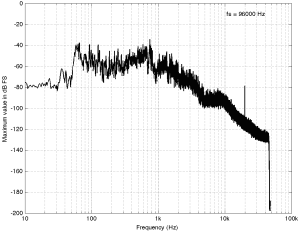
The third track on my hit list (another 94/24 file) is interesting…

Track 3: Full spectrum
Track 3: Full bandwidth

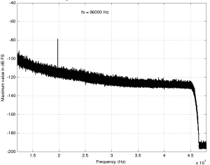
Take a look at the spike there around 20 kHz… What the heck are they doing there!? Let’s take a look at the zoom (shown below) to see if it makes more sense.

Track 3: Top 2 octaves

Okay, so zooming in more didn’t help – all we know is that there is something in this recording that is singing along at about 20 kHz at least for part of the recording (remember I’m plotting the highest value found for each FFT bin…). If you’re wondering what it might be, I asked a bunch of smart friends, and the best explanation we can come up with is that it’s noise from a switched-mode power supply that is somehow bleeding into the recording. HOW it’s bleeding into the recording is a potentially interesting question for recording engineers. One possibility is that one of the musicians was charging up a phone in the room where the microphones were – and the mic’s just picked up the noise. Another possibility is that the power supply noise is bleeding electrically into the recording chain – maybe it’s a computer power supply or the sound card and the manufacturer hasn’t thought about isolating this high frequency noise from the audio path. Or, maybe it’s something else.

Track #4

This last track is also sold as a 48 kHz, 24 bit recording. The total spectrum is shown below.

Track X: Full bandwidth
Track 4: Full bandwidth

This one is particularly interesting if we zoom in on the top end…

Track 4: Top 2 octaves

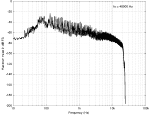
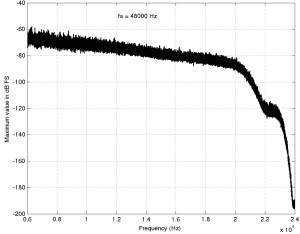
This one has an interesting change in slope as we near the top end. As you go up, you can see the knee of a low-pass filter around 20 kHz, and a second on around 23 kHz. This could be explained a couple of different ways, but one possible explanation is that it was originally a 44.1 kHz recording that was sample-rate converted to 48 kHz and sold as a higher-resolution file. The lower low-pass could be the anti-aliasing filter of the original 44.1 kHz recording. When the tune was converted to 48 kHz (assuming that it was…) there was some error (either noise or distortion) generated by the conversion process. This also had to be low-pass filtered by a second anti-aliasing filter for the new sampling rate. Of course, that’s just a guess – it might be the result of something totally different.

So what?

So what did I learn? Well, as you can see in the four examples above, just because a track is sold under the banner of “high-resolution”, it doesn’t necessarily mean that it’s better than a “normal resolution”recording. This could be because the higher resolution doesn’t actually give you more content or because it gives you content that you don’t necessarily want. Then again, it might mean that you get a nice, clean, recording that has the resolution you paid for, as in the first track. It seems that there is a bit of a gamble involved here, unfortunately. I guess that the phrase “don’t judge a book by its cover” could be updated to be “don’t judge a recording by its resolution” but it doesn’t really roll off the tongue quite so nicely, does it?

P.S.

Please do not bother asking what these four tracks are or where I bought them. I’m not telling. I’m not doing any of this to “out” anyone – I’m just saying “buyer beware”.

P.P.S

Please do not use this article as proof that high resolution recordings are a load of hooey that aren’t worth the money. That’s not what I’m trying to prove here. I’m just trying to prove that things are not always as they are advertised – but sometimes they are. Whether or not high res audio files are worth the money when they ARE the real McCoy is up to you.

Appendix

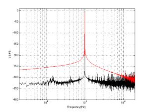
I mentioned some things above about “spectral leakage” and FFT windowing and a Blackman Harris function. Let’s do a quick run-through of what this stuff means without getting into too many details. When you do an FFT (a Fast Fourier Transform – but more correctly called a DFT or Discrete Fourier Transform in our case – but now I’m getting picky), you’re doing some math to convert a signal (like an audio recording) in the time domain into the frequency domain. For example, in the time domain, a sine wave will look like a wave, since it goes up and down in time. In the frequency domain, a sine wave will look like a single spike, because it contains only one frequency and no others. So, in a perfect world, an FFT would tell us what frequencies are contained in an audio recording. Luckily, it actually does this pretty well, but it has limitations. An FFT applied to an audio signal has a fixed number of outputs, each one corresponding to a certain frequency. The longer the FFT that you do, the more resolution you have on the frequencies (in other words, the “frequency bins” or “frequency centres” are closer together). If the signal that you were analysing only contained frequencies that were exactly the same as the frequency bins that the FFT was reporting on, then it would tell you exactly what was in the signal – limited only by the resolution of your calculator. However, if the signal contains frequencies that are different from the FFT’s frequency bins, then the energy in the signal “leaks” into the adjacent bins. This makes it look like there is a signal with a different frequency than actually exists – but it’s just a side effect of the FFT process – it’s not really there. The amount that the energy leaks into other frequency bins can be minimised by shaping the audio signal in time with a “windowing function”. There are many of these functions with different names and equations. I happened to use the Blackman Harris function because it gives a good rejection of spectral artefacts that are far from the frequency centre, and because it produces relatively similar artefact levels regardless of whether your signal is on or off the frequency bin of the FFT. For more info on this, read this.

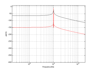
Spectral leakage of Blackman-Harris windowing function. 1000 Hz, Fs=2^18, FFT Window length = 2^18 samples. The black plot shows the magnitude response calculated using an FFT and a rectangular windowing function. The red curve is with a Blackman Harris function.
Spectral leakage of Blackman-Harris windowing function. 1000 Hz at 0 dB FS, Fs=2^16, FFT Window length = 2^16 samples. The black plot shows the magnitude response calculated using an FFT and a rectangular windowing function. The red curve is with a Blackman Harris function. Note that the spectral leakage caused by the Blackman Harris function “bleeds” energy into all other bins, resulting in apparently much higher values than in the case of the rectangular windowing function.

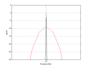
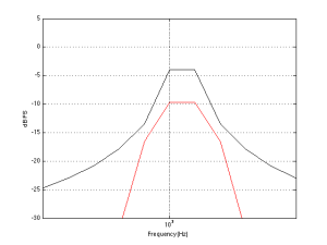
This is a detail showing the peak of the response of for the 1000 Hz tone analysis.
This is a detail showing the peak of the response of for the 1000 Hz tone analysis. Note that the apparent level of the tone windowed using the Blackman Harris function is about 9 dB lower than when it’s windowed with a rectangular function.


Spectral leakage of Blackman-Harris windowing function. 1000.5 Hz, Fs=2^18, FFT Window length = 2^18 samples. The black plot shows the magnitude response calculated using an FFT and a rectangular windowing function. The red curve is with a Blackman Harris function.
Spectral leakage of Blackman-Harris windowing function. 1000.5 Hz at 0 dB FS, Fs=2^16, FFT Window length = 2^16 samples. The black plot shows the magnitude response calculated using an FFT and a rectangular windowing function. The red curve is with a Blackman Harris function. Now, since the frequency of the signal does not fall exactly on an FFT bin, the Blackman Harris – windowed signal appears “cleaner” than the one windowed using a rectangular function.


This is a detail showing the peak of the response of for the 1000.5 Hz tone analysis.