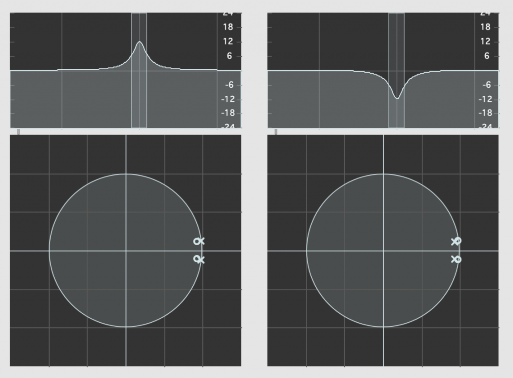
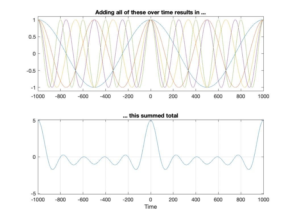
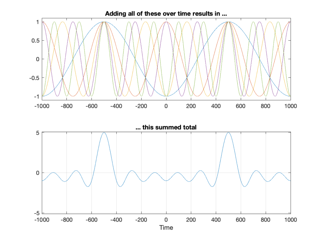
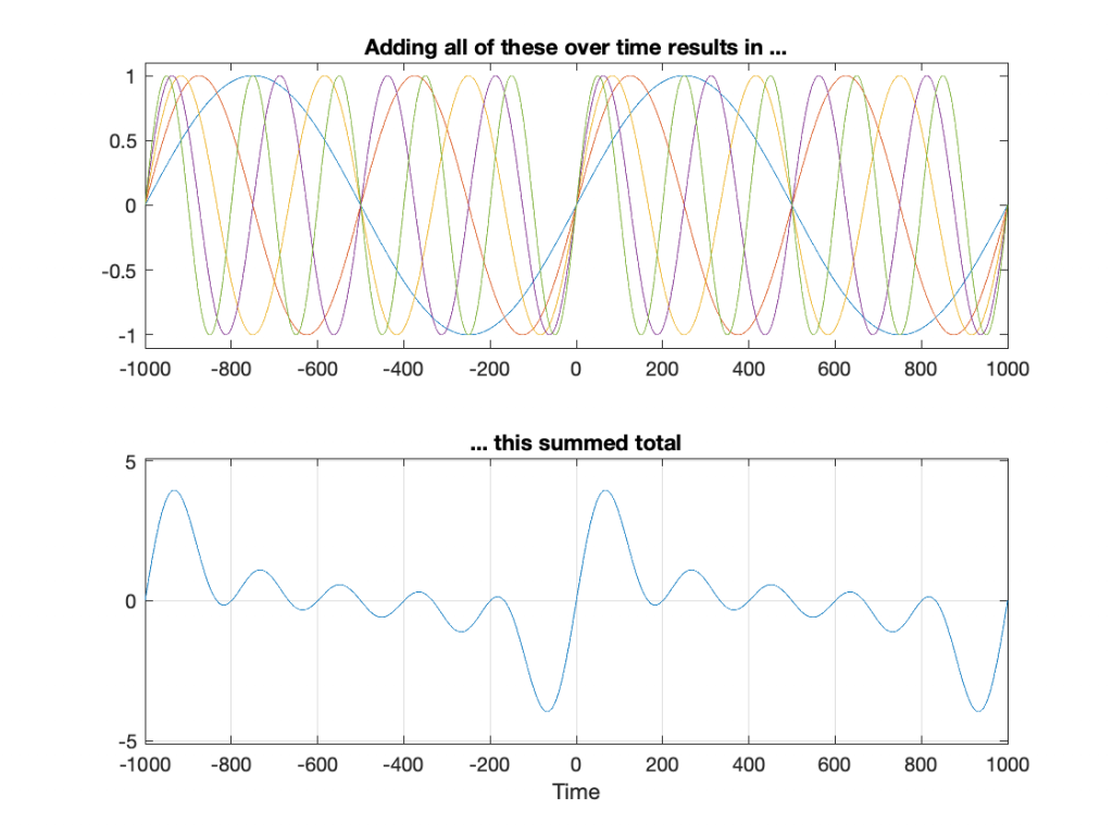
Quantisation of Poles in the Z-plane

Back in this posting, I talked about biquads and their use in digital signal processing for making linear filters (what most of us call “equalisers”). Part of that explanation showed that a biquad is formed of a feed-forward section and a feed-back section, and you could swap the order of these two and get the same results. In a “Direct Form 1” implementation, the feed-forward comes first, as shown in Figure 1.

Figure 1: A Direct Form 1 implementation of a biquad

in the “Direct Form 2” implementation, the feed-back comes first, as shown in Figure 2.

Figure2: A Direct Form 2 implementation of a biquad.

There are advantages and disadvantages to each of these implementations, depending on things like how the rest of your system is implemented, and what, exactly you’re expecting the biquad to do.

However, for this posting, we’re going to “zoom in” a bit to the feed-back portion of the above diagrams. This portion of the biquad provides the “poles” in the Z-plane, as I described in the “Intuitive Z-plane” series of postings last week.

If I separate the feed-back portion of the above figures, it would look like Figure 3:

Figure 3: A Direct Form implementation of the feed-back portion of a biquad.

The locations of the poles (and therefore the magnitude response) of this portion of the filter are dependent on the gains at the outputs of the two 1-sample delays. What happens when these gains do not have an infinite resolution (which they can’t, because everything in a digitally-represented world is quantised to a finite number of steps)?

Before we go any further with this, I have to put in a reminder that quantisation (or “rounding”) in a DSP world is done in binary – not decimal. So, the quantisation that I’m about to do isn’t the same as stopping a couple of digits after the decimal…

In a world with infinite resolution, I can set the values of those two gains to be anything I want, and therefore the poles in my system can be anywhere within the circle. (We’ll assume that we don’t want a pole on the circle because that would result in a gain of ∞ dB, which is very loud.) However, let’s say that we quantise the gain values to a 4-bit binary value, where the first bit is reserved for the +/- indicator. This means that we only have +/- 2^3 possibilities, or 8 values, one of which is +0, and another is -0 (which is the same thing…). So, in other words, we have 7 possible negative values, 7 possible positive values, and 0.

The end result of this is that the poles have a limited number of locations where they can be placed. For the 4-bit quantisation described above, the resulting locations look like Figure 4.

Figure 4: The circles indicate the possible locations of the poles as a result of quantisation of the gain coefficients in a 4-bit Direct Form implementation.

Remember that we’re not talking about quantisation of the audio signal – it’s quantisation of the gain coefficients inside the biquad that will have an impact on the response of the filter.

Of course, it would be crazy to implement a biquad using only 4-bit quantisation for the gain coefficients. However, the point of this posting is not to show that biquads suck. It’s only to show one possibly important aspect of them if you’re a DSP engineer – but we’re getting there.

Just for fun, let’s increase the resolution of the system to 6 bits:

Figure 5: The dots indicate the possible locations of the poles as a result of quantisation of the gain coefficients in a 6-bit Direct Form implementation.

… or to 8 bits:

Figure 6: The dots indicate the possible locations of the poles as a result of quantisation of the gain coefficients in a 4-bit Direct Form implementation.

Any higher than this and the pattern will just get so dense that it’ll turn black, so I’ll stop.

So what?

At this point, you may be asking “so what?” The answer to this very important question lies on the far right side of all of those graphs. Notice that there aren’t any locations near the point on the graph where X=1 and Y=0. You may remember from Figure 7 in this posting that I did last week, that that’s the point on the Z-plane that corresponds to very low frequencies.

This means that, if you want to create a digital filter, and you need a pole near 0 Hz, you’re going to run into some trouble with a Direct Form implementation of the biquad. Yes, the higher the bit depth of the gain coefficients, the closer you can get, but this might not be the best way to do things.

There is another option for implementing your feed-back portion of the biquad. You can use a design called a Coupled Form instead, which is shown in Figure 7 (compare it to Figure 3).

Figure 7: A Coupled Form implementation of the feed-back portion of a biquad.

Notice that you still have two 1-sample delays, however there are now 4 gains instead of 2. How can this be better? Well, in a system with infinite resolution on the gain coefficients, it’s not. Given the appropriate choice of gain values, this implementation will do exactly the same thing as the Direct Form implementation if your resolution is infinite.

However, if you have a limited resolution, then the available locations of the poles on the Z-plane are very different. Let’s use the 4-bit, 6-bit, and 8-bit quantisations of the gain values again: these are shown in Figures 8 to 10.

Figure 8: The circles indicate the possible locations of the poles as a result of quantisation of the gain coefficients in a 4-bit Coupled Form implementation.
Figure 9: The dots indicate the possible locations of the poles as a result of quantisation of the gain coefficients in a 6-bit Coupled Form implementation.
Figure 10: The dots indicate the possible locations of the poles as a result of quantisation of the gain coefficients in a 8-bit Direct Form implementation.

As you can see in Figures 8 through 10, the Coupled Form implementation, given the same resolution on the gain coefficients, will give you much better placement opportunities for the poles in the low frequency region than the Direct Form implementation.

Of course, in all of these examples, I’m only showing up to an 8-bit word, and a typical DSP runs uses a lot more than 8 bits for the gain coefficients. So, it’s possible that, in the real world, the actual resolution is high enough that this is of no concern whatsoever.

However, if you’re building a very-low-frequency filter an if the magnitude response isn’t exactly what you’re looking for, this might help you get a little closer to your goal.

It’s important to point out here that the quantisation of the locations of the zeros is not the same as this. Someday, I’ll come back to this and plot the expected vs. actual magnitude responses of some biquads where I’ve quantised the zeros and poles, just to see how badly things go wrong when they do…

Further Reading

This posting is a simple summary of the discussion of a section called “Poles of Quantized Second-Order Sections” in “Discrete-Time Signal Processing” by Alan V. Oppenheim and Ronald W. Schafer.

The Coupled Form implementation was introduced by C.M. Rader and B. Gold in their paper called “Digital Filter Design Techniques in the Frequency Domain” from the Proceesings of the IEEE, Vol. 55, pp. 149 – 171 , from February, 1967.

Intuitive Z-plane: Part 5 – Conclusion

If you’ve read through the first four parts of this series, then you’re already at a point where you can intuitively understand what’s going on. We just have a couple of details to take care of before finishing off.

Firstly, the plots showing the zeros and poles in the figures you’ve been looking at plots of the “Z-plane” or “Complex-plane“. As I said at the start, we’re only trying to get to an intuitive understanding of these plots – so I’m not going to get into complex numbers, or even much math (apart from what you’ll see below… which isn’t very complicated, and avoids complex numbers).

When I’m developing a new DSP algorithm, I use an application called Max from cycling74.com. Figure 1 shows a screenshot from Max, where I’m using an object to calculate the biquad coefficients to make a low pass filter, as you can see. I’ve then connected the output of that object (it looks like a magnitude response) to a Z-plan representation that shows me the same thing in a different way.

Figure 1: The top plot shows the magnitude response of the filter. The bottom plot shows the Z-plane representation of the same filter.

You may notice that this plot has two poles, one at (0, 0.408) and the other at (0, -0.408). In fact there are two zeros there as well, but they’re situated in the same place, on “on top” of the other, at (-1, 0). This is always true for a biquad – there are always two zeros and two poles. Sometimes, they’re located in the same place, sometimes not, sometimes they’re placed symmetrically, sometimes not, depending on the filter, as we’ll see below.

Let’s look at that Z-plane representation in 3-dimensions:

Figure 2: A 3D view of the Z-plane representation of the filter shown in Figure 1.
Figure 3: The same plot as shown in Figure 2, rotated to show the back of the plot.

So, as you would now expect, the poles pull up the edge of the circle, and the zeros (both in the same place) pull down, giving the red line the height that it has.

Now, think back to this Figure from earlier in the series:

Figure 4: Think of the edge of the circle as the frequency

If you therefore look at Figure 3, which is like looking at Figure 4 from the top, you’ll notice that the height of the red line (the edge of the circle is high on the left (in the low frequencies) and drops as you go to the right (the high frequencies). This is the magnitude response that’s shown on the top of Figure 1. The only difference is that it’s on a linear scale instead of a logarithmic scale, so the shape looks a little weird.

Let’s do another one:

Figure 5: A reciprocal peak/dip filter.
Figure 6: A 3D view of the Z-plane representation of the filter shown in Figure 5.
Figure 7: The same plot as shown in Figure 6, rotated to show the back of the plot.

Hopefully, now you are able to look at a Z-plane representation of a filter and think about the effect of the poles and zeros on the edge of the circle, and therefore get a rough idea of the magnitude response of the filter…

If not, I apologize for wasting your time. On the other hand, if you’re in a life-threatening situation, this knowledge probably wouldn’t help you anyway… Very few people have gotten a critical injury in a biquad accident.

How I did it

If you want to make these plots for yourself, the math is pretty simple.

Figure 8: How to do the math.

Start by choosing the frequency, which will be a point on the circle. You then find the four distances from the zeros and poles to that point (I’ve indicated those distances in Figure 8 with the variables z1, z2, p1, and p2.) This can be done using the Pythagorean theorem.

To find the gain of the filter at the frequency, you divide the sum of the zeros’ distances by the sum of the poles’ distances. In other words:

(z1 + z2) / (p1 + p2)

That will give you the result as a linear value. If you then want to convert it to decibels, like I’ve done, you do a little extra math like this:

20 * log10 ( (z1 + z2) / (p1 + p2) )

That’s it! You just need to do repeat that math for each frequency that you’re interested in, and you’re done!

Intuitive Z-plane: Part 4 – How, not what

I ended Part 3 by saying that DSP engineers think of the frequency scale as a circle rather than as a straight line. The questions are “Why do they think like this? What’s wrong with them?” Although I can’t answer the second question, the answer to the first question is fundamentally simple.

A DSP engineer is not really interested in what a filter does. She or he is interested in how it filters. A normal magnitude response plot shows us mortals the result of what’s happened to the audio after it’s gone through a filter (or a processor in general). Someone making that filter (or system) needs to know how it’s working instead.

So far, in this series, we’ve seen the following:

  • Digital audio filters are made with feed-forward and feed-back delays with different gains.
  • Feed-forward delays make narrow dips (and wide peaks) in the magnitude response
  • Feed-back delays make narrow peaks (and wide dips) in the magnitude response
  • DSP engineers think of frequency on a circle instead of a straight line
  • DSP engineers also want to see plots of how a filter works instead of its result on the audio signal.

Let’s put all of this together.

We’ll draw the circle showing the frequency scale, but then rotate the view to see it in three dimensions. For example, I can pretend to make the surface of of the circle out of a rubber sheet that can be pulled upwards (like a tent) or downwards (like a funnel), whilst always maintaining a circular edge.

If I want to pull the tent upwards, I’ll use a “pole” to do it. That pole has an infinite height (we’re going to need some very stretchy rubber). If I want to pull the funnel downwards, I’ll use something I’ll call a “zero“. (I am not going to go into why zeros and poles are called that, so as to avoid doing too much math.)

So, if I were to put a zero in the middle of the circle, its 2D representation would look like Figure 1 (notice the red circle in the middle showing where the zero is placed), and the 3D version would look like Figure 2:

Figure 1: A 2D representation of a “zero” (indicated by a red circle) in the middle of the circle that shows the frequency scale (the red line shows the scale going counter-clockwise from 0 Hz on the right to Fs/2 on the left)
Figure 2: A 3D representation of the same information shown in Figure 1.

If I were to put the pole (indicated by a red ‘x’) in the middle of the circle instead, then the result would look like Figures 3 and 4.

Figure 3: A 2D representation of a “pole” (indicated by a red circle) in the middle of the circle that shows the frequency scale (the red line shows the scale going counter-clockwise from 0 Hz on the right to Fs/2 on the left)
Figure 4: A 3D representation of the same information shown in Figure 3.

So far so good… If we were to rotate Figures 2 or 4 and look at the red line that I’ve drawn around the edge, we’d see that it’s flat with a height of 0 (on the vertical scale) all the way around. This is because I’ve carefully placed the zero or the pole at the exact middle of the circle, so it’s pulling equally on all points of the edge of the “tent” or the “funnel”.
However, what would happen if I moved the zero or the pole away from the middle? Some examples of this for a zero moved to the location (-0.75, 0) are shown in Figures 5 to 7, below.

Figure 5: A zero placed at the location (-0.75, 0), shown in a 2-dimensional representation
Figure 6: A 3-dimensional view of Figure 5.
Figure 7: The same plot as the one shown in Figure 6, rotated to show the “back” of the shape.

As you can see in Figure 7, when the zero is moved away from the centre of the circle, it pulls downwards on the closer edge (notice how the red line is lower than the black line which has a constant height of 0). However, it also doesn’t pull downwards as much on the opposite side of the circle (notice how the red line is higher than the black line on the left side).

Of course, if I were to do the same thing with a pole, everything would behave symmetrically, as shown in Figures 8 to 10.

Figure 8: A pole located at the position (-0.75, 0)
Figure 9: a 3-dimensional view of Figure 8
Figure 10: The same plot as Figure 9, rotated to show the “back”

We’re almost finished… One more posting to go to wrap up.

Intuitive Z-plane: Part 3 – More setup

I wrote an intuitive explanation of aliasing in this posting and dug in a little deeper, looking at the side-effects of aliasing with audio signals specifically in this posting.

One of the more important figures in that second posting is repeated below in Figure 1.

Figure 1: The black line shows the intended frequency of a sine wave created in the digital domain, expressed as a fraction of the sampling rate (Fs). The red line shows the actual frequency that comes out of the system as a result – its “alias”.
Let’s say that we wanted to make a sine wave generator in the digital domain. This is pretty easy to do using some rather simple math, as follows:
Output(n) = sin(2 * π * Fc / Fs * n)

where Fc is the frequency of the sine wave in Hz, Fs is the sampling rate in Hz, and n is the time, expressed as a sample number.

There are no restrictions on Fc – so if you wanted to plug in a value that is higher than Fs/2 (the Nyquist frequency) then you’ll get a value. However, if you used this math to try to make a sine wave where Fc > Fs/2, then the output will be different from what you expect. This is what’s shown in Figure 1. The red curve shows the actual frequency of the output (read off the Y-axis) for an intended frequency (on the X-axis).

This problem of the difference between input and output is identical to what would happen if you rotated a wheel by some angle, and then asked someone to measure the rotation. For example, look at Figure 2.

Figure 2. The Red arrow shows the actual rotation. The Black arrow shows the assumed rotation.

On the left, it shows a wheel that was rotated clockwise by 90º (indicated by the red arrow). Someone measuring the rotation would say that it was rotated by 90º – a perfect match! If you rotated by 180º (the second example), the person measuring would also get the right answer. However, if you rotated by 270º (the third example, in the middle), the person measuring would (correctly) say that you rotated by 90º counterclockwise. A rotation of 360º gets you back where you started, so it would be measured as 0º. A rotation of 450º (the example on the right) would be measured as a rotation of 90º.

If we were to do this a lot, and plot the results, they’d look like Figure 3.

Figure 3: The results of my little thought experiment shown in Figure 2.

Now compare Figure 3 to Figure 1. Notice how they’re identical? This is important because it’s a graphic example of exactly the way frequencies “wrap” in a digital audio world. This “wrapping” is the result of the fact that a sinusoidal wave (a signal containing only one frequency) is just a 2-dimensional view of a 3-dimensional rotation (I showed this with photos of a Slinky™ in this posting.

When we normal people look at a magnitude response of a device – let’s say, a low-pass filter, we put it on a nice cartesian plot with the frequency displayed on a straight line on the X-axis and the magnitude displayed on a straight line called the Y-axis. This looks something like Figure 4.

Figure 4: A typical, familiar way of viewing a magnitude response of something (in this case, a low-pass filter with Fc=1 kHz).

However, this is only a portion of the truth. The truth extends further than the limits of that plot. I conveniently stopped plotting at Fs/2 (since the filter that I made is running at 48 kHz, this plot goes up to 24 kHz). I also didn’t plot anything below 20 Hz – and I certainly didn’t extend the plot below 0 Hz into the negative frequencies… (“Negative frequencies?” I hear you ask… These are the same as positive frequencies, except that 3-dimensional wheel is rotating in the opposite direction; but since we’re only looking at it on-edge from one location, we can’t tell whether it’s rotating clockwise or counter-clockwise. See this posting if you want to go further.)

Let’s try extending the plot. First, I’ll show Figure 4, but using a linear scale for the frequency instead of a logarithmic scale. This is shown in Figure 5.

Figure 5: The same information shown in Figure 4, but on a linear frequency scale. Notice how 1 kHz is quite low compared to 24 kHz.

If I then were to plot beyond Fs/2, then the magnitude response would be a mirrored version of the one you see in Figure 4. The same would be true if I were to plot below 0 Hz. This is shown in Figure 6.

Figure 6: The same information shown in Figure 5, but showing an extended frequency range.

What does this mean? It means for example that, if I had an LPCM system running at 48 kHz, and I were to digitally generate a sine tone at 48 kHz, then the result would be the same as making a “sine tone” at 0 Hz (or “DC”) because all of the samples would have the same value – neither 0 Hz nor 48 kHz would be a sinusoidal wave in a 48 kHz system. If I then, inside the same system, sent that “48 kHz sine tone” through a low-pass filter with a cutoff frequency of 1 kHz, then it would go through un-impeded (just like a 0 Hz signal would get through a low-pass filter).

Assembling the pieces

Let’s take the illustration I just showed in Figure 6, and consider it, knowing what I showed in the comparison between Figures 3 and 1.

Although we normal people show each other magnitude responses that look like the one in Figure 4, this is not the way people who make digital signal processing (DSP) software think. They see the frequency axis on a circle that goes from 0 Hz up to Fs/2 (the Nyquist frequency), and then wraps back around to 0 Hz (= Fs). This weird way of viewing the world is shown in Figure 7.

Figure 7: DSP engineers think of the frequency axis as the top half of a circle that starts at 0 (Hz) on the right side, and goes (linearly) up to Fs/2 when you get to the opposite side. An example, with a system running at 48 kHz, is shown on the right.

There are some very good reasons why DSP engineers think like this – one of which you already know (the wrapping and aliasing issue). There are some reasons I’m not going to talk about here (but you can read this if you’re interested), and there are some other reasons that I’m headed towards…

However, before we move on to the next chapter in our little saga, it’s best to get really comfortable with the plots in Figure 7. I especially want you to get used to some specific things, in order of importance:

  • The frequency scale is circle – it’s not a straight line.
  • The scale starts on the right (at the 3 o’clock position) and goes counter-clockwise to the left (the 9 o’clock position).
  • The scale is linear, not logarithmic, like you’re used to seeing.
  • The maximum frequency is the Nyquist frequency, so it’s defined by the sampling rate.
  • Once the point on the circle goes beyond the Nyquist, we’ve started aliasing, and so we’ve entered a symmetrical world that mirrors the half below the Nyquist. (In other words, when we get a little farther, you’ll see that the top and the bottom of that circle are mirror images of each other – as I’ve already hinted in Figure 6 looking at the frequency range from 0 to 48 kHz.)

Intuitive Z-plane: Part 2 – Peaks and Dips

Most digital filters that are applied to audio signals use a “basic” building block called a “biquadratic filter” or “biquad” which consists of 2 feed-forward delays and 2 feed-back delays, each with its own output gain and a delay time of 1 sample. I’ve already talked a little about biquads in this posting, where I showed a couple of different ways to implement it. One of the standard ways is shown below in Figure 1.

Figure 1: A biquad implemented using the “Direct Form 1” method.

The signal flow that I drew for Figure 1 is a little more modular than the way it’s normally shown, but that’s to keep things separate for the purposes of this discussion.

The two feed-forward delays add to the input signal (via gains b0, b1, and b2) and the result shows up at the red arrow. Remember from Part 1 that this portion of the biquad can only make a magnitude response that has (in an extreme case) infinitely deep, sharp dips, and smooth rounded peaks.

The signal from the red arrow onwards goes into the feed-back portion of the filter with two feed-back delays adding through gains -a1 and -a2. Again, remember from Part 1 that this portion of the biquad can make a magnitude response that has infinitely deep, sharp peaks, and smooth rounded dips.

Let’s say that we wanted to make a simple filter – let’s make it a low pass filter – using this biquad. How do we do it?

The simplest way is to cheat and go straight to the answer.

Cheating Option 1: You go to this page at www.earlevel.com and put in the parameters you’re interested in (Filter Type, sampling rate, Fc, Q, etc…) and copy-and-paste the resulting five gains (we’ll call them “coefficients” from now on).

Cheating Option 2: We search on the Interweb for the words “RBJ Audio Cookbook” and then spend some time copying, pasting, and porting the equations that Robert Bristow-Johnson bestowed upon us many years ago* into your processor. You then say “I want a low pass filter at 1000 Hz with a Q of 0.5, please” and the equations spit out the five coefficients that you seek.

However, if you cheat, you’ll never really get a grasp of how those coefficients work and what they’re really doing – and that’s where we’re headed in this little series of articles. So, you might decide to go through this series, and then cheat afterwards (that’s what I would recommend…)

Now, before you go any further, I’ll warn you – the whole purpose of this series is to give you an intuitive understanding. This means that there are things I’m going to (intentionally) skip over, merely mention in passing, or omit completely. So, if you already know what I’m talking about, there’s no point in reading what I’m writing – and there’s certainly no need to email me to remind me that I didn’t mention some aspect of this that you think is important, but I’ve decided is not. If you feel strongly about this, write your own blog.

P.S.

* Thanks, Robert!

Intuitive Z-plane: Part 1 – Introduction

Back in this posting, I made the following statement:

Generally speaking, digital filters work by taking an audio signal, delaying it, changing the level, and adding the result back to the signal itself.

I then showed an example of a simple digital filter like this:

Figure 1: Simple digital filter

If we use the filter in Figure 1, set the delay to 0, and set the gain to 1, then the output is just the input signal added to itself, so it’s two times the amplitude or about 6 dB louder.

If we leave the gain at 1, and set the delay to something else – let’s say, 1 ms, for example – then, in the very low frequencies (say, 1 Hz) the phase difference caused by the 1 ms delay is almost nothing – therefore the output will be +6 dB. At 500 Hz, however, the 1 ms delay is equal to a 180º phase shift, so the output of the delay will always be opposite in polarity with the non-delayed signal. Therefore, at 500 Hz, this filter will have no output. At 1 kHz, the output will be +6 dB again, because 1 ms = 360º at 1 kHz. At 1.5 kHz, there’s no output (540º phase shift), at 2 kHz, we’re back to +6 dB, and so on all the way up. The result is a magnitude response that looks like this:

Figure 2: The magnitude response of the filter shown in Figure 1, if Delay = 1 ms and Gain = 1. Note that these are two identical plots, the only difference is the scaling of the X-axes.

If I used the same delay time on the same filter structure, but set the gain to something between 0 and 1 – let’s make it 0.75, for example, then the overall shape would be the same, but the effect would be less, as shown in Figure 3.

Figure 3: The magnitude response of the filter shown in Figure 1, if Delay = 1 ms and Gain = 0.75.

If we make the gain a negative value, then the overall shape remains the same, but the high points and the low points swap places because the delayed signal is now cancelling where it was adding, and vice versa.

Figure 4: The magnitude response of the filter shown in Figure 1, if Delay = 1 ms and Gain = -0.75. Notice how the boosts and dips have swapped places as a result of using a negative gain.

Let’s think about this intuitively. If my audio signal cannot exceed a value of 1 (which is normally the way we work… a full-scale signal ranges from -1 to 1) and the gain of the delay output in the filter in Figure 1 also ranges from -1 to 1, then the maximum possible output of the filter is 2.

If I had two delay lines and I were summing all three signals (the input and the two delayed signals) and the gains were still limited within the range of -1 to 1, then the maximum possible output would be 3…

However, the minimum possible output level (not the minimum possible output value) would be no signal (as in the case of a 500 Hz input in Figure 2. This is equivalent to an output of -∞ dB.

If I generalise this, then I can say that if your filter is built using ONLY the summed outputs of feed-forward delays, then the maximum possible output can be easily calculated, and the minimum possible output is no signal.

Still generalising: notice that the “bumps” in the above frequency responses are smooth and rounded, and the dips are pointy notches.

What happens if the filter uses feed-back instead of feed-forward?

Figure 5: A simple filter with a feed-back delay line.

Let’s set the delay time to 1 ms again, and set the gain to 0.99. I chose 0.99 instead of 1 because this means that each time the signal re-circulates back, it will get a little bit quieter. If I had set the gain to 1, then the delay would keep “echoing” forever. If I made it greater than 1, then the output would get louder on each re-circulation, and things would get very loud, sooner or later…

So, if Delay = 1 ms and Gain = 0.99 in the filter in Figure 5, the resulting magnitude response looks like Figure 6.

Figure 6: The magnitude response of the filter in Figure 5 when Delay = 1 ms and Gain = 0.99.

There are some things to notice in Figure 6.

Firstly, notice that the overall “shape” of the curve is upside-down relative to the one in Figure 2. The rounded bits are on the bottom and the pointy bits are on the top. This means that instead of having very narrow notches, you have very narrow resonances that are “singing” like a collection of sinusoidal waves, one at the frequency of each peak.

Secondly, notice that the peaks and the dips are in the same places as in Figure 2. In both cases, the Delay = 1 ms and the gain is positive, so the frequencies that are boosted are the same in both cases. For example, both have a peak at 1 kHz, and a dip at 500 Hz.

Thirdly, notice that the overall level is much, much higher. 40 dB is a LOT louder than 6 dB – this is because the sum of all those re-circulated signals echoing over and over in the filter add up to something loud over time.

If I reduce the gain, but keep it positive, then (just like in the case with the feed-forward filter) the shape of the magnitude response stays the same, it’s just reduced in effect.

Figure 7: Delay = 1 ms and Gain = 0.75. Notice that the peaks are smaller because the lower gain causes the signal to “die away” faster.

If I did the same thing, but set the gain to a negative number (say, -0.99) instead, then each time the signal re-circulates, it flips polarity. The resulting magnitude response looks like Figure 8.

Figure 8: The filter in Figure 5 where Delay = 1 ms and Gain = -0.99.

Notice that this is related to the magnitude response in Figure 4 – we have less output in the low end, and now the first peak is at 500 Hz instead of 1 kHz.

If I generalise this one, then I can say that if your filter is built using ONLY the summed outputs of feed-back delays, then the peaks are much higher than with a feed-forward design because they’re resonating.

Still generalising: notice that the “bumps” in the above frequency responses are pointy (because they’re resonances), and the dips are smooth and rounded.

The summary (for now)

Repeating myself, because this is the take-away information for this posting:

  • If your filter is built using ONLY the summed outputs of feed-forward delays, then:
    • the maximum possible output can be easily calculated
    • the minimum possible output is no signal
    • the “bumps” in the above frequency responses are smooth and rounded
    • the dips are pointy notches.
  • if your filter is built using ONLY the summed outputs of feed-back delays, then:
    • the peaks are much higher in level than with a feed-forward design because they’re resonating
    • the “bumps” in the above frequency responses are pointy because they’re resonating
    • the dips are smooth and rounded

“High-Res” Audio: Part 13: Wrapping up

As I’ve stated a couple of times through this series, my reason for writing this stuff was not to prove that high res audio is better or worse than normal res audio (whatever that is…). My reason was to highlight some of the advantages and disadvantages associated with LPCM audio at different bit depths and sampling rates. Just as a bullet-point summary of things-to-remember/consider (with some loose grouping):

  • “High resolution audio” could mean
    • “more than 16 bits per sample”
      or
    • “a sampling rate higher than 44.1 kHz”
      or
    • both.
  • These two dimensions of the specifications have different implications on the signal

  • Doubling the sampling rate only increases your audio bandwidth by 1 octave.
    Yes, it’s twice as much information, but that’s only one octave. If you add an extra octave on top of a piano, you don’t get twice as many notes.
  • Just because you have more bits per sample doesn’t mean that you are actually getting more resolution.
    There are examples out there where a “24-bit recording” is just a 16-bit recording with 8 zeros stuck on the end.
  • Just because you have a higher sampling rate doesn’t mean that you are actually getting a recording that was done at that sampling rate.
    There are examples out there where, if you do a spectral analysis of a “high-res” recording, you’ll see the cutoff filter of the original 44.1 kHz recording.
  • Just because you have a recording done at a higher sampling rate doesn’t mean that the extra information you get is actually useful.


  • There are many cases where you want equipment that has higher specifications than your audio signal.
  • If you have a volume control after the conversion to analogue, then 93 dB of dynamic range (16 bits, TPDF dithered) might be enough – especially if you listen to music with a limited dynamic range. However, if your volume control is in the digital domain, and you have a speaker that can play loudly, then you’ll probably want more dynamic range, and therefore more bits per sample hitting the DAC.

Like I said, I’m not here to tell you that one thing is better or worse than another thing.

As I said, my intention in writing all of this is to help you to never fall into the trap of assuming that “high resolution audio” is better than “normal resolution audio” in all respects.

More is not necessarily better, sometimes, it’s not even more. Don’t fall victim to misleading advertising.

“High-Res” Audio: Part 12: Outputs

Part 1
Part 2
Part 3
Part 4
Part 5
Part 6
Part 7
Part 8a
Part 8b
Part 9
Part 10
Part 11

This series has flipped back and forth between talking about high resolution audio files & sources and the processing that happens in the equipment when you play it. For this posting, we’re going to deal exclusively with the playback side – regardless of the source content.

I work for a company that makes loudspeakers (among other things). All of the loudspeakers we make use digital signal processing instead of resistors, capacitors, and inductors because that’s the best way to do things these days…

Point 1: This means that our volume control is a gain (a multiplier) that’s applied to the digital signal.

We also make surround processors (most of our customers call them “televisions”) that take a multichannel audio input (these days, this is under the flag of “spatial audio”, but that’s just a new name on an old idea) and distribute the signals to multiple loudspeakers. Consequently, all of our loudspeakers have the same “sensitivity”. This is a measurement of how loud the output is for a given input.

Let’s take one loudspeaker model, Beolab 90, as an example. The sensitivity of this loudspeaker is set to be the same as all other Bang & Olufsen loudspeakers. Originally, this was based on an analogue signal, but has since been converted to digital.

Point 2: Specifically, if you send a 0 dB FS signal into a Beolab 90 set to maximum volume, then it will produce a little over 122 dB SPL at 1 m in a free field (theoretically).

Let’s combine points 1 and 2, with a consideration of bit depth on the audio signal.

If you have a DSP-based loudspeaker with a maximum output of 122 dB SPL, and you play a 16-bit audio signal with nothing but TPDF dither, then the noise floor caused by that dither will be 122 – 93 = 29 dB SPL which is pretty loud. Certainly loud enough for a customer to complain about the noise coming from their loudspeaker.

Now, you might say “but no one would play a CD at maximum volume on that loudspeaker” to which I say two things:

  1. I do.
    The “Banditen Galop” track from Telarc’s disc called “Ein Straussfest” has enough dynamic range that this is not dangerous. You just get very loud, but very short spikes when the gunshots happen.
  2. That’s not the point I’m trying to make anyway…

The point I’m trying to make is that, if Beolab 90 (or any other Bang & Olufsen loudspeaker) used 16-bit DACs, then the noise floor would be 29 dB SPL, regardless of the input signal’s bit depth or dynamic range.

So, the only way to ensure that the DAC (or the bit depth of the signal feeding the DAC) isn’t the source of the noise floor from the loudspeaker is to use more than 16 bits at that point in the signal flow. So, we use a 24-bit DAC, which gives us a (theoretical) noise floor of 122 – 141 = -19 dB SPL. Of course, this is just a theoretical number, since there are no DACs with a 141 dB dynamic range (not without doing some very creative cheating, but this wouldn’t be worth it, since we don’t really need 141 dB of dynamic range anyway).

So, there are many cases where a 24-bit DAC is a REALLY good idea, even though you’re only playing 16-bit recordings.

Similarly, you want the processing itself to be running at a higher resolution than your DAC, so that you can control its (the DAC’s) signal (for example, you want to create the dither in the DSP – not hope that the DAC does it for you. This is why you’ll often see digital signal processing running at floating point (typically 32-bit floating point) or fixed point with a wider bit depth than the DAC.

“High-Res” Audio: Part 11: How high can you go?

Part 1
Part 2
Part 3
Part 4
Part 5
Part 6
Part 7
Part 8a
Part 8b
Part 9
Part 10

If you you get an audiometry test done, you’ll be shown into a small room, about the size of a public bathroom stall. Someone will put a pair of headphones on you, and pass you a small handle with a button. Your instructions are to press the button if you hear a tone. Then the audiometrist will leave the room, closing the door, and you’ll suddenly realise that if there’s any noise in this room, it’s because you’re making it.

Then you hear a beep in your left ear. You press the button. You hear a quieter beep. Press. Quieter beep. Press…. …. …. Beep, press… …. …. …. Beep, press…. New frequency beep, loud again. Press… and so on.

What’s happening here is that you’re presented with a sine tone at some frequency, probably loud enough for you to hear. You press. The tone gets quieter, and you press again. Eventually, the tone is so quiet that you cannot hear it (this is normal) so you don’t press. So, the tone gets louder, and you press. Then it gets quieter again, until you can’t hear it again.

By crossing over that threshold of “can hear” and “can’t hear” a couple of times, the audiometrist finds out whether or not you got lucky… If you bottom out at the same level a couple of times in a row, then that’s your threshold of hearing at that frequency in that ear.

The frequency changes (usually by 1 octave, but sometimes less), and the whole process is repeated.

If you get a full test done, then this is probably done at 9 frequencies (250, 500, 1k, 1.5k, 2k, 3k, 4k, 6k, and 8kHz) in both ears individually – 18 tests in all.

You’ll then be given a sheet of paper, or at least shown a plot of your hearing threshold. Typically, if you have “normal” hearing (whatever that means) your thresholds will all be sitting on a horizontal line marked 0 dB. If you’re “better than normal” then you get a negative score, if you’re “worse than normal” you get a positive score.

What does this mean?

Let’s start over.

If a lot of people do this test, and we only test at 1 kHz, we’ll find out that, after the results are averaged, the group can hear the 1 kHz sine tone when the change in air pressure at the ear entrance is 20 µPa. We’re not going to talk about what this means other than to say that “sound is a change in air pressure over time, and that pressure is measured in pascals, abbreviated Pa”. Needless to say, 20 µPa is pretty quiet, since it’s the quietest sound a group of people can hear at 1 kHz when you take their average.

If you did that test at a much lower frequency, you would find out that people aren’t as good at hearing quiet sounds. In other words, at 100 Hz, the sine tone has to be louder than 20 µPa for people to hear it.

The same is true if you repeated the test at a much higher frequency – say, 10,000 Hz.

If you did this test at a lot of frequencies, then you’d find out that, on average, the threshold of hearing for a human follows the bottom red line of the plot in Figure 1, borrowed from Wikipedia.

Figure 1: The bottom red curve is the average threshold of hearing for a human being.

That bottom plot shows the threshold of hearing for different frequencies, plotted in dB SPL. Notice that, at 1 kHz, the line is at 0 dB SPL. This is because 0 dB SPL is defined to be the average threshold of hearing of a human at 1 kHz, which is 20 µPa. So, it’s not an accident…

Looking at that plot, you can see that, in order to hear a sine tone at 20 Hz, the tone has got to be more than 70 dB louder (that’s a LOT louder). So, a microphone “sees” a 73 dB SPL, 20 Hz sine tone as being louder than a 0 dB SPL, 1 kHz sine tone – but as far as you’re concerned, they’re both “the quietest sound you can hear” – therefore, they’re the same level.

If we take that threshold of hearing curve, and we play tones at those levels for those frequencies, then you should “just be able to” hear them. So, we’ll call those levels “0 dB” – since it’s the same as what is expected of you.

In other words, the piece of paper you got from the audiometrist tells you how much above or below that red threshold of hearing YOU sit.

Now, let’s back up a bit.

  1. I said that, in your test, you only went up to 8 kHz. This is because, above that (and possibly even before that) the headphones might not be trust-worthy, and even a tiny movement (say a couple of millimetres) in the position of the headphones will have a (relatively) big effect on the level at your eardrum. So, rather than get people worried about losing their hearing at 20,000 Hz (when, in fact, they were actually just wearing the headphones 1 mm too far forward), you won’t get tested.
  2. Notice how variable that threshold of hearing line is. There are big changes in level over the “audible” frequency range.
  3. Remember that the threshold of hearing curve is an AVERAGE of a lot of people. Just like no one has 2.6 children, no one has this exact response. And, if you are some freak of nature and you DO have exactly that response, you don’t for long… we all get old…
  4. Notice how that threshold of hearing curve only goes up to about 16 kHz, and above that it says “estimated”. See point #1.

Now, you should know that your ability to hear a sine tone at some frequency is defined as how your ability compares to an expectation based on an average, within a relatively small frequency band: 250 to 8 kHz.

Then you look at a textbook or you read a website that says “humans can hear from 20 Hz to 20 kHz”, which is not enough information to be either true or false… It’s like saying “humans are usually between 0 and 10 m tall” which is also sort of true, but also adequately vague to be potentially worse-than-useless information.

The truth is, unfortunately, much more complicated… However, it’s fair to say that, in order for you to just hear a sine tone at 20 kHz, it would have to be much, much louder than one at 1 kHz. In fact, if I played a 20 kHz sine tone loud enough for you to hear, measured that level, and then played a 1 kHz sine tone for you at the same level, you’d probably punch me – after you had passed out due to the pain, woken up, hunted me down, and found me… (I’d already have run away by then….)

So what?

We humans like nice, tidy, answers. “It will rain tomorrow” is preferable to “there is a 70 – 80% chance of scattered showers in the afternoon tomorrow”. We even get mad when the information is correct, but we interpret it tidily… For example, we’ll complain about getting rained on in the middle of our hike, when there was only a 10% chance of rain. On the other hand, if there was a 10% chance of winning 1 Million dollars in the lottery, we’d all buy a ticket.

Anyways, once-upon-a-time, when the committee for inventing the compact disc was holding meetings, they said “what should the sampling rate be?” and someone said “at least 40 kHz, because we can hear up to 20 kHz”. (The reason it’s 44100 is related to the fact that the bits were stored as black and white stripes on video tape, and NTSC and PAL come close to meeting each other close to that number, when you look at the numbers of lines per field and frames per second.)

Of course, like any first-generation thing, digital recording equipment wasn’t very good at the start (back around 1980 or so) – so the first DDD recordings that were released on CD sounded… well…. weird. There was quantisation distortion because they hadn’t figured out dither yet, only 12 or 13 of the bit values were working properly on the ADC’s, the anti-aliasing filters were implemented as analogue circuits, so they let some stuff through that aliased, and they rang (“sang along”) with the signal at a high frequency… All of that added up to “weird” – possibly even “bad”. Then, people who had good equipment (high-end turntables or, even better, 1/4″ tape running at 30 ips) listened to this new format, decided it was bad, and that was that.

Some of them asked “why is is bad?” and one answer they came up with was the band limiting… If the system can’t capture or store or play materials above 20 kHz, then it’s useless… Right? Maybe…

Then, instruments were put in front of measurement microphones and spectra were measured – and the proof was in. Trumpets with harmon (wah-wah) mutes, when pointing directly at the microphone, contain harmonics as high as 50 kHz! This must explain why CDs sound bad! Right? Maybe…

Then Rupert Neve did a demo at an AES (Audio Engineering Society) convention where he played people two tones. Both were at 7 kHz, but one was a sine wave and the other was a square wave (at some level). The question was: have a listen and tell me which is which. The results were the same as if everyone was just guessing. (Remember that, in order to make a square wave, you need to add odd harmonics – so the lowest-frequency content difference between a 7 kHz sine wave and a 7 kHz square wave is at 21 kHz.) Proof that we don’t need to go above 20 kHz, right? Maybe…

Some years ago, I took some “high resolution” audio files and measured their spectral content. One particularly interesting result is shown in Figures 2, below.

Figure 2: The spectral content of a 96/24 “high resolution” audio file I bought.

Look at that spike in the top end – around 20 kHz. What musical instrument makes that sound? The answer is “no musical instrument makes that sound – at least none of the baroque instruments in that recording make that sound. As I wrote back in 2014:

 If you’re wondering what it might be, I asked a bunch of smart friends, and the best explanation we can come up with is that it’s noise from a switched-mode power supply that is somehow bleeding into the recording. HOW it’s bleeding into the recording is a potentially interesting question for recording engineers. One possibility is that one of the musicians was charging up a phone in the room where the microphones were – and the mic’s just picked up the noise. Another possibility is that the power supply noise is bleeding electrically into the recording chain – maybe it’s a computer power supply or the sound card and the manufacturer hasn’t thought about isolating this high frequency noise from the audio path. Or, maybe it’s something else.

Interestingly, this is a conflict of two engineers. The designer of the power supply (assuming that’s what it is…) said “I’ll put the switching frequency above 20 kHz so that no one will hear it” and the recording engineer said “I’ll record this at 96 kHz so that people can get the content they’re missing…” The problem is that the content you’re missing is something you don’t want…

Similarly, if you listen to Eric Clapton’s “Unplugged” album with headphones or loudspeakers that have a low-enough low-frequency range, you’ll hear a loud thump, thump, thump going along with the music. This is the sound of someone tapping their foot on a temporary stage floor, shaking a vocal microphone. In my not-very-humble opinion, that should never have made it out to the public release. However, my guess is that the speakers it was mastered on didn’t go low enough… (OR, it was an artistic decision, and I would have done it differently.) Assuming that I’m right, then this is a second example where a “better” system sounds “worse”.

Of course, through all of this, I have assumed that your loudspeakers or headphones can produce the signals that we’re talking about in the direction that you’re sitting in, and that those signals are not being masked by other sounds in the room (like phone chargers singing…) However, to complicate things with reality would just be too far to go today…

Conclusions?

I don’t have any, but I have some questions and (as usual) some opinions…

  • Does a harmon mute on a trumpet produce energy at 50 kHz, if you’re sitting right in front of it?
    Yes.
  • Do you want to sit right in front of a trumpet with a harmon mute?
    Debatable.
  • Can a high-res audio recording include the sound of a phone charger?
    Yes.
  • Do you want to have an expensive recording of a baroque ensemble with obligato phone charger?
    Probably not – the charger is not in Buxtehude’s original score as far as I can see.
  • Can you hear the difference between a 7 kHz sine and a 7 kHz square wave?
    Depends on the speaker / headphone, the listening position, the background noise level, and whether or not you were out clubbing last night. Heads or tails?
  • Will you feel better by knowing that your file contains “audio” content above 20 kHz? Probably.
    Placebos have been known to work bigger miracles than this. (But don’t forget the stuff I said about sampling rate converters earlier…)

“High-Res” Audio: Part 10: The myth of temporal resolution

Part 1
Part 2
Part 3
Part 4
Part 5
Part 6
Part 7
Part 8a
Part 8b
Part 9

If you read about high resolution audio – or you talk to some proponents of it, occasionally you’ll hear someone talk about “temporal resolution” or “micro details” or some such nonsense… This posting is just my attempt to convince the world that this belief is a load of horse manure – and that anyone using timing resolution as a reason to use higher sampling rates has no idea what they’re talking about.

Now that I’ve gotten that off my chest, let’s look at why these people could be so misguided in their belief systems…

Many people use the analogy of film to explain sampling. Even I do this – it’s how I introduced aliasing in Part 3 of this series. This is a nice analogy because it uses a known concept (converting movement into a series of still “samples”, frame by frame) to explain a new one. It also has some of the same artefacts, like aliasing, so it’s good for this as well.

The problem is that this is just an analogy – digital audio conversion is NOT the same as film. This is because of the details when you zoom in on a time scale.

Film runs at 24 frames per second (let’s say that’s true, because it’s true enough). This means that the time between on frame of film being shot and the next frame being shot is 1/24th of a second. However, the shutter speed – the time the shutter is open to make each individual photograph is less than 1/24th of a second – possibly much less. Let’s say, for the purposes of this discussion, that it’s 1/100th of a second. This means that, at the start of the frame, the shutter opens, then closes 1/100th of a second later. Then, for about 317/10,000ths of a second, the shutter is closed (1/24 – 1/100 ≈ 317/10,000). Then the process starts again.

In film, if something happened while that shutter was closed for those 317 ten-thousandths of a second, whatever it was that happened will never be recorded. As far as the film is concerned, it never happened.

This is not the way that digital audio works. Remember that, in order to convert an analogue signal into a digital representation, you have to band-limit it first. This ensures (at least in theory…) that there is no signal above the Nyquist frequency that will be encoded as an alias (a different frequency) in the digital domain.

When that low-pass filtering happens, it has an effect in the time domain (it must – otherwise it wouldn’t have an effect in the frequency domain). Let’s look at an example of this…

Let’s say that you have an analogue signal that consists of silence and one almost-infinitely short click that is converted to LPCM digital audio. Remember that this click goes through the anti-aliasing low-pass filter, and then gets sampled at some time. Let’s also say that, by some miracle of universal alignment of planets and stars, that click happened at exactly the same time as the sample was measured (we’ll pretend that this is a big deal and I won’t suggest otherwise for the rest of this posting). The result could look like Figure 1.

Figure 1: A click in the analogue domain (red) sampled and encoded as a digital signal (black circles). The analogue output of the digital system will be the black line

If I zoom in on Figure 1 vertically, it looks like the plot in Figure 2.

Figure 2: A vertical zoom of Figure 1.

There are at least three things to notice in these plots.

  • Since the click happened at the same time as a sample, that sample value is high.
  • Since the click happened at the same time as a sample, all other sample values are 0.
  • Once the digital signal is converted back to analogue later (shown as the black line) the maximum point in the signal will happen at exactly the same time as the click

I won’t talk about the fact that the maximum sample value is lower than the original click yet… we’ll deal with that later.

Now, what would happen if the click did not occur at the same time as the sample time? For example, what if the click happened at exactly the half-way point between two samples? This result is shown in Figure 3.

Figure 3: The click happened half-way in time between two samples.

Notice now that almost all samples have some non-zero value, and notice that the two middle samples (8 and 9) are equal. This means that when the signal is converted to analogue (as is shown with the black line) the time of maximum output is half-way between those two samples – at exactly the same time that the click happened.

Let’s try some more:

Figure 4: The click happened sometime between two samples
Figure 5: The click happened some other time between two samples.

I could keep doing this all night, but there’s no point. The message here is, no matter when in time the click happened, the maximum output of the digital signal, after it’s been converted back to analogue, happens at exactly the same time.

But, you ask, what about all that “temporal smearing” – the once-pristine click has been reduced to a long wave that extends in time – both forwards and backwards? Waitaminute… how can the output of the system start a wave before something happened?

Okay, okay…. calm down.

Firstly, I’ve made this example using only one type of anti-aliasing filter, and only one type of reconstruction filter. The waveforms I’ve shown here are valid examples – but so are other examples… This depends on the details of the filters you use. In this case, I’m using “linear phase” filters which are symmetrical in time. I could have used a different kind of filter that would have looked different – but the maximum point of energy would have occurred at the same time as the click. Because of this temporal symmetry, the output appears to be starting to ring before the input – but that’s only because of the way I plotted it. In reality, there is a constant delay that I have removed before doing the plotting. It’s just a filter, not a time machine.

Secondly, the black line is exactly the same signal you would get if you stayed in the analogue domain and just filtered the click using the two filters I just mentioned (because, in this discussion, I’m not including quantisation error or dither – they have already been discussed as a separate topic…) so the fact that the signal was turned into “digital” in between was irrelevant.

Thirdly, you may still be wondering why the level of the black line is so low compared to the red line. This is because the energy is distributed in time – so, in fact, if you were to listen to these two clicks, they’d sound like they’re the same level. Another way to say it is that the black line shows exactly the same as if the red curve was band-limited. The only thing missing is the upper part of the frequency band. (You may notice that I have not said anything about the actual sampling rate in any of this posting, because it doesn’t matter – the overall effect in the time domain is the same.)

Fourthly, hopefully you are able to see now that an auditory event that happens between two samples is not thrown away in the conversion to digital. Its timing information is preserved – only its frequency is band-limited. If you still don’t believe me, go listen to a digital recording (which is almost all recordings today) of a moving source – anything moving more than 7 mm will do*. If you can hear clicks in the sound as the source moves, then I’m wrong, and the arrival time of the sound is quantising to the closest sample. However, you won’t hear clicks (at least not because the source is moving), so I’m not wrong. Similarly, if digital audio quantised audio events to the nearest sample, an interpolated delay wouldn’t work – and since lots of people use “flanger” and “phaser” effects on their guitar solos with their weekend garage band, then I’m still right…

The conclusion

Hopefully, from now on, if you are having an argument about high resolution audio, and the person you’re arguing with says “but what about the timing information!? It’s lost at 44.1 kHz!” The correct response is to state (as calmly as possible) “BullS#!T!!”

Rant over.


* I said “7 mm” because I’m assuming a sampling rate of 48 kHz, and a speed of sound of 344 m/s. This means that the propagation distance in air is 344/48000 = 0.0071666 m per sample. In other words, if you’re running a 48 kHz signal out of a loudspeaker, the amplitude caused by a sample is 7 mm away when the next sample comes out.

Thought another way, if you have a stereo system, and your left loudspeaker is 7 mm further away from you than your right loudspeaker, at 48 kHz, you can delay the right loudspeaker by 1 sample to re-align the times of arrival of the two signals at the listening position.

On to Part 11