If you’ve read the three introductory parts of this series, linked above; and if you’re still awake, then we are ready to start putting things together and jumping to incorrect conclusions…
Let’s say that you’ve been hired to specify a digital audio system for some reason (we’ll assume that it’s an LPCM system – nothing exotic). Using the information I’ve told you so far, you can make two decisions in your specification:
You select a bit depth to be enough to give you the dynamic range you desire. In this case, “dynamic range” means the “distance” in level between the loudest sound you can record / store / transmit (I isn’t say what the “digital audio system” was going to be used for) and the inherent noise floor of the system. If you’re recording the background noise on an airplane while it’s in flight, you don’t need a big dynamic range, because it’s always loud, and never changes. However, if you’re recording a Japanese Taiko Drummer group, you’ll need a huge usable dynamic range because the loud parts of the performance are a LOT louder than the quietest parts.
As we saw in Part 3, an LPCM digital audio system cannot record any audio that has a frequency higher than 1/2 the sampling rate. So, you select a sampling rate that is at least 2x the highest frequency you’re interested in. For example, if you believe the books that say you can hear from 20 Hz to 20,000 Hz, then you might decide that your sampling rate has to be at least 40,000 Hz. On the other hand, if you’re making a subwoofer that you know will never be fed a signal above 120 Hz, then you don’t need a sampling rate higher than 240 Hz.
Don’t get angry yet. I’m just keeping these numbers simple to make the math easy. Later on, I’ll explain why what I just said might not be correct.
Mistake #1
I just jumped to at least three conclusions (probably more) that are going to haunt me.
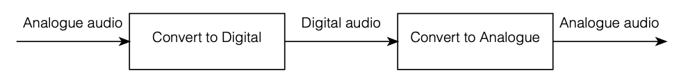
The first was that my “digital audio system” was something like the following:
Figure 1
As you can see there, I took an analogue audio signal, converted it to digital, and then converted it back to analogue. Maybe I transmitted it or stored it in the part that says “digital audio”.
However, the important, and very probably incorrect assumption here is that I did nothing to the signal. No volume control, no bass and treble adjustments… nothing.
Mistake #2
We assumed above that we can define the system’s dynamic range based on the dynamic range of the audio signal itself. However, this makes the assumption that the noise floor of the digital system and the noise floor of your audio signal are identical, which is probably not true. As we saw in Part 2, the noise generated by TPDF dither is white – it has the same probability of having a given amount of energy per Hertz. Since we hear sound logarithmically (meaning that, to us, octaves are equal widths. Equal spacings in Hz are not.) This means that the noise sound “bright” to us – because there’s just as much energy in the top octave (say, 10 kHz to 20 kHz, if you believe the books) as there is in all other frequencies combined from 0 Hz up to 10 kHz.
If, however, the noise floor in your concert hall where the taiko drummers are playing is caused by the air conditioning system, then this noise will be a lot louder in the low frequencies than the the highs – which is not the same.
Therefore it’s too simplistic to say “the noise floor of the digital system” and the “noise floor of the signal” – since these two noise floors are different. (As Steven Wright said: “It doesn’t matter what temperature the room is, it’s always room temperature.”)
Mistake #3
As we’ll see later, if you’re going to do anything to the signal while it’s in the “digital domain”, then you need to take that into consideration when you’re deciding on your sampling rate. It’s not enough to say “useful audio bandwidth times 2” because there are some side effects that need to be remembered…
However, counter-intuitively, it could be that, in order to improve your system, you’ll want to make the sampling rate LOWER instead of HIGHER – so this is not a simple case of “more is better”.
We’ll get to that topic later. For now, I’ll leave you in suspense.
Some details
One thing we saw in Part 3 was that, if we have an audio signal with energy at a frequency higher than 1/2 the sampling rate, and if that signal gets into the analogue-to-digital converter (ADC), then the output of the ADC will contain an error. We’ll get out energy at frequencies that were not in the original, due to the effect called “aliasing“.
Once that’s in the digital audio signal, there’s no removing it, so we need to make sure that the too-high-frequency signals don’t get into the ADC’s input in the first place. This is done using a low-pass filter that (in theory) removes all energy in the signal above the Nyquist frequency (which is equal to 1/2 the sampling rate). Since that low-pass filter prevents aliasing, we call it an anti-aliasing filter. Normally, these days, that antialiasing filter is built into the ADC itself.
As we also saw in Part 3, the digital-to-analogue converter (DAC) has to smooth out the digital signal to convert it from a “staircase” wave to a smoother one. That’s also done with a low-pass filter that eliminates all the harmonics that would be required to make the staircase have sharp corners. Since this is done to re-construct the analogue signal, it’s called a “reconstruction filter“.
This means that, if we pull apart some of the components in the signal chain I showed in Figure 1, it really looks more like this:
Reminder: This is still just the lead-up to the real topic of this series. However, we have to get some basics out of the way first…
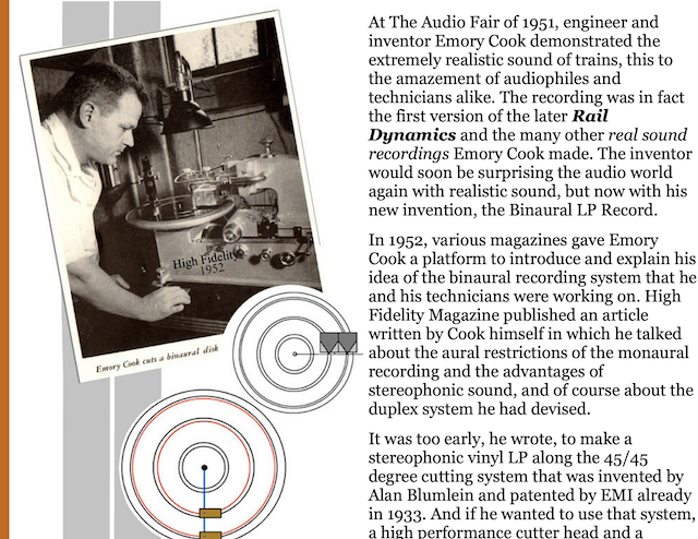
Just like the last posting, this is a copy-and-paste from an article that I wrote for another series. However, this one is important, and rather than just link you to a different page, I’ve reproduced it (with some minor editing to make it fit) here.
In the first posting in this series, I talked about digital audio (more accurately, Linear Pulse Code Modulation or LPCM digital audio) is basically just a string of stored measurements of the electrical voltage that is analogous to the audio signal, which is a change in pressure over time… In the second posting in the series, we looked at a “trick” for dealing with the issue of quantisation (the fact that we have a limited resolution for measuring the amplitude of the audio signal). This trick is to add dither (a fancy word for “noise”) to the signal before we quantise it in order to randomise the error and turn it into noise instead of distortion.
In this posting, we’ll look at some of the problems incurred by the way we carve up time into discrete moments when we grab those samples.
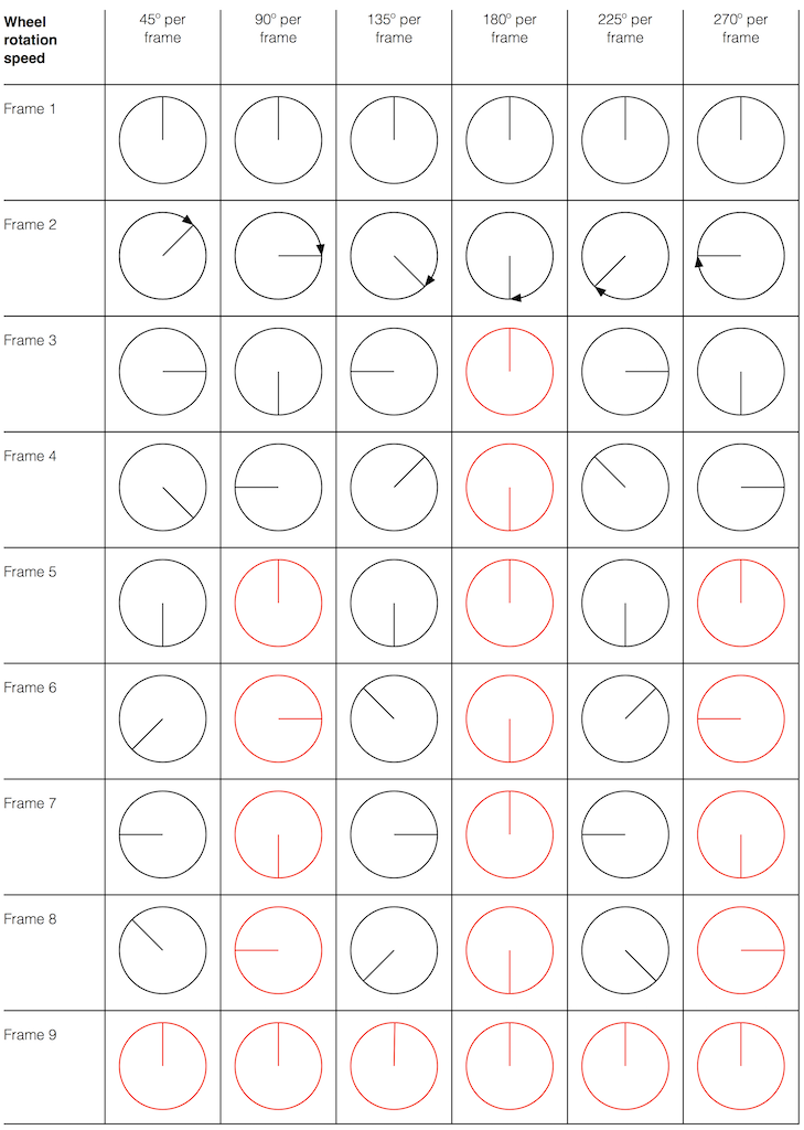
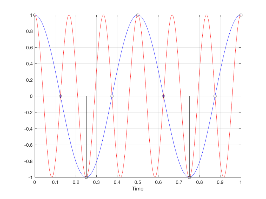
Let’s make a wheel that has one spoke. We’ll rotate it at some speed, and make a film of it turning. We can define the rotational speed in RPM – rotations per minute, but this is not very useful. In this case, what’s more useful is to measure the wheel rotation speed in degrees per frame of the film.
Fig 1. The position of a clockwise-rotating wheel (with only one spoke) for 9 frames of a film. Each column shows a different rotational speed of the wheel. The far left column is the slowest rate of rotation. The far right column is the fastest rate of rotation. Red wheels show the frame in which the sequence starts repeating.
Take a look at the left-most column in Figure 1. This shows the wheel rotating 45º each frame. If we play back these frames, the wheel will look like it’s rotating 45º per frame. So, the playback of the wheel rotating looks the same as it does in real life.
This is more or less the same for the next two columns, showing rotational speeds of 90º and 135º per frame.
However, things change dramatically when we look at the next column – the wheel rotating at 180º per frame. Think about what this would look like if we played this movie (assuming that the frame rate is pretty fast – fast enough that we don’t see things blinking…) Instead of seeing a rotating wheel with only one spoke, we would see a wheel that’s not rotating – and with two spokes.
This is important, so let’s think about this some more. This means that, because we are cutting time into discrete moments (each frame is a “slice” of time) and at a regular rate (I’m assuming here that the frame rate of the film does not vary), then the movement of the wheel is recorded (since our 1 spoke turns into 2) but the direction of movement does not. (We don’t know whether the wheel is rotating clockwise or counter-clockwise. Both directions of rotation would result in the same film…)
Now, let’s move over one more column – where the wheel is rotating at 225º per frame. In this case, if we look at the film, it appears that the wheel is back to having only one spoke again – but it will appear to be rotating backwards at a rate of 135º per frame. So, although the wheel is rotating clockwise, the film shows it rotating counter-clockwise at a different (slower) speed. This is an effect that you’ve probably seen many times in films and on TV. What may come as a surprise is that this never happens in “real life” unless you’re in a place where the lights are flickering at a constant rate (as in the case of fluorescent or some LED lights, for example).
Again, we have to consider the fact that if the wheel actually were rotating counter-clockwise at 135º per frame, we would get exactly the same thing on the frames of the film as when the wheel if rotating clockwise at 225º per frame. These two events in real life will result in identical photos in the film. This is important – so if it didn’t make sense, read it again.
This means that, if all you know is what’s on the film, you cannot determine whether the wheel was going clockwise at 225º per frame, or counter-clockwise at 135º per frame. Both of these conclusions are valid interpretations of the “data” (the film). (Of course, there are more – the wheel could have rotated clockwise by 360º+225º = 585º or counter-clockwise by 360º+135º = 495º, for example…)
Since these two interpretations of reality are equally valid, we call the one we know is wrong an alias of the correct answer. If I say “The Big Apple”, most people will know that this is the same as saying “New York City” – it’s an alias that can be interpreted to mean the same thing.
Wheels and Slinkies
We people in audio commit many sins. One of them is that, every time we draw a plot of anything called “audio” we start out by drawing a sine wave. (A similar sin is committed by musicians who, at the first opportunity to play a grand piano, will play a middle-C, as if there were no other notes in the world.) The question is: what, exactly, is a sine wave?
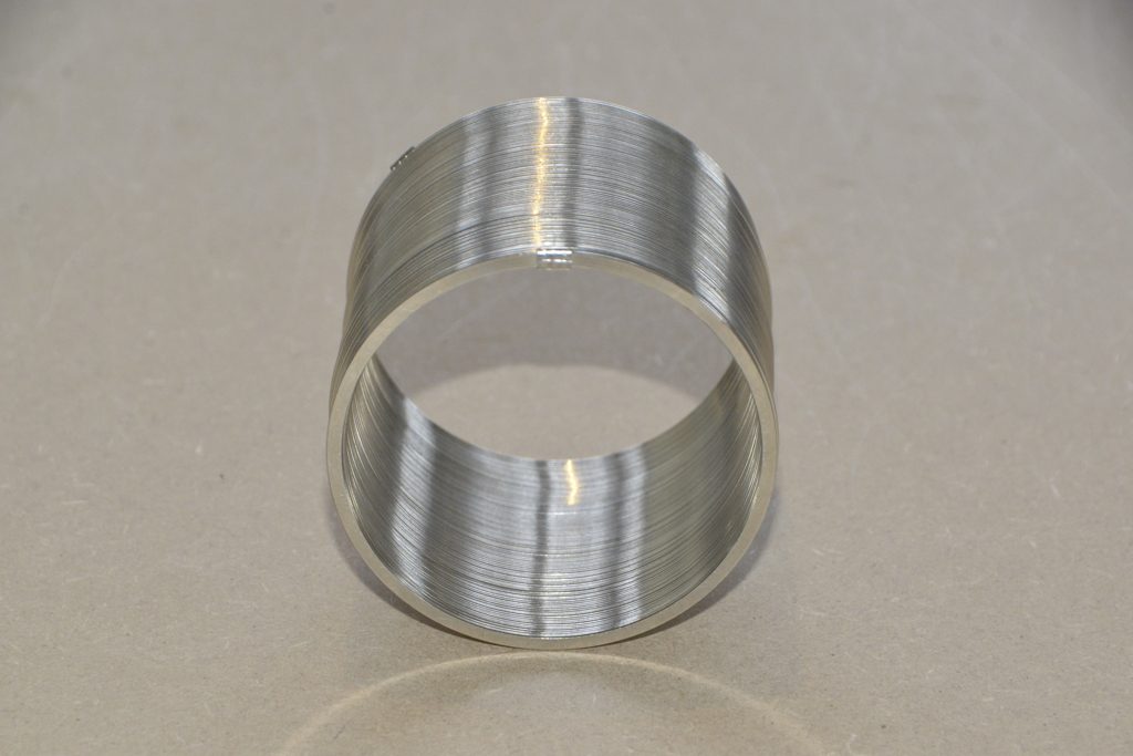
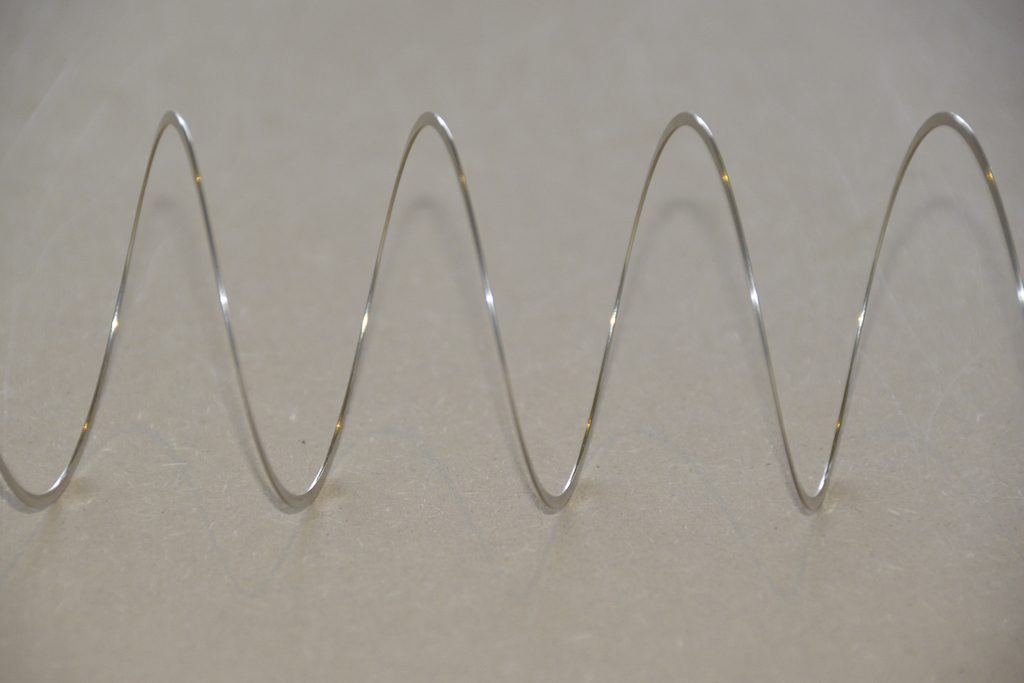
Get a Slinky – or if you don’t want to spend money on a brand name, get a spring. Look at it from one end, and you’ll see that it’s a circle, as can be (sort of) seen in Figure 2.
Fig 2. A Slinky, seen from one end. If I had really lined things up, this would just look like a shiny circle.
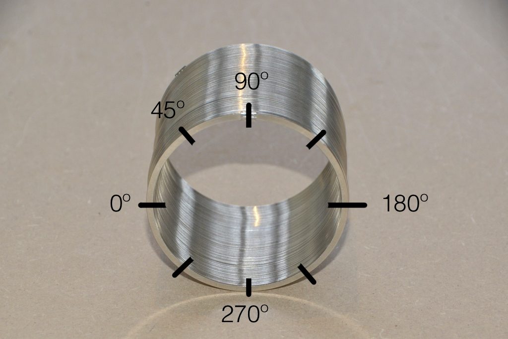
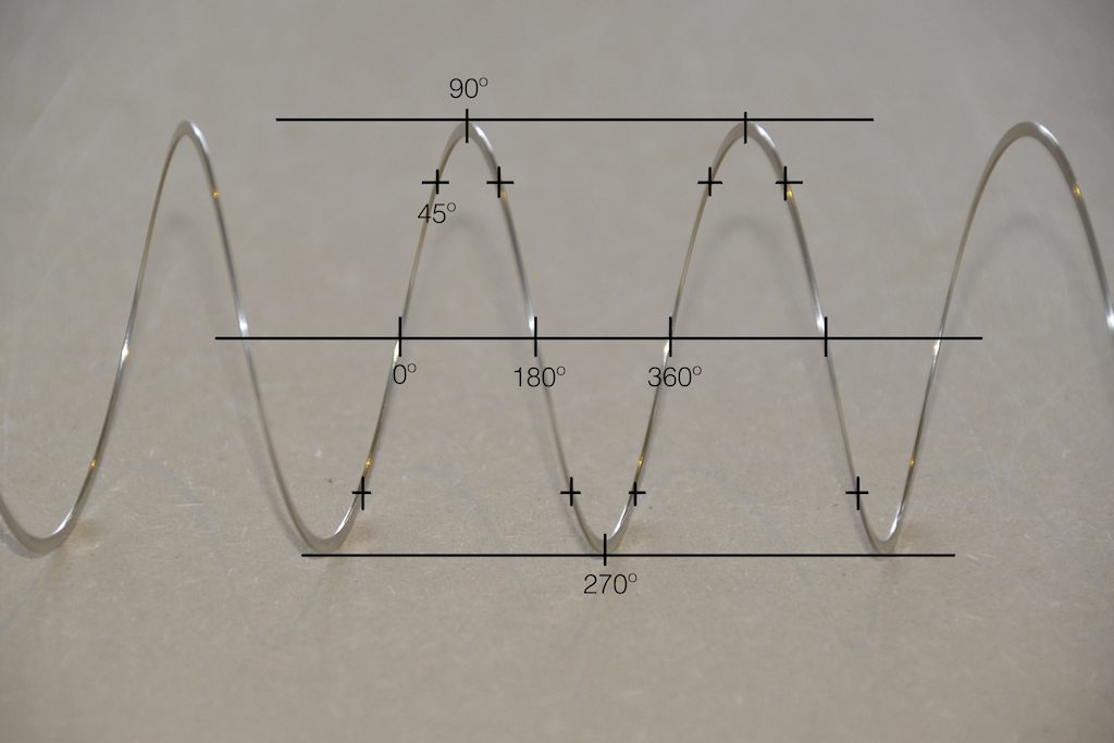
Since this is a circle, we can put marks on the Slinky at various amounts of rotation, as in Figure 3.
Fig 3. The same Slinky, marked in increasing angles of 45º.
Of course, I could have put the 0º mark anywhere. I could have also rotated counter-clockwise instead of clockwise. But since both of these are arbitrary choices, I’m not going to debate either one.
Now, let’s rotate the Slinky so that we’re looking at from the side. We’ll stretch it out a little too…
Fig 4. The same Slinky, stretched a little, and viewed from the side.
Let’s do that some more…
Fig 5. The same Slinky, stretched more, and viewed from the “side” (in a direction perpendicular to the axis of the rotation).
When you do this, and you look at the Slinky directly from one side, you are able to see the vertical change of the spring from the centre as a result of the change in rotation. For example, we can see in Figure 6 that, if you mark the 45º rotation point in this view, the distance from the centre of the spring is 71% of the maximum height of the spring (at 90º).
Fig 6. The same markings shown in Figure 3, when looking at the Slinky from the side. Note that, if we didn’t have the advantage of a little perspective (and a spring made of flat metal), we would not know whether the 0º point was closer or further away from us than the 180º point. In other words, we wouldn’t know if the Slinky was rotating clockwise or counter-clockwise.
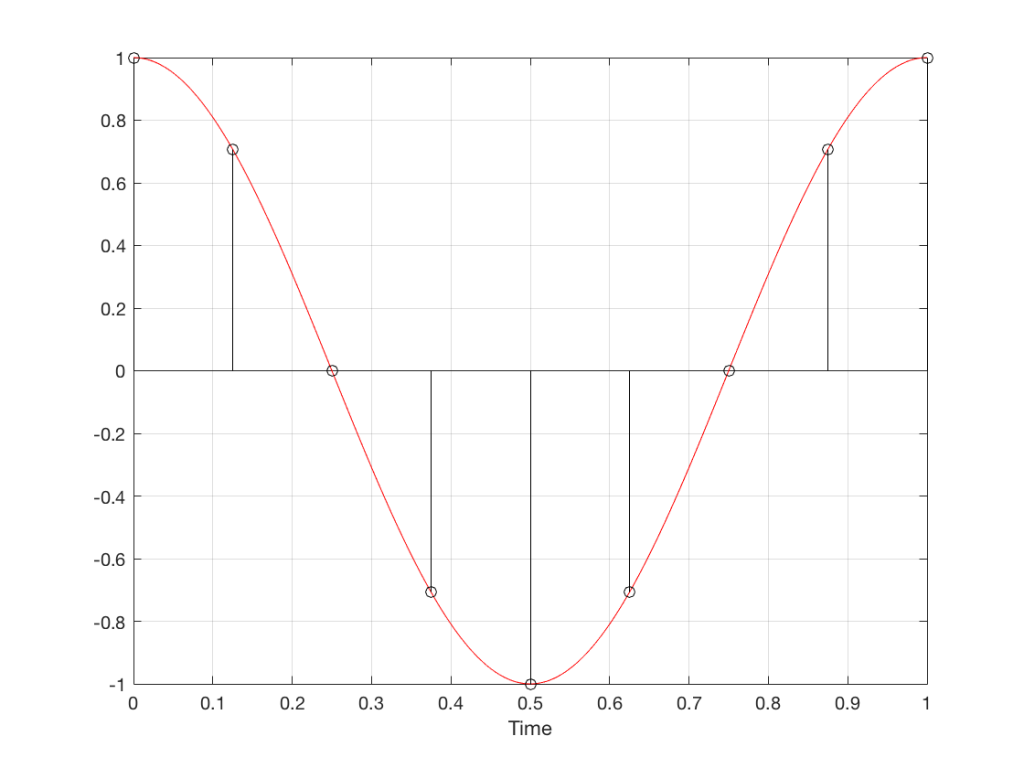
So what? Well, basically, the “punch line” here is that a sine wave is actually a “side view” of a rotation. So, Figure 7, shows a measurement – a capture – of the amplitude of the signal every 45º.
Fig 7. Each measurement (a black “lollipop”) is a measurement of the vertical change of the signal as a result of rotating 45º.
Since we can now think of a sine wave as a rotation of a circle viewed from the side, it should be just a small leap to see that Figure 7 and the left-most column of Figure 1 are basically identical.
Let’s make audio equivalents of the different columns in Figure 1.
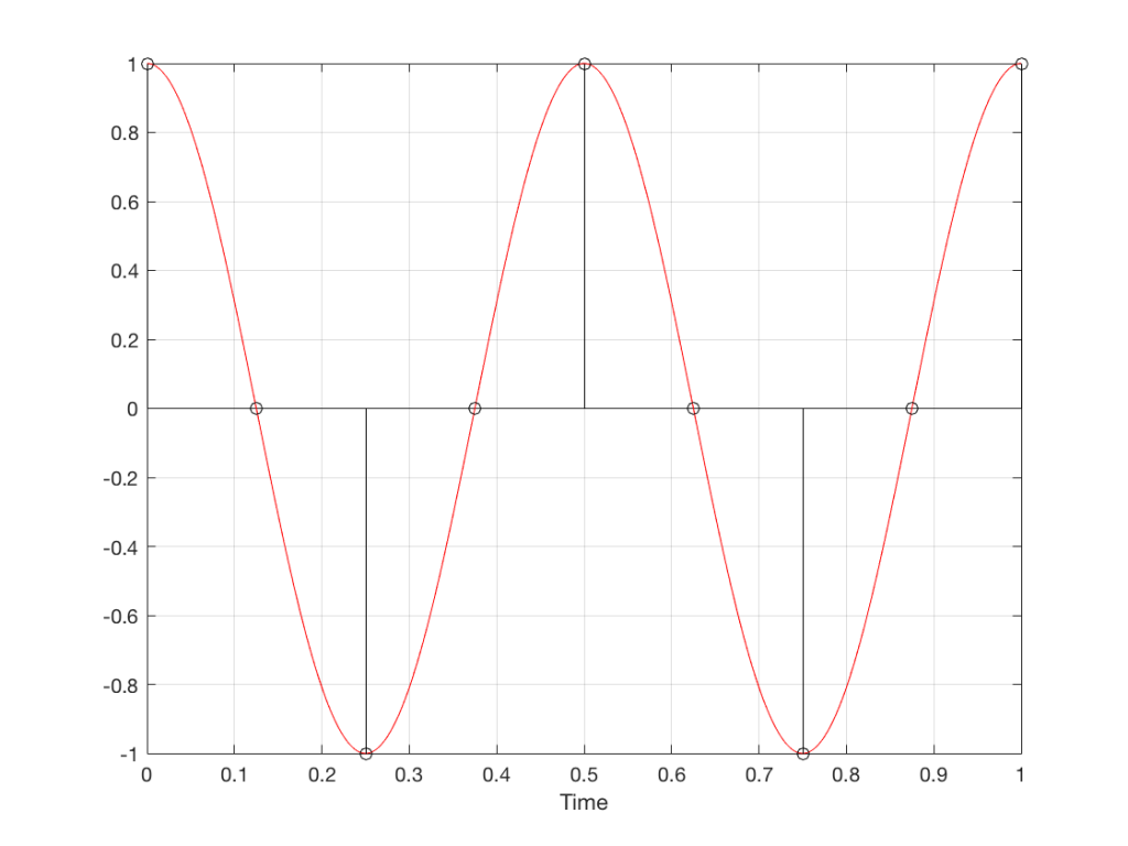
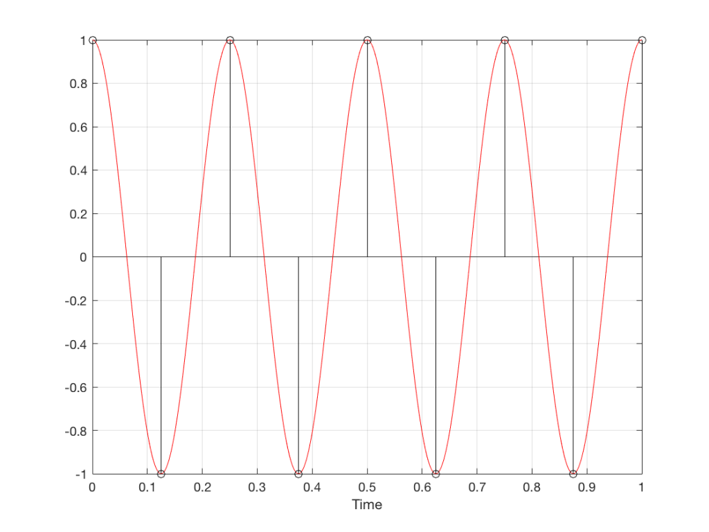
Fig 8. A sampled cosine wave where the frequency of the signal is equivalent to 90º per sample period. This is identical to the “90º per frame” column in Figure 1.Fig 9. A sampled cosine wave where the frequency of the signal is equivalent to 135º per sample period. This is identical to the “135º per frame” column in Figure 1.Fig 10. A sampled cosine wave where the frequency of the signal is equivalent to 180º per sample period. This is identical to the “180º per frame” column in Figure 1.
Figure 10 is an important one. Notice that we have a case here where there are exactly 2 samples per period of the cosine wave. This means that our sampling frequency (the number of samples we make per second) is exactly one-half of the frequency of the signal. If the signal gets any higher in frequency than this, then we will be making fewer than 2 samples per period. And, as we saw in Figure 1, this is where things start to go haywire.
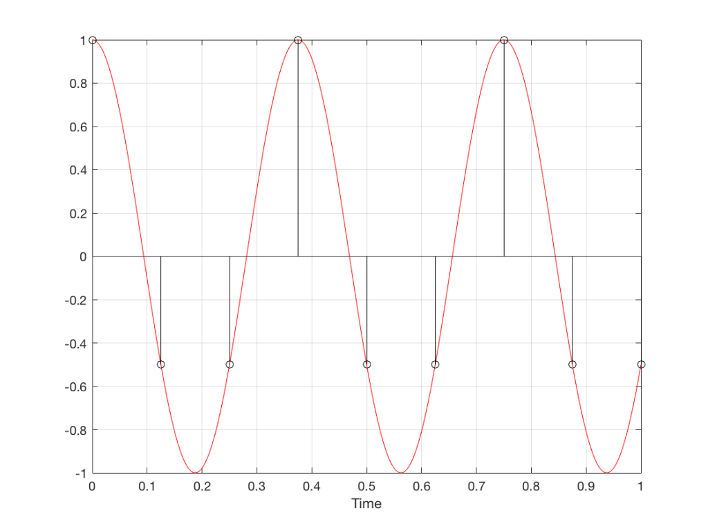
Fig 11. A sampled cosine wave where the frequency of the signal is equivalent to 225º per sample period. This is identical to the “225º per frame” column in Figure 1.
Figure 11 shows the equivalent audio case to the “225º per frame” column in Figure 1. When we were talking about rotating wheels, we saw that this resulted in a film that looked like the wheel was rotating backwards at the wrong speed. The audio equivalent of this “wrong speed” is “a different frequency” – the alias of the actual frequency. However, we have to remember that both the correct frequency and the alias are valid answers – so, in fact, both frequencies (or, more accurately, all of the frequencies) exist in the signal.
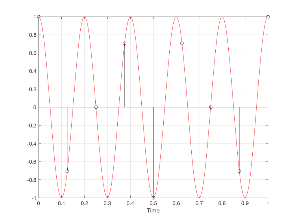
So, we could take Fig 11, look at the samples (the black lollipops) and figure out what other frequency fits these. That’s shown in Figure 12.
Fig 12. The red signal and the black samples of it are the same as was shown in Figure 11. However, another frequency (the blue signal) also fits those samples. So, both the red signal and the blue signal exist in our system.
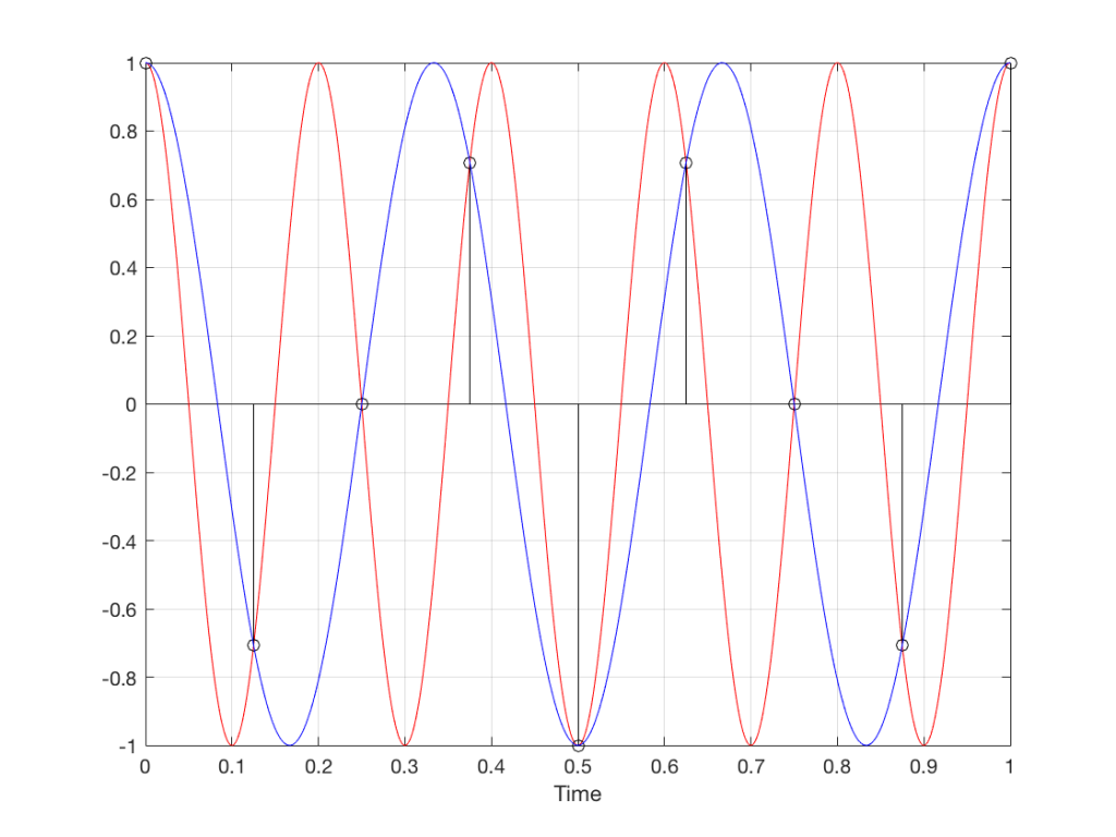
Moving up in frequency one more step, we get to the right-hand column in Figure 1, whose equivalent, including the aliased signal, are shown in Figure 13.
Fig 13. A signal (the red curve) that has a frequency equivalent to 280º of rotation per sample, its samples (the black lollipops) and the aliased additional signal that results (the blue curve).
Do I need to worry yet?
Hopefully, now, you can see that an LPCM system has a limit with respect to the maximum frequency that it can deal with appropriately. Specifically, the signal that you are trying to capture CANNOT exceed one-half of the sampling rate. So, if you are recording a CD, which has a sampling rate of 44,100 samples per second (or 44.1 kHz) then you CANNOT have any audio signals in that system that are higher than 22,050 Hz.
That limit is commonly known as the “Nyquist frequency“, named after Harry Nyquist – one of the persons who figured out that this limit exists.
In theory, this is always true. So, when someone did the recording destined for the CD, they made sure that the signal went through a low-pass filter that eliminated all signals above the Nyquist frequency.
In practice, however, there are many cases where aliasing occurs in digital audio systems because someone wasn’t paying enough attention to what was happening “under the hood” in the signal processing of an audio device. This will come up later.
Two more details to remember…
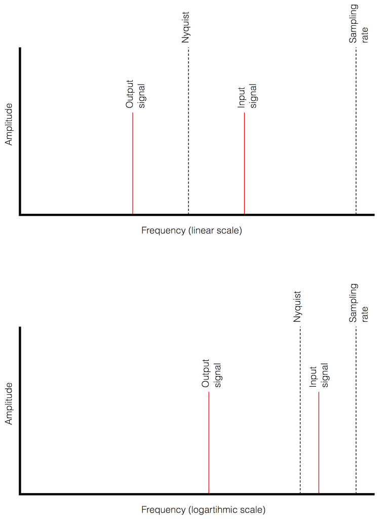
There’s an easy way to predict the output of a system that’s suffering from aliasing if your input is sinusoidal (and therefore contains only one frequency). The frequency of the output signal will be the same distance from the Nyquist frequency as the frequency if the input signal. In other words, the Nyquist frequency is like a “mirror” that “reflects” the frequency of the input signal to another frequency below Nyquist.
This can be easily seen in the upper plot of Figure 14. The distance from the Input signal and the Nyquist is the same as the distance between the output signal and the Nyquist.
Also, since that Nyquist frequency acts as a mirror, then the Input and output signal’s frequencies will move in opposite directions (this point will help later).
Fig 14. Two plots showing the same information about an Input Signal above the Nyquist frequency and the output alias signal. Notice that, in the linear plot on top, it’s easier to see that the Nyquist frequency is the mirror point at the centre of the frequencies of the Input and Output signals.
Usually, frequency-domain plots are done on a logarithmic scale, because this is more intuitive for we humans who hear logarithmically. (For example, we hear two consecutive octaves on a piano as having the same “interval” or “width”. We don’t hear the width of the upper octave as being twice as wide, like a measurement system does. that’s why music notation does not get wider on the top, with a really tall treble clef.) This means that it’s not as obvious that the Nyquist frequency is in the centre of the frequencies of the input signal and its alias below Nyquist.
Reminder: This is still just the lead-up to the real topic of this series. However, we have to get some basics out of the way first…
Just like the last posting, this is a copy-and-paste from an article that I wrote for another series. However, this one is important, and rather than just link you to a different page, I’ve reproduced it (with some minor editing to make it fit) here.
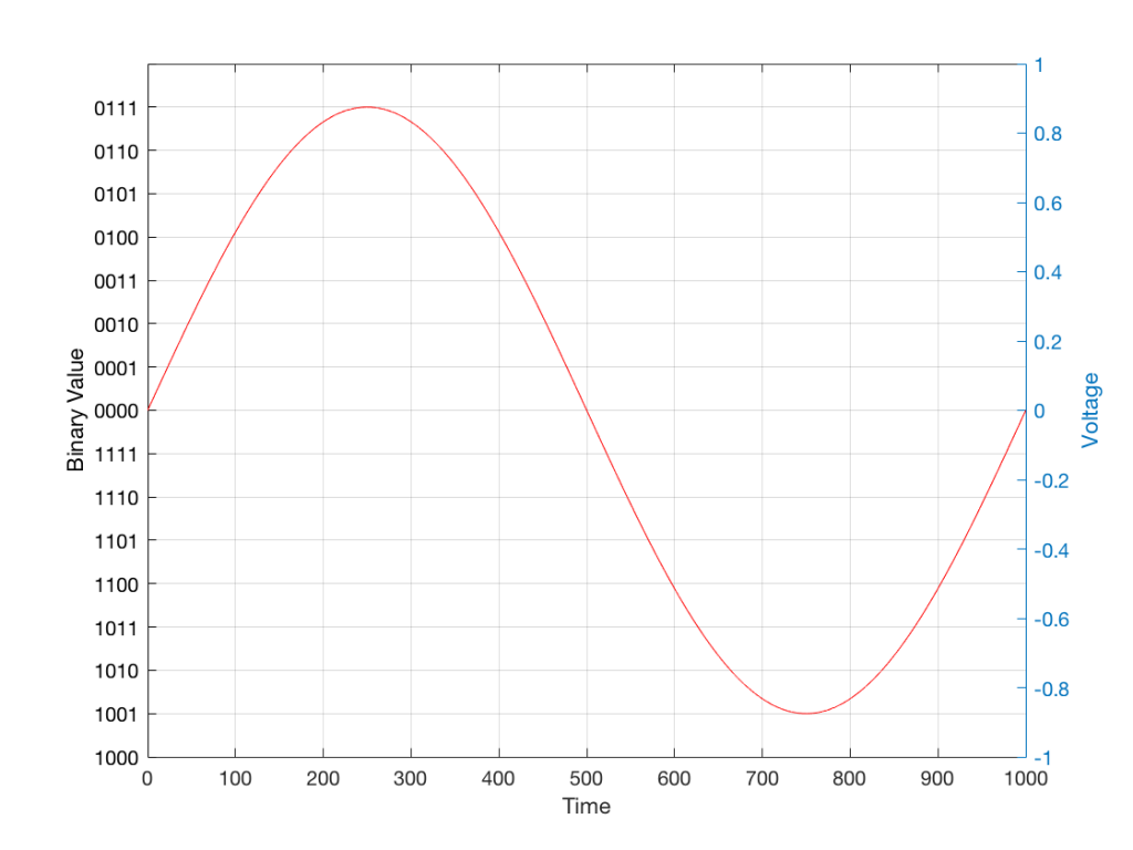
In the last posting, I talked about digital audio (more accurately, Linear Pulse Code Modulation or LPCM digital audio) is basically just a string of stored measurements of the electrical voltage that is analogous to the audio signal, which is a change in pressure over time…
For now, we’ll say that each measurement is rounded off to the nearest possible “tick” on the ruler that we’re using to measure the voltage. That rounding results in an error. However, (assuming that everything is working correctly) that error can never be bigger than 1/2 of a “step”. Therefore, in order to reduce the amount of error, we need to increase the number of ticks on the ruler.
Now we have to introduce a new word. If we really had a ruler, we could talk about whether the ticks are 1 mm apart – or 1/16″ – or whatever. We talk about the resolution of the ruler in terms of distance between ticks. However, if we are going to be more general, we can talk about the distance between two ticks being one “quantum” – a fancy word for the smallest step size on the ruler.
So, when you’re “rounding off to the nearest value” you are “quantising” the measurement (or “quantizing” it, if you live in Noah Webster’s country and therefore you harbor the belief that wordz should be spelled like they sound – and therefore the world needz more zees). This also means that the amount of error that you get as a result of that “rounding off” is called “quantisation error“.
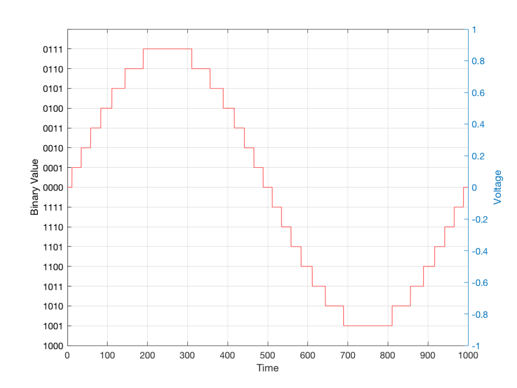
In some explanations of this problem, you may read that this error is called “quantisation noise”. However, this isn’t always correct. This is because if something is “noise” then is is random, and therefore impossible to predict. However, that’s not strictly the case for quantisation error. If you know the signal, and you know the quantisation values, then you’ll be able to predict exactly what the error will be. So, although that error might sound like noise, technically speaking, it’s not. This can easily be seen in Figures 1 through 3 which demonstrate that the quantisation error causes a periodic, predictable error (and therefore harmonic distortion), not a random error (and therefore noise).
Sidebar: The reason people call it quantisation noise is that, if the signal is complicated (unlike a sine wave) and high in level relative to the quantisation levels – say a recording of Britney Spears, for example – then the distortion that is generated sounds “random-ish”, which causes people to jump to the conclusion that it’s noise.
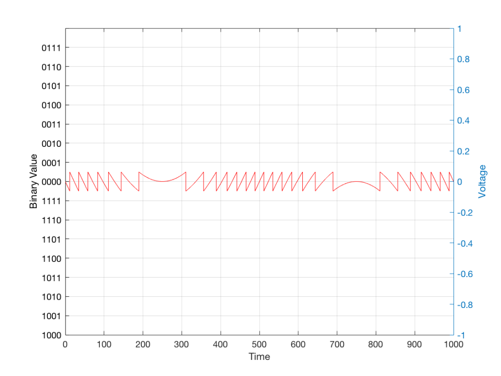
Fig 1: The first cycle of a periodic signal (in this case, a sinusoidal waveform) that we are going to quantise using a 4-bit system (notice the 4 bits in the scale on the left).
Fig 2: The same waveform shown in Figure 1 after quantisation (rounding off) in a 4-bit world.
Fig 3: The difference between Figure 2 and Figure 1. I made this by subtracting the original signal from the quantised version. This is the error in the quantised waveform – the quantisation error. Notice that it is not noise… it’s completely predictable and it will repeat with repetitions of the signal. Therefore the result of this is distortion, not noise…
Now, let’s talk about perception for a while… We humans are really good at detecting patterns – signals – in an otherwise noisy world. This is just as true with hearing as it is with vision. So, if you have a sound that exists in a truly random background noise, then you can focus on listening to the sound and ignore the noise. For example, if you (like me) are old enough to have used cassette tapes, then you can remember listening to songs with a high background noise (the “tape hiss”) – but it wasn’t too annoying because the hiss was independent of the music, and constant. However, if you, like me, have listened to Bob Marley’s live version of “No Woman No Cry” from the “Legend” album, then you, like me, would miss the the feedback in the PA system at that point in the song when the FoH engineer wasn’t paying enough attention… That noise (the howl of the feedback) is not noise – it’s a signal… Which makes it just as important as the song itself. (I could get into a long boring talk about John Cage at this point, but I’ll try to not get too distracted…)
The problem with the signal in Figure 2 is that the error (shown in Figure 3) is periodic – it’s a signal that demands attention. If the signal that I was sending into the quantisation system (in Figure 1) was a little more complicated than a sine wave – say a sine wave with an amplitude modulation – then the error would be easily “trackable” by anyone who was listening.
So, what we want to do is to quantise the signal (because we’re assuming that we can’t make a better “ruler”) but to make the error random – so it is changed from distortion to noise. We do this by adding noise to the signal before we quantise it. The result of this is that the error will be randomised, and will become independent of the original signal… So, instead of a modulating signal with modulated distortion, we get a modulated signal with constant noise – which is easier for us to ignore. (It has the added benefit of spreading the frequency content of the error over a wide frequency band, rather than being stuck on the harmonics of the original signal… but let’s not talk about that…)
For example…
Let’s take a look at an example of this from an equivalent world – digital photography.
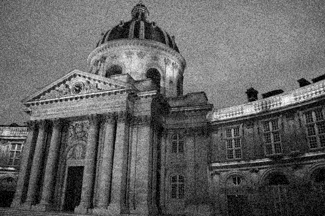
The photo in Figure 4 is a black and white photo – which actually means that it’s comprised of shades of gray ranging from black all the way to white. The photo has 272,640 individual pixels (because it’s 640 pixels wide and 426 pixels high). Each of those pixels is some shade of gray, but that shading does not have an infinite resolution. There are “only” 256 possible shades of gray available for each pixel.
So, each pixel has a number that can range from 0 (black) up to 255 (white).
Fig 4: A photo of a building in Paris. Each pixel in this photo has one of 256 possible levels of gray – from white (255) down to black (0).
If we were to zoom in to the top left corner of the photo and look at the values of the 64 pixels there (an 8×8 pixel square), you’d see that they are:
What if we were to reduce the available resolution so that there were fewer shades of gray between white and black? We can take the photo in Figure 1 and round the value in each pixel to the new value. For example, Figure 5 shows an example of the same photo reduced to only 6 levels of gray.
Fig 5: The same photo of the same building. Each pixel in this photo has one of 6 possible levels of gray. Notice that some details are lost – like the smooth transitions in the clouds, or the stripes in the marble in the pillars.
Now, if we look at those same pixels in the upper left corner, we’d see that their values are
They’ve all been quantised to the nearest available level, which is 102. (Our possible values are restricted to 0, 51, 102, 154, 205, and 255).
So, we can see that, by quantising the gray levels from 256 possible values down to only 6, we lose details in the photo. This should not be a surprise… That loss of detail means that, for example, the gentle transition from lighter to darker gray in the sky in the original is “flattened” to a light spot in a darker background, with a jagged edge at the transition between the two. Also, the details of the wall pillars between the windows are lost.
If we take our original photo and add noise to it – so were adding a random value to the value of each pixel in the original photo (I won’t talk about the range of those random values…) it will look like Figure 6. This photo has all 256 possible values of gray – the same as in Figure 1.
Fig 6: A photo of noise with the same width and height as the original photo, with random values (ranging from 0 to 255) in each pixel.
If we then quantise Figure 6 using our 6 possible values of gray, we get Figure 7. Notice that, although we do not have more grays than in Figure 5, we can see things like the gradual shading in the sky and some details in the walls between the tall windows.
Fig 7: The same photo of the same building in Figure 4. Each pixel in this photo ALSO only has one of 6 possible levels of gray – just like in Figure 5. However, this version is the result of quantising the original photo with the noise added before quantisation. The result is admittedly noisy – but we are able to see pattens in the noise that preserve some of the details that we lost in Figure 5.
That noise that we add to the original signal is called dither – because it is forcing the quantiser to be indecisive about which level to quantise to choose.
I should be clear here and say that dither does not eliminate quantisation error. The purpose of dither is to randomise the error, turning the quantisation error into noise instead of distortion. This makes it (among other things) independent of the signal that you’re listening to, so it’s easier for your brain to separate it from the music, and ignore it.
Addendum: Binary basics and SNR
We normally write down our numbers using a “base 10” notation. So, when I write down 9374 – I mean 9 x 1000 + 3 x 100 + 7 x 10 + 4 x 1 or 9 x 10³ + 3 x 10² + 7 x 101 + 4 x 100
We use base 10 notation – a system based on 10 digits (0 through 9) because we have 10 fingers.
If we only had 2 fingers, we would do things differently… We would only have 2 digits (0 and 1) and we would write down numbers like this: 11101
which would be the same as saying 1 x 16 + 1 x 8 + 1 x 4 + 0 x 2 + 1 x 1 or 1 x 24 + 1 x 23 + 1 x 22 + 0 x 21 + 1 x 20
The details of this are not important – but one small point is. If we’re using a base-10 system and we increase the number by one more digit – say, going from a 3-digit number to a 4-digit number, then we increase the possible number of values we can represent by a factor of 10. (in other words, there are 10 times as many possible values in the number XXXX than in XXX.)
If we’re using a base-2 system and we increase by one extra digit, we increase the number of possible values by a factor of 2. So XXXX has 2 times as many possible values as XXX.
Now, remember that the error that we generate when we quantise is no bigger than 1/2 of a quantisation step, regardless of the number of steps. So, if we double the number of steps (by adding an extra binary digit or bit to the value that we’re storing), then the signal can be twice as “far away” from the quantisation error.
This means that, by adding an extra bit to the stored value, we increase the potential signal-to-error ratio of our LPCM system by a factor of 2 – or 6.02 dB.
So, if we have a 16-bit LPCM signal, then a sine wave at the maximum level that it can be without clipping is about 6 dB/bit * 16 bits – 3 dB = 93 dB louder than the error. The reason we subtract the 3 dB from the value is that the error is +/- 0.5 of a quantisation step (normally called an “LSB” or “Least Significant Bit”).
Note as well that this calculation is just a rule of thumb. It is neither precise nor accurate, since the details of exactly what kind of error we have will have a minor effect on the actual number. However, it will be close enough.
Just heard about this project on the BBC News this morning. “According to non-profit organisation World Wide Hearing, fewer than one in 40 people who need hearing aids in developing countries can afford them.”