Turn it down half-way…

#81 in a series of articles about the technology behind Bang & Olufsen loudspeakers

Bertrand Russell once said, “In all affairs it’s a healthy thing now and then to hang a question mark on the things you have long taken for granted.”

This article is a discussion, both philosophical and technical about what a volume control is, and what can be expected of it. This seems like a rather banal topic, but I find it surprising how often I’m required to explain it.

Why am I writing this?

I often get questions from colleagues and customers that sound something like the following:

  • Why does my Beovision television’s volume control only go to 90%? Why can’t I go to 100%?
  • I set the volume on my TV to 40, so why is it so quiet (or loud)?

The first question comes from people who think that the number on the screen is in percent – but it’s not. The speedometer in your car displays your speed in kilometres per hour (km/h), the tachometer is in revolutions of the engine per minute (RPM) the temperature on your thermostat is in degrees Celsius (ºC), and the display on your Beovision television is on a scale based on decibels (dB). None of these things are in percent (imagine if the speed limit on the highway was 80% of your car’s maximum speed… we’d have more accidents…)

The short reason we use decibels instead of percent is that it means that we can use subtraction instead of division – which is harder to do. The shortcut rule-of-thumb to remember is that, every time you drop by 6 dB on the volume control, you drop by 50% of the output. So, for example, going from Volume step 90 to Volume step 84 is going from 100% to 50%. If I keep going down, then the table of equivalents looks like this:

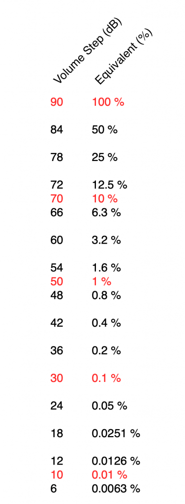
I’ve used two colours there to illustrate two things:

  • Every time you drop by 6 volume steps, you cut the percentage in half. For example, 60 is five drops of 6 steps, which is 1/2 of 1/2 of 1/2 of 1/2 of 1/2 of 100%, or 3.2% (notice the five halves there…)
  • Every time you drop by 20, you cut the percentage to 1/10. So, Volume Step 50 is 1% of Volume Step 90 because it’s two drops of 20 on the volume control.

If I graph this, showing the percentage equivalent of all 91 volume steps (from 0 to 90) then it looks like this:

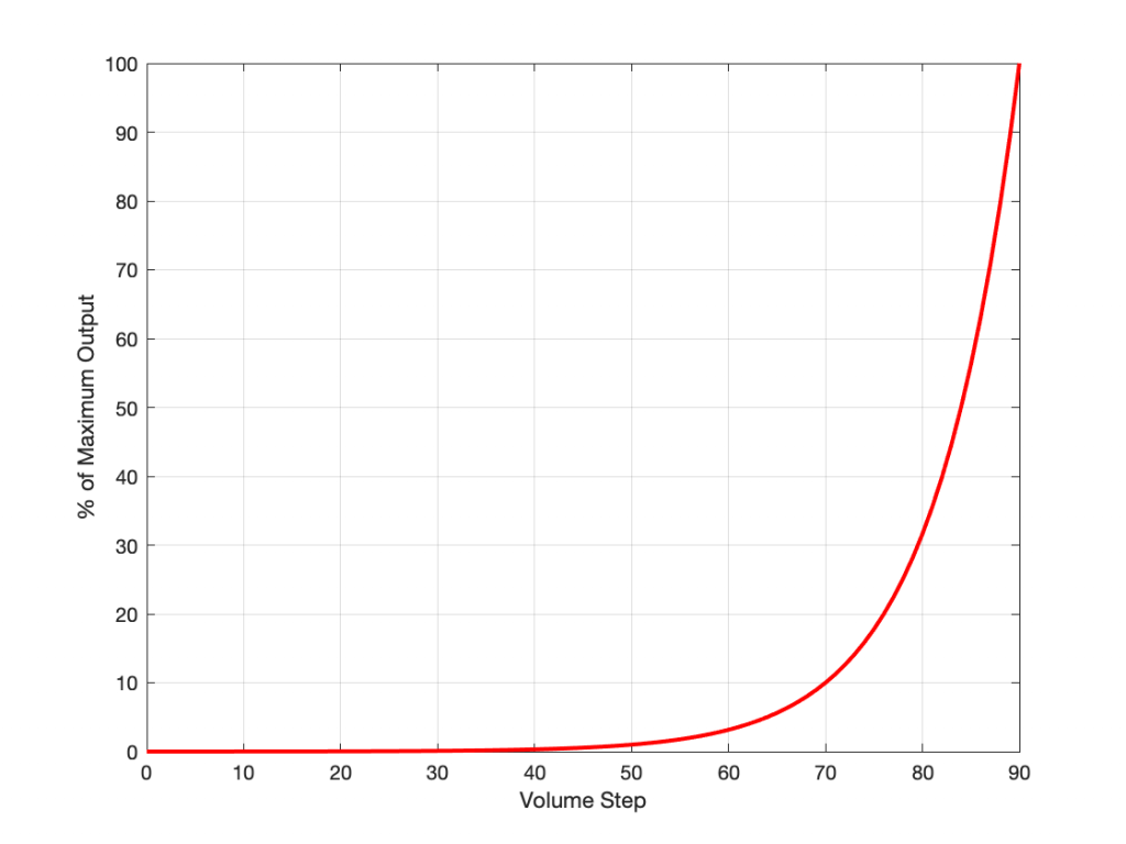
Of course, the problem this plot is that everything from about Volume Step 40 and lower looks like 0% because the plot doesn’t have enough detail. But I can fix that by changing the way the vertical axis is displayed, as shown below.

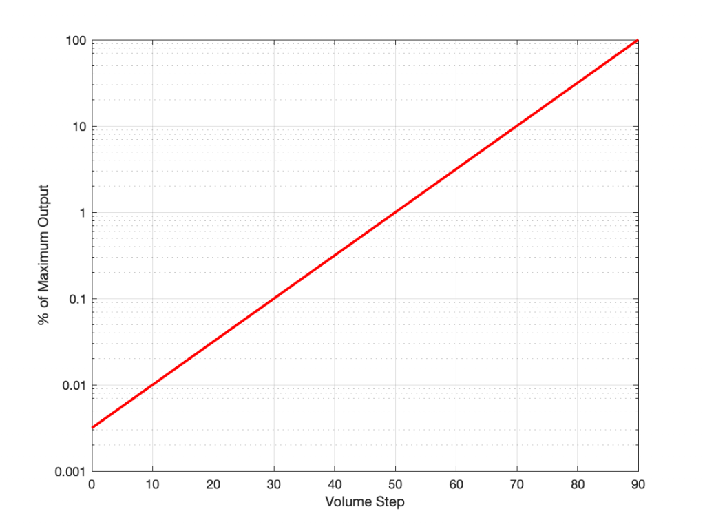
That plot shows exactly the same information. The only difference is that the vertical scale is no longer linearly counting from 0% to 100% in equal steps.

Why do we (and every other audio company) do it this way? The simple reason is that we want to make a volume slider (or knob) where an equal distance (or rotation) corresponds to an equal change in output level. We humans don’t perceive things like change in level in percent – so it doesn’t make sense to use a percent scale.

For the longer explanation, read on…

Basic concepts

We need to start at the very beginning, so here goes:

Volume control and gain

  1. An audio signal is (at least in a digital audio world) just a long list of numbers for each audio channel.
  2. The level of the audio signal can be changed by multiplying it by a number (called the gain).
    1. If you multiply by a value larger than 1, the audio signal gets louder.
    2. If you multiply by a number between 0 and 1, the audio signal gets quieter.
    3. If you multiply by zero, you mute the audio signal.
  3. Therefore, at its simplest core, a volume control implemented in a digital audio system is a multiplication by a gain. You turn up the volume, the gain value increases, and the audio is multiplied by a bigger number producing a bigger result.

That’s the first thing. Now we move on to how we perceive things…

Perception of Level

Speaking very generally, our senses (that we use to perceive the world around us) scale logarithmically instead of linearly. What does this mean? Let’s take an example:

Let’s say that you have $100 in your bank account. If I then told you that you’d won $100, you’d probably be pretty excited about it.

However, if you have $1,000,000 in your bank account, and I told you that you’re won $100, you probably wouldn’t even bother to collect your prize.

This can be seen as strange; the second $100 prize is not less money than the first $100 prize. However, it’s perceived to be very different.

If, instead of being $100, the cash prize were “equal to whatever you have in your bank account” – so the person with $100 gets $100 and the person with $1,000,000 gets $1,000,000, then they would both be equally excited.

The way we perceive audio signals is similar. Let’s say that you are listening to a song by Metallica at some level, and I ask you to turn it down, and you do. Then I ask you to turn it down by the same amount again, and you do. Then I ask you to turn it down by the same amount again, and you do… If I were to measure what just happened to the gain value, what would I find?

Well, let’s say that, the first time, you dropped the gain to 70% of the original level, so (for example) you went from multiplying the audio signal by 1 to multiplying the audio signal by 0.7 (a reduction of 0.3, if we were subtracting, which we’re not). The second time, you would drop by the same amount – which is 70% of that – so from 0.7 to 0.49 (notice that you did not subtract 0.3 to get to 0.4). The third time, you would drop from 0.49 to 0.343. (not subtracting 0.3 from 0.4 to get to 0.1).

In other words, each time you change the volume level by the “same amount”, you’re doing a multiplication in your head (although you don’t know it) – in this example, by 0.7. The important thing to note here is that you are NOT subtracting 0.3 from the gain in each of the above steps – you’re multiplying by 0.7 each time.

What happens if I were to express the above as percentages? Then our volume steps (and some additional ones) would look like this:

100%
70%
49%
34%
24%
17%
12%
8%

Notice that there is a different “distance” between each of those steps if we’re looking at it linearly (if we’re just subtracting adjacent values to find the difference between them). However, each of those steps is a reduction to 70% of the previous value.

This is a case where the numbers (as I’ve expressed them there) don’t match our experience. We hear each reduction in level as the same as the other steps, but they don’t look like they’re the same step size when we write them all down the way I’ve done above. (In other words, the numerical “distance” between 100 and 70 is not the same as the numerical “distance” between 49 and 34, but these steps would sound like the same difference in audio level.)

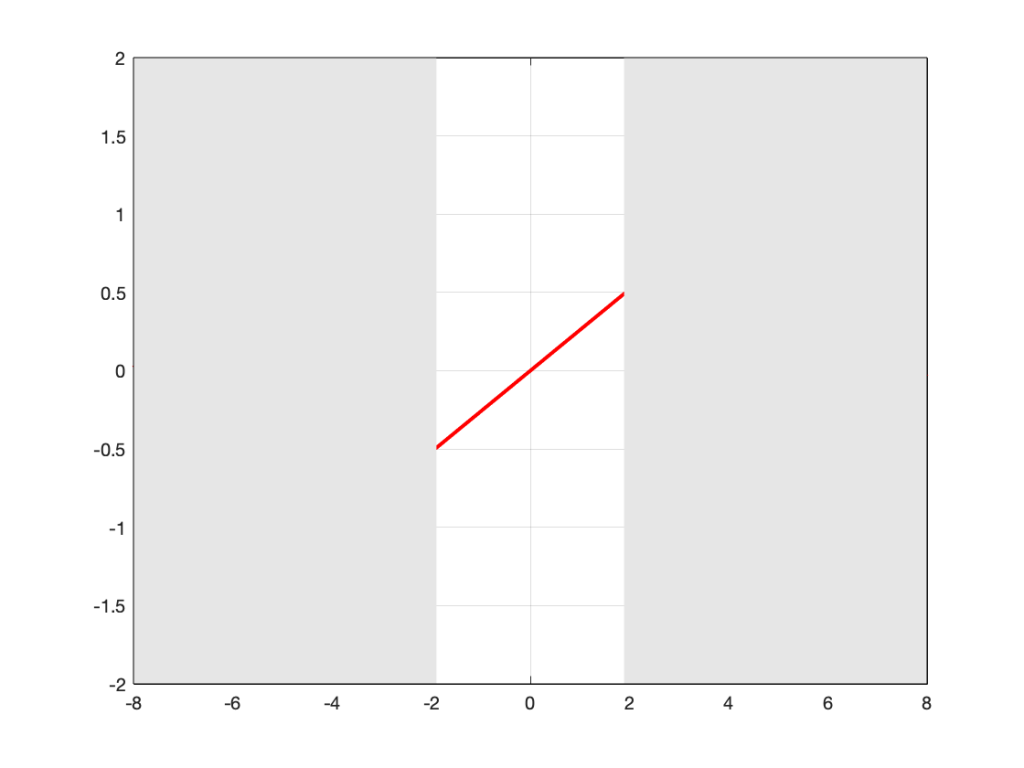
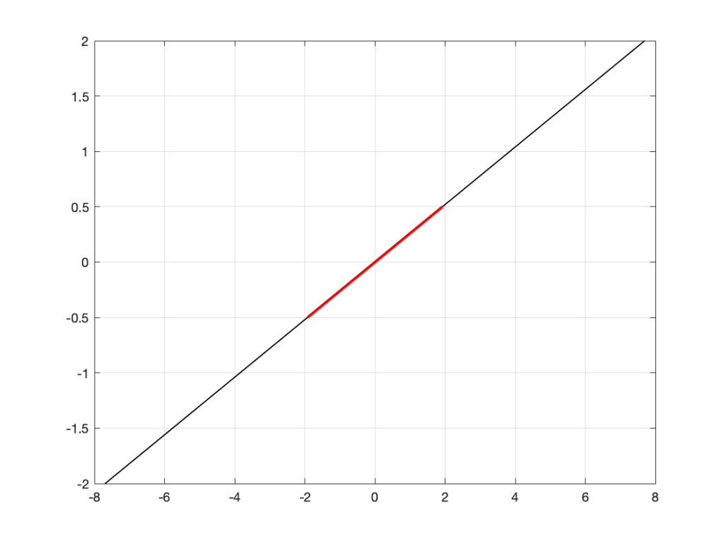
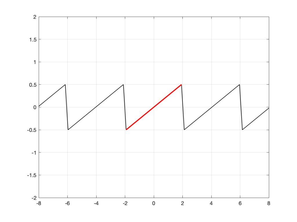
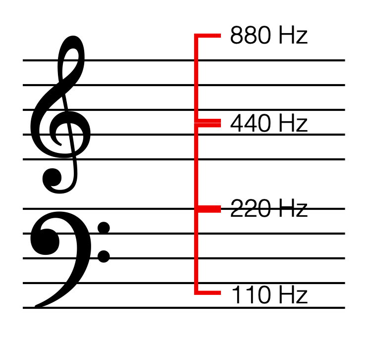
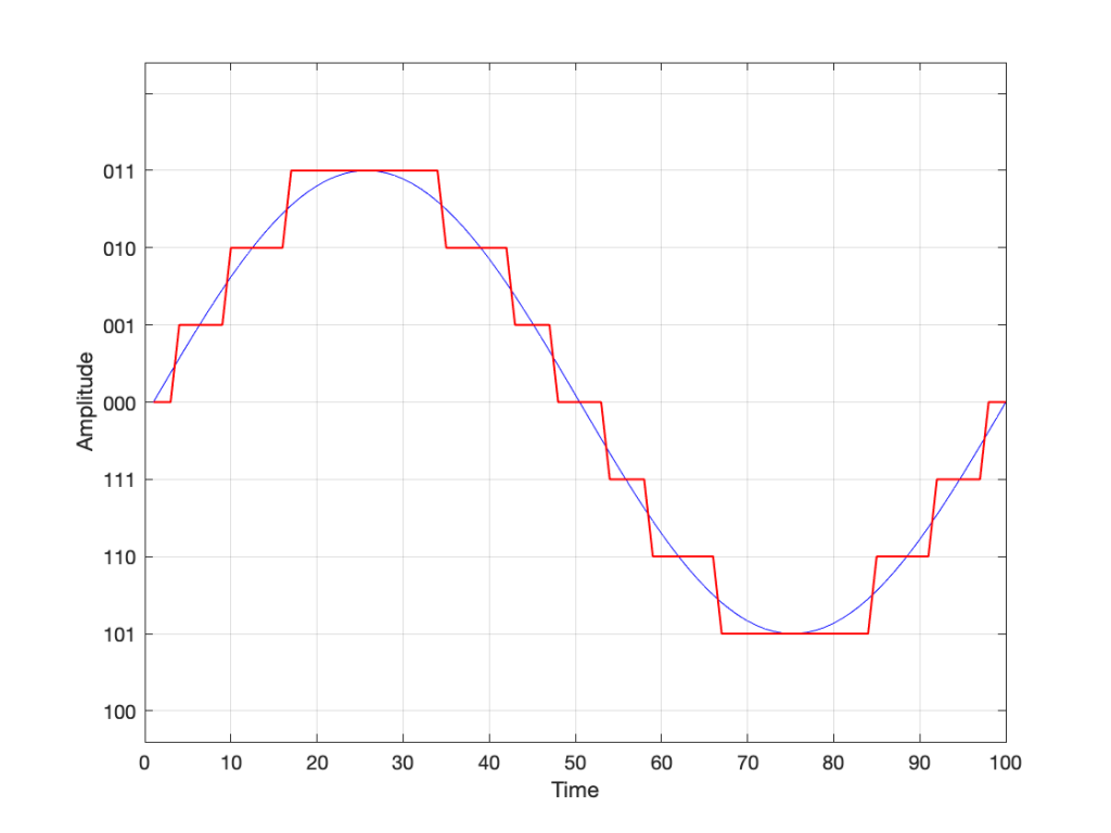
SIDEBAR: This is very similar / identical to the way we hear and express frequency changes. For example, the figure below shows a musical staff. The red brackets on the left show 3 spacings of one octave each; the distance between each of the marked frequencies sound the same to us. However, as you can see by the frequency indications, each of those octaves has a very different “width” in terms of frequency. Seen another way, the distance in Hertz in the octave from 440 Hz to 880 Hz is equal to the distance from 440 Hz all the way down to 0 Hz (both have a width of 440 Hz). However, to us, these sound like very different intervals.

SIDEBAR to the SIDEBAR: This also means that the distance in Hertz covered by the top octave on a piano is larger than the the distance covered by all of the other keys.

SIDEBAR to the SIDEBAR to the SIDEBAR: This also means that changing your sampling rate from 48 kHz to 96 kHz doubles your bandwidth, but only gives you an extra octave. However, this is not an argument against high-resolution audio, since the frequency range of the output is a small part of the list of pro’s and con’s.)

This is why people who deal with audio don’t use percent – ever. Instead, we use an extra bit of math that uses an evil concept called a logarithm to help to make things make more sense.

What is a logarithm?

If I say the following, you should not raise your eyebrows:

2*3 = 6, therefore 6/2 = 3 and 6/3 = 2

In other words, division is just multiplication done backwards. This can be generalised to the following:

if a*b=c, then c/a=b and c/b=a

Logarithms are similar; they’re just exponents done backwards. For example:

102 = 100, therefore Log10(100) = 2

and generally:

AB=C, therefore LogA(C) = B

Why use a logarithm?

The nice thing about logarithms is that they are a convenient way for a mathematician to do addition instead of multiplication.

For example, if I have the following sequence of numbers:

2, 4, 8, 16, 32, 64, and so on…

It’s easy to see that I’m just multiplying by 2 to get the next number.

What if I were to express the number sequence above as a series of exponents? Then it would look like this:

21, 22, 23, 24, 25, 26

Not useful yet…

What if I asked you to multiply two numbers in that sequence? Say, for example, 1024 * 8192. This would take some work (or at least some scrambling, looking for the calculator app on your phone…). However, it helps to know that this is the same as asking you to multiply 210 * 213 – to which the answer is 223. Notice that 23 is merely 10+13. So, I’ve used exponents to convert the problem from multiplication (1024*8192) to addition (210 * 213 = 2(10+13)).

How did I find out that 8192 = 213? By using a logarithm : Log2(8192) = 13.

In the old days, you would have been given a book of logarithmic tables in school, which was a way of looking up the logarithm of 8192. (Actually, those books were in base 10 and not base 2, so you would have found out that Log10(8192) = 3.9013, which would have made this discussion more confusing…) Nowadays, you can use an antique device called a “calculator” – a simulacrum of which is probably on a device you call a “phone” but is rarely used as such.

I will leave it to the reader to figure out why this quality of logarithms (that they convert multiplication into addition) is why slide rules work.

So what?

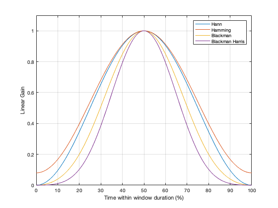
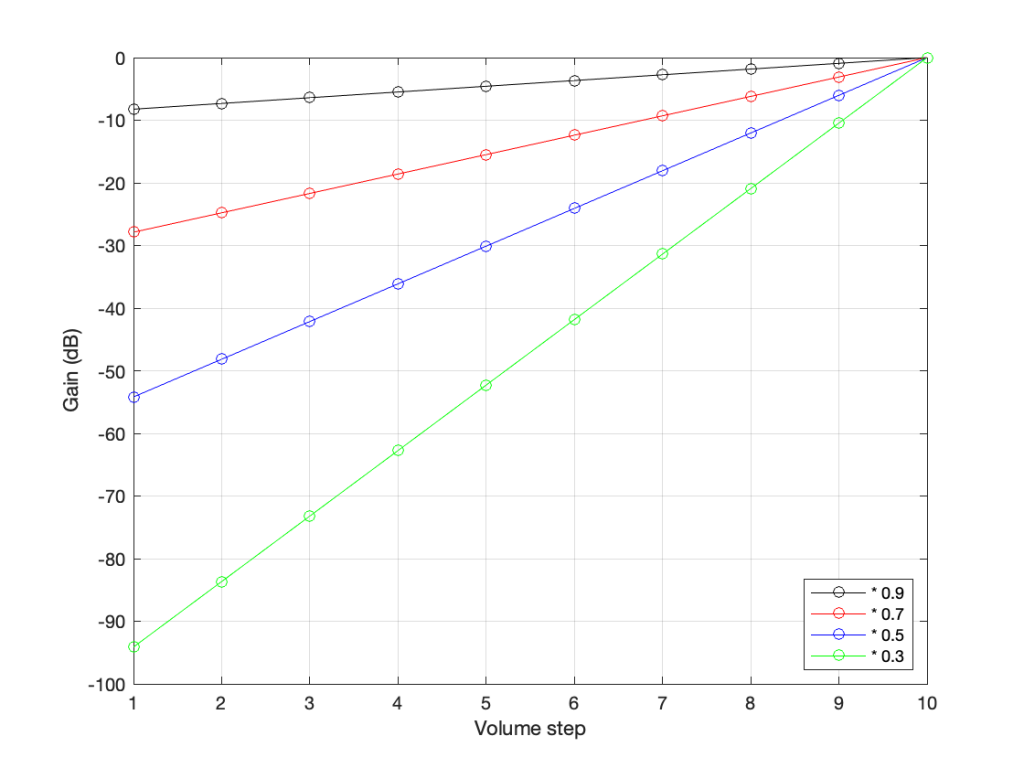
Let’s go back to the problem: We want to make a volume slider (or knob) where an equal distance (or rotation) corresponds to an equal change in level. Let’s do a simple one that has 10 steps. Coming down from “maximum” (which we’ll say is a gain of 1 or 100%), it could look like these:

The gain values for four different versions of a 10-step volume control.

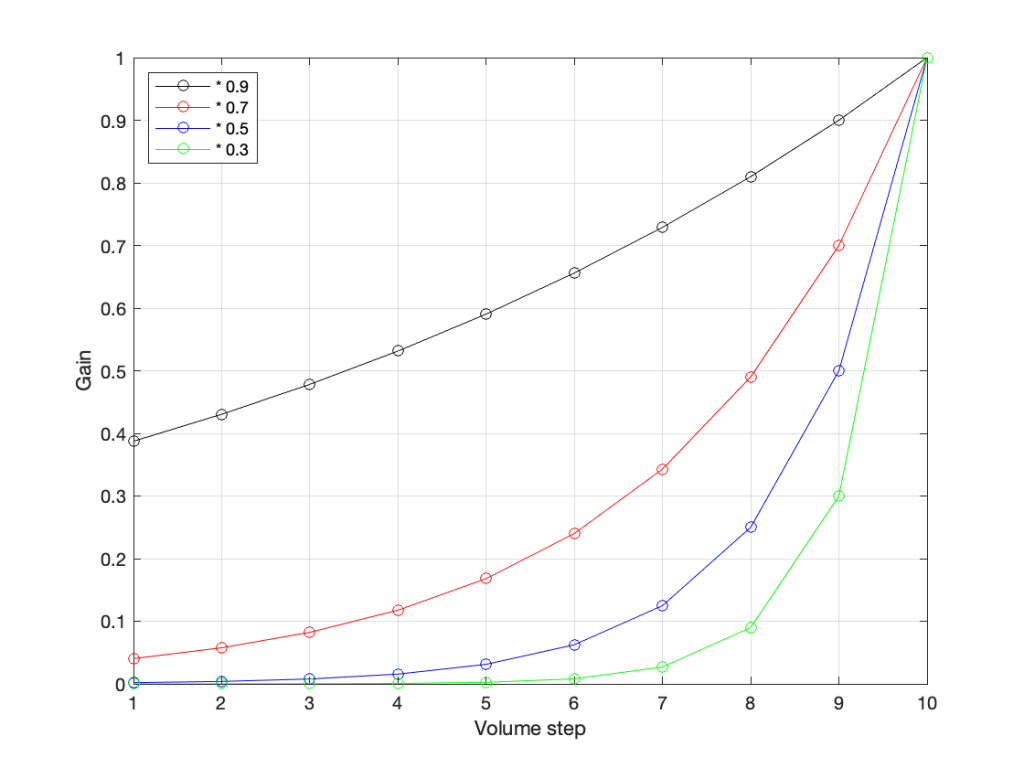
The plot above shows four different options for our volume controller. Starting at the maximum (volume step 10) and working downwards to the left, each one drops by the same perceived amount per step. The Black plot shows a drop of 90% per step, the red plot shows a drop of 70% per step (which matches the list of values I put above), Blue is 50% per step, and green is 30% per step.

As you can see, these lines are curved. As you can also see, as you get lower and lower, they get to the point where it gets harder to see the value (for example, the green curve looks like it has the same gain value for Volume steps 1 through 4).

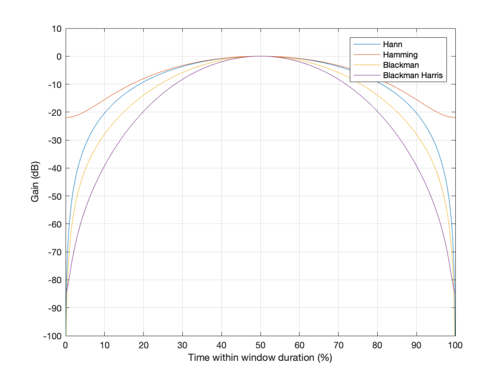
However, we can view this a different way. If we change the scale of our graph’s Y-Axis to a logarithmic one instead of a linear one, the exact same information will look like this:

The same data plotted using a different scale for the Y-Axis.

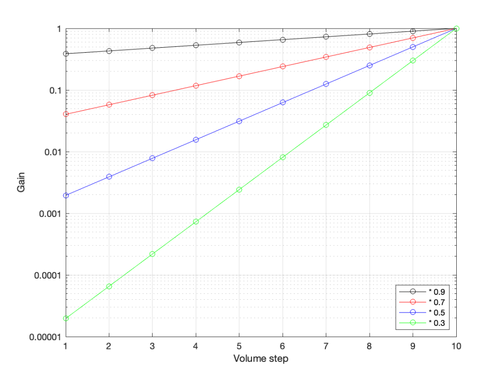
Notice now that the Y-axis has an equal distance upwards every time the gain multiplies by 10 (the same way the music staff had the same distance every time we multiplied the frequency by 2). By doing this, we now see our gain curves as straight lines instead of curved ones. This makes it easy to read the values both when they’re really small and when they’re (comparatively) big (those first 4 steps on the green curve don’t look the same on that plot).

So, one way to view the values for our Volume controller is to calculate the gains, and then plot them on a logarithmic graph. The other way is to build the logarithm into the gain itself, which is what we do. Instead of reading out gain values in percent, we use Bels (named after Alexander Graham Bell). However, since a Bel is a big step, we we use tenths of a Bel or “decibels” instead. (… In the same way that I tell people that my house is 4,000 km, and not 4,000,000 m from my Mom’s house because a metre is too small a division for a big distance. I also buy 0.5 mm pencil leads – not 0.0005 m pencil leads. There are many times when the basic unit of measurement is not the right scale for the thing you’re talking about.)

In order to convert our gain value (say, of 0.7) to decibels, we do the following equation:

20 * Log10(gain) = Gain in dB

So, we would say

20 * Log10(0.7) = -3.01 dB

I won’t explain why we say 20 * the logarithm, since this is (only a little) complicated.

I will explain why it’s small-d and capital-B when you write “dB”. The small-d is the convention for “deci-“, so 1 decimetre is 1 dm. The capital-B is there because the Bel is named after Alexander Graham Bell. This is similar to the reason we capitalize Hz, V, A, and so on…

So, if you know the linear gain value, you can calculate the equivalent in decibels. If I do this for all of the values in the plots above, it will look like this:

Notice that, on first glance, this looks exactly like the plot in the previous figure (with the logarithmic Y-Axis), however, the Y-Axis on this plot is linear (counting from -100 to 0 in equal distances per step) because the logarithmic scaling is already “built into” the values that we’re plotting.

For example, if we re-do the list of gains above (with a little rounding), it becomes

100% = 0 dB
70% = -3 dB
49% = -6 dB
34% = -9 dB
24% = -12 dB
17% = -15 dB
12% = -18 dB
8% = -21 dB

Notice coming down that list that each time we multiplied the linear gain by 0.7, we just subtracted 3 from the decibel value, because, as we see in the equation above, these mean the same thing.

This means that we can make a volume control – whether it’s a slider or a rotating knob – where the amount that you move or turn it corresponds to the change in level. In other words, if you move the slider by 1 cm or rotate the knob by 10º – NO MATTER WHERE YOU ARE WITHIN THE RANGE – the change is level will be the same as if you made the same movement somewhere else.

This is why Bang & Olufsen devices made since about 1990 (give or take) have a volume control in decibels. In older models, there were 79 steps (0 to 78) or 73 steps (0 to 72), which was expanded to 91 steps (0 to 90) around the year 2000, and expanded again recently to 101 steps (0 to 100). Each step on the volume control corresponds to a 1 dB change in the gain. So, if you change the volume from step 30 to step 40, the change in level will appear to be the same as changing from step 50 to step 60.

Volume Step ≠ Output Level

Up to now, all I’ve said can be condensed into two bullet points:

  • Volume control is a change in the gain value that is multiplied by the incoming signal
  • We express that gain value in decibels to better match the way we hear changes in level

Notice that I didn’t say anything in those two statements about how loud things actually are… This is because the volume setting has almost nothing to do with the level of the output, which, admittedly, is a very strange thing to say…

For example, get a DVD or Blu-ray player, connect it to a television, set the volume of the TV to something and don’t touch it for the rest of this experiment. Now, put in a DVD copy of any movie that has ONLY dialogue, and listen to how loud it sounds. Then, take out the DVD and put in a CD of Metallica’s Death Magnetic, press play. This will be much, much louder. In fact, if you own a B&O TV, the difference in level between those two things is the same as turning up the volume by 31 steps, which corresponds to 31 dB. Why?

When re-recording engineers mix a movie, they aim to make the dialogue sit around a level of 31 dB below maximum (better known as -31 dB FS or “31 decibels below Full Scale”). This gives them enough “headroom” to get much louder for explosions and gunshots to be exciting.

When a mixing engineer and a mastering engineer work on a pop or rock album, it’s not uncommon for them to make it as loud as possible, aiming for maximum (better known as 0 dB FS).

This means that a movie’s dialogue is much quieter than Metallica or Billie Eilish or whomever is popular when you’re reading this, because Metallica is as loud as the explosions in the movie.

The volume setting is just a value that changes that input level… So, If I listen to music at volume step 42 on a Beovision television, and you watch a movie at volume step 73 on the same Beovision television, it’s possible that we’re both hearing the same sound pressure level in our living rooms, because the music is 31 dB louder than the movie, which is the same amount that I’ve turned down my TV relative to yours (73-42 = 31).

In other words, the Volume Setting is not a predictor of how loud it is. A Volume Setting is a little like the accelerator pedal in your car. You can use the pedal to go faster or slower, but there’s no way of knowing how fast you’re driving if you only know how hard you’re pushing on the pedal.

What about other brands and devices?

This is where things get really random:

  • take any device (or computer or audio software)
  • play a sine wave (because thats easy to measure)
  • measure the change in output level as you change the volume setting
  • graph the result
  • Repeat everything above for different devices

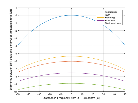
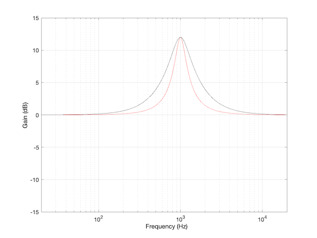
You’ll see something like this:

The gain vs. Volume step behaviours of 8 different devices / software players

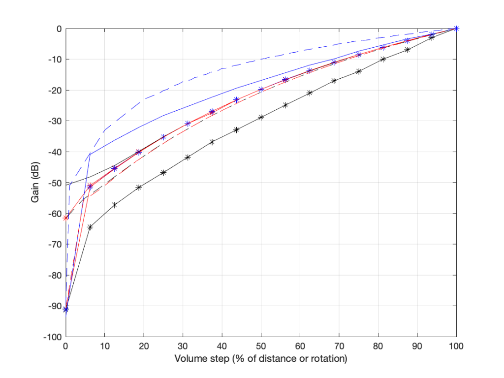
there are two important things to note in the above plot.

  1. These are the measurements of 8 different devices (or software players or “apps”) and you get 8 different results (although some of them overlap, but this is because those are just different version numbers of the same apps).
    • Notice as well that there’s a big difference here. At a volume setting of “50%” there’s a 20 dB difference between the blue dashed line and the black one with the asterisk markings. 20 dB is a LOT.
  2. None of them look like the straight lines seen in the previous plot, despite the fact that the Y-axis is in decibels. In ALL of these cases, the biggest jumps in level happen at the beginning of the volume control (some are worse than others). This is not only because they’re coming up from a MUTE state – but because they’re designed that way to fool you. How?

Think about using any of these controllers: you turn it 25% of the way up, and it’s already THIS loud! Cool! This speaker has LOTS of power! I’m only at 25%! I’ll definitely buy it! But the truth is, when the slider / knob is at 25% of the way up, you’re already pushing close to the maximum it can deliver.

These are all the equivalent of a car that has high acceleration when starting from 0 km/h, but if you’re doing 100 km/h on the highway, and you push on the accelerator, nothing happens.

First impressions are important…

On the other hand (in support of thee engineers who designed these curves), all of these devices are “one-offs” (meaning that they’re all stand-alone devices) made by companies who make (or expect to be connected to) small loudspeakers. This is part of the reason why the curves look the way they do.

If B&O used those style of gain curves for a Beovision television connected to a pair of Beolab 90s, you’d either

  • be listening at very loud levels, even at low volume settings;
  • or you wouldn’t be able to turn it up enough for music with high dynamic range.

Some quick conclusions

Hopefully, if you’ve read this far and you’re still awake:

  • you will never again use “percent” to describe your volume level
  • you will never again expect that the output level can be predicted by the volume setting
  • you will never expect two devices of two different brands to output the same level when set to the same volume setting
  • you understand why B&O devices have so many volume steps over such a large range.

That’s a wrap…

I spent some time this week helping to track down the source of an error in a digital audio signal flow chain, and we wound up having a discussion that I thought might be worth repeating here.

Let’s start at the very beginning.

Let’s take an analogue audio signal and convert it to a Linear Pulse Code Modulation (LPCM) representation in the dumbest possible way.

Fig 1. A simple analogue signal that we’ll use for the purposes of this discussion.

In order to save this signal as a string of numerical values, we have to first accept the fact that we don’t have an infinite number of numbers to use. So, we have to round off the signal to the nearest usable value or “quantisation value”. This process of rounding the value is called “quantisation”.

Let’s say for now that our available quantisation values are the ones shown on the grid. If we then take our original sine wave and round it to those values, we get the result shown below.

Fig 2. The original signal is shown as the blue line. The quantized version of it is shown as the red line.

Of course, I’m leaving out a lot of important details here like anti-aliasing filtering and dither (I said that we were going to be dumb…) but those things don’t matter for this discussion.

So far so good. However, we have to be a bit more specific: an LPCM system encodes the values using binary representations of the values. So, a quantisation value of “0.25”, as shown above isn’t helpful. So, let’s make a “baby” LPCM system with only 3 bits (meaning that we have three Binary digITs available to represent our values).

To start, let’s count using a 3-bit system:

Binary Value4s place2s place1s placeDecimal Value
000=0 x 4 +0 x 2 + 0 x 1=0
001=0 x 4 +0 x 2 +1 x 1=1
010=0 x 4 +1 x 2 +0 x 1=2
011=0 x 4 +1 x 2 +1 x 1=3
100=1 x 4 +0 x 2 +0 x 1=4
101=1 x 4 +0 x 2 +1 x 1=5
110=1 x 4 +1 x 2 +0 x 1=6
111=1 x 4 +1 x 2 +1 x 1=7
Table 1: The 8 numbers that can be represented using a 3-bit binary representation

and that’s as far as we can go before needing 4 bits. However, for now, that’s enough.

Take a look at our signal. It ranges from -1 to 1 and 0 is in the middle. So, if we say that the “0” in our original signal is encoded as “000” in our 3-bit system, then we just count upwards from there as follows:

Fig 3. Starting at 000 for the “0” value, and counting upwards into the positive values.

Now what? Well, let’s look at this a little differently. If we were to divide a circle into the same number of quantisation values, make the “12:00” position = 000, and count clockwise, it would look like this:

Fig 4. Counting from 000 to 111 around a circle

The question now is “how do we number the negative values?” but the answer is already in the circle shown above… If I make it a little more obvious, then the answer is shown below.

Fig 5. Relating the values on the circle to the values we’ll need to represent the audio signal…

If we use the convention shown above, and represent that on the graph of our audio signal, then it looks like this:

Fig. 6

One nice thing about this way of doing things is that you just need to look at the first digit in the binary word to know whether the value is positive or negative. A 0 means it’s positive, and a 1 means it’s negative.

However, there are two issues here that we need to sort out… The first is that, since we have an even number of values, but an odd number of quantisation steps (4 above zero, 4 below zero, and zero = 9 steps) then we had to do something asymmetrical. As you can see in the plot above, there are no numbers assigned to the top quantisation value, which actually means that it doesn’t exist.

So, if we’re still being dumb, then the result of our quantisation will either look like this:

Fig 7. The dumb way to deal with the asymmetrical quantisation problem. Notice that the result is asymmetrically clipped on the positive side, but not the negative.

or this:

Fig 8. A smarter way to deal with the asymmetrical quantisation problem. Notice that we’ll never use the bottom value.

Wrapping up…

But what happens when you make two mistakes simultaneously? Let’s go back and look at an earlier plot.

Fig 9.

Let’s say that you’re writing some DSP code, and you forget about the asymmetry problem, so you scale things so they’ll TRY to look like the plot above.

However, as we already know, that top quantisation value doesn’t exist – but the code will try to put something there. If you’ve forgotten about this, then the system will THINK that you want this:

Fig 10. Notice that top quantisation value. I’ve labeled it as (100) because that’s the binary number after 011 – but 100 is ACTUALLY already used for the bottom-most negative value… Bad things are about to happen.

As you can see there, your code (because you’ve forgotten to write an IF-THEN statement) will think that the top-most positive quantisation value is just the number after 011, which is 100. However, that value means something totally different… So, the result coming out will ACTUALLY look like this:

Fig 11. The actual output resulting from the mistakes described above.

As you can see there, the signal is very different from what we think it should be.

This error is called a “wrapping” error, because the signal is “wrapped” too far around the circle shown in Figure 5, shown above. It sounds very bad – much worse than “normal” clipping (as shown in Figure 7) because of that huge nearly-instantaneous transition from maximum positive to maximum negative and back.

Of course, the wrapping can also happen in the opposite direction; a negatively-clipped signal can wrap around and show up at the top of the positive values. The reason is the same because the values are trying to go around the same circle.

As I said: this is actually the result of two problems that both have to occur in the same system:

  • The signal has to be trying to get to a level that is beyond the limits of the quantisation values
  • Someone forgot to write a line of code that makes sure that, when that happens, the signal is “just” clipped and not wrapped.

So, if the second of these issues is sitting there, unresolved, but the signal never exceeds the limits, then you’ll never have a problem. However, I will never need the airbags in my car, unless I have an accident. So, it’s best to remember to look after that second issue… just in case.

P.S.

This method of encoding the quantisation values is called the “Two’s Complement” method. If you want to know more about it, read this.

Translating Q to Q

As I’ve talked about in a previous posting, when a reciprocal peak/dip filter says “Q”, there’s no knowing what it might mean, because there are at least 7 different definitions of Q (3 for boosts and 4 for dips).

For many people, this doesn’t really matter. If you’re just playing with an EQ to make things sound better right now, then the values on the display really don’t matter: it’s the sound that counts.

If you’re like me, you need to be able to navigate between different pieces of software and hardware, and to get the same EQ response from them, then you’ll also need to know firstly that you can’t trust the display, and secondly, how to “translate” from device to device when necessary.

For example, take a look at Figure 1

Figure 1: The magnitude response of two peaking filters, both with Fc=1 kHz, Gain = +12 dB, Q = 2

This shows two magnitude responses, however, these are the measurements of two equalisers with identical settings:
Fc = 1 kHz, Gain = +12 dB, Q = 2.

The black curve shows the response of an equaliser that uses the -3 dB points to define the bandwidth of the filter, and therefore the Q is based on 1/(2 zeta). The red curve shows the response of an equaliser that uses the mid-point (in this case, +6 dB because the Gain is +12 dB) to define the bandwidth of the filter.

The difference between these two plots is shown below in Figure 2.

Figure 2: The difference between the two curves in Figure 1.

We’d have a similar problem if we were cutting instead of boosting, as shown in Figure 3.

Figure 3: The magnitude response of two peaking filters, both with Fc=1 kHz, Gain = -12 dB, Q = 2

You have to think upside down in this case, because the 1/(2 zeta) filter is actually using the 3 dB UP points to measure bandwidth; but we’ll ignore that and move on.

If you need to translate between the two systems shown above, there’s a pretty easy way to do it.

I’ll assume that you are implementing your filter using the mid-point definition of the bandwidth, so you need to convert into that system rather than out of it. (I’m making this assumption because it’s the one that Robert Bristow-Johnson used in his Audio Cookbook, which was freely copy-and-pasteable, which means that you find it everywhere these days.) Get the parameters from the filter you want to copy.

We’ll call these parameters Fc (for centre frequency, in Hz), G_{dB} (Gain in dB), and Q_{z}. I’m calling it Q_{z} because it’s a Q based on 1/(2 zeta) and we’ll need to keep it separate from our other Q, which I’ll call Q_{rbj} (for Robert Bristow-Johnson).

Convert the gain into linear.

    \[G_{lin} = 10^\frac{G_{dB}}{20}\]

Then do the following:

IF G_{dB} > 0

    \[Q_{rbj} = \frac {Q_{z}} {\sqrt{ G_{lin}}}\]

ELSEIF G_{dB} < 0

    \[Q_{rbj} = Q_{z} * \sqrt{ G_{lin}}\]

ELSE
your filter isn’t doing anything because G_{dB} = 0

END

Example 1

If you have a -3 dB-based filter with the following parameters:
Fc = 1.0 kHz
G_{dB} = +12 dB
Q_{z} = 2

and you want to implement that using the Bristow-Johnson equations, then you’ll have to use the following parameters:
Fc = 1.0 kHz
G_{dB} = +12 dB

    \[Q_{rbj} = \frac {2} {\sqrt{ 3.9811}} = 1.0024\]


Example 2

If you have a -3 dB-based filter with the following parameters:
Fc = 2.0 kHz
G_{dB} = -9 dB
Q = 2

and you want to implement that using the Bristow-Johnson equations, then you’ll have to use the following parameters:
Fc = 2.0 kHz
G_{dB} = -9 dB

    \[Q_{rbj} = 2 * \sqrt{ 0.3548} = 2.3826\]


Two Extra Things…

If the filter that you’re translating FROM is based on Andy Moorer’s design (which is based on the gain mid-point if the gain is within the ±6 dB range, but based on the 3 dB points if it’s outside that), then you’ll have to write your own IF/THEN statements.

If you’re implementing a filter that was specified for RBJ’s equations in a system that’s based on 1/(2 zeta), then you’re probably smart enough to figure out how to do the above in reverse.

One additional addendum

IF
you don’t like IF/THEN statements for some reason or another (code optimisation, for example)

THEN
you could do it this way instead:

    \[Q_{rbj} = \frac{Q_{z} }{ \sqrt{10^\frac{\lvert G_{dB} \rvert }{20}}}\]

What I’ve done there is to fold the decibel-to-linear conversion into the equation. I’ve also converted the gain in dB to an absolute value before converting to linear. That way, it’s always positive, so you always divide.

Q stands for…

These days, I’m spending a lot of time wrapping my head around the relationship between the frequency and the time responses of filters. In doing so, I’m digging into the concept of “Q”, of course. As a result, I’m reading my old books and some Internet sites, and I’m frequently presented with something like the following:

That, of course, is from the Wikipedia entry on “Q”.

However, in the Bell Telephone System Technical Publication – Monograph 2491, called “The Story of Q” by Estill I. Green ( published in the American Scientist, Vol 43, pp 584-594, in October 1955), it states:

“For a time, Johnson* designated the ratio of reactance to effective resistance of a coil by the symbol K. It was in 1920, while working the practical application of the wave filter which G. A. Campbell had invented some years before, that he for the first time employed the symbol Q for his parameter. His reason for choosing Q was quite simple. He says that it did not stand for ‘quality factor’ or anything else, but since the other letters of the alphabet had already been pre-empted for other purposes, Q was all he had left.”

So, if we’re going to be pedantic (which I love to be) there are two errors on that Wikipedia page. Firstly, Q does not stand for Quality. Secondly, it’s not the “Q factor”, it’s just the “Q”.

As an aside, that monograph is not only informative, it’s fun to read (depending, of course, on your definition of “fun”). For example, near the end of the paper, Green applies Q to rotating bodies (which is not a surprise, since an audio-wave oscillation is just a rotation represented in two dimensions). In that section, he points out that the rotation of the earth is slowing down due, in part, to tidal friction. Consequently, the length of a day is increasing at a rate of 0.00164 second per century, which would make the Q of the rotation of the earth equal to about 10,000,000,000,000 (10^13).

* K.S. Johnson worked in the Western Electric Company’s Engineering Department, which became Bell Telephone Laboratories in 1925.

DFT’s Part 6: Windowing artefacts

Links to:
DFT’s Part 1: Some introductory basics
DFT’s Part 2: It’s a little complex…
DFT’s Part 3: The Math
DFT’s Part 4: The Artefacts
DFT’s Part 5: Windowing

In Part 5, we talked about the idea of using a windowing function to “clean up” a DFT of a signal, and the cost of doing so. We talked about how the magnitude response that is given by the DFT is rarely “the Truth” – and that the amount that it’s not True is dependent on the interaction between the frequency content of the signal, the signal envelope, the windowing function, the size of the FFT, and the sampling rate. The only real solution to this problem is to know what-not-to-believe when you look at a DFT output.

However, we “only” looked at the artefacts on the magnitude response in the previous posting. In this last posting, we’ll dig a little deeper and NOT throw away the phase information. The problem is that, when you’re windowing, you’re not just looking at a screwed up version of the magnitude response, you’re also looking at a screwed up phase response as well.

We saw in Part 1 and Part 2 how the phase of a sinusoidal waveform can be converted to the sum of a real and an imaginary component. (In other words, if you add a cosine and a sine of the same frequency with very specific separate gains applied to them, the result will be a sinusoidal waveform with any amplitude and phase that you want.) For this posting, we’ll be looking at the artefacts of the same windowing functions that we’ve been working on – but keeping the real and imaginary components separate.

Rectangular windowing

We’ll start by looking at a plot from the previous post, which I’ve duplicated below.

Figure 1: The magnitude responses calculated by a DFT for 6 different frequencies. Note that the bin centre frequency is 1000.0 Hz.

The way I did the plot in Figure 1 was to create a sine wave with a given frequency, do a DFT of that, and plot the magnitude of the result. I did that for 6 different frequencies, ranging from 1000 Hz (exactly on a bin centre frequency) to 999.5 Hz (halfway to the adjacent bin centre frequency).

There’s a different way to plot this, which is to show the result of the DFT output, bin by bin, for a sinusoidal waveform with a frequency relative to the bin centre frequency. This is shown below in Figure 2.

Figure 2: Rectangular window:
The relationship between the frequency of the signal, the frequency centres of the DFT bin, and the resulting magnitude in dB. Note that the X-axis is frequency, measured in distance between bin frequencies or “bin widths”.

Now we have to talk about how to read that plot… This tells me the following (as examples):

  • If the bin centre frequency EXACTLY matches the frequency of the signal (therefore, the ∆ Freq. = 0) then the magnitude of that bin will be 0 dB (in other words, it will give me the correct answer).
  • If the bin centre frequency is EXACTLY an integer number of bin widths away from the frequency of the signal (therefore, the ∆ Freq. = … -10, -9, – 8… -3, -2, -1, 1, 2, 3, … 8, 9, 10, …) then the magnitude of that bin will be -∞ dB (in other words, it will have no output).
  • These two first points are why the light blue curve is so good in Figure 1.
  • If the frequency of the signal is half-way between two bins (therefore, the ∆ Freq. = -0.5 or +0.5), then you get an output of about -4 dB (which is what we also saw in the blue curve in Figure 25 in Part 5.
  • If the frequency of the signal is an integer number away from half-way between two bins (for example, ∆ Freq. = -2.5, -1.5, 1.5, or 2.5, etc… ) then the output of that bin will be the value shown at the tops of those bumps in the plots… (For example, if you mark a dot at each place where ∆ Freq. = ±x.5 on that curve above, and you join the dots, you’ll get the same curve as the curve for 999.5 Hz in Figure 1.)

So, Figure 2 shows us that, unless the signal frequency is exactly the same as the bin centre frequency, then the DFT’s magnitude will be too low, and there will be an output from all bins.

Figure 3: Rectangular window:
The relationship between the frequency of the signal, the frequency centres of the DFT bin, and the resulting phase in degrees.

Figure 3 shows us the same kind of analysis, but for the phase information instead. The important thing when reading this plot is to keep the magnitude response plot in mind as well. For example:

  • when the bin frequency matches the signal frequency (∆ Freq. = 0) then the phase error is 0º.
  • When the signal frequency is an integer number of bin widths away from the bin frequency, then it appears that the phase error is either 0º or ±180º, but neither of these is true, since the output is -∞ dB – there is no output (remember the magnitude response plot).
  • There is a gradually increasing error from 0º to ±180º (depending on whether you’re going up or down in frequency)( as the signal frequency moves from being adjacent to one bin or the next.
  • When you signal frequency crosses the bin frequency, you get a polarity flip (the vertical lines in the sawtooth shape in the plot).
Figure 4. Rectangular window:
The top two plots show the same relationship as in Figures 2 and 3, but divided into the various components, as explained below.

Figure 4, above, shows the same information, plotted differently.

  • The bottom right plot shows the magnitude response (exactly the same as shown in Figure 2) on a linear scale instead of in dB.
  • The top two plots show the Real and Imaginary components, which, combined, were used to generate the Magnitude and Phase plots. (Remember from Parts 1 and 2 that the Real component is like looking at the response from above, and the Imaginary component is like looking at the response from the side.)
  • The Nyquist plot is difficult, if not impossible to understand if you’ve never seen one before. But looking at the entire length of the animation in Figure 5, below, should help. I won’t bother explaining it more than to say that it (like the Real vs. Freq. and the Imaginary vs. Freq. plots) is just showing two dimensions of a three-dimensional plot – which is why it makes no sense on its own without some prior knowledge.
Figure 5. Rectangular window:
The Real, Imaginary, and Nyquist plots from Figure 4, viewed from different angles.

Hopefully, I’ve said enough about the plots above that you are now equipped to look at the same analyses of the other windowing functions and draw your own conclusions. I’ll just make the occasional comment here and there to highlight something…

Hann Window

Figure 6: Hann window: magnitude response error

Generally, the things to note with the Hann window are the wider centre lobe, but the lower side lobes (as compared to the rectangular windowing function).

Figure 7: Hann window: Phase response error
Figure 8: Hann window: Real, Imaginary, and Nyquist plots
Figure 9: Hann window: Real, Imaginary, and Nyquist plots in all three dimensions.

Hamming window

Figure 10: Hamming window: Magnitude response error.

The interesting thing about the Hamming window is that the lobes adjacent to the main lobe in the middle are lower. This might be useful if you’re trying to ignore some frequency content next to your signal’s frequency.

Figure 11: Hamming window: Phase response error.
Figure 12: Hamming window: Real, Imaginary, and Nyquist plots
Figure 13: Hamming window: Real, Imaginary, and Nyquist plots in all three dimensions

Blackman Window

Figure 14: Blackman window: Magnitude response error.

The Blackman window has a wider centre lobe, but the side lobes are lower in level.

Figure 15: Hamming window: Magnitude response error.
Figure 16: Blackman window: Real, Imaginary, and Nyquist plots
Figure 17: Blackman window: Real, Imaginary, and Nyquist plots in all three dimensions.

Blackman Harris window

Figure 18: Blackman-Harris window: Magnitude response error.

Although the Blackman-Harris window results in a wider centre lobe, as you can see in Figure 18, the side lobes are all at least 90 dB down from that…

Figure 19: Blackman-Harris window: Phase response error.
Figure 21: Blackman-Harris window: Real, Imaginary, and Nyquist plots
Figure 22: Blackman-Harris window: Real, Imaginary, and Nyquist plots in all three dimensions.

Wrapping up

I know that there’s lots left out of this series on DFT’s. There are other windowing functions that I didn’t talk about. I didn’t look at the math that is used to generate the functions… and I just glossed over lots of things. However, my intention here was not to do a complete analysis – it was a just an introductory discussion to help instil a lack of trust – or a healthy suspicion about the results of a DFT (or FFT – depending on how fast you do the math….).

Also, a reason I did this series was as a set-up, so when I write about some other topics in the future (like the actual resolution of 16-bit LPCM audio in a fixed point world, or the implications of making a volume control in the digital domain as just two examples…), I can refer back to this, pointing out what you can and cannot believe is the plots that I haven’t even made yet…

DFT’s Part 5: Windowing

Links to:
DFT’s Part 1: Some introductory basics
DFT’s Part 2: It’s a little complex…
DFT’s Part 3: The Math
DFT’s Part 4: The Artefacts

The previous posting in this series showed that, if we just take a slice of audio and run it through the DFT math, we get a distorted view of the truth. We’ll see the frequencies that are in the audio signal, but we’ll also see that there’s energy at frequencies that don’t really exist in the original signal. These are artefacts of slicing a “window” of time out of the original signal.

Let’s say that I were a musician, making samples (in this sentence, the word “sample” means what it means to musicians – a slice of a recording of a sound that I will play using a sampler) to put into my latest track in my new hip hop album. (Okay, I use the word “musician” loosely here… but never mind…) I would take a sample – say, of the bell that I recorded, which looks like this:

Figure 1: My original bell recording – or 2048 samples of it, at least…

We’ve already seen that the first sample (now I’m back to using the technical definition of the word “sample” – an instantaneous measurement of the amplitude of the signal) and the last sample aren’t on the 0 line. So, if we just play this recording, it will start and end with a “click”.

We get rid of the click by applying a “fade” on the start and the end of the recording, resulting in something like the following:

Figure 2: The same recording with a fade in and a fade out applied to it. Now it will sound more like a bell because it has a fast attack (a short fade in) and a longer decay (fade out).

So, the moral of the story so far is that, in order to get rid of an audible “click”, we need to fade in and fade out so that we start and end on the 0 line.

We can do the same thing to our slice of audio (from now on, I’m going to call it a “window”) to help the computer that’s doing the DFT math so that it doesn’t get all the extra frequency content caused by the clicks.

In Figure 2, above, I was being artistic with my fade in and fade out. I made the fade in fast (100 samples long) and I made the fade in slow (2000 samples long) so that the end result would look and sound more like a bell. A computer doesn’t care if we’re artistic or not – we’re just trying to get rid of those clicks. So, let’s do it.

Option 1 is to do nothing – which is what we’ve done so far. We take all of the individual samples in our window, and we multiply them by 1. (All other samples (the ones that we’re not using because they’re outside the window) are multiplied by 0.) If you think about what this looks like if I graph it in time, you’ll imagine a rectangle with a height of 1 and a length equal to the length of the window in samples.

If I do that to my original bell recording, I get the result shown in Figure 3.

Figure 3. The original bell sound, where each sample was multiplied by 1.

You may notice that Figure 3 is almost identical to Figure 1. The only difference is that I put the word “Rectangular” at the top. The reason for this will become clear later.

As we’ve already seen, this rectangular windowing of our recording is what gives us the problems in the first place. So, if I do a DFT of that window, I’ll get the following magnitude response.

Figure 4. The magnitude response of the bell sound with a rectangular window, as shown in Figure 3.

What we know already is that we want to fade in and fade out to get rid of those clicks. So, let’s do that.

Figure 5. The original bell sound, with a fade in and fade out applied to it.

Figure 5, above, shows the result. the ramp in and the ramp out are not straight lines – in fact, they look very much like the shape of an upside-down cosine wave (which is exactly what they are…). If we do a DFT of that window, we get the result shown in Figure 6.

Figure 6. The magnitude response of the bell sound with a Hann window, as shown in Figure 5.

There are now some things to talk about.

The first is to say that the shape of this “envelope” or “windowing function” – the gain over time that we apply to the audio signal – is named after the Austrian meteorologist Julius von Hann. He didn’t invent this particular curve – but he did come up with the idea of smoothing data (but in his case, he was smoothing meteorological data over geographical regions – not audio signals over time). Because he came up with the general idea, they named this curve after him.

Important sidebar: Some people will call this a “Hanning” window. This is not strictly correct – it’s a Hann function. However, you can use the excuse that, if you apply a Hann window to the signal, then you are hanning it… which is the kind of obfuscated back-pedalling and revisionist history used to cover up a mistake that is typically only within the purview of government officials.

The second thing is to notice is that the overall response at frequencies that are not in the original signal has dropped significantly. Where, in Figure 4, we see energy around -60 dB FS at all frequencies (give or take….) the plot in Figure 6 drops down below -100 dB FS – off the plot. This is good. It’s the result of getting rid of those non-zero values at the start and stop of the window… No clicks means no energy spread all over the frequency spectrum.

The third thing to discuss is the levels of the peaks in the plots. Take a look at the highest peak in Figure 4. It’s about -17 dB FS or so. The peak at the same frequency in Figure 6 is about -21 dB or so… 4 dB lower… This is because, if you look at the entire time window, there is indeed less energy in there. We made portions of the signal quieter, so, on average, the whole thing is quieter. We’ll look at how much quieter later.

This is where things get a little interesting, because some people think that the way that we faded in and faded out of the window (specifically, using a Hann function) can be improved in some way or another… So, let’s try a different way.

Figure 7. The original bell sound, with a different kind of fade in and fade out applied to it.

Figure 7, above, shows the same bell sound again, this time processed using a Hamming function instead. It looks very similar to the Hann function – but it’s not identical. For starters, you may notice that the start and stop values are not 0 – although they’re considerably quieter than they would have been if we had used a rectangular windowing function (or, in other words “done nothing”). The result of a DFT on this signal is shown in Figure 8.

Figure 8: The magnitude response of the bell sound with a Hamming window, as shown in Figure 7.

There are two things about Figure 8 that are different from Figure 6. The first is that the overall apparent level of the wide-band artefacts is higher (although not as high as that in Figure 4…). This is because we have a “click” caused by the fact that we don’t start and stop at 0. However, the advantage of this function is that the peaks are narrower – so we get a better idea of the actual signal – we just need to learn to ignore the bottom part of the plot.

Figure 9, shows yet another function, called a Blackman function.

Figure 9. The original bell sound, with a different kind of fade in and fade out applied to it.

You can see there that it takes longer for the signal to ramp in from 0 (and to ramp out again at the end), so we can expect that the peaks will be even lower than those for the Hann window. This can be seen in Figure 10.

Figure 10: The magnitude response of the bell sound with a Blackman window, as shown in Figure 7.

Indeed, the peaks are lower….

Another function is called the Blackman-Harris function, shown in Figures 11 and 12.

Figure 11.
Figure 12.

There are other windowing functions. And there are some where you can change some variables to play with width and things. Or you can make up your own. I won’t talk about them all here… This is just a brief introduction…

The purpose of this is to show some basic issues with windowing. You can play with the windowing function, but there will be subsequent effects in the DFT result like:

  • the apparent magnitude of the actual signal (the peaks in the plots above)
  • the apparent magnitude in frequency bands that aren’t in the signal
  • the apparent width of the frequency band of the actual signal

Also, you have to remember that a DFT shows you the complete frequency content of the slice of time that you fed it. So, if the frequency content changes over time (the sound of a sitar string being plucked, or the “pew pew” sound of Han Solo’s laser, for example) then this change over time will not be shown…

Some more details…

Let’s dig a little into the differences in the peaks in the DFT plots above. As we saw in Part 4, if the frequency of the signal you’re analysing is not exactly the same as the frequency of the DFT bin, then the energy will “bleed” into adjacent bins. The example I showed in that posting compared the levels shown by the DFT when the frequency of the signal is either exactly the same as a frequency bin, or half-way between two of them – a reminder of this is shown below in Figure 13.

Figure 13. The results of a DFT analysis of two signals. The blue plot shows the result when the signal frequency is 1000.0 Hz (exactly the same as the DFT bin frequency). The red plot shows the result when the signal frequency is 1000.5 Hz (half-way between two bins).

As you can see in that plot, the energy in the 1000.5 Hz bleeds into the two adjacent bins. In fact, it’s more accurate to say that there is energy in all of the DFT bins, due to the discontinuity of the signal when the beginning is wrapped around to meet its end.

So, let’s analyse this a little further. I’ll create a signal that is on a frequency bin (therefore it’s a sine wave with a carefully-chosen frequency), and do the DFT. Then, I’ll make the frequency a little lower, and do the DFT again. I’ll repeat this until I get to a signal frequency that is half-way between two bins. I’ll stop there, because once I pass the half-way point, I’ll just start seeing the same behaviour. The result of this is shown for a rectangular window in Figure 14.

Figure 14. The results of doing a DFT analysis on a sine wave with frequencies ranging from exactly on a DFT bin (1000 Hz) to half-way between two bins (999.5 Hz).

As you can see there, there is a LOT of energy bleeding into all frequency bins when the signal is not exactly on a bin. Remember that this does not mean that those frequencies are in the signal – but they are in the signal that the DFT is being asked to analyse.

Let’s do this again for the other windowing functions.

Figure 15. The same results, with a Hann window applied to the signal. Notice that the 1000 Hz result is now not as precise – but all of the other frequencies are “cleaner”.
Figure 16. The same results with a Hamming window. The 1000 Hz is narrower than with the Hann window – but all other frequencies are “noisier” due to the fact that the start and stop gains of the Hamming window are not 0.
Figure 17. The same analysis for the Blackman windowing function.
Figure 18. The same analysis for the Blackman Harris function.

What you may notice when you look at Figures 14 to 18 is that there is a relationship between the narrowness of the plot when the signal is on a bin frequency and the amount of energy that’s spread everywhere else when it’s not. Generally, you have to make a trade between accuracy and precision at the frequency where there’s energy to truth at all other frequencies.

However, if you look carefully at those plots around the 1000 Hz area, you can see that it’s a little more complicated. Let’s zoom into that area and have a look…

Figure 19. A zoom-in of the plot in Figure 14.
Figure 20. A zoom-in of the plot in Figure 15.
Figure 21. A zoom-in of the plot in Figure 16.
Figure 22. A zoom-in of the plot in Figure 17.
Figure 22. A zoom-in of the plot in Figure 18.

The thing to compare in plots 19 to 22 is the how similar the plots in each figure is, relative to each other. For example, in Figure 19, the six plots are very different from each other. In Figure 22, the six plots are almost identical from 995 Hz to 1005 Hz.

Depending on what kind of analysis you’re doing, you have to decide which of these behaviours is most useful to you. In other words, each type of windowing function screws up the result of the DFT. So you have to choose which one screws it up the least for the type of signal and the type of analysis you’re doing.

Alternatively, you can choose a favourite windowing function, and always use that one, and just get used to looking at the way your results are screwed up.

Some final details

So far, I have not actually defined the details of any of the windowing functions we’ve looked at here. I’ve just said that they fade in and fade out differently. I won’t give you the mathematical equations for creating the actual curves of the functions. You can get that somewhere else. Just look them up on the Internet. However, we can compare the shapes of the gain functions by looking at them on the same plot, which I’ve put in Figure 23.

Figure 23. The gain vs. time for 4 of the 5 windowing functions I’ve talked about.

You may notice that I left out the rectangular window. If I had plotted it, it would just be a straight line of 1’s, which is not a very interesting shape.

What may surprise you is how similar these curves look, especially since they have such different results on the DFT behaviour.

Another way to look at these curves (which is almost never shown) is to see them in decibels instead, which I’ve done in Figure 24.

Figure 24. The sample plots that were shown in Figure 23, on a decibel scale.

The reason I’ve plotted them in dB in Figure 24 is to show that, although they all look basically the same in Figure 23, you can see that they’re actually pretty different… For example, notice that, at about 10% of the way into the time of the window, there is a 40 dB difference between the Blackman Harris and the Hann functions… This is a lot.

One thing that I’ve only briefly mentioned is the fact that the windowing functions have an effect on the level that is shown in the DFT result, even when the signal frequency is exactly the same as the DFT bin frequency. As I said earlier, this is because there is, in fact, less energy in the time window overall, because we made the signal quieter at the beginning and end. The question is: “exactly how much quieter?” This is shown in Figure 25.

Figure 25. The relationship between the signal frequency, the maximum level shown in the DFT results, and the windowing function used.

So, as you can see there, a DFT of a rectangular windowed signal can show the actual level of the signal if the frequency of the signal is exactly the same as the DFT bin centre. All of the other windowing functions will show you a lower level.

HOWEVER, all of the other windowing functions have less variation in that error when the signal frequency moves away from the DFT bin. In other words, (for example) if you use a Blackman Harris window for your DFT, the level that’s displayed will be more wrong than if you used a rectangular window, but it will be more consistent. (Notice that the rectangular window ranges from almost -4 dB to 0 dB, whereas the Blackman Harris window only ranges from about -10 to -9 dB.)

We’ll dig into some more details in the next and final posting in this series… with some exciting animated 3D plots to keep things edu-taining.

DFT’s Part 4: The Artefacts

Links to:
DFT’s Part 1: Some introductory basics
DFT’s Part 2: It’s a little complex…
DFT’s Part 3: The Math

The previous post ended with the following:

And, you should be left with a question… Why does that plot in Figure 12 look like it’s got lots of energy at a bunch of frequencies – not just two clean spikes? We’ll get into that in the next posting.

Let’s begin by taking a nice, clean example…

If my sampling rate is 65,536 Hz (2^16) and I take one second of audio (therefore 65,536 samples) and I do a DFT, then I’ll get 65,536 values coming out, one for each frequency with an integer value (nothing after the decimal point. The frequencies range from 0 to 65,535 Hz, on integer values (so, 1 Hz, 2 Hz, 3 Hz, etc…) (And we’ll remember to throw away the top half of those values due to mirroring which we talked about in the last post.)

I then make a sine wave with an amplitude of 0 dB FS and a frequency of 1,000 Hz for 1 second, and I do an DFT of it, and then convert the output to show me just the magnitude (the level) of the signal (so I’m ignoring phase). The result would look like the plot below.

Figure 1. The magnitude response of a 1000 Hz sine tone, sampled at 65,536 Hz, calculated using a 65,536-point DFT.

The plot above looks very nice. I put in a 1,000 Hz sine wave at 0 dB FS, and the plot tells me that I have a signal at 1,000 Hz and 0 dB FS and nothing at any other frequency (at least with a dynamic range of 200 dB). However, what happens if my signal is 1000.5 Hz instead? Let’s try that:

Figure 2. The magnitude response of a 1000.5 Hz sine tone, sampled at 65,536 Hz, calculated using a 65,536-point DFT.

Now things don’t look so pretty. I can see that there’s signal around 1000 Hz, but it’s lower in level than the actual signal and there seems to be lots of stuff at other frequencies… Why is this?

In order to understand why the level in Figure 2 is lower than that in Figure 1, we have to zoom in at 1000 Hz and see the individual points on the plot.

Figure 1 (Zoom)

As you can see in Figure 1 (Zoom), above, there is one DFT frequency “bin” at 1000 Hz, exactly where the sine wave is centred.

Figure 2 (Zoom)

Figure 2 (Zoom) shows that, when the sine wave is at 1000.5 Hz, then the energy in that signal is distributed between two DFT frequency bins – at 1000 Hz and 1001 Hz. Since the energy is shared between two bins, then each of their level values is lower than the actual signal.

The reason for the “lots of stuff at other frequencies” problem is that the math in a DFT has a limited number of samples at its input, so it assumes that it is given a slice of time that repeats itself exactly.

For example…

Let’s look at a portion of a plot like the one below:

Figure 3. A portion of a plot. The gray rectangles hide things…

If I asked you to continue this plot to the left and right (in other words, guess what’s under the gray rectangles), would you draw a curve like the one below?

Figure 3. An obvious extrapolation of the curve in Figure 3.

This would be a good guess. However, the figure below is also a good guess.

Figure 4. An obvious extrapolation of the curve in Figure 3.

Of course, we could guess something else. Perhaps Figure 3 is mostly correct, but we should add a drawing of Calvin and Hobbes on a toboggan, sliding down the hill to certain death as well. You never know what was originally behind those grey rectangles…

This is exactly the problem the math behind a DFT has – you feed it a “slice” of a recording, some number of samples long, and the math (let’s call it “a computer”, since it’s probably doing the math) has to assume that this slice is a portion of time that is repeated forever – it started at the beginning of time, and it will continue repeating until the end of time. In essence, it has to make an “extrapolation” like the one shown in Figure 4 because it doesn’t have enough information to make assumptions that result in the plot in Figure 3.

For example: Part 2

Let’s go back to the bell recording that we’ve been looking at in the previous posts. We have a portion of a recording, 2048 samples long. If I plot that signal, it looks like the curve in Figure 5.

Figure 5. The bell recording we saw in previous postings, hiding the information that comes before and after.

When the computer does the DFT math, the assumption is that this is a slice that is repeated forever. So, the computer’s assumption is that the original signal looks like the one below, in Figure 6.

Figure 6. The signal, as assumed by the computer when it’s doing the DFT math.

I’ve put rectangles around the beginning (at sample 1) and end (at sample 2048) of the slice to highlight what the signal looks like, according to the computer… The signal in the left half of the left rectangle (ending at sample 0) is the end of the slice of the recording, right before it repeats. The signal starting at 2049 is the beginning again – a repeat of sample 1.

If we zoom in on the signal in the left rectangle, it looks like Figure 7.

Figure 7. the signal inside the left rectangle in Figure 6.

Notice that vertical line at sample 1 (actually going from sample 0 to sample 1, to be accurate). Of course, our original bell recording didn’t have that “instantaneous” drop in there – but the computer assumes it does because it doesn’t have enough information to assume anything else.

If we wanted to actually make that “instantaneous” vertical change in the signal (with a theoretical slope of infinity – although it’s not really that steep….), we would have to add other frequencies to our original signal. Generally, you can assume that, the higher the slope of an audio signal, either 1) the louder the signal or 2) the more high frequency content in the signal. Let’s look at the second one of those.

Let’s look at portions of sine waves at three different frequencies. These are shown below, in Figure 8. The top plot shows a sine wave with some frequency, showing how it looks as it passes phase = 0º (which we’ll call “time = 0” (on the X-axis)). At that moment, the sine wave has a value of 0 (on the Y-axis) and the slope is positive (it’s going upwards). The middle plot shows a sine wave with 3 times the frequency (notice that there are 6 negative-and-positive bumps in there instead of just 2). Everything I said about the top plot is still true. The level is 0 at time=0, and the slope is positive. The bottom plot is 5 times the frequency (10 bumps instead of 2). And, again, at time=0, everything is the same.

Figure 8. Three sinusoidal waves at related frequencies. We’re looking at the curves as they cross time=0 (on the X-axis).

Let’s look a little more carefully at the slope of the signal as it crosses time=0. I’ve added blue lines in Figure 9 to highlight those.

Figure 9.

Notice that, as the frequency increases, the slope of the signal when it crosses the 0 line also increases (assuming that the maximum amplitude stays the same – all three sine waves go from -1 to 1 on the Y-axis.

One take-away from that is the idea that I’ve already mentioned: the only way to get a steep slope in an audio signal is to add high frequency content. Or, to say it another way: if your audio signal has a steep slope at some time, it must contain energy at high frequencies.

Although I won’t explain here, the truth is just a little more complicated. This is because what we’re really looking for is a sharp change in the slope of the signal – the “corners” in the plot around Sample 0 in Figure 7. I’ve put little red circles around those corners to highlight them, shown below in Figure 10. When audio geeks see a sharp corner like that in an audio signal, they say that the waveform is discontinuous – meaning that the level jumps suddenly to something unexpected – which means that its slope does as well.

Basically, if you see a discontinuity in an audio signal that is otherwise smooth, you’re probably going to hear a “click”. The audibility of the click depends on how big a jump there is in the signal relative to the remaining signal. (For example, if you put a discontinuity in a nice, smooth, sine wave, you’ll hear it. If you put a discontinuity in a white noise signal – which is made up of nothing but discontinuities (because it’s random) then you won’t hear it…)

Figure 10. The red circles show the discontinuities in the slope of the signal when it is assumed that it repeats.

Circling back…

Think back to the examples I started with at the beginning of this post. When I do a 65,536-point DFT of a 1000 Hz sine wave sampled at 65,536 Hz, the result is a nice clean-looking magnitude response (Figure 1). However, when I do a 65,536-point DFT of a 1000.5 Hz sine wave sampled at 65,536 Hz, the result is not nearly as nice. Why?

Think about how the end of the two sine waves join up with their beginnings. When you do a 65,536-point DFT on a signal that has a sampling rate of 65,536 Hz, then the slice of time that you’re analysing is exactly 1 second long. A 1000 Hz sine wave, repeats itself exactly after 1 second, so the 65,537th sample is identical to the first. If you join the last 30 samples of the slice to the first 30 samples, it will look like the red curve on the top plot in Figure 10, below.

However, if the sinusoid has a frequency of 1000.5 Hz, then it is only half-way through the waveform when you get to the end of the second. This will look like the lower black curve in Figure 10.

Figure 11. The top plot shows the a 1000 Hz sine wave at the end of exactly 1 second, joined to the beginning of the same sine wave. The bottom plot shows the same for a 1000.5 Hz sine wave

Notice that the lower plot has a discontinuity in the slope of the waveform. This means that there is energy in frequencies other than 1000.5 Hz in it. And, in fact, if you measured how much energy there is in that weird waveform that sounds like a sine wave most of the time, but has a little click every second, you’ll find out that the result is already plotted in Figure 2.

The conclusion

The important thing to remember from this posting is that a DFT tells you what the relative frequency content of the signal is – but only for the signal that you give it. And, in most cases, the signal that you give it (a slice of time that is looped for infinity) is not the same as the total signal that you took the slice from.

So, most of the time, a DFT (or FFT – you choose what you call it) is NOT showing you what is in your signal in real life. It’s just giving you a reasonably good idea of what’s in there – and you have to understand how to interpret the plot that you’re looking at.

In other words, Figure 2 does not show me how a 1000.5 Hz sine tone sounds – but Figure 1 shows me how a 1000 Hz sine tone sounds. However, Figures 1 and 2 show me exactly how the computer “hears” those signals – or at least the portion of audio that I gave it to listen to.

There is a general term applied to the problem that we’re talking about. It’s called “windowing effects” because the DFT is looking at a “window” of time (up to now, I’ve been calling it a “slice” of the audio signal. I’m going to change to using the word “time window” or just “window” from now on.

In the next posting, DFT’s Part 5: Windowing, we’ll look at some sneaky ways to minimise these windowing effects so that they’re less distracting when you’re looking at magnitude response plots.

DFT’s Part 3: The Math

Links to:
DFT’s Part 1: Some introductory basics
DFT’s Part 2: It’s a little complex…

If you have an audio signal or the impulse response measurement of an audio device (which is just the audio output of a device when the input signal is a very short “click” – how the device responds to an impulse), one way to find out its spectral content is to use a Fourier Transform. Normally, we live in a digital audio world, with discrete divisions of time, so we use a DFT or a Discrete Fourier Transform (although most people call it an FFT – a Fast Fourier Transform).

If you do a DFT of a signal (say, a sinusoidal waveform), then you take a slice of time, usually with a length (measured in samples) that is a nice power of 2 – for example 2, or 4 (2^2), or 2^12 (4096 samples) or 2^13 (8192 samples). When you convert this signal in time through the DFT math, you get out the same number of number (so, 2048 samples in, 2048 numbers out). Each of those numbers can be used to find out the magnitude (the level) and the phase for a frequency.

Those frequencies (say, 2048 of them) are linearly spaced from 0 Hz up to just below the sampling rate (the sampling rate would be the 2049th frequency in this case… we’ll see why, below…)

So, generally speaking: if I have an audio signal (a measurement of level over time) and I do a DFT (which is just a series of mathematical equations) and then I can see the relative amount of energy by frequency for that “slice” of time.

So, how does the math work? In essence, it’s just a matter of doing a lot of multiplication, and then adding the results that you get (and then maybe doing a little division, if you’re in the mood…). We’ve already seen in Parts 1 and 2 of this series that

  • a sinusoidal waveform is just 2 dimensions (dimension #1 is movement in space, the other dimension is time) of a three-dimensional rotation (dimensions #1 and #2 are space and #3 is time)
  • if we want to know the frequency, the amplitude, and the direction of rotation of the “wheel”, we will need to see the real component (the cosine) and the imaginary component (the negative sine)
  • the imaginary component is a negative sine wave instead of a positive sine wave because the wheel is rotation clockwise

A real-world example

I took a bell and I hit it, so it rang the way bells ring. While I was doing that, I recorded it with a microphone connected to my computer. The sampling rate was 48 kHz and I recorded with enough bits to not worry about that. The result of that recording is shown in Figure 1.

Figure 1. A 7-second long recording of a bell

Seven seconds is a lot of samples at 48,000 samples per second. (In fact, it’s 7 * 48000 samples – which is a lot…) So, let’s take a slice somewhere out of the middle of that recording. This portion (a “zoomed-in” view of Figure 1) is shown below in Figure 2.

Figure 2. A portion of the signal shown in Figure 1. The gray part is 2048 samples long.

So, for the remainder of this posting, we’ll only be looking at that little slice of time, 2048 samples long. Since our sampling rate is 48 kHz, this means that the total length of that slice is 2048 * 1/48000 = 0.0427 seconds, or approximately 42.7 ms.

Let’s start by calculating the amount of energy there is at 0 Hz or “DC” in this section. We do this by taking the value of each individual sample in the section, and adding all those values together. Some of the values are positive (they’re above the 0 line in Figure 2) and some are negative (they’re below 0). So, if we add them all up we should be somewhere close to 0… Let’s try….

Figure 3.

Figure 3 has three separate plots. The top plot in blue is the section of the recording that we’re using, 2048 samples long. You’ll see that I put a red circle around two samples, sample number 47 and sample number 1000. These were chosen at random, just so we have something near the beginning and something near the middle of the recording to use as examples…

So, to find the total energy at 0 Hz, we have to add the individual values of each of the 2048 samples. So, for example, sample #47 has a value of 0.2054 and sample #1000 has a value of -0.2235. We add those two values and the other 2046 sample values together and we get a total value of 2.9057. Let’s just leave that number sitting there for now. We’ll come back to it later.

For now, we’ll ignore the middle and bottom plots in Figure 3. This is because they’ll be easier to understand after Figure 4 is explained…

Now we want to move up to frequencies above 0 Hz. The way we do this is similar to what we did, with an extra step in the process.

Figure 4.

The top blue plot in Figure 4 shows the same thing that it showed in Figure 3 – it’s the 2048 samples in the recording, with sample numbers 47 and 1000 highlighted with red circles.

Take a look at the middle plot. The red curve in that plot is a cosine wave with a period (the amount of time it takes to complete 1 cycle) of 2048 samples. On that plot, I’ve put two * signs (“asterisks”, if you prefer…) – one on sample number 47 and the other at sample 1000.

One small, but important note here: although it’s impossible to see in that plot, the last value of the cosine wave is not the same as the first – it’s just a little lower in level. This is because the cosine wave would start to repeat itself on the next sample. So, the 2049th sample is equal to the 1st. This makes the period of the cosine wave 2048 samples.

The black curve in this plot is the result when you multiply the original recording (in blue) by the cosine curve (in red). So, for example, sample #47 on the blue curve (a value of 0.2054) multiplied by sample #47 on the red cosine curve (0.9901) equals 0.2033, which is indicated by a red circle on the black curve in the middle plot.

If you look at sample 1000, the value on the blue curve is positive, but when it’s multiplied by the negative value on the cosine curve, the result is a negative value on the black curve.

You’ll also notice that, when the cosine wave is 0, the result of the multiplication in the black curve is also 0.

So, we take each of the 2048 samples in the original recording of the bell, and multiply each of those values, one by one, by their corresponding samples in the cosine curve. This gives us 2048 sample values shown in the black curve, which we add all together, and that gives us a total of 1.5891.

We then do exactly the same thing again, but instead of using a cosine wave, we use a negative sine wave, shown as the red curve in the bottom plot. The blue curve multiplied by the negative sine wave, sample-by-sample results in the black curve in the bottom plot. We add all those sample values together and we get -2.5203.

Now, we do it all again at the next frequency.

Figure 5.

Now, the period of the cosine and the negative sine waves is 1024 samples, so they’re at two times the frequency of those shown in Figure 4. However, apart from that change, the procedure is identical. We multiply the signal by the cosine wave (sample-by-sample), add up all the results, and we get 1.3547. We multiply the signal by the negative sine wave and we get -1.025.

This procedure is repeated, increasing the frequency of the cosine (the real) and the negative sine (the imaginary) waves each time. So far we have seen 0 periods (Figure 3), 1 period (Figure 2), and 2 periods (Figure 3) – we just keep going with 3 periods, 4 periods, and so on.

Eventually we get to 1024 periods. If I were to plot that, it would not look like a cosine wave, since the values would be 1, -1, 1, -1…. for 2048 samples. (But, due to the nature of digital audio and smoothing filters that we’re not going to talk about, it would, in fact, be a cosine wave at a frequency of one half of the sampling rate…)

At that frequency, the values for the negative sine wave would be a string of 2048 zeros – exactly as it is in Figure 3.

If we keep going up, we get to 2048 periods – one period of the cosine wave for each sample. This means that, at each sample, the cosine starts, so the result is a string of 2048 ones. Similarly, the negative sine wave will be a string of 2048 zeros. Note that both of these are identical to what we saw in Figure 1 when we were looking at 0 Hz…

Since we’ve already seen in the previous posting that, at a given frequency, the cosine component (the total sum of the results of multiplying the original signal by a cosine wave) is the real component and the negative sine is the imaginary component, then we can write all of the results as follows:

frequency “x”: Real + Imaginary contributions
f1: 2.9057 + 0.0000 j
f2: 1.5891 – 2.5203 j
f3: 1.3547 – 1.0251 j

f2047: 1.3547 – 1.0251 j
f2048: 1.5891 – 2.5203 j
f2049: 2.9057 + 0.0000 j

… and, as we saw in Figure 1 in the last post, for any one frequency, the real and imaginary contributions can be converted into a magnitude (a level) by using a little Pythagoras:

magnitude = sqrt(real^2 + imag^2)

So, we get the following magnitudes

frequency “x”: magnitude
f1: 2.9057
f2: 2.9794
f3: 1.6988

f2047: 1.6988
f2048: 2.9794
f2049: 2.9057

Let’s plot the first 10 values – f1 up to f10. (Remember that these are not in Hertz – they’re frequency numbers. We’ll find out what the actual frequencies are later…)

Figure 6.

So, Figure 6 shows the beginning of the results of our calculations – the first 10 values of the 2048 values that we’re going to get. Not much interesting here yet, so let’s plot all 2048 values.

Figure 7.

Figure 7 shows two interesting things. The first is that at least one of those numbers gets very big – almost up to 160 – whatever that means. The other is that, you may notice that we have some symmetry going on here. In fact, you might have already noticed this… If you go back and look at the lists of numbers I gave earlier, you’ll see that the values for f1 and f2049 are identical (this is true in the complex world, where we see the real and imaginary components separately, and also therefore in their magnitudes). Similarly, f2 and f2048 are identical, as are f3 and f2047. If I had put in all of the values, you would have seen that the symmetry started at f1024 which is identical to f1026. (See this posting for a discussion about aliasing, which may help to understand why this happens….)

So, since the values are repeated, we only need to look at the first 1025 values that we calculated – we know that f1026 to f2048 are the same in reverse order… So, let’s plot the bottom half of Figure 7.

Figure 8.

Figure 8 shows us the same information as Figure 7 – just without the symmetrical repetition. However, it’s still a little hard to read. This is because our frequency divisions are linear. Remember that we multiplied our original signal by 1 period, 2 period, 3 periods, etc… This means that we were going up in linear frequency steps – adding equal frequencies on each step. The problem is that humans hear frequency steps logarithmically – semitones (1.06 times the frequency) and octaves (2 times the frequency) are examples – we multiply (not add) in equal steps. So, let’s plot Figure 8 again, but change the X-axis to a logarithmic scale.

Figure 9.

Figure 9 and Figure 8 show exactly the same information – I’ve just changed the way the x-axis is scaled so that it looks more like the way we hear distribution of frequency.

But what frequency is it?

There are two remaining problems with Figure 9 – the scaling of the two axes. Let’s tackle the X-axis first.

We know that, to get the value for f1, we found the average of all of the values in the recording. This told us the magnitude of the 0Hz. component of the signal.

Then things got a little complicated. To find the magnitude at f2, we multiplied the signal by a cosine (and a negative sine) with a period of 2048 sample. What is the frequency of that cosine wave in real life? Well, we know that the original recording was done with a sampling rate of 48 kHz or 48,000 samples per second, and our 2048-sample long slice of time equalled 42.66666666… milliseconds. If we divide the sampling rate by the period of the cosine wave, we’ll find its frequency, since we’ll find out how many times per second (per 48,000 samples) the wave will occur.

f2 = 48,000 / 2048 = 23.4375 Hz

The next frequency value will be the sampling rate divided the period of the next cosine wave – half the length of the first, or:

f3 = 48,000 / (2048 / 2) = 46.875 Hz

You might notice that f3 = 2 * f2… this helps the math.

f4 = 48,000 / (2048 / 3) = 70.3125 Hz

or f4 = 3 * f2

So, I can now keep going up to find all of my frequencies, and then change the labels on my X-axis so that they make sense to humans.

Figure 10.

That’s one problem solved. We now know that the bell’s loudest frequency is just under 600 Hz (the peak with a magnitude of about 160) and there’s another frequency at about 1500 Hz as well – with a magnitude of about 30 or so.

But how loud is it?

So, let’s tackle the second problem – what does a magnitude of 160 mean in real life?

Not only do humans hear changes in frequency logarithmically, we also hear changes in level logarithmically as well. We say something like “a trumpet is twice as loud as a dog barking” instead of “the loudness of a trumpet is the loudness of a dog barking plus 2”. In fact, that second one just sounds silly when you say it…

As a result, we use logarithms to convert linear levels (like the ones shown on the Y-axis of Figure 10) to something that makes more sense. Instead of having values like 1, 10, 100, and 1000 (I multiplied by 10 each time), we take the log of those values, and tell people that…

Log10 (1) = 0
Log10 (10) = 1
log10 (100) = 2
log10 (1000) = 3

Now we can use the numbers on the right of those equations, which are small-ish instead of the other ones, which are big-ish…

We use this logarithmic conversion in the calculation of a decibel – which we will not get into here – but it would make the topic of another posting in the future. For now, you’ll just have to hang on…

What we’ll do is to take the magnitude values plotted in Figure 10 and find their logarithms, multiply those by 20, and we get their values in decibels. Cool.

The only problem is that if I were to do that, the numbers would look unusually big. This is because I left out one step way up at the top. Back when we were multiplying and adding all those samples and cosine (and negative sine) waves, we should have done one more thing. We should have found the average value instead of the total sum. This means that we should have divided by the total number of samples. However, since we’re only looking at half of the data (the lower 1025 frequency bins – and not all 2048) we divide by half of the number of samples in our slice of time.

So, we take each sample in the recording, multiply each of those by a value in the cosine (or negative sine) wave – and divide the results by half of the number of samples. When you get that average, you then find its logarithm (base 10) and multiply by 20.

If you do that for each value, you get the result shown below in Figure 11.

Figure 11.

If we connect the dots, then we get Figure 12.

Figure 12.

And there are the peaks we saw earlier. One just under 600 Hz at about -16 dB FS, and the other at about 1500 Hz with a level of about -31 dB FS.

The important stuff to remember for now…

There are two important things to remember from this posting.

  1. The frequencies that are calculated using a DFT (or FFT) are linearly spaced. That means that (on a human, logarithmic scale) we have a poor resolution in the low frequencies and a very fine resolution in the high frequencies. (for example, in this case, the first three frequencies are 0 Hz, 23.4 Hz, and 46.9 Hz. The last three frequencies are 23953.1 Hz, 23976.6 Hz, and 24,000 Hz.)
  2. If you want better resolution in the low frequencies, you’ll need to calculate with more samples – a longer slice of time, which means more might have happened in that time (although there are some tricks we can play, as we’ll see later).

And, you should be left with a question… Why does that plot in Figure 12 look like it’s got lots of energy at a bunch of frequencies – not just two clean spikes? We’ll get into that in the next posting: DFT’s Part 4: The Artefacts.

DFT’s Part 2: It’s a little complex…

Links to:
DFT’s Part 1: Some introductory basics

Whole Numbers and Integers

Once upon a time you learned how to count. You were probably taught to count your fingers… 1, 2, 3, 4 and so on. Although no one told you so at the time, you were being taught a set of numbers called whole numbers.

Sometime after that, you were probably taught that there’s one number that gets tacked on before the ones you already knew – the number 0.

A little later, sometime after you learned about money and the fact that we don’t have enough, you were taught negative numbers… -1, -2, -3 and so on. These are the numbers that are less than 0.

That collection of numbers is called integers – all “countable” numbers that are negative, zero and positive. So the collection is typically written

… -5, -4, -3, -2, -1, 0, 1, 2, 3, 4, 5 …

Rational Numbers

Eventually, after you learned about counting and numbers, you were taught how to divide (the mathematical word for “sharing equally”). When someone said “20 divided by 5 equals 4” then they meant “if you have 20 sticks, then you could put those sticks in 4 piles with 5 sticks in each pile.” Eventually, you learned that the division of one number by another can be written as a fraction like 3/1 or 20/5 or 5/4 or 1/3.

If you do that division the old-fashioned way, you get numbers like this:

3 1 = 3.000000000 etc…

20 5 = 4.00000000 etc…

5 4 = 1.200000000 etc…

1 3 = 0.333333333 etc…

The thing that I’m trying to point out here is that eventually, these numbers start repeating sometime after the decimal point. These numbers are called rational numbers.

Irrational Numbers

What happens if you have a number that doesn’t start repeating, no matter how many numbers you have? Take a number like the square root of 2 for example. This is a number that, when you multiply it by itself, results in the number 2. This number is approximately 1.4142. But, if we multiply 1.4142 by 1.4142, we get 1.99996164 – so 1.4142 isn’t exactly the square root of 2. In fact, if we started calculating the exact square root of 2, we’d result in a number that keeps going forever after the decimal place and never repeats. Numbers like this (π is another one…) that never repeat after the decimal are called irrational numbers

Real Numbers

All of these number types – rational numbers (which includes integers) and irrational numbers fall under the general heading of real numbers. The fact that these are called “real” implies immediately that there is a classification of numbers that are “unreal” – but we’ll get to that later…

Imaginary Numbers

Let’s think about the idea of a square root. The square root of a number is another number which, when multiplied by itself is the first number. For example, 3 is the square root of 9 because 3*3 = 9. Let’s consider this a little further: a positive number muliplied by itself is a positive number (for example, 4*4 = 16… 4 is positive and 16 is also positive). A negative number multiplied by itself is also positive (i.e. 4*-4 = 16).

Now, in the first case, the square root of 16 is 4 because 4*4 = 16. (Some people would be really picky and they’ll tell you that 16 has two roots: 4 and -4. Those people are slightly geeky, but technically correct.) There’s just one small snag – what if you were asked for the square root of a negative number? There is no such thing as a number which, when multiplied by itself results in a negative number. So asking for the square root of -16 doesn’t make sense. In fact, if you try to do this on your calculator, it’ll probably tell you that it gets an error instead of producing an answer.

For a long time, mathematicians just called the square root of a negative number “imaginary” since it didn’t exist – like an imaginary friend that you had when you were 2… However, mathematicians as a general rule don’t like loose ends – they aren’t the type of people who leave things lying around… and having something as simple as the square root of a negative number lying around unanswered got on their nerves.

Then, in 1797, a Norwegian surveyor named Casper Wessel presented a paper to the Royal Academy of Denmark that described a new idea of his. He started by taking a number line that contains all the real numbers like this:

Figure 1: The number line containing all real numbers.

He then pointed out that multiplying a number by -1 was the same as rotating by an angle of 180º, like this:

Figure 2: Multiplying a number by -1 is the same as rotating by 180º

He then reasoned that, if this were true, then the square root of -1 must be the same as rotating by 90º.

Figure 3: This means that the square root of -1 must be the same a rotating by 90º.

This meant that the number line we started with containing the real numbers is the X-axis on a 2-dimensional plane where the Y-axis contains the imaginary numbers. That plane is called the Z plane, where any point (which we’ll call ‘Z’) is the combination of a real number (X) and an imaginary number (Y).

Figure 4: The Z-plane, where X-values are real and the Y-values are imaginary.

If you look carefully at Figure 4, you’ll see that I used a “j” to indicate the imaginary portion of the number. Generally speaking, mathematicians use and physicists and engineers use so we’ll stick with j. (The reason physics and engineering people use j is that they use i to mean “electrical current”.)

“What is j?” I hear you cry. Well, is just the square root of -1. Of course, there is no number that is the square root of -1

and therefore

Now, remember that = -1. This is useful for any square root of any negative number, you just calculate the square root of the number pretending that it was positive, and then stick a after it. So, since the square root of 16, abbreviated sqrt(16) = 4 and sqrt(-1) = j, then sqrt(-16) = 4j.

Complex numbers

Now that we have real and imaginary numbers, we can combine them to create a complex number. Remember that you can’t just mix real numbers with imaginary ones – you keep them separate most of the time, so you see numbers like

3+2j

This is an example of a complex number that contains a real component (the 3) and an imaginary component (the 2j). In some cases, these numbers are further abbreviated with a single Greek character, like α or β, so you’ll see things like

α = 3+2j

In other cases, you’ll see a bold letter like the following:

Z = 3+2j

A lot of people do this because they like reserving Greek letters like α and ϕ for variables associated with angles.

Personally, I like seeing the whole thing – the real and the imaginary components – no reducing them to single Greek letters (they’re for angles!) or bold letters.

Absolute Value (aka the Modulus)

The absolute value of a complex number is a little weirder than what we usually think of as an absolute value. In order to understand this, we have to look at complex numbers a little differently:

Remember that j*j = -1.

Also, remember that, if we have a cosine wave and we delay it by 90º and then delay it by another 90º, it’s the same as inverting the polarity of the cosine, in other words, multiplying the cosine by -1. So, we can think of the imaginary component of a complex number as being a real number that’s been rotated by 90º, we can picture it as is shown in the figure below.

Figure 5. The relationship bewteen the real and imaginary components for the number (2 + 3 j). Notice that the X and Y axes have been labeled the “real” and “imaginary” axes.

Notice that Figure 5 actually winds up showing three things. It shows the real component along the x-axis, the imaginary component along the y-axis, and the absolute value or modulus of the complex number as the hypotenuse of the triangle. This is shown in mathematical notation in exactly the same way as in normal math – with vertical lines. For example, the modulus of 2+3j is written |2+3j|

This should make the calculation for determining the modulus of the complex number almost obvious. Since it’s the length of the hypotenuse of the right triangle formed by the real and imaginary components, and since we already know the Pythagorean theorem then the modulus of the complex number (a + b j) is

Given the values of the real and imaginary components, we can also calculate the angle of the hypotenuse from horizontal using the equation

This will come in handy later.

Complex notation or… Who cares?

This is probably the most important question for us. Imaginary numbers are great for mathematicians who like wrapping up loose ends that are incurred when a student asks “what’s the square root of -1?” but what use are complex numbers for people in audio? Well, it turns out that they’re used all the time, by the people doing analog electronics as well as the people working on digital signal processing. We’ll get into how they apply to each specific field in a little more detail once we know what we’re talking about, but let’s do a little right now to get a taste.

In the previous posting, that introduces the trigonometric functions sine and cosine, we looked at how both functions are just one-dimensional representations of a two-dimensional rotation of a wheel. Essentially, the cosine is the horizontal displacement of a point on the wheel as it rotates. The sine is the vertical displacement of the same point at the same time. Also, if we know either one of these two components, we know:

  1. the diameter of the wheel and
  2. how fast it’s rotating

but we need to know both components to know the direction of rotation.

At any given moment in time, if we froze the wheel, we’d have some contribution of these two components – a cosine component and a sine component for a given angle of rotation. Since these two components are effectively identical functions that are 90º apart (for example, a cossine wave is the same as a sine that’s been delayed by 90º) and since we’re thinking of the real and imaginary components in a complex number as being 90º apart, then we can use complex math to describe the contributions of the sine and cosine components to a signal.

Huh?

Let’s look at an example. If the signal we wanted to look at a signal that consisted only of a cosine wave, then we’d know that the signal had 100cosine and 0sine. So, if we express the cosine component as the real component and the sine as the imaginary, then what we have is:

1 + 0 j

If the signal were an upside-down cosine, then the complex notation for it would be (1 + 0 jbecause it would essentially be a cosine * -1 and no sine component. Similarly, if the signal was a sine wave, it would be notated as (0 1 j).

This last statement should raise at least one eyebrow… Why is the complex notation for a positive sine wave (0 1 j)? In other words, why is there a negative sign there to represent a positive sine component? (Hint – we want the wheel to turn clockwise… and clocks turn clockwise to maintain backwards compatibility with an earlier technology – the sundial. So, we use a negative number because of the direction of rotation of the earth…)

This is fine, but what if the signal looks like a sinusoidal wave that’s been delayed a little? As we saw in the previous posting, we can create a sinusoid of any delay by adding the cosine and sine components with appropriate gains applied to each.

So, is we made a signal that were 70.7sine and 70.7cosine. (If you don’t know how I arrived that those numbers, check out the previous posting.) How would you express this using complex notation? Well, you just look at the relative contributions of the two components as before:

0.707 – 0.707 j

It’s interesting to notice that, although this is actually a combination of a cosine and a sine with a specific ratio of amplitudes (in this case, both at 0.707 of “normal”), the result will look like a sine wave that’s been shifted in phase by -45º (or a cosine that’s been phase-shifted by 45º). In fact, this is the case – any phase-shifted sine wave can be expressed as the combination of its sine and cosine components with a specific amplitude relationship.

Therefore (again), any sinusoidal waveform with any phase can be simplified and expressed as its two elemental components, the gains applied to the cosine (or real) and the sine (or imaginary). Once the signal is broken into these two constituent components, it cannot be further simplified.

Link to DFT’s Part 3: The Math

DFT’s Part 1: Some introductory basics

This is the first posting in a 6-part series on doing and understanding Fourier Transforms – specifically with respect to audio signals in the digital domain. However, before we dive into DFT’s (more commonly knowns as “FFT’s”, as we’ll talk about in the next posting) we need to get some basic concepts out of the way first.

Frequency

When a normal person says “frequency” they mean “how often something happens”. I go to the dentist with a frequency of two times per year. I eat dinner with a frequency of one time per day.

When someone who works in audio says “frequency” they mean something like “the number of times per second this particular portion of the audio waveform repeats – even if it doesn’t last for a whole second…”. And, if we’re being a little more specific, then we are a bit more effuse than saying “this particular portion”… but I’m getting ahead of myself.

Let’s take a wheel with an axel, and a handle sticking out of it on its edge, like this:

Fig. 1

We’ll turn the wheel clockwise, at a constant speed, or “frequency of rotation” – with some number of revolutions per second. If we look at the wheel from the “front” – its face – then we’ll see something like this:

Fig. 2

When we look at the front of the wheel, we can tell its diameter (the “size” of the wheel), the frequency at which it’s rotating (in revolutions or cycles per second), and the direction (clockwise or anti-clockwise).

One way to look at the rotation is to consider the position of the handle – the red circle above – as an angle. If it started at the “3 o’clock” position, and it’s rotating clockwise, then it rotated 90 degrees when it’s at the “6 o’clock” position, for example.

However, another way to think about the movement of the handle is to see it as simultaneously moving up and down as it moves side-to-side. Again, if it moves from the 3 o’clock position to the 6 o’clock position, then it moved downwards and to the left.

We can focus on the vertical movement only if we look at the side of the wheel instead of its face, as shown in the right-hand side of the animation below.

Fig. 3

The side-view of the wheel in that animation tells us two of the three things we know from the front-view. We can tell the size of the wheel and the frequency of its rotation. However, we don’t know whether the wheel is turning clockwise or anti-clockwise. For example, if you look at the animation below, the two side views (on the right) are identical – but the two wheels that they represent are rotating in opposite directions.

Fig. 4

So, if you’re looking only at the side of the wheel, you cannot know the direction of rotation. However, there is one possibility – if we can look at the wheel from the side and from above at the same time, then we can use those two pieces of information to know everything. This is represented in the animation below.

Fig. 5

Although I haven’t shown it here, if the wheel was rotating in the opposite direction, the side view would look the same, but the top view would show the opposite…

If we were to make a plot of the vertical position of the handle as a function of time, starting at the 3 o’clock position, and rotating clockwise, then the result would look like the plot below. It would start at the mid-point, start moving downwards until the handle had rotated with a “phase shift” of 90 degrees, then start coming back upwards.

Fig. 6

If we graph the horizontal position instead, then the plot would look like the one below. The handle starts on the right (indicated as the top of the plot), moves towards the mid-point until it gets all the way to the left (the bottom of this plot) when then wheel has a phase shift (a rotation) of 180 degrees.

Fig. 7

If we were to put these two plots together to make a three dimensional plot, showing the side view (the vertical position) and the top view (the horizontal position), and the time (or the angular rotation of the wheel), then we wind up with the plot shown below.

Fig. 8

Time to name names… The plot shown in Figure 6 is a “sine wave”, plotted upside down. (The word sine coming from the same root as words like “sinuous” and “sinus” (as in “could you hand me a tissue, please… my sinuses are all blocked up…”) – from the Latin word “sinus” meaning “a bay” – as in “sittin’ by the dock of the bay, watchin’ the tide roll in…”.) Note that, if the wheel were turning anti-clockwise, then it would not be upside down.

Phase

If you look at the plot in Figure 7, you may notice that it looks the same as a sine wave would look, if it started 90 degrees of rotation later. This is because, when you’re looking at the wheel from the top, instead of the side, then you have rotated your viewing position by 90 degrees. This is called a “cosine wave” (because it’s the complement of the sine wave).

Notice how, whenever the sine wave is at a maximum or a minimum, the cosine wave is at 0 – in the middle of its movement. The opposite is also true – whenever the cosine is at a maximum or a minimum, the sine wave is at 0.

Remember that if we only knew the cosine, we still wouldn’t know the direction of rotation of the wheel – we need to know the simultaneous values of the sine and the cosine to know whether the wheel is going clockwise or counterclockwise.

The important thing to know so far is that a sine wave (or a cosine wave) is just a two-dimensional view of a three-dimensional thing. The wheel is rotating with a frequency of some angle per second (one full revolution per second = 360º/sec. 10 revolutions per second = 3600º/sec) and this causes a point on its circumference (the handle in the graphics above) to move back and forth (along the x-axis, which we see in the “top” view) and up and down (along the y-axis, which we see in the side view).

So what?

Let’s say that I asked you to make a sine wave generator – and I would like the wave to start at some arbitrary phase. For example, I might ask you to give me a sine wave that starts at 0º. That would look like this:

Fig. 9

But, since I’m whimsical, I might say “actually, can you start the sine wave at 45º instead please?” which would look like this:

Fig. 10

One way for you do do this is to make a sine wave generator with a very carefully timed gain control after it. So, you start the sine wave generator with its output turned completely down (a gain of 0), and you wait the amount of time it takes for 45º of rotation (of the wheel) to elapse – and then you set the output gain suddenly to 1.

However, there’s an easier way to do it – at least one that doesn’t require a fancy timer…

If you add the values of two sinusoidal waves of the same frequency, the result will be a sinusoidal waveform with the same frequency. (There is one exception to this statement, which is when the two sinusoids are 180º apart and identical in level – then if you add them, the result is nothing – but we’ll forget about that exception for now…)

This also means that if we add a sine and a cosine of the same frequency together (remember that a cosine wave is just a sine wave that starts 90º later) then the result will be a sinusoidal waveform of the same frequency. However, the amplitude and the phase of that resulting waveform will be dependent on the amplitudes of the sine and the cosine that you started with…

Let’s look at a couple of examples of this.

Fig. 11

Figure 11, above shows that if you take a cosine wave with a maximum amplitude of 0.7 (in blue) and a sine wave of the same frequency and amplitude, starting at a phase of 180º (or -1 * the sine wave starting at 0º), and you add them together (just add their “y” values, for each point on the x axis – I’ve shown this for an X value of 270º in the figure), then the result is a cosine wave with an amplitude of 1 and a phase delay of 45º (or a sine wave with a phase delay of 135º (45+90 = 135) – it’s the same thing…)

Here’s another example:

Fig. 12

In Figure 12 we see that if we add a a cosine wave * -0.5 and add it to a sine wave * -0.866, then the result is a cosine wave with an amplitude of 1, starting at 120º.

I can keep doing this for different gains applied to the cosine and sine wave, but at this point, I’ll stop giving examples and just say that you’ll have to trust me when I say:

If I want to make a sinusoidal waveform that starts at any phase, I just need to add a cosine and a sine wave with carefully-chosen gains…

Pythagoreas gets involved…

You may be wondering how I found the weird gains in Figures 11 and 12, above. In order to understand that, we need to grab a frame from the animation in Figure 5. If we do that, then you can see that there’s a “hidden” right triangle formed by the radius of the wheel, and the vertical and the horizontal displacement of the handle.

Fig 13

Pythagoras taught us that the square of the hypotenuse of a right triangle is equal to the sum of the squares of the two other sides. Or, expressed as an equation:

a2 + b2 = c2

where “c” is the length of the hypotenuse, and “a” and “b” are the lengths of the other two sides.

This means that, looking at Figure 13:

cos2(a) + sin2(a) = R2

I’ve set “R” (the radius of the wheel ) to equal 1. This is the same as the amplitude of the sum of the cosine and the sine in Figures 11 and 12… and since 1*1 = 1, then I can re-write the equation like this:

sine_gain = sqrt ( 1 – cosine_gain2)

So, for example, in Figure 12, I said that the gain on the cosine is -0.5, and then I calculated sqrt(1 – -0.52) = 0.86603 which is the gain that I applied to the upside-down sine wave.

Three ways to say the same thing…

I can say “a sine wave with an amplitude of 1 and a phase delay of 135º” and you should now know what I mean.

I could also express this mathematically like this:

which means the value of at a given value of α is equal to multiplied by the sine of the sum of the values α and ϕ. In other words, the amplitude at angle α equals the sine of the angle α added to a constant value ϕ and the peak value will be A. In the above example, y(αwould be equal to 1*sin(α +135where α can be any value depending on the time (because it’s the angle of rotation of the wheel).

But, now we know that there is another way to express this. If we scale the sine and cosine components correctly and add them together, the result will be a sinusoidal wave at any phase and amplitude we want. Take a look at the equation below:

where A is the amplitude

ϕ is the phase angle

α is any angle of rotation of the wheel

Acos(ϕ)

Asin(ϕ)

What does this mean? Well, all it means is that we can now specify values for and b and, using this equation, wind up with a sinusoidal waveform of any amplitude and phase that we want. Essentially, we just have an alternate way of describing the waveform.

In Part 2, we’ll talk about a fourth way of saying the same thing…